 | This page, part of the Graphics Lab Wikiproject, is an archive of requests for February 2011. Please do not edit the contents of this page. You can submit new requests here. |
Stale
Europe Map
-
 Map of EU and deals with neighbors
 -
 Map showing EU and ENP policies
._.png)
Article(s): Future enlargement of the European Union Request: Please convert these images to svg format. Rctycoplay (talk) 21:05, 13 January 2011 (UTC)
Graphist opinion:
Coat of arms of Mecklenburg-Strelitz
-
 This image requires SVGification

-
 This image may help as a reference....
 -
 ...and this image may also help (but it might be heraldically wrong - particularly the crown)....
 -
 ...and finally this image may also help (for the supporter)
 -
 Bull supporter
.svg)

.svg)

Article(s): Mecklenburg-Strelitz on English WP; can be used for others too.
Request: SVGification. 86.159.104.235 (talk) 23:25, 4 January 2011 (UTC)
Graphist opinion(s): I've uploaded a bull supporter. - SSJ t 18:59, 24 January 2011 (UTC)
European neighborhood initiatives
-
 The European Union and its neighbors

Article(s): Eurosphere, Greater Europe, European integration
Request: Convert it to SVG, and explain in the legend what dark blue (Switzerland and Norway) represents. 129.10.230.225 (talk) 21:25, 16 January 2011 (UTC)
Graphist opinion(s): Simple legends and captions should not be included in graphics. They should be moved to the image description pages and the captions in the articles. Kaldari (talk) 21:07, 26 January 2011 (UTC)
Southern Sudan
--Kintetsubuffalo (talk) 03:45, 29 January 2011 (UTC)


Article(s): Southern Sudan
Request: In light of independence per referendum, please vectorize. In the event of the referendum supporting separation from Sudan, Southern Sudan will become an independent country on 9 July 2011. [1]. Kintetsubuffalo (talk) 11:16, 10 January 2011 (UTC)
Graphist opinion(s):
Nebraska highway marker
-
 File:N-Blank.svg

Article(s): Used as the image on ((Nebraska-road-stub)), but was used as a template for the files in commons:Category:Nebraska State Highway Shields
Request: This is already an SVG, but it has issues. My concern is with the drawing at the bottom. I'm not even sure how to accurately describe what's wrong with it, but there are lines which seem to be extending randomly from the oxen and wagon and some color is missing. This image shows what the image should look like. –Fredddie™ 05:21, 28 January 2011 (UTC)
Graphist opinion(s): Those are artifacts from auto-tracing. The signs will likely need some tender loving care (i.e., drawing from scratch), given the Nebraska state's highway collection doesn't include this figure. It would be of tremendous help if there are clean, high-resolution raster image of this - all the ones I could find on the web are quite low resolution. Jon C (talk) 18:48, 31 January 2011 (UTC)
- Once you delete the artifacts you'll find the stroked paths much cleaner than usual auto-tracing results. The file looks funny, but still salvageable, although it'd take some time to do. If tracing from scratch is not possible, here's what you can do: The black-filled areas and some rogue paths should be deleted, the stroked paths are for some weird reason divided into small segments, you can select segments that are supposed to be one path and use 'join' function to combine (obvious example would be the text), or you can lock them and trace above them (with smart guides on) with the picture linked above an additional reference. Regards, -- Orionist ★ talk 19:34, 31 January 2011 (UTC)
- I did find this image on this page if it's of any use. –Fredddie™ 00:00, 1 February 2011 (UTC)
Kolkata Knight Riders Logo
![]() Not doable
Not doable
Article(s): Kolkata Knight Riders
Request: Vectorize.--Kkm010 | Talk with me 05:44, 31 January 2011 (UTC)
Graphist opinion(s):
- The logo is not suitable for vectorization and the original itself is likely to be a bitmap. —Quibik (talk) 16:58, 31 January 2011 (UTC)
- We apologize, but this request is not doable. Regards, -- Orionist ★ talk 19:42, 31 January 2011 (UTC)
Creating Scribus Template for "Wikipedia Tutorials"
Request: Hi there, I need to get File:DYK Tutorial.pdf, which was created in PowerPoint using minimal graphic design skills, into the Scribus format. Basically, this document will be used as a template for future "Wikipedia Tutorials" for the US Public Policy Initiative, which is working with numerous college classes to include Wikipedia in their curriculum, so the students need quick, easy-to-read, and easy-on-the-eyes tutorial documents to help them out in their early days. So if this could be made in Scribus, that would be great.
Also, use your design judgment to make the document better if you'd like. I'll also need a 2nd page template (i.e., the pdf I linked before is only a one-page document; for multipage documents, I'll need a template page for those other pages, too). You've got a good amount of graphic freedom here, I'm just giving you a starting point. The ultimate goal is to have a recognizable format so that when a student sees one of these documents, they know it's from the same source as the rest of the documents we're handing out to them. If nobody here is familiar with Scribus, if you could point me where else I should try, that would be great. Thanks! upstateNYer (Ambassador) 01:14, 21 January 2011 (UTC)
Graphist opinion: — Preceding unsigned comment added by Jkwchui (talk • contribs) 03:50, 1 February 2011 (UTC)
Seals of Puerto Rico
-
 Coat of Arms of Puerto Rico(SVG)
 -
 Seal of Puerto Rico
 -
 Seal of the House of Representatives
 -
 Seal of the Senate
.svg)


Article(s): Puerto Rico
Request: Please recreate the following seals in SVG. They can be uploaded to the Commons under the same license as the Coat of Arms. The first seal, the Seal of Puerto Rico, takes most of it's elements from the Coat of Arms I have provided. Thanks very much to whoever takes this, I really appreciate it. Fry1989 (talk)
Graphist opinion(s):
- The CoA file goes crazy when opened in Illustrator. You need someone who works with Inkscape to do it. Sorry! -- Orionist ★ talk 18:27, 31 January 2011 (UTC)
- Damn. Well, thanks for trying. Is there anybody else who could pleasee do this????? Fry1989 (talk) 18:52, 1 February 2011 (UTC)
Belfast, Cardiff and Edinburgh flags
-
 Belfast: SVGify
 -
 Cardiff : SVGify
 -
 Edinburgh: SVGify
 -
 Edinburgh could have a flag derived (and modified) from this file


.svg)
Need SVG illustrations for the following:
- Flag of Belfast - examples here and here
- Flag of Cardiff - examples here and here
- Flag of Edinburgh - examples here and here
Request: Hi all, we have a File:Flag of the City of London.svg, but we don't have illustrations for the other three British capitals (Belfast for Northern Ireland; Cardiff for Wales; and Edinburgh for Scotland). SVG flags of these would be greatly appreciated. Please note, this request has also been made at the less active Wikimedia Commons Illustration Workshop too. 86.159.104.235 (talk) 12:46, 2 February 2011 (UTC)
- I found the Cardiff and Edinburgh flags at the Flag Institute website (PD) and uploaded them in PNG. -- Orionist ★ talk 17:42, 2 February 2011 (UTC)
Graphist opinion(s):
Resolved
Julius Chambers
-
 redraw as svg
 -
 SVG
SVG
Article(s): Julius Chambers
Request: Please redraw as a svg. P. S. Burton (talk) 20:25, 28 January 2011 (UTC)
Graphist opinion(s):![]() Request taken by Jovianeye.
Request taken by Jovianeye. ![]() Done --JovianEye (talk) 04:32, 30 January 2011 (UTC)
Done --JovianEye (talk) 04:32, 30 January 2011 (UTC)
- Perfect. Thank you very much. P. S. Burton (talk) 09:37, 30 January 2011 (UTC)
22nd op group
-
 redrawn SVG

Article(s): 22d Operations Group
Request: Please redraw as svg. P. S. Burton (talk) 09:44, 30 January 2011 (UTC)
Graphist opinion(s): ![]() Done Jon C (talk) 19:01, 30 January 2011 (UTC)
Done Jon C (talk) 19:01, 30 January 2011 (UTC)
- Great. Thank you very much. P. S. Burton (talk) 10:19, 31 January 2011 (UTC)
"New" icon
-
 A little "new" icon
 -
 A bunch to get the conversation rolling.
 -
 Generation 3 (may need to refresh browser).
Template: ((New star)) ![]()
Request: I just made a little template for marking things as "new" (for highlighting new instructional screencasts on a page full of them). This was the only relevant icon I could find. It's good, but it looks bad at small sizes. I'm hoping someone can create a version that is simpler and looks better at 35px or even smaller. Thanks! Sage Ross - Online Facilitator, Wikimedia Foundation (talk) 03:11, 1 February 2011 (UTC)
Graphist opinion(s): Not sure which pages/dimensions you're doing this for, I quickly threw a couple together to get the conversation started. Is there any of them that you think would be a good lead for the final design? Jon C (talk) 03:38, 1 February 2011 (UTC)
- Thanks! The page I want it for now is here, although I think it would be handy elsewhere too. I think it ought to be bright, contrasty, and solidly colorful, along the lines of the stereotypical "new" star/explosion icon, kinda like this, and also have more points than the stars you drafted, like at least 7. I think the current one would work well if the text was a solid without an outline, or something a little more optimized for small size. The size of your drafts are perfect, I'd say.--Sage Ross - Online Facilitator, Wikimedia Foundation (talk) 03:49, 1 February 2011 (UTC)
- Take 2. I was going to insert one into your page to see how it works, but I'm not sure how to do that (template and all). Jon C (talk) 04:03, 1 February 2011 (UTC)
- PS, your second link killed my eyes :P — Preceding unsigned comment added by Jkwchui (talk • contribs) 04:04, 1 February 2011 (UTC)
- Hmm. The red-on-gray is tough to read at the proper small size:
 Maybe if the text was horizontal and a little bit wider? And sorry to spring that gif on you. I looked for something closer to the archetype in my mind, but that was the best I found on a quick Google search.--Sage Ross - Online Facilitator, Wikimedia Foundation (talk) 04:10, 1 February 2011 (UTC)
- Hmm. The red-on-gray is tough to read at the proper small size:
- Take 3. I've overwritten the last version with larger (but lighter) font - I think it's readable at the small size now (it wasn't before). I prefer the slanted text; the slant and the red will help catch attention on an otherwise horizontal and black/blue/white environment. Taken the liberty to change the template, and it looks sorta OK in the page you've mentioned. I'm not ready to make neon-green/party pink on Wikipedia :) Jon C (talk) 04:34, 1 February 2011 (UTC)
- Thanks so much! I like it. It's a huge improvement over the other one. And don't worry about the colors; I can probably figure out how to change them to hot pink and neon green on my own. :D --Sage Ross - Online Facilitator, Wikimedia Foundation (talk) 04:44, 1 February 2011 (UTC)
 Done Glad to be of help. Jon C (talk) 05:01, 1 February 2011 (UTC)
- I still don't understand for what this template is usefull. Explain it to a moderate english speaker. Thank you.-- ♫Greatorangepumpkin♫ T 14:56, 1 February 2011 (UTC)
- The Wikipedia Ambassador Program has been collecting instructional videos for helping newcomers learn how to edit: Wikipedia:Ambassadors/Resources#Videos. The gallery is getting large. The template is just a way to insert a small image into the gallery to a video as being a new addition. That way, if you've seen the older ones already, it's easy to spot what's new.--Sage Ross - Online Facilitator, Wikimedia Foundation (talk) 15:06, 1 February 2011 (UTC)
British Commandos Patch
-

-
 svg version


Article(s): British Commandos
Request: Redraw as a .SVG. Vearthy (talk) 00:14, 11 January 2011 (UTC)
Graphist opinion(s):
![]() Request taken by Orionist.
Request taken by Orionist.
- Done I was not sure of the background color so I searched for similar images, and all of them had black backgound, so I made it black. Regards, -- Orionist ★ talk 10:52, 27 January 2011 (UTC)
- Nicely done.Jon C (talk) 22:35, 27 January 2011 (UTC)
- I'm glad you find it so. Regards, -- Orionist ★ talk 18:29, 31 January 2011 (UTC)
- I tried my hands on this and gave up on the (irregular) feathers... did you manually pen Bezier curves for all of them, or is there a different way of going about this? Jon C (talk) 18:52, 31 January 2011 (UTC)
- You're right. I also used only a few points to keep the curves smooth, and tried to make opposite curves of different feathers go somehow parallel to one another. Once I figured out the first couple, the rest became much easier. -- Orionist ★ talk 19:55, 31 January 2011 (UTC)
- That's great! Thanks. Vearthy (talk) 13:30, 2 February 2011 (UTC)
- You're right. I also used only a few points to keep the curves smooth, and tried to make opposite curves of different feathers go somehow parallel to one another. Once I figured out the first couple, the rest became much easier. -- Orionist ★ talk 19:55, 31 January 2011 (UTC)
- Nicely done.Jon C (talk) 22:35, 27 January 2011 (UTC)
Dervish


Article(s): Dervish
Request: svgify... Kintetsubuffalo (talk) 17:01, 29 January 2011 (UTC)
Graphist opinion(s): ![]() Done - Fallschirmjäger ✉ 19:28, 31 January 2011 (UTC)
Done - Fallschirmjäger ✉ 19:28, 31 January 2011 (UTC)
- Sorry I missed this, thank you!--Kintetsubuffalo (talk) 12:44, 2 February 2011 (UTC)
Latgalian Wikipedia logos
-
 Old logo (png)
 -
 New logo (png)
 -
 New logo (svg) -
some gradient is lost -
 Original globe logo (svg)
Article(s): can be used in article Latgalian Wikipedia
Request: Please, redraw them into SVG --Dark Eagle (talk) 17:04, 29 January 2011 (UTC)
Graphist opinion(s): Does anyone know what font the Wikipedia texts are in? Jon C (talk) 18:39, 31 January 2011 (UTC)
- Yep its called Linux Libertine. Its free open source and you can download it here. Regards, Fallschirmjäger ✉ 00:23, 1 February 2011 (UTC)
- Thanks Fallschirmjäger. I've given this a stab, and included the file up there, but the logo is one of those cases that breaks upon opening/saving in Illustrator. I've tried running it through Quibik's gradient simplify python code, and it does not seem to affect the result in this case. An Inkscape editor may need to replace the globe, also linked. Hey, at least the type is in the right place! Jon C (talk) 04:58, 1 February 2011 (UTC)
- check out text "VikipedejA Breivuo eņciklopedeja" if it's necessary ;) --Dark Eagle (talk) 14:48, 1 February 2011 (UTC)
- Done - I've worked on your logo and used Inkscape which has to be used with troublesome SVGs made in it, although I prefer Illustrator, to sort out the globe and match the style of the text with the standard format for Wikipedia logos. Regards, Fallschirmjäger ✉ 19:56, 1 February 2011 (UTC)
- Maybe you can do text size as on Linhuanian logo? And in text is 1 grammar mistake "VikipedejA Breivuo eņciklopedeja". Tanks --Dark Eagle (talk) 20:50, 1 February 2011 (UTC)
- Sorry for the delay. I've fixed the spelling in the text now, adding the ņ. Fallschirmjäger ✉ 11:48, 5 February 2011 (UTC)
- Thanks, now logo is good for creating Wikipedia... =) --Dark Eagle (talk) 13:38, 5 February 2011 (UTC)
- Sorry for the delay. I've fixed the spelling in the text now, adding the ņ. Fallschirmjäger ✉ 11:48, 5 February 2011 (UTC)
- Maybe you can do text size as on Linhuanian logo? And in text is 1 grammar mistake "VikipedejA Breivuo eņciklopedeja". Tanks --Dark Eagle (talk) 20:50, 1 February 2011 (UTC)
Pedro Álvares Cabral
-
 Pedro Álvares Cabral
 -
 Pedro Álvares Cabral


Article(s): Pedro Álvares Cabral
Request: Hello! Please, remove the background of the picture to the left and make it translucid and upload it over the picture to the right. Thank you very much, Lecen (talk) 13:51, 7 February 2011 (UTC)
Graphist opinion(s): ![]() Request taken by Fallschirmjäger. 19:10, 7 February 2011 (UTC)
Request taken by Fallschirmjäger. 19:10, 7 February 2011 (UTC)
- Done: New version uploaded over file. Regards, Fallschirmjäger ✉ 19:29, 7 February 2011 (UTC)
- It's perfect! Thank you very much! --Lecen (talk) 21:42, 7 February 2011 (UTC)
Biting Image
-
 that one, so he bite this star instead the globe.

Article(s): to my user page
Request: per above. don't replace the pictures, save the finish work to [[File:Biting FL.jpg]]. Thank you. ♫Greatorangepumpkin♫ T 18:37, 30 January 2011 (UTC)
Graphist opinion: But how is this useful to en.wikipedia? Jon C (talk) 18:44, 30 January 2011 (UTC)
- I knew that someone would ask this. But I need it for my user page only, please!-- ♫Greatorangepumpkin♫ T 18:50, 30 January 2011 (UTC)
- Hi Great Pumpkin (are you the one Linus waits for every year?) - I took a further look at the images. Here at illustration workshop most of us work with vector graphics, whereas over at the photography workshop they are experts at raster manipulations. Given this is a clone out / paste kinda task, and no higher resolution is needed, you're more likely to find someone who can help you over there. Jon C (talk) 03:57, 3 February 2011 (UTC)
- OK, I will try there, though I don't know who Linus is.-- ♫Greatorangepumpkin♫ T 14:53, 3 February 2011 (UTC)
- It's a reference to Charlie Brown & Peanuts :) Jon C (talk) 20:43, 3 February 2011 (UTC)
- Ah, now I know who you mean :D. No I am not the one :D.-- ♫Greatorangepumpkin♫ T 21:56, 3 February 2011 (UTC)
- Hi Great Pumpkin (are you the one Linus waits for every year?) - I took a further look at the images. Here at illustration workshop most of us work with vector graphics, whereas over at the photography workshop they are experts at raster manipulations. Given this is a clone out / paste kinda task, and no higher resolution is needed, you're more likely to find someone who can help you over there. Jon C (talk) 03:57, 3 February 2011 (UTC)
Empire of Brazil
-
 Emperor Pedro II of Brazil, 1846.
 -
 Emperor Pedro II of Brazil as an infant, c.1830.
 -
 Empress Teresa Cristina, 1846.
 -
 Afonso, Prince Imperial, 1846.
 -
 Afonso, Prince Imperial, 1845.


Article(s): Empire of Brazil
Request: Please, remove the frame and background of all pictures and make it translucid. The first painting of Prince Afonso already has a .png version [2] as well as the one with Pedro II as an infant [3], so you may simply upload the new pictures over both. Thank you very much, Lecen (talk) 22:04, 8 February 2011 (UTC)
Graphist opinion(s): For these pictures you should go to the photography workshop. This is the illustrator workshop. Wereldburger758 (talk) 09:44, 10 February 2011 (UTC)
- Really? Ok, I made a request there. Thank you! --Lecen (talk) 14:20, 10 February 2011 (UTC)
Signature
-
 Please redraw as a SVG
 -
 SVG
SVG
Article(s): L. Ron Hubbard
Request: Please redraw as a SVG. P. S. Burton (talk) 19:58, 8 February 2011 (UTC)
Graphist opinion(s): ![]() Done Jon C (talk) 19:55, 13 February 2011 (UTC)
Done Jon C (talk) 19:55, 13 February 2011 (UTC)
- Great. Thank you very much! P. S. Burton (talk) 23:24, 15 February 2011 (UTC)
Periodic table image
-
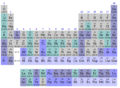 Periodic table discovery periods
 -
 A SVG base to start from


Article(s): Timeline of chemical elements discoveries
Request: Add the elements beyond Rg (i.e. Cn, Uut, Uuq, Uup, Uuh, Uus, Uuo), with Cn and Uuq going into the 1950-1999 period and, I suppose, the rest going into a new "2000+" period. Lanthanum-138 (talk) 04:44, 2 February 2011 (UTC) (This seems to be one of the last un-updated periodic table images. If there are any more like this one, please fix them too! Lanthanum-138 (talk) 04:47, 2 February 2011 (UTC))
Graphist opinion(s): I think a vector version is useful (the original is a screenshot), and added link to a SVG periodic table. But I recommend against adding the unconfirmed elements to the table. Jon C (talk) 05:37, 2 February 2011 (UTC)
- Alternatively, one may not want to do this as an image, but instead through the periodic table template. Jon C (talk) 20:49, 3 February 2011 (UTC)
- Or the compact one. Jon C (talk) 20:51, 3 February 2011 (UTC)
 Request taken by jkwchui.; ongoing progress here.
- Or the compact one. Jon C (talk) 20:51, 3 February 2011 (UTC)
- Done Lanthanum-138 did all the hard work. It looks great! Do you mind if I modify the colors to something that suggest a pattern (e.g., red->orange->green->blue)? The current colors as it is sorta random (looking through the code it seems the original author simply picked between "CC" "00" and "FF" ;) ). Also, I find the short template looks better than the one currently in article - the readers don't really need to know the extra details like group# within that context. Jon C (talk) 21:35, 13 February 2011 (UTC)
- See the following, using both the color-wheel and saturation as guidance (the newly discovered elements are "brighter/fresher" than the older ones):
((Periodic_table_discovery_en))
- Now I'm doing Template:Periodic table (discovery periods). Lanthanum-138 (talk) 11:25, 14 February 2011 (UTC)
![]() Question: I've tried a variety of things, but don't seem to be able to get the dashed box to go away. Can someone versed in Wikitables help? Jon C (talk) 19:48, 15 February 2011 (UTC)
Question: I've tried a variety of things, but don't seem to be able to get the dashed box to go away. Can someone versed in Wikitables help? Jon C (talk) 19:48, 15 February 2011 (UTC)
- Done Done. Lanthanum-138 (talk) 09:15, 16 February 2011 (UTC)
- Sweetness and light. I'll mark this one as resolved. Jon C (talk) 18:01, 16 February 2011 (UTC)
Manchester United crest to SVG


Article(s): Manchester United F.C., Manchester United F.C. Reserves and Academy
Request: Can someone please convert the crest from PNG to SVG, thanks.
– HonorTheKing (talk) 16:57, 21 February 2011 (UTC)
Graphist opinion(s): ![]() Request taken by Jovianeye.
Request taken by Jovianeye. ![]() Done Now this SVG is really massive 2.5MB. So decide if you want it! --JovianEye (talk) 18:27, 21 February 2011 (UTC)
Done Now this SVG is really massive 2.5MB. So decide if you want it! --JovianEye (talk) 18:27, 21 February 2011 (UTC)
Requester: Thank you very much.
– HonorTheKing (talk) 20:58, 21 February 2011 (UTC)
Coat of Arms of Rēzekne
-
 On this COA
 -
 correct SVG COA


Article(s): Rēzekne
Request: Please correct SVG Coat of Arms of Rēzekne Dark Eagle (talk) 20:41, 14 February 2011 (UTC)
Graphist opinion:
- Please explain what corrections are required. gringer (talk) 12:22, 15 February 2011 (UTC)
- Mostly shield & silhouette --Dark Eagle (talk) 18:31, 15 February 2011 (UTC)
- Done Did many small adjustments (including color changes) to match http://www.rezekne.lv/typo3temp/GB/ee92756b5e.jpg (the official CoA). Is this what you had in mind? —Quibik (talk) 14:32, 19 February 2011 (UTC)
- Please restore background colour, it should be sky-blue as here; not dark blue, thanks --Dark Eagle (talk) 15:07, 19 February 2011 (UTC)
- Changed the colors. —Quibik (talk) 16:33, 19 February 2011 (UTC)
- That is more better..) --Dark Eagle (talk) 17:28, 19 February 2011 (UTC)
- Changed the colors. —Quibik (talk) 16:33, 19 February 2011 (UTC)
- Please restore background colour, it should be sky-blue as here; not dark blue, thanks --Dark Eagle (talk) 15:07, 19 February 2011 (UTC)
Flag of Rēzekne
-
 Flag (need correction)
 -
CoA

Article(s): Rēzekne
Request: Please, create good Rēzekne's flag --Dark Eagle (talk) 17:44, 19 February 2011 (UTC)
Graphist opinion:
- Done. Re-created with the updated CoA. —Quibik (talk) 20:34, 19 February 2011 (UTC)
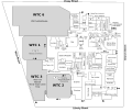
White house room locator diagrams
-
 note low contrast
 -
 this one is even worse
 -
 this more like what is intended


Article(s): Map Room (White House), Library (White House), and Vermeil Room
Request: The contrast in the first two images for the indicated room is too low. I tried fixing the first one but got a file that was three times as large. Mangoe (talk) 20:39, 4 February 2011 (UTC)
Graphist opinion(s): Can you use File:WHground.svg instead? It could be turned into a locator diagram fairly easily if it's not already sufficient. Makeemlighter (talk) 20:49, 4 February 2011 (UTC)
- Hmmm... It would be better to make a set of these but let me get back to you on that. Mangoe (talk) 22:10, 4 February 2011 (UTC)
- It would be preferable to have a separate locator diagram for each room given that most such diagrams exist, as it would be hard to get people to stop using them. I would suggest replacing existing diagrams (and adding any that may be missing) by taking the diagram you indicate (and the matching diagrams for the other floors) and blanking out all but the room in question. Mangoe (talk) 18:37, 10 February 2011 (UTC)
- Done See next gallery for links. Jon C (talk) 21:27, 13 February 2011 (UTC)
-
 Vermeil room
 -
 Oval office
 -
 Map room
 -
 Library
 -
 China room
 -
 Center hall


The Mall at the World Trade Center
-
 Version with non-modifiable text
 -
 Version with modifiable text

.svg)
Article(s): The Mall at the World Trade Center
Request: Requesting that this floorplan be converted to SVG. Thanks! SchuminWeb (Talk) 03:51, 7 February 2011 (UTC)
Graphist opinion(s):![]() Request taken by Makeemlighter.
Request taken by Makeemlighter.
![]() Done I've uploaded versions with and without modifiable text. The non-modifiable version renders better, so it should be used in articles. The other version is good for translation and making corrections. If there are any errors or if you'd like anything changed, just let me know. Cheers, Makeemlighter (talk) 23:22, 14 February 2011 (UTC)
Done I've uploaded versions with and without modifiable text. The non-modifiable version renders better, so it should be used in articles. The other version is good for translation and making corrections. If there are any errors or if you'd like anything changed, just let me know. Cheers, Makeemlighter (talk) 23:22, 14 February 2011 (UTC)
- <sigh> changed font to Arial, because it scales properly on wikimedia sites. For other watching wikigraphists, this fixes most font scaling problems. gringer (talk) 12:21, 15 February 2011 (UTC)
 Question: Really? How does that work? Arial isn't even on the supported fonts list... Jon C (talk) 18:19, 15 February 2011 (UTC)
- It's pointless to change the font. It's far better to just create a version with text converted to paths and put that version in the articles. The modifiable version is then listed in other version and is available for translation, corrections, etc. Makeemlighter (talk) 18:58, 15 February 2011 (UTC)
- Wow! Thank you very much! It looks awesome. SchuminWeb (Talk) 03:06, 16 February 2011 (UTC)
United States Bankruptcy Court Seal
-
 Seal of the United States Bankruptcy Court

Article(s): Chapter 11, Title 11, United States Code, Chapter 7, Title 11, United States Code, United States bankruptcy court, Chapter 13, Title 11, United States Code, United States Trustee Program, Bankruptcy in the United States, Claim in bankruptcy, Chapter 12, Title 11, United States Code, Trustee in bankruptcy, Debtor in possession, Bankruptcy discharge, Chapter 15, Title 11, United States Code, Title 11 of the United States Code, Chapter 9, Title 11, United States Code, Federal Rules of Bankruptcy Procedure, Bankruptcy Appellate Panel
Request: Replace white background with transparency. --Cybercobra (talk) 07:11, 11 February 2011 (UTC)
Graphist opinion(s): this is a png -file and therefore the request should be done on the photography workshop-page. Wereldburger758 (talk) 12:32, 11 February 2011 (UTC)
- Done Since this is used in many articles, and the source is small (192x192px), a vector version would be useful at some point. Jon C (talk) 19:48, 13 February 2011 (UTC)
"Free book cover needed"
-
 Current image
 -

-

-
 Take 1
 -
 Take 2


Article(s): All books (~0) found in Category:Wikipedia books (books without cover images)
Request: Wikipedia books currently have the "Picture Needed" plus when prompting users for a cover. However, many people just add fair use images, etc... and they have to be reverted, again and again... So I was thinking that designing a new image would go a long way. Something like a book with the "no copyright" sign as its cover, in SVG format. Perhaps with a question mark somewhere in there? Headbomb {talk / contribs / physics / books} 07:43, 21 February 2011 (UTC)
Graphist opinion(s): Hi Headbomb - see gallery. Let me know of any changes and improvements you'd like. Jon C (talk) 17:40, 22 February 2011 (UTC)
- The layout is awesome! Some tweaks: It really shouldn't be named [[File:Wikibooks-something.svg]], since Wikipedia books (collections of Wikipedia articles) are different from Wikibooks (books written from scratch). A better file name would be something like File:Wikipedia-books-missing-cover.svg or similar. Also the blue question mark with a white border has, IMO, a bad contrast with the darkgray book and the aliasing makes the white border looks crappy when the image is small (which is how it would be viewed most of the time). Maybe make the question mark a solid light gray, matching the lighter gray from the inside of the "no copyright" circle?
- The original PNG also had a black line instead of a series of black "dots" on the left side of the book. I think that looked better, or at least it's less prone to aliasing. Headbomb {talk / contribs / physics / books} 20:16, 22 February 2011 (UTC)
- Uploaded a modified version under the proposed name - I didn't know that there's a Wikipedia Books. I replaced the black line with a gray one (I think it's easier to see now). I uploaded 2 version - a blue ? with buffed up outline, overwritten by a gray ? as you suggested (which I think looks nicer). If you like the former, simply revert it. Jon C (talk) 22:17, 22 February 2011 (UTC)
- The "wikipedia books" concept is a little strange to me... I think my concept of a book is one that reads coherently from front-to-back. Hmm... but it would make the "chemistry experiment" illustration effort more worthwhile. Jon C (talk) 19:53, 23 February 2011 (UTC)
New Flyer
Article(s): New Flyer Industries
Request: Requesting that this logo be converted to SVG. Thanks! SchuminWeb (Talk) 06:16, 22 February 2011 (UTC)
Graphist opinion(s): I'm not sure if this is doable. The bevel effect is difficult to reverse engineer, and I think it may have been a bitmap to begin with (the style of bevel reminds me of something in Photoshop rather than a vector drawing). Jon C (talk) 17:17, 22 February 2011 (UTC)
![]() Request taken by Jovianeye.
Request taken by Jovianeye. ![]() Done The SVG file is bigger than the PNG version in terms of file size. --JovianEye (talk) 04:15, 23 February 2011 (UTC)
Done The SVG file is bigger than the PNG version in terms of file size. --JovianEye (talk) 04:15, 23 February 2011 (UTC)
- Looks awesome! Thanks! SchuminWeb (Talk) 04:25, 23 February 2011 (UTC)
- Great job Jovianeye! Can you tell me how you did this? Jon C (talk) 19:55, 23 February 2011 (UTC)
- Ah - a minute of search is better than an hour drawing :) Jon C (talk) 18:23, 24 February 2011 (UTC)
Sigma coordinate system
-
 Sigma coordinate system

Article(s): Numerical weather prediction
Request: This should be an easy one. The image is already vectorized, but for some reason the subscripts are not showing up correctly in MediaWiki. Can you guys fix it? Titoxd(?!? - cool stuff) 01:50, 26 February 2011 (UTC)
Graphist opinion(s):
![]() Done Figured it out. Titoxd(?!? - cool stuff) 01:58, 26 February 2011 (UTC)
Done Figured it out. Titoxd(?!? - cool stuff) 01:58, 26 February 2011 (UTC)