Alaska Scenic Byway marker[edit]
-
 Alaska Scenic Byways marker

Article(s): Alaska's Scenic Byways
Request:
- I extracted the graphic from the PDF and saved it as an SVG in Adobe Illustrator. The DOT&PF created the file as a series of tiles. In Illustrator, each tile is contiguous, but on the file description page, there are white gridlines between them. I would appreciate anything that can be done to remove the gaps. Imzadi 1979 →
Graphist opinion(s):
- The image you extracted is a raster image not a vector, probably the reason why the grids are overlaying the image. Not sure if that's the problem. ///EuroCarGT 15:14, 28 September 2014 (UTC)
- @EuroCarGT: any thoughts on then fully converting it to a vector image? I've already asked Michael J if he could help since he's been great at vectorizing other highway signs in the past. Imzadi 1979 → 20:45, 3 October 2014 (UTC)
- @Imzadi1979: Try www
.seward , the sign (last page) is already vectored, I've tried extracting it, however I don't have the font so it converts it to another one. ///EuroCarGT 20:51, 3 October 2014 (UTC).com /wp-content /uploads /2011 /09 /Seward-Highway-Scenic-Guide .pdf - @Imzadi1979: BTW, the font is Palatino. ///EuroCarGT 21:01, 3 October 2014 (UTC)
- I think I got it re-extracted and then modified to put the sign borders on the new version. There does seem to be some minor details missing (one green stem, some flower pistols/stamen), and the current preview and the current thumbnail on the image description page still wants to show the gridlines even though the image as rendered on the article doesn't have them. *shrugs* Thanks for the help, EuroCarGT. Michael J, if you can do some clean up to add some of those minor details, that would be great too. Imzadi 1979 → 21:59, 3 October 2014 (UTC)
- And it's about to be deleted on Commons due to it having an incorrect license. Commons:Deletion requests/File:Alaska Scenic Byway.svg --207.207.28.198 (talk) 22:57, 3 October 2014 (UTC)
- @207.207.28.198: actually, I doubt that. The nominator on Commons seems not to understand that this is a sign listed in the Alaska Traffic Manual, which explicitly contains the full contents of the federal Manual on Uniform Traffic Control Devices, including the same copyright release as the federal MUTCD. That's the difference between ((PD-MUTCD)) and ((PD-MUTCD-AK)). Imzadi 1979 → 01:35, 4 October 2014 (UTC)
- And it's about to be deleted on Commons due to it having an incorrect license. Commons:Deletion requests/File:Alaska Scenic Byway.svg --207.207.28.198 (talk) 22:57, 3 October 2014 (UTC)
- I think I got it re-extracted and then modified to put the sign borders on the new version. There does seem to be some minor details missing (one green stem, some flower pistols/stamen), and the current preview and the current thumbnail on the image description page still wants to show the gridlines even though the image as rendered on the article doesn't have them. *shrugs* Thanks for the help, EuroCarGT. Michael J, if you can do some clean up to add some of those minor details, that would be great too. Imzadi 1979 → 21:59, 3 October 2014 (UTC)
- @Imzadi1979: BTW, the font is Palatino. ///EuroCarGT 21:01, 3 October 2014 (UTC)
- @Imzadi1979: Try www
- @EuroCarGT: any thoughts on then fully converting it to a vector image? I've already asked Michael J if he could help since he's been great at vectorizing other highway signs in the past. Imzadi 1979 → 20:45, 3 October 2014 (UTC)
Archabbot Boniface Wimmer's Coat of Arms[edit]
-
 The Coat of Arms of the first abbot of St. Vincent Archabbey, Boniface Wimmer
 -
 B/W vector version


Article(s): Boniface Wimmer
Request:
- Could someone vectorize this for me? Also, does someone know how to add color to it. I know there are rules for how the dots and lines translate into color, I just can't do it myself. Any help would be GREATLY appreciated! -- Jcs7708 (talk) 01:51, 1 October 2014 (UTC)
Graphist opinion(s):
- I have traced a B/W version; I'm not expert in SVG colouring, but others may use it and do what they want. Also could you please put in the file description the source of the pic instead of ((own)) (unless you have drawn it by yourself...) to be sure it is public domain?--Carnby (talk) 21:05, 13 October 2014 (UTC)
Popcaplogo.png[edit]

-
 PopCap's current logo (SVG)
Article(s): PopCap Games
Request:
- Article "PopCap Games" needs an SVG version of the logo. -- None159 (talk) 03:25, 1 October 2014 (UTC)
Graphist opinion(s): ![]() Done: That was PopCap's legacy logo. I've uploaded an SVG of the current one to Commons. The Haz talk 18:43, 4 October 2014 (UTC)
Done: That was PopCap's legacy logo. I've uploaded an SVG of the current one to Commons. The Haz talk 18:43, 4 October 2014 (UTC)
License plates of Germany[edit]
-
 please note registration seal has been defaced, red reichsadler in banded stamped disc on white plate
 -

-
 German Motorcycle Front License Plate pre 1945
 -
 German Motorcycle Front License Plate post 1945
Article(s): license plates of Germany
- Request
- please pngify or svgify both, giving neutral but meaningful names, like File:German motorcycle front license plate pre 1945.svg, File:German motorcycle front license plate post 1945.svg. Source material might be useful at http://www.warrelics.eu/forum/germany-ww1-ww2-armour-artillery-vehicles/license-plates-261833/
- and .. -- Kintetsubuffalo (talk) 10:45, 2 October 2014 (UTC)
- Graphist opinion(s)
 Done by Uddhav Sureka (talk) 09:49, 4 December 2014 (UTC)))
56th Field Artillery Command[edit]
-
 56th Field Artillery Command shoulder sleeve insignia
 -
 Done
Done


Article(s): 56th Field Artillery Command
Request:
- Please convert to SVG. Colors are described at "56th Field Artillery Command". United States Army Institute of Heraldry.-- Gadget850 talk 18:20, 4 October 2014 (UTC)
Graphist opinion(s):
Thanks!
So_clan[edit]


Article(s): So_clan
Request:
- please remove whitespace so mon shows larger... -- Kintetsubuffalo (talk) 04:11, 5 October 2014 (UTC)
Graphist opinion(s):
It has already been done but the uploader hadn't updated the lab page.--Carnby (talk) 19:43, 27 October 2014 (UTC)
Field artillery DUIs[edit]
-
 9th Field Artillery Regiment Distinctive Unit Insignia
 -
 81st Field Artillery Regiment Distinctive Unit Insignia
 -
 84th Field Artillery Regiment Distinctive Unit Insignia
 -
 Done
Done -
 Done
Done -
Done


Article(s): 9th Field Artillery Regiment, 81st Field Artillery Regiment, 84th Field Artillery Regiment
Request:
- Convert to SVG. for all three emblems, the yellow is gold and the red is scarlet. -- Gadget850 talk 00:44, 6 October 2014 (UTC)
Graphist opinion(s):
- I did the second one. If I get the chance, I will work on the others as well, but if anyone else can help, it'd be appreciated. MjolnirPants Tell me all about it. 22:03, 7 October 2014 (UTC)
- Have we forgotten something rather important on the second one? --64.9.157.66 (talk) 22:54, 7 October 2014 (UTC)
- I figured MjolnirPants would notice that pretty quickly. -- Gadget850 talk 23:34, 7 October 2014 (UTC)
- Not forgotten, just didn't show up once I uploaded.... I'll smack my computer around a bit, let it know that I expect better from it in the future. :D MjolnirPants Tell me all about it. 13:48, 8 October 2014 (UTC)
- FYI: I had forgotten to convert the flowed text to paths before uploading. I'd re-upload, but it EuroCarGT has already fixed it. MjolnirPants Tell me all about it. 13:58, 8 October 2014 (UTC)
- I figured MjolnirPants would notice that pretty quickly. -- Gadget850 talk 23:34, 7 October 2014 (UTC)
- Have we forgotten something rather important on the second one? --64.9.157.66 (talk) 22:54, 7 October 2014 (UTC)
Images #2-#3 can be cropped, a bit of white space at the bottom. Anyways nice job MjolnirPants! ///EuroCarGT 20:28, 8 October 2014 (UTC)
- Thanks! Regarding the cropping, I tried a couple of times to crop it down, but Inkscape doesn't want to do it (I'm still fairly new to it, and the last time I worked on vector graphics before coming here was in the late '90s, using Illustrator). Think you could lend a hand? I'd appreciate it if you could, or even if you could tell me what I'm missing. MjolnirPants Tell me all about it. 20:57, 8 October 2014 (UTC)
- I did #2 with Adobe Illustrator however it seemed to resized the image which is werid. ///EuroCarGT 21:17, 8 October 2014 (UTC)
- It depends on which version of Illustrator you're using. Earlier ones don't put a specific width/height measurement in the SVG file, and later ones won't do it if you have the "responsive" tickbox ticked. Also opening an Inkscape-created SVG in Illustrator sometimes resets the 0,0 coordinates for the artboard. Inkscape outputs truly awful code. and they don't appear to be in a rush to fix that anytime soon. --64.9.157.201 (talk) 21:33, 8 October 2014 (UTC)
- I did #2 with Adobe Illustrator however it seemed to resized the image which is werid. ///EuroCarGT 21:17, 8 October 2014 (UTC)
Create Vector image of this signature[edit]
-
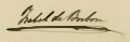
-
 vector version
Articles: On the article of Isabel II
Request:
- Please create a vector images of this signature.Here is a link that might help. Please make it look as similar to the original file as possible. -- --Hipposcrashed (talk) 03:06, 7 October 2014 (UTC)Hipposcrashed (talk) 20:42, 5 October 2014 (UTC)
Graphist opinion(s):
- I tried but the result is not satisfactory. I will try again later. Wereldburger758 (talk) 08:29, 10 October 2014 (UTC)
Thank you! --Hipposcrashed (talk) 21:55, 14 October 2014 (UTC)
Flag of Northamptonshire[edit]
-
PNGPNG
-
SVGSVG
Article(s): Northamptonshire
Request:
- The County adopted a flag[1]. Could a SVG be drwan? -- Antemister (talk) 18:20, 7 October 2014 (UTC)
Graphist opinion(s):
 Request taken. MjolnirPants Tell me all about it. 18:30, 7 October 2014 (UTC)
- DoneMjolnirPants Tell me all about it. 20:13, 7 October 2014 (UTC)
- Thanks! Really fast!--Antemister (talk) 20:46, 7 October 2014 (UTC)
Earth cable thermal stability[edit]
Article(s): High-voltage cable
-
 Done
Done

Source: Fig. 2.11 from here
Request:
- Requesting SVG diagram of Sheath temperature against Heat emission of a 400 kV earth cable. If you find a better template than mine please use it.--Kopiersperre (talk) 09:58, 8 October 2014 (UTC)
Graphist opinion(s):
That was fast, thank you.--Kopiersperre (talk) 11:28, 8 October 2014 (UTC)
Logo of Kolomna Locomotive works[edit]
Article(s): de:Lokomotivfabrik Kolomna, ru:Коломенский завод
Source: ru:Файл:Kolomenskiy zavod.jpg
Request:
- Requesting SVG of simple raster logo.--Kopiersperre (talk) 16:55, 8 October 2014 (UTC)
Graphist opinion(s):
- Request taken. MjolnirPants Tell me all about it. 21:08, 8 October 2014 (UTC)
- Question: Can you translate the information on the ru.WP page for that image? I have the .svg file ready to upload, but I want to get all the info correct. MjolnirPants Tell me all about it. 21:20, 8 October 2014 (UTC)
- Answer: English and russian are both not my mother tongue. But here is a try:
((This is the logo of on organisation, good, event or computer program.
- This is an information and not a license tag. Parallel to this is a free license template needed.
- The presence of this picture on the pages of wikipedia does not mean a stake of wikimedia foundation, and vice versa.))
Description: Logotip Kolomenskogo zavoda
Source: Transmashholding
Date created: unknown
Author: Коломенский завод
((This image is non-free (does not meet the definition of a Free Cultural Work). In accordance with the decision of the Wikimedia Foundation, it can be used in the articles section of Russian Wikipedia only when criteria of fair use are met. Any other use (such as in the Russian section of Wikipedia, and outside of it) can be a violation of copyright law.))
Fair Use Purpose: Using vector logo in the article about the company
Fair Use Rationale: indespensible--Kopiersperre (talk) 22:00, 8 October 2014 (UTC)
- Okay, The info you got is plenty good enough, but since I can't read Russian and I cant use any translation software on my work computer, I'm not able to upload the file to the proper WP. Unfortunately, I'm also not able to access any online file hosting services from this computer. I can email you the file if you like, or you can wait and see if someone who can access the right WP wants to redo it. MjolnirPants Tell me all about it. 15:05, 9 October 2014 (UTC)
- May you mail me the logo?--Kopiersperre (talk) 08:56, 10 October 2014 (UTC)
- Okay, The info you got is plenty good enough, but since I can't read Russian and I cant use any translation software on my work computer, I'm not able to upload the file to the proper WP. Unfortunately, I'm also not able to access any online file hosting services from this computer. I can email you the file if you like, or you can wait and see if someone who can access the right WP wants to redo it. MjolnirPants Tell me all about it. 15:05, 9 October 2014 (UTC)
Minor correction[edit]
-
 Description of first image

Article(s): many...
Request:
- This CoA has a mistake: According to the blason, the star has to be above the head of the panther, according to [2] -- Antemister (talk) 19:39, 8 October 2014 (UTC)
Graphist opinion(s):
- Done
Map needs striping[edit]
-

-
 Example of stripping
.svg)

Article(s): Various
Request:
- Colombia on the South American map should be stripped both light and dark blue, similar to how some of the states on the map of the United States are stripped. Unions in Colombia are being converted at judicial discretion into marriages. Fry1989 eh? 17:19, 9 October 2014 (UTC)
- I'll just bet that there's a lot of stripping going on on their wedding night!--64.9.157.30 (talk) 22:17, 14 October 2014 (UTC)
- You will have to be more specific what needs to be done. What country should be given what colour? And watch your language ;) Wereldburger758 (talk) 07:53, 22 November 2014 (UTC)
- I'll just bet that there's a lot of stripping going on on their wedding night!--64.9.157.30 (talk) 22:17, 14 October 2014 (UTC)
Graphist opinion(s):
Vakhtang V[edit]
-
 original raster
 -
 new vector

.svg)
Article(s): Vakhtang V of Kartli
Request:
- Please SVG vectorize the signature. Jaqeli 18:43, 9 October 2014 (UTC)
Graphist opinion(s):
- Done In the future, please use the usual template for your requests. It can be difficult to format things correctly when you post this way. MjolnirPants Tell me all about it. 19:15, 9 October 2014 (UTC)
- @MjolnirPants: Thank you. Can you please join the circle as it should have a circle signature and also please remove that dot in the middle of the signature. Jaqeli 20:15, 9 October 2014 (UTC)
- I can join the circle, but I'm reluctant to remove the dot. It was clearly part of the original signature that I vectorized. If you can find another copy of his signature that lacks the dot, I will remove it then. I don't want to misrepresent the design of the signature based on someone's personal preference. MjolnirPants Tell me all about it. 20:22, 9 October 2014 (UTC)
- @MjolnirPants: Thanks. Can you please also SVG vectorize this signature for Mariam Dadiani article? Jaqeli 20:30, 9 October 2014 (UTC)
- @MjolnirPants: Can you please correct the signature of Vakhtang V according to this? Jaqeli 19:14, 13 November 2014 (UTC)
- @MjolnirPants: Thanks. Can you please also SVG vectorize this signature for Mariam Dadiani article? Jaqeli 20:30, 9 October 2014 (UTC)
- I can join the circle, but I'm reluctant to remove the dot. It was clearly part of the original signature that I vectorized. If you can find another copy of his signature that lacks the dot, I will remove it then. I don't want to misrepresent the design of the signature based on someone's personal preference. MjolnirPants Tell me all about it. 20:22, 9 October 2014 (UTC)
- @MjolnirPants: Thank you. Can you please join the circle as it should have a circle signature and also please remove that dot in the middle of the signature. Jaqeli 20:15, 9 October 2014 (UTC)
-
 raster version
 -
 vector version


![]() Done--Carnby (talk) 20:29, 13 October 2014 (UTC)
Done--Carnby (talk) 20:29, 13 October 2014 (UTC)
- Perfect. Thanks. Jaqeli 07:46, 14 October 2014 (UTC)
Symbols of Tonga[edit]
-

-
File:IMAGE2.EXT
-
File:IMAGE3.EXT

Article(s): Various
Request:
- Please recreate the seal of the Legislative Assembly of Tonga and the coat of arms of the Tonga Defence Services. The crown needed can be taken from the coat of arms displayed above, and the rest of the elements should be easy enough for someone with SVG skills. Both should be eligible to be uploaded to Commons. Fry1989 eh? 18:48, 11 October 2014 (UTC)
Graphist opinion(s):
Existential risk chart - cropping needed[edit]

Article(s): Global catastrophic risks
Request:
- Could somebody crop off all the empty space on the right side of this chart? It shows in the article as a ridiculous amount of whitespace that makes it hard to read the text. ∴ ZX95 [discuss] 17:38, 13 October 2014 (UTC)
Graphist opinion(s):
- Done. ///EuroCarGT 18:16, 13 October 2014 (UTC)
The Masque of the Red Death poster[edit]

Article(s): Masque of the Red Death (1989 film)
Request:
Graphist opinion(s):
- The watermark was removed when the original uploader found a newer version. However, I took the liberty of taking the first version without the watermark (the largest one), and removing the paper distortion and glare, adjusting the levels, rotating and cropping it. MjolnirPants Tell me all about it. 15:18, 14 October 2014 (UTC)
-
 SVG signature
Article(s): Sandra Roelofs
Request:
- Please SVG vectorize this signature. Jaqeli 11:03, 14 October 2014 (UTC)
Graphist opinion(s):
- DoneMjolnirPants Tell me all about it. 12:29, 14 October 2014 (UTC)
- Thank you. Jaqeli 19:26, 14 October 2014 (UTC)
Rektor and Tabidze[edit]

Article(s): David Rektor (on Georgian wiki) and Galaktion Tabidze
Request:
Graphist opinion(s):
- Could you please tell me which is Rektor's and which is Tabidze's signature?--Carnby(talk) 20:18, 15 October 2014 (UTC)
![]() Done--Carnby (talk) 06:26, 16 October 2014 (UTC)
Done--Carnby (talk) 06:26, 16 October 2014 (UTC)
Badge for Sanayi Medal[edit]
Article(s): Sanayi medal
Request:
- Can someone please make a badge of this medal? As you can see, it is red and white. I'd really appreciate it. Étienne Dolet (talk) 07:29, 16 October 2014 (UTC)
- Please withdraw the nomination. I already did it. Étienne Dolet (talk) 22:46, 16 October 2014 (UTC)
Graphist opinion(s):
Discovery Family Channel[edit]
Article(s): Discovery Family Channel
Request:
- Daytime version of new logo, like this. -- John123521 (Talk-Contib.) RA 14:06, 16 October 2014 (UTC)
Graphist opinion(s):
- Being an image generated using 3D software, it is advised that this image is not vectorised. It has complex shading and gradients and probably cannot be replacated throught vectorization. — Preceding unsigned comment added by 218.188.222.205 (talk) 09:18, 27 November 2014 (UTC)
Alexander II[edit]
Article(s): Alexander II of Imereti
Request:
- Please SVG vectorize this signature. Jaqeli 20:27, 16 October 2014 (UTC)
Graphist opinion(s):
- Request taken by Carnby (talk) 20:43, 22 October 2014 (UTC). @Jaqeli: Are they three different signatures of the same person?--Carnby (talk) 20:43, 22 October 2014 (UTC)
Flag of Perth[edit]
Article(s): City of Perth, List of Australian flags
Request:
- Would someone please create an SVG File of the flag of the City of Perth, found at the top of the page http://www.crwflags.com/fotw/flags/au-wa-pe.html
-Snow Lion Fenian- — Preceding undated comment added 15:32, 19 October 2014 (UTC)
Graphist opinion(s):
Flag of Sydney[edit]
Article(s): City of Sydney, List of Australian flags
Request:
- Would someone please create an SVG File of the Flag of the City of Sydney, found at the top of the page http://www.crwflags.com/fotw/flags/au-ns-sy.html
Graphist opinion(s):
Derafsh_Kaviani[edit]
-
 Done
Done

Article(s): Derafsh_Kaviani
Request:
- please remove unnecessary bottom shading per WPMOS on flags... -- Kintetsubuffalo (talk) 10:54, 24 October 2014 (UTC)
- Thank you, masked man!--Kintetsubuffalo (talk) 01:07, 25 October 2014 (UTC)
Graphist opinion(s):
Great Seal of the Islamic State[edit]
-
Great Seal of the Islamic StateGreat Seal of the Islamic State
-
The basics done, just waiting for textThe basics done, just waiting for text
Article(s): Islamic State of Iraq and the Levant
Request:
- Could someone possibly vectorise this seal please, many thanks. TRAJAN 117 (talk) 03:41, 25 October 2014 (UTC)
Graphist opinion(s):
- Is there a string of Arabic text available that can be pasted into the image instead of non-Arabic speakers having to search out every character in whatever font is used? The seal itself is easy, the text characters not so much. Unless one speaks Arabic of course. --209.99.2.160 (talk) 11:21, 25 October 2014 (UTC)
- @TRAJAN 117: I've done the basic structure. All text is there in Lorem Ipsum form, even the circular text (complete with the required circular paths) but the renderer isn't displaying it, but it is there for editing purposes so that the correct Arabic script can be pasted in and pathed for viewing. So if anyone else wants to finish/tweak it go right ahead. Otherwise it'll just sit there until the necessary script comes along for pasting into the document. For graphists, the file was produced in Illustrator CC 2014 (v18) so the svg code is correct, but has no Inkscape markup so I've no idea what it'll look like in that dodgy app ;) --207.207.28.148 (talk) 18:34, 25 October 2014 (UTC)
- @207.207.28.148: Many thanks for the work so far. Hopefully someone will be able to complete the image :) TRAJAN 117 (talk) 22:46, 25 October 2014 (UTC)
- @TRAJAN 117: I've done the basic structure. All text is there in Lorem Ipsum form, even the circular text (complete with the required circular paths) but the renderer isn't displaying it, but it is there for editing purposes so that the correct Arabic script can be pasted in and pathed for viewing. So if anyone else wants to finish/tweak it go right ahead. Otherwise it'll just sit there until the necessary script comes along for pasting into the document. For graphists, the file was produced in Illustrator CC 2014 (v18) so the svg code is correct, but has no Inkscape markup so I've no idea what it'll look like in that dodgy app ;) --207.207.28.148 (talk) 18:34, 25 October 2014 (UTC)
- I have found the Arabic text if it will help anyone. TRAJAN 117 (talk) 10:41, 23 November 2014 (UTC)
- Top exterior: "الدولة الإسلامية في العراق والشام"
-
- Top interior: "لا إله إلا الله"
- Lower interior: " الله رسو لمحمد "
- Bottom exterior: "راية وحدة امة وحدة"
- The French Wikipedia's graphics lab is also working on this logo (that's where TRAJAN 117's transcription come from). I dropped a message on the Arabic Wikipedia's embassy in order to find someone able to help us choose a fitting font. -- Whidou (talk) 10:33, 24 November 2014 (UTC)
- Arabic text from French Wikipedia's Graphics Lab placed, can someone check that it's correct (only text, not font)? --Victor•talk 21:55, 25 November 2014 (UTC).
- @V4711: The font is incorrect it doesn't match the original. TRAJAN 117 (talk) 13:00, 26 November 2014 (UTC)
Coat of arms of Ukraine[edit]
.gif)
_(black_version).jpg)
Article(s): Coat of arms of Ukraine
Request:
- png or svg color version, please... -- Kintetsubuffalo (talk) 14:04, 25 October 2014 (UTC)
Graphist opinion(s):
- Any easy task , just use one of the files in Commons:Category:Coats of arms of ASSR and change the text.--Antemister (talk) 21:13, 25 October 2014 (UTC)
Europäische Wasserscheiden[edit]

Article(s): Valdai
Request:
- English version please... -- Kintetsubuffalo (talk) 04:24, 26 October 2014 (UTC)
Graphist opinion(s):
Barnsley F.C. Logo[edit]

Article(s): Barnsley F.C.
Request:
- Appreciate if any wiki-graphist could modify the above older version Barnsley FC logo by adding some wordings and shield-like borders to it. The present logo could be found here. Thanks in advance. -- Arteyu ? Blame it on me ! 01:26, 31 October 2014 (UTC)
Graphist opinion(s):
![]() Request taken. - Fallschirmjäger ✉ 21:31, 31 October 2014 (UTC)
Request taken. - Fallschirmjäger ✉ 21:31, 31 October 2014 (UTC)
- Done - Regards, Fallschirmjäger ✉ 22:43, 31 October 2014 (UTC)
- Thank you soo much. Arteyu ? Blame it on me ! 06:44, 3 November 2014 (UTC)
G.fast spectrum[edit]
Article(s): G.fast

Request:
- May someone draw the extended frequency spectrum of the G.fast standard ? (from here)
Something like this or this would be nice, too.--Kopiersperre (talk) 15:28, 31 October 2014 (UTC)
Graphist opinion(s):
- Done first one. MjolnirPants Tell me all about it. 16:49, 31 October 2014 (UTC)
- Just out of interest, why is it so big? It shouldn't be much more than about 15k or so. But 111k? --64.9.157.12 (talk) 20:32, 31 October 2014 (UTC)
- Fred the Oyster has squeezed it to 4k.--Kopiersperre (talk) 14:33, 1 November 2014 (UTC)
- I haven't been able to get text created in Inkscape to show in files uploaded here, so I've taken to pathing out the text. All those extra vertexes add a lot to the size. I've tried a couple of methods to make regular text work, but none have shown any results yet. I'm open to learning, if anyone knows how to do it. MjolnirPants Tell me all about it. 13:35, 6 November 2014 (UTC)
- Switch off "flowed text", it's part of the non-existent SVG v1.2 and the renderer doesn't support it. Just use normal normal text. And your default sans-serif font should be Liberation Sans (which is the font the renderer substitutes for Arial, Helvetica, Frutiger et al). Another couple of fonts you can use that the renderer recognises is DejaVu Sans and Nimbus Sans. The only time you really need to use pathed text is if positioning has to be absolutely perfect, text on a path, or you have to use a very specific font that the renderer doesn't recognise. But using Liberation with font sizes specified in pixels will give very good accuracy for alignments etc.--207.207.22.215 (talk) 18:11, 6 November 2014 (UTC)
- Just out of interest, why is it so big? It shouldn't be much more than about 15k or so. But 111k? --64.9.157.12 (talk) 20:32, 31 October 2014 (UTC)
Hi @MjolnirPants:, I have some links here which you can look at for your work with svg files on Wikimedia.
- fonts
- svg check This is a tool to check how a svg file will be rendered and shown on any Wikimedia site. Right now when I write this the tool doesn't load but I think that is just a temporary problem.
- svg files in Wikimedia --Goran tek-en (talk) 17:46, 6 November 2014 (UTC)
- @Goran tek-en:, thanks! I think that first link (the list of supported fonts) might be what does it for me. I had precious few of them installed on my machine. I've actually read the last one several times over, to see if I missed something that might fix it. MjolnirPants Tell me all about it. 18:42, 6 November 2014 (UTC)