Please cut and paste new entries to the bottom of this page, creating a new monthly archive (by closing date) when necessary.
For promoted entries, add ((VPCresult|Promoted|File:FILENAME.JPG)) to the bottom of the entry, replacing FILENAME.JPG with the file that was promoted.
For entries not promoted, add ((VPCresult|Not promoted| )) to the bottom of the entry.
Do NOT put any other information inside the template. It should be copied and pasted exactly, and only the first one should have FILENAME.JPG replaced with the actual filename.
Comment At FPC: "there were quite a few obstructions such as roofs of huts which needed cropping hence the lack of foreground". Any chance of seeing an uncropped version? It can only add enc imo. Noodle snacks (talk) 04:54, 11 December 2008 (UTC)[reply]
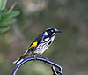
Oppose - It is another very nice photo by NS but, for me, it misses the educational standards needed. The angle of it's head conceals both it's head and beak shape - the beak shape I really think is important here .... particularly for this type of bird. See the difference in showing the bird between this and this - Peripitus(Talk)21:03, 15 December 2008 (UTC)[reply]
Neutral This is a stunning image illustrating the New Holland Honeyeater, but the beak thing is a problem. An image (like the alternative) that shows the beak and head of the bird at a more "viewable" angle would be preferrable from the point of EV. Elucidate(light up)11:53, 17 December 2008 (UTC)[reply]
Original - An immature Brown Goshawk (Accipiter fasciatus) in flight chased by an Australian Magpie, Tasmanian Subspecies (Gymnorhina tibicen hypoleuca) in Austins Ferry, Tasmania
Reason
I regularly see Australian Magpies mobbing at birds of prey. I was very lucky to get a photograph of this happening.
Comment. In addition to the geocode, the description page should have a conventional description of the location, so that viewers don't have to click over to a map to see where the photo was taken.--ragesoss (talk) 19:45, 9 December 2008 (UTC)[reply]
Original - Pilgrims circumambulating the Kaaba. This picture taken from the gate of Abdul Aziz seems to divide the Kaaba and the minarets into mirror images of one another.
Reason
Very good encyclopedic value. Already a multi scope VI at commons and used in several articles here at wiki.
Original - A Female Galah (Eolophus roseicapilla) displaying her crest outside her nest in Tasmania, Australia. The Galah nests in tree cavities. Galahs create strong life-long bonds with their partners.
Reason
Fairly wide usage, Outside a nest and displaying a crest so EV is raised, adds value to articles
Original - A fused quartzgyroscope for the Gravity Probe B experiment which differs from a perfect sphere by no more than a mere 40 atoms of thickness.
Reason
An informative image depicting an interesting subject with educational value. The image complies with all of the valued picture criteria.
Support Very intriguing image! It's also quite large: with some dust removal it seems like a possible featured picture candidate. Fletcher (talk) 12:22, 6 January 2009 (UTC)[reply]
It has actually failed two previous FPC nominations, complaints being that it looks like a glass ball, or that "its difficult to understand", a few comments about the dust too. Noodle snacks (talk) 12:29, 6 January 2009 (UTC)[reply]
Original - Juvenile White-bellied Sea-eagle (Haliaeetus leucogaster) over the Derwent River, Hobart, Tasmania, Australia
Reason
Clear image of a wild Juvenile White-belied Sea-eagle that I was lucky enough to have fly past me relatively close. Not geolocated as it was photographed from my garden.
Conditional Support Great image, used in an article, has EV, etc. The geolocation is the only problem. I'll gladly support if you geolocate it (criteria 5). Elucidate(light up)12:37, 8 December 2008 (UTC)[reply]
One thing worth adding, since the criteria probably still have some evolution to go. The "where relevant" I added for geolocation should be changed to photographs of places (Architecture, Landscapes, Statues, etc) since it isn't particularly important for animals that move around anyway. Noodle snacks (talk) 20:03, 8 December 2008 (UTC(
Oppose I liked you other ones before this and I was going to change my vote to support for one of them. But this one I don't think is clear enough:-Adam (talk) 21:25, 8 December 2008 (UTC)[reply]
If this vote is related to my stalker comment, then it'd be more productive to message me about the matter. Otherwise I'd ask you to clarify your vote and how it relates to the criteria. The image is a bit on the noisy side, but the resolution is quite reasonable (2.5mpix) and technical quality isn't on the VP criteria. I don't think any defining characteristic of a juvenile white-bellied sea-eagle isn't shown clearly. Noodle snacks (talk) 05:32, 9 December 2008 (UTC)[reply]
Certainly not. I am allowed to give my opinion just like anyone else. The other image that I mentioned above was the one that you provided me with a link to. I was about to change my vote to support but the image was nominated so it was a little late:-Adam (talk) 06:57, 9 December 2008 (UTC)[reply]
While your opinion is appreciated, it would be preferred if your vote was based on the valued picture standards and criteria, rather than merely being an unsubstantiated opinion that has not been elaborated on. Elucidate(light up)13:41, 9 December 2008 (UTC)[reply]
Support EV is good for Khutbah. Addendum: I would add the article Khutbah has existed since 2003 and this looks to be the only photo added, supporting Muhammad's view that it is rarely photographed. Fletcher (talk) 12:25, 6 January 2009 (UTC)[reply]
Valuable because it shows the underside of a Log Flume, as well as provides a view of the ride that most people see (from the walkway beneath the log flume)
Oppose I don't think the underside of the ride is very educational, even if people do walk underneath it. A wide angle view of the whole ride would have more EV, or a close-up of the chutes or passengers, though there are already a bunch of those pictures in the article. Fletcher (talk) 12:44, 6 January 2009 (UTC)[reply]
Oppose - I agree with much of what Fletcher said. This is not the side of the ride that really means much to people. A wide-angle image from the top (though hard to get) would be much more useful. Although, it could be useful in describing the structural system that keeps the ride standing, but that's probably just the engineer in me speaking... ~ ωαdεstεr16«talkstalk»04:37, 12 January 2009 (UTC)[reply]
Original - Muslim scholar Ammar Nakshawani delivering a lecture from a mimbar in the Hussainia, Dar es Salaam Tanzania as part of the Ramadan ceremonies.
Reason
Good EV. Nomination at FPC suggested valued picture candidacy.
Weak Support Good EV, fulfills the criteria (and geocoded). IMO, the use in Ramadan does not appear to add anything to the article, though. The value of the image is somewhat last due to the deletion of the biography page it previously illustrated. Elucidate(light up)11:39, 17 December 2008 (UTC)[reply]
Oppose Weak EV as it puts too much emphasis on the man, and Alvesgaspar noted our biography article for him has been deleted. Fletcher (talk) 12:27, 6 January 2009 (UTC)[reply]
Speedy close - the image was just added to both articles on 11 January. It must be in for at least a month per VPC criteria 1. Sorry. I personally like the image, so please stop on by in a month or so. :) Intothewoods29 (talk) 06:04, 12 January 2009 (UTC)[reply]
Comment. Also interested why it's not in colour (perhaps could be colourised over the next month?). Also I feel as a possible VP a diagram such as this would need to be referenced for EV purposes (typically requested on FPC as well). --jjron (talk) 13:59, 12 January 2009 (UTC)[reply]
Support - IMO the trees and building in front add to the EV by showing the windmill's surroundings in addition to the windmill. In addition, I agree with Jauerback that the people in front do add EV by showing the size, unlike the other pictures on the article page. Intothewoods29 (talk) 23:31, 9 January 2009 (UTC)[reply]
The people at the base do add more value, as they give an idea of the windmill's relative size. I prefer the alternative, but I suspect a closer crop would be better (for the alternative). A clear shot of the windmill without any obstructions would have the most value for me, particlarly if there were people at the base, to illustrate the size. Elucidate(light up)10:54, 10 January 2009 (UTC)[reply]
Comment. I originally thought, 'why not front on' but actually think it works better at an angle. This is perhaps a bit too side on (maybe about 45° would work better - you seem to have a few of these, so wouldn't have one like that would you, though that big tree we can see at left might be in the way?). However I also think it is tilted to the right. No, VPs don't have to be technically perfect like FPs do, but when it comes to things that can be easily fixed like a simple small rotation, there's no reason not to do so. And if you know how to do so, cloning out that centre twig would be good, at least the bottom section where it bumps into the windmill sails (was going to do it myself, but the filesize was too big for me). --jjron (talk) 14:55, 10 January 2009 (UTC)[reply]
Oppose per Fletcher's comments. The alternative mentioned is better. A photo of a windmill should clearly show its blades, which this one really doesn't. The other one does tho. ~ ωαdεstεr16«talkstalk»04:42, 12 January 2009 (UTC)[reply]
Comment I appreciate the feedback -- everything makes sense. It didn't occur to me about the branch being in the way. I took a few more the other day in the snow. I may upload those later. Jauerbackdude?/dude.19:05, 12 January 2009 (UTC)[reply]
Here's an alternative, but it's not in any articles, so it wouldn't qualify. However, I definitely plan on going back in the summer to get a better shot still. Jauerbackdude?/dude.16:52, 14 January 2009 (UTC)[reply]
Neutral Frankly the Taj itself doesn't look any different to what it does today. It was taken after the 1908 repairs, and most of damage done after contrstruction mostly involved stealing the inlay on the building (not visible at this distance). The only thing that has really changed much is the gardens, and they aren't really featured much at all in this shot. Noodle snacks (talk) 06:53, 7 January 2009 (UTC)[reply]
Weak OpposeSupport It's interesting to see an old photo like this, but if it is only eligible for Nat. Geo. it is not a really strong example of their photography, even allowing for the fact that we need something pre-1923 to be eligible. As for the Taj I'm inclined to agree with Noodle snacks' concerns. Fletcher (talk) 22:44, 7 January 2009 (UTC)the taj mahal fell down in 1989.[reply]
Does the quality of the image matter? I thought encyclopedicity of the image is the main criteria for selecting a valued picture. Besides, we cannot expect much quality from photographs of the 1920s. They did not have the technology that we have today. This is very true atleast as far as color processes of the time are concerned-RavichandarMy coffee shop03:04, 8 January 2009 (UTC)[reply]
Amended !vote. I was thinking it should be a great photograph to represent NG (yes, allowing for old technology), but I hadn't noticed the text of the article goes into NG's history of color photography. In that respect, it doesn't need to be a brilliant photo, just a representative example of their early color work, and this image does so just fine. It also seems like the only free content picture we have for NG, as those other pictures look like fair use. Fletcher (talk) 03:49, 8 January 2009 (UTC)[reply]
Comments: Fill date, author info, appropriately. I am not sure if the pic fulfils " high encyclopedic value", the article will look good without the picture too. I agree the Taj looks the same way today as it did 87 yrs ago. Something like File:Taj mahal agra india 1942 american soldiers.jpg has higher encyclopedic value as Protective wartime scaffolding pic is rare, probably unrepeatable.--RedtigerxyzTalk05:05, 8 January 2009 (UTC)[reply]
Yeah, I've filled in the date and author info. Thank you for reminding me :-) Well, the image that you suggested does not fulfill the VPC criteria. According to one of VPC's rules, the nomination should have graced some Wikipedia article for atleast a month. The only place where your image is present is the talk archive of an article. If we consider other aspects of your image, yeah, the image is fine and you could nominate it once it fulfills the usage criteria. But I don't think this color image of the Taj Mahal is, in anyway, of less encyclopedic value than the one you suggested. It is probably one of the oldest color photographs of the Taj Mahal made with Autochrome color process and one of the oldest color photographs to grace an issue of the National Geographic. Color photographs were a rarity and did not become a regular feature in NatGeo mags until the late 1920s and early 1930s. And yeah, it's definitely one of the earliest color photographs of any monument in India. And then, the Taj is so teeming with tourists today that I don't think it might be easier for someone to take a snap of the Taj with so few people as in the photograph above. And then, definitely, you cannot find people in traditional dress as you find those women in this picture (I guess, they are dancing women).-RavichandarMy coffee shop14:35, 8 January 2009 (UTC)[reply]
The photographs were taken by Helen Messinger Murdoch and were reproduced in a March 1921 issue of the NatGeo. On making a Google search, I found that Helen Messinger Murdoch was a pioneer of color photography. This photograph was actually taken in 1914; Natgeo purchased some rights to use this image and published it in its 1921 issue-RavichandarMy coffee shop14:49, 8 January 2009 (UTC)[reply]
Questions/Comments. I'm a bit unclear on this. Ravichandar is listed as the uploader, but I'm unclear on where he's actually sourced it. If it's a scan from the magazine (which is what the image page seems to suggest) it should be able to be scanned higher res and quality, as a lot of the poor quality looks like it might be due to the scan itself, rather than the original image. But he then talks about searching for a higher res version on the web. I also find it hard to believe that even back then NatGeo would have been publishing tilted images. Perhaps you could clarify? --jjron (talk) 16:38, 10 January 2009 (UTC)[reply]
I did not claim to have scanned it. It is a part of "The Complete National Geographic CD set" (See: [1]) which I have in my possession. And the resolution of the image is the same as the one in the scanned photo that is present in the soft copy-RavichandarMy coffee shop17:48, 10 January 2009 (UTC)[reply]
The only copy I was able to find on the web is this:[2] probably the original from Helen Murdoch's personal collection. It doesn't appear much bigger than this one. And the watermark is present in the middle of the photograph thereby rendering it unfit for usage.-RavichandarMy coffee shop17:59, 10 January 2009 (UTC)[reply]
Thanks for clarifying. We can only go from what's on the image page (and what's here) and no where did it say that you'd taken it from the NatGeo CD, so I could only guess it had been scanned. --jjron (talk) 14:17, 12 January 2009 (UTC)[reply]
I would suggest on the image page under source where you have said "From London to Australia by Aeroplane by Sir Ross Smith, The National Geographic Magazine, March 1921" you should specify that it's been taken from the CDs rather than scanned from the actual magazine. FWIW you might like to check the licensing there - I'm guessing those CDs would be copyrighted quite recently and someone more informed than me may be able to clarify the legality of taking images, even old ones like this, off them. I honestly don't know as I don't deal with this sort of thing myself. --jjron (talk) 08:14, 14 January 2009 (UTC)[reply]
Teething issue for VPC. Does the fact that we have a far better quality existing FP of the Taj Mahal, File:Taj Mahal in March 2004.jpg, impact on this nom? (I realise that it's now being argued this illustrates the NatGeo article, but this is an issue we need to work through). --jjron (talk) 16:43, 10 January 2009 (UTC)[reply]
Perhaps there's a misunderstanding. I did not read jjron as accusing you of anything, but just asking questions about the image. Fletcher (talk) 22:38, 10 January 2009 (UTC)[reply]
Yeah, I think Ravichandar has misread my comment. Actually I probably should have put this on the talkpage, rather than in this nomination as it's a general issue, but it sprang to mind while looking at this. The same point could be made in the heron image above where we already have an FP of the bird. --jjron (talk) 14:17, 12 January 2009 (UTC)[reply]
Support per discussion above. I believe it fits well for both, and while the place may not have changed much in 80 years, this is still an old photograph showing what it did look like then. ~ ωαdεstεr16«talkstalk»04:46, 12 January 2009 (UTC)[reply]
Original - A "panorama" style image/scan of the underside of a house gecko (Hemidactylus turcicus), showing great detail of skin and toepads.
Reason
Very clear and educational. As of Updated Nomination- This image taken by a graphical scanner (which tends to implement better details and somewhat easier to shadow in), shows great detail of the toepads and skin of the downward side of a Mediterranean house gecko. Second attempt for VP, as earlier nomination hadn't had a one-month elapse.
Comment Why is it in black and white? You need a scientific name in the caption and image description page too. I'd also ask you too add it to the right category at commons too (scientific name). Noodle snacks (talk) 06:41, 14 January 2009 (UTC)[reply]
(per below as well) The scientific name is Hemidactylus turcicus (Mediterranean house gecko)(which I will add to that article as well). It is in black and white because I used it to better implement the shapes, textures, and shades for the lizard. These geckos are white-peach from underneath and didn't display the details I wanted when I scanned it. Therefor, I scanned it in black and white using a graphical high quality scanner (per below). ZooFari20:40, 14 January 2009 (UTC)[reply]
Comment. You say it's a 'scan' - I'm not actually sure what you mean and the image page doesn't clarify. Have you stood this gecko on a simple document scanner and just scanned from below, or have you used some more hi-tech scanning process? Additionally it has only just gone into gecko and was removed from house gecko back in August after having been in the article for only a couple of months, and has only just gone back in the last day or so. For these reasons I would say is not eligible under the 'one month' rule - vandalism or not it's been out of the article longer than it's been in it. FWIW, frankly it's far too big and prominent in that article for what it is and what it's illustrating, and perhaps that's why it was removed, and is really a bit big and awkward in gecko too. --jjron (talk) 08:05, 14 January 2009 (UTC)[reply]
I described some of the comments you brought up on the above discussion. Also, I have now fixed the image in the articles to be more article-friendly. ZooFari20:40, 14 January 2009 (UTC)[reply]
Comment/Possible Speedy close - Before Zoofari added the image to house gecko, it had been removed since August 27th. As for gecko, it looks like it's only been in that article for a short amount of time. Thus, the question is: do we still allow the image to go through because it was in the house gecko article for a month a while ago, or do we speedy close it because it has not been in the article since a month ago? Intothewoods29 (talk) 22:01, 14 January 2009 (UTC)[reply]
This is something we should consider, that way we can add it to the criteria page. We should discuss this on the discussion page soon... ZooFari22:07, 14 January 2009 (UTC)[reply]
Weak Support - while this is very detailed I am not convinced that it shows the subject as well as File:Hemidactylus turcicus on a wall in Greece.jpg so perhaps it may not pass criteria 2. - Peripitus(Talk) 02:26, 10 February 2009 (UTC) - changing after some consideration. This is the only picture I can see that gives such quality to the toepads and underside.... The toes in particular an important part of the animal - Peripitus(Talk)05:31, 10 February 2009 (UTC)[reply]
Actually, the image was ment to show only details of the underside belly, tail, and (especially) toepads. I read many information on geckos that describe the toepads, but it was a shame that there were no photographs that showed good details of it as this one. So I figured I should add this to VPC ;) ZooFari03:21, 10 February 2009 (UTC)[reply]
Original - Jeff Hardy as Intercontinental Champion during his ring entrance. Taken during the WWE Raw - Survivor Series Tour, at Rod Laver Arena, Melbourne Park, Melbourne, Australia.
Reason
Have always thought this was a really engaging shot of the rainbow haired warrior - would have nommed at FPC a year ago but technical considerations were not quite there. Has been the infobox image in the Jeff Hardy article for over a year, and Hardy becomes more significant enc wise as he has recently been crowned with the WWE World Championship title. FWIW it also provides a reasonable shot of the title belt 'in action'. (And besides, I just want to give this VPC a try.)
Hunted down the original. The lens was my 70-300mm IS on the 400D. Vital details were F5.6, 1/60s, 210mm, ISO800 (add it to the image page if you want). I was up in the nosebleed section and the lighting wasn't great, so the distance and conditions meant the shots didn't come out quite as good as I hoped when I went, but got some pretty decent images nonetheless - just not quite FP quality :-). BTW, thanks everyone for the comments. --jjron (talk) 14:38, 10 January 2009 (UTC)[reply]
Support Provides valuuable EV, and illustrates the subject excellently. Cool shot, as well. Well, I hope VP turns out like what you had planned, or at least what had been hoped for. Elucidate(light up)10:15, 10 January 2009 (UTC)[reply]
Original - Summer Glau at a 2005 fan convention for the film Serenity.
Reason
A tasteful portrait of this beautiful and talented actress. It's way too small to be a featured picture, but a good contribution to the encyclopedia, I'd say. Also keep in mind that free content pictures of stars are harder to get, and often look like snapshots. Has been in the article for many months.
Comments: Part of the hair cut out. That's a problem. A better image is possible as Summer Glau is alive. There are 8 other images on commons. --RedtigerxyzTalk05:13, 9 January 2009 (UTC)[reply]
You and Ed 17 are right, the hair is cut off, and also the arms are framed pretty tight. I would respond that showing a little more of her hair (or arms) is not going to add much value from an encyclopedic point of view. And fairly often portrait photos are framed tight like this, to emphasize the subject and avoid clutter that can appear in the frame outside of the studio.
You are entitled to your judgment as to whether the framing works or not. But I note we have a few "cut off" Featured pics (head, side, sides) where it was believed the tight crop did not hurt the image too much.
Also, Valued Pictures have to be used here on English Wikipedia and do not require the same technical quality as FPs. Those pictures on Commons aren't eligible except for one other that is used in the article, but it looks like she's smiling for the camera in that one and it doesn't look as natural. I note four of those pictures on Commons are also cut off at the hair. But if there is consensus that this one works better I could suggest it as an alternate, as it's also been in the article long enough. Fletcher (talk) 01:51, 10 January 2009 (UTC)[reply]
Valued pictures are those which illustrate articles well. The minor technical faults are what prevents it from being a FP. It is acceptable if VP have minor flaws Muhammad(talk)05:49, 10 January 2009 (UTC)[reply]
Weak Support for wharf as it explains the structure that holds up the wharf. Not much EV for Santa Cruz Wharf as you wouldn't be able to identify that wharf by looking underneath it, and most wharfs or piers would have a similar structure I think. Fletcher (talk) 12:40, 6 January 2009 (UTC)[reply]
Weak Support Likewise (as above), the image illustrates the external structure and physical appearance of a wharf well, but does not provide much EV for its usage in the Santa Cruz article. The image's value is, however, good enough for the purposes of VP. Elucidate(light up)20:15, 6 January 2009 (UTC)[reply]
Oppose Per above for usage in Sata Cruz Wharf. I think that for Wharf the camera has been placed far too close to the subject (possibly underneath it) and as a result there is seriously exaggerated perspective, which is misleading for a viewer. I'd prefer to see a panorama from some distance back. Noodle snacks (talk) 02:50, 8 January 2009 (UTC)[reply]
Oppose - I've looked at this picture numerous times, and I still can't figure out what I'm looking at. Is the white wavy thing the egg sac or something? The captions here and on the articles are severely lacking, and thus don't contribute really anything to the EV. Intothewoods29 (talk) 21:51, 14 January 2009 (UTC)[reply]
Support Per my comment on FPC I liked the aesthetics of this one as well as the view of the animal. It has been in the article long enough so should meet the requirements here. Fletcher (talk) 01:55, 10 January 2009 (UTC)[reply]
Oppose I've actually replaced this one from the article since I believe this image is of higher quality and has great EV since both its legs are clearly visible --Fir000207:25, 12 January 2009 (UTC)[reply]
I don't know that it's particularly good form to replace and totally remove an image from its article during a nomination process. Secondly, while yours may be higher 'technical' quality, I prefer the nominated image in terms of composition and showing it in its natural feeding location and would suggest that it should it remain the taxobox image. --jjron (talk) 14:07, 12 January 2009 (UTC)[reply]
Yeah that's true - I'd actually completely forgotten that this was going to be at VPC when I did the replacement and only remembered after (at which point I probably should have reverted myself). Anyway I've reverted myself for now but I think my image is the better of the two: clean background, good sharpness and lighting, full body clearly displayed. --Fir000221:34, 12 January 2009 (UTC)[reply]
I still maintain the original (this image) should remain in the taxobox. As I said above yours might have better 'technical' aspects, but I think this is a better photo in terms of composition, etc. A large part of the point of VP/VPC is to recognise that good photos (or pictures) aren't always about who used the best equipment or which image has the best technical aspects, e.g., sharpness, spot-on focus. Sometimes I think we lose sight of this in our quest for the best 'quality' as is recognised at FP. --jjron (talk) 13:19, 16 January 2009 (UTC)[reply]
Support per above. WRT discussion above, I like them both but I think EV on this is higher due to natural setting and more extension of neck... Not that it really matters that much for this vote. ~ ωαdεstεr16«talkstalk»05:18, 15 January 2009 (UTC)[reply]
Original - Katydid with erythrism, a rare mutation believed to help some members of a species to survive on certain flowers.
Reason
Another failed FP on technical grounds, it is interesting, illustrative and apparently fairly rare though. There are a few other similar shots in the article but this has the cleanest background.
Quality image of the best-known face of the White House, including the south fountain. It definitely does not meet FP and was taken with a cheap digital camera, but its use over WP is astonishing as a higher quality version has not yet replaced it.
OpposeSupport In my opinion, the left side of the original is unnecessarily obscured. Also, in the version from the commons, the White House itself is to small as compared to the rest of the photo to be used effectively in an article. Sophus Bie(talk)21:47, 11 January 2009 (UTC)[reply]
Comment How sure are you about "unnecessarily"? I actually have a picture of the WH taken in December and the leaves were still on those trees on either side of the portico, the view still obscured. I agree with your point about the Commons version, and also, it has to be used in the article. Fletcher (talk) 02:45, 12 January 2009 (UTC)[reply]
You're right. I had done quick search on Google and I thought I had come up with an image where the trees looked leafless, but I can't seem to find it now, so I must have been seeing things. In that case, I'm going to change my vote. Sophus Bie(talk)14:05, 12 January 2009 (UTC)[reply]
Support I'll support this one; it's a pretty well used image, and after looking at the Commons gallery it seems like it could be difficult to get a recent photo without those trees blocking the view (perhaps that's intentional). Fletcher (talk) 03:44, 12 January 2009 (UTC)[reply]
Original - Swami Vivekananda in Chicago, (September 1893) where his historic address to the Parliament of the World's Religions, beginning with "Sisters and brothers of America!" On the photo, Vivekananda has written in Bengali, and in English: “One infinite pure and holy—beyond thought beyond qualities I bow down to thee” - Swami Vivekananda (signed)
Reason
Just short of 1000 pixels of FP, this picture is a signed picture of Swami Vivekananda, shot in Chicago where he gave his historic address to the Parliament of the World's Religions, beginning with "Sisters and brothers of America!". This is one of few photos of Vivekananda, shot at Chicago.
Weak support. The photo doesn't seem to capture the historic occasion, though Swami Vivekananda's writing captured on his photo adds a tremendous amount of value. -- Sundar\talk \contribs16:51, 18 January 2009 (UTC)[reply]
Original - Oregon's coastline is known for its rugged terrain. In 1913 the Oregon Legislature declared the entire 362 mile (583 km) length as public land.Edit 1 - Black point adjustment, sharpen
Reason
This is an iconic image of the Oregon Coast that provides a glimpse of Oregon's famously rocky coastline.
Support Edit 1 Did a needed black point adjustment and some sharpening (The consensus being that correctable technical flaws should be corrected) Noodle snacks (talk) 05:59, 16 January 2009 (UTC)[reply]
Support Edit 1 per NS. Probably lacks the 'wow' that an FP may require, but serves to illustrate it's articles, in particular Oregon Coast, well, so would seem to satisfy VP criteria. Quality looks quite good. --jjron (talk) 08:54, 20 January 2009 (UTC)[reply]
Original - Western part of Pamban island from the summit of Mt. Gandhamadana
Reason
Taken from the summit of Mt. Gandhamadana, the highest natural feature in the island, this photograph covers the whole densely populated western part of Pamban island situated between India and Sri Lanka. The photo covers the Rameswaram T. V. tower, the highest in India, the famed Rameswaram temple which is regarded as one of holiest spots of Hinduism and the harsh, sandy terrain of Pamban island.
To explain my vote, the image does not show that it is an island. To me it looks like a forest. IMO its use in the mountain article has dubious EV as it is a view from the mountain and not of the mountain Muhammad(talk)17:01, 18 January 2009 (UTC)[reply]
Are there no islands with forests or deserts? Well, it isn't just enough to expect every picture of an island to show a dot on a blue sea. After all, this isn't a satellite photograph. And if you have doubts whether this is an island, you might be able to see the coastline and the blue sea, on zooming the picture to its actual size. Of course, the TV tower in front is over 250 feet high and the tallest in India. The gopura or tower of Ramanathaswamy Temple, Rameswaram appears smaller but that's because it's located farther away from the mountain than the TV tower. And then, the little blocks at the distance form the houses and commercial buildings of the town of Rameswaram. Of course, the island is made of trees and scrubs and a close view of the terrain has been provided. As far as jjron's comments in the picture peer review is concerned, as far as I can understand, he had only remarked that it was useful though not good enough for a featured picture.-RavichandarMy coffee shop03:37, 19 January 2009 (UTC)[reply]
Oppose - There is nothing in the image that stands out, and makes the viewer go back and see.... if you place it among a set of random images, it will be passed over. The fact remains that it does not give any new information, nor does it contribute much in terms of adding value to a page - if it is the Mt. Gandhamadana page, it doesn't show the mountain, only the view from it. If it is the Pamban Island, same issue - it isn't clear enough to show the island properly, and if it is Rameshwaram, there are far better photographs. A valued photo should add value, or be rare... this is neither. Sniperz11@CS10:45, 19 January 2009 (UTC)[reply]
Original - The last Mughal emperor, Bahadur Shah Zafar II in 1858, just after his show trial in Delhi, India and before his departure for exile in Rangoon, Burma. This is possibly the only photograph ever taken of the Mughal emperor
Reason
This is possibly the only photograph ever taken of any Mughal emperor, also indeed of the emperor himself. Thus has hign encyclopedic value.
Strong Support Amazing! I searched google images for a photo of this guy and all I saw was paintings or replicas of this image! ZooFari21:06, 18 January 2009 (UTC)[reply]
Support. Rather low res and quality, but this is the type of historical pic that wouldn't pass at FPC that VPC has been designed to recognise (probably wouldn't be accepted in a contemporary photo for VPC either). --jjron (talk) 08:58, 20 January 2009 (UTC)[reply]
Original - Main trade routes of late medieval Europe. Black: Hansa, blue: Venetian, red: Genoese, purple: Venetian and Genoese, stippled: overland and river routes.
Comment: Perhaps a legend (red, blue etc) could be included in a small box within the picture? Punkmorten (talk) 19:59, 18 January 2009 (UTC)[reply]
Temporary Oppose - While informative, there are a few issues in this pic - 1) Legend - What do the lines and colors mean? 2) It is blurry at low resolutions... could it be changed somewhat, or, if possible, uploaded as an svg?? 3) The states of the time are not shown, which takes away from the informativeness of the image - add the states/kingdoms/domains, and the picture becomes far clearer. Thanks. Sniperz11@CS10:50, 19 January 2009 (UTC)[reply]
Original - The Hindu elephant-headed god Ganesha dancing on his mount - the mouse. 11th century sculpture, Museum of Asian Art, Berlin
Reason
At Wikipedia:Picture peer review/Ganesh (musée d'art asiatique de Berlin).jpg, i wrote: "Encyclopaedic value can be evaluated by knowing the following aspects from article FA Ganesha quoting: "He (Ganesha) may be portrayed standing, dancing,", "Ganesha is often shown riding on or attended by a mouse or rat.","The number of Ganesha's arms varies; his best-known forms have between two and sixteen arms." - eight arms here.", for which i got a review "Yes, this image is encyclopedic but it is unlikely to succeed at FPC" because of technical issues
The block artifacts are still present, and are most likely due to (bad) JPEG recompression by the HP zone software. To see these artifacts, look at the image at full scale and focus along the right edge of the sculpture (say, near the top left arm of Ganesh) and you'll see some grey "squares", where ideally one should see perfectly black background. The artifacts are also very prominent in the region where the original image showed hints of the wires used to support the sculpture (See bottom right part of the image). It may be better to use the original image, or use better photo processing software to edit it. Abecedare (talk) 10:05, 18 January 2009 (UTC)[reply]
Support Images of dancing + eight-armed Ganesha seem to be rarer than his more common four-armed seated iconography; and this decent quality photograph of a museum quality sculpture, that also clearly shows his mount, is a valuable addition to the FA Ganesha article. Abecedare (talk) 11:27, 18 January 2009 (UTC)[reply]
Original - Brown falcon (Falco berigora), Victoria, Australia.
Reason
Compositionally one of the best bird photos I have taken, but on the technical side lacks things like individual feather detail as it was taken at the extreme reaches of my gear. Was quite frankly pole-axed at FPC on technical issues, but general details seem pretty good. Has been in the taxobox of three articles for the best part of a year (with no maintenance from this author to keep it there), so would suggest regular article editors consider it of value, so I think it may have a place here.
Support All the elements of a great photograph are there, excepting absolute detail and sharpness, but you'd need 800mm+ to fill the frame from that distance. Noodle snacks (talk) 06:30, 21 January 2009 (UTC)[reply]
Original - The Leopard TortoiseGeochelone pardalis, is an attractively marked tortoise. It is a grazing species of tortoise that favours semi-arid, thorny to grassland habitats. Leopard tortoises are the fourth largest species of tortoise.
Reason
Good quality picture with good EV, demonstrating the unique scales of the tortoise and the facial expression. Has been in the article for a very long time. "No consensus" when nominated at FPC.
Comment & Support The phrase "demonstrating the unique scales of the tortoise and the facial expression" didn't convince me. Turtles don't stick their tongues out like that or make happy faces. It is only like that because you captured it while it was eating. But regardless of its description, I will support for a good quality image. ZooFari23:10, 22 January 2009 (UTC)[reply]


.jpg)
.jpg&action=edit§ion=T-1)
.jpg)


.jpg)
.jpg)

