 | This page, part of the Graphics Lab Wikiproject, is an archive of requests for December 2011. Please do not edit the contents of this page. You can submit new requests here. |
Stale
Paramilitary flag

Article(s): Serb Volunteer Guard
Request: Can someone vectorize this flag and post it in the article,please!? Drax90 (talk) 16:55, 10 November 2011 (UTC)
Graphist opinion(s):
request for correction
see discussion at http://en.wikipedia.org/wiki/File:Alice_in_Wonderland.jpg — Preceding unsigned comment added by Cestmoicestmoi (talk • contribs) 09:40, 10 November 2011 (UTC)
- What discussion would that be? --The Pink Oboe (talk) 10:08, 10 November 2011 (UTC)
- File talk:Alice in Wonderland.jpg, obviously. D O N D E groovily Talk to me 00:41, 11 November 2011 (UTC)
- And the relevance to the Illustration Workshop is...? --The Pink Oboe (talk) 09:05, 11 November 2011 (UTC)
Logo for Vector formate
 Done Done |
| Done |
Article(s): IBall (company), Force India
Request: Vectorize.--Kkm010* ۩ ۞ 04:27, 4 November 2011 (UTC)
- One done. Sn1per (talk) 22:49, 4 November 2011 (UTC)
- I don't have the fonts to do the second one, but I know (through WhatTheFont) that the main words are Roncial Ultra and that the top words ("SAHARA") are some kind of street sign font (Interstate, maybe?) Sn1per (talk) 15:03, 12 November 2011 (UTC)
Graphist opinion(s):
Redraw as SVG Emblem of Navy of Croatia
-
 GIF version
 -
 JPG version


Article(s): Navy of Croatia
Request: Could someone redraw those files of Croatian Navy's Emblem as SVG. Ex13 (talk) 08:55, 15 November 2011 (UTC)
- I would suggest contacting User:Nanin7. He has great experience and interest in Croatian symbols. Fry1989 eh? 20:53, 15 November 2011 (UTC)
Graphist opinion(s):
Fuel cell chart
-
 Fuel cell comparison table from US DOE
Article(s): Fuel cell
Request: Create SVG version. Note this is a PDF, may already be largely vector... James Bubeck (talk) 23:22, 12 November 2011 (UTC)
Graphist opinion(s): ![]() Request taken by The Pink Oboe. --The Pink Oboe (talk) 08:44, 13 November 2011 (UTC)
Request taken by The Pink Oboe. --The Pink Oboe (talk) 08:44, 13 November 2011 (UTC)
- Any reason this shouldn't be done as a text table? gren グレン 03:19, 22 November 2011 (UTC)
Rockville Montgomery Swim Club
-
 Rockville Montgomery Swim Club logo

Article(s): Rockville Montgomery Swim Club
Request: Requesting that this logo be converted to SVG. Thanks! SchuminWeb (Talk) 01:00, 24 November 2011 (UTC)
Graphist opinion(s):
Scouts from developing countries
 Done Done |
 |
 |
 |
 |
 |
 |
 |
 |
 Done Done |
 |
 Done Done |
 |
 |
 |
 |
 |
 |
 |
 |
 Done
Done Done
Done Done
DoneArticle(s): multiple
Request: Vectorize. I know the Graphics Lab does not like to do Scout emblems, but these are from developing countries that may never have a website, just for the quality of the Wikipedia, please improve these. I have only picked the 20 most dire need. Thanks.. Kintetsubuffalo (talk) 11:08, 11 November 2011 (UTC)
- One down. Sn1per (talk) 00:17, 19 November 2011 (UTC)
- Two down. Sn1per (talk) 18:08, 19 November 2011 (UTC)
- Thank you so much, they're great! Please don't add "Logo of the ..." to the name-according to Scouting WP MoS, we just name them after the parent article as the primary image. --Kintetsubuffalo (talk) 13:47, 20 November 2011 (UTC)
- Nearly done with Madagascar. --Sn1per (talk) 15:40, 24 November 2011 (UTC)
- Madagascar is done. --Sn1per (talk) 16:47, 24 November 2011 (UTC)
- The enveloping on the MADAGASIKARA word is pretty bad, since I couldn't get Skencil to work and Inkscape has no vertical-skew-text-on-path kind of thing. Could someone fix that, and make the bold letters one the side better? Thanks. --Sn1per (talk) 16:52, 24 November 2011 (UTC)
Graphist opinion(s):
Emblem of South Kasai
Article(s): South Kasai
Request: You find the emblem of South Kasai (the Leopard above the letter "V") on stamps [1], [2], [3] published in that state. Is it possible to vectorize them? The image does not need to follow every single detail. The licence n Commons is commons:Template:PD-Democratic Republic of the Congo Antemister (talk) 09:32, 27 November 2011 (UTC)
Graphist opinion(s):
Resolved
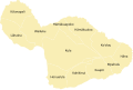
Oahu ahupuaa
-

-
 Done
Done


Article(s): Ahupuaa
Request: Can someone vectorize this? Thank you.... KAVEBEAR (talk) 01:44, 6 November 2011 (UTC)
Graphist opinion(s):
- I have the GIS data, but the shp2svg converter won't work. --Sn1per (talk) 02:33, 24 November 2011 (UTC)
- I finally got the converter to work. I'll color the map now. Do you want the whole map of just the southern part, and do you want numbers in the map (like this region is 1 and in the caption it says 1 is this region) or do you want the names of the regions in the map? --Sn1per (talk) 17:26, 24 November 2011 (UTC)
- If there is the northern part you should include itl Numbers shouldn't be there preferably. Thank you.--KAVEBEAR (talk) 18:14, 24 November 2011 (UTC)
- Do you have a complete list of where each Ahupua'a is? 'cause the converter didn't include what each region was, and the gif only has the bottom part. --Sn1per (talk) 18:23, 24 November 2011 (UTC)
- In fact, the data includes the whole state of Hawaiʻi! I think I should focus on this map, though. --Sn1per (talk) 21:32, 24 November 2011 (UTC)
- What data or converter are you talking about? I found these really low resolution ones [4] and [5]. If you can't read them just create the south. Also can you address the new request I have down at the bottom.--KAVEBEAR (talk) 00:12, 25 November 2011 (UTC)
- This data and this converter. --Sn1per (talk) 01:02, 25 November 2011 (UTC)
- I don't undertstand either of those things. Honestly don't put too much work into this. My original request was just to turn the background transparent. --KAVEBEAR (talk) 01:20, 25 November 2011 (UTC)
- Done --Sn1per (talk) 20:47, 27 November 2011 (UTC)
KF Tirana

 Done
DoneArticle(s): KF Tirana
Request: Vectorise please Vinie007 19:17, 13 November 2011 (UTC)
Graphist opinion(s):
![]() Request taken by Sn1per. Sn1per (talk) 22:11, 19 November 2011 (UTC)
Request taken by Sn1per. Sn1per (talk) 22:11, 19 November 2011 (UTC)
star correction !
-
 Flag of SR Croatia
 -
 Flag of SFR Yugoslavia
 -
 Civil ensign of SFR Yugoslavia
.svg)
.svg)
.svg)
Article(s): Socialist Federal Republic of Yugoslavia
Request: Please replace the red star on the SFRY flag with the star placed on SR Croatia flag... Drax90 (talk) 14:54, 19 November 2011 (UTC)
Graphist opinion(s):
![]() Request taken by Sn1per. -Sn1per (talk) 23:21, 19 November 2011 (UTC)
Request taken by Sn1per. -Sn1per (talk) 23:21, 19 November 2011 (UTC)
- Done, but Commons is messing up. When I upload the correct version, it renders the old version. Then, I try again, and it still doesn't work. But the older copy I uploaded works right. I rv to that copy, but then it shows up wrong again. Weird... --Sn1per (talk) 23:33, 19 November 2011 (UTC)
- Nvmd, the thumbnails are updating. --Sn1per (talk) 23:38, 19 November 2011 (UTC)
- Perhaps you need to delete all the other version and then reupload the flag, even the civil ensign?! Drax90 (talk) 13:12, 20 November 2011 (UTC)
- What do you mean? The new flag has been reuploaded over the old one. It's just that I forgot to refresh my browser. Do you mean that you want the new flag as an alt or something? --Sn1per (talk) 17:20, 20 November 2011 (UTC)
- I meant civil ensign should be changed:http://en.wikipedia.org/wiki/File:Civil Ensign of Yugoslavia (1950-1992).svg Drax90 (talk) 17:58, 20 November 2011 (UTC)
- Ok, will do when I have time. --Sn1per (talk) 01:40, 21 November 2011 (UTC)
- All Done --Sn1per (talk) 01:12, 22 November 2011 (UTC)
- Nvmd, the thumbnails are updating. --Sn1per (talk) 23:38, 19 November 2011 (UTC)

-
 Logo of CENTO
Done

-
 Done
Done -
 Done
Done


Request: Please vectorize, see [6] and [7] for additional information.--Antemister (talk) 12:30, 20 November 2011 (UTC)
Graphist opinion(s):
![]() Request taken by Sn1per. -- will do SEATO --Sn1per (talk) 19:06, 20 November 2011 (UTC)
Request taken by Sn1per. -- will do SEATO --Sn1per (talk) 19:06, 20 November 2011 (UTC)
- SEATO Done Image under pub. domain so no GLNF template needed --Sn1per (talk) 21:01, 20 November 2011 (UTC)
- For File:Flag of CENTO.svg, a similar licence should be OK:((PD-TR)), ((PD-Iran)), ((PD-UKGov)), ((PD-USGov)), ((PD-Iraq)), ((PD-Pakistan))--Antemister (talk) 21:09, 20 November 2011 (UTC)
- Almost done with CENTO. --Sn1per (talk) 17:15, 23 November 2011 (UTC)
- Done with CENTO. --Sn1per (talk) 19:11, 23 November 2011 (UTC)
Request Alternate Flag
-
 Byzantine Cross
 -
 Serbian Cross Flag
 -
 Serbian Cross Flag Alternate 1
 -
 Serbian Cross Flag Alternate 2
Done


Article(s): Only Unity Saves the Serbs
Request: Please can someone replace the cross from Serbian Cross flag with the one from Byzantine flag, and keep it in yellow color?... Drax90 (talk) 10:12, 21 November 2011 (UTC)
Graphist opinion(s):
- Watch your gallery tags. I've corrected them for you. See here for syntax. --Sn1per (talk) 00:12, 22 November 2011 (UTC)
- Done --Sn1per (talk) 01:28, 22 November 2011 (UTC)
2nd alt flag request
-
 Flag of Serbia and Montenegro
 -
 Coat of Arms
 -
 Done
Done
.svg)

.svg)
Article(s): Serbia
Request: Please create alt flag of FRY with the eagle in this CoA... Drax90 (talk) 16:19, 23 November 2011 (UTC)
Graphist opinion(s):
![]() Request taken by Sn1per. --Sn1per (talk) 18:47, 23 November 2011 (UTC)
Request taken by Sn1per. --Sn1per (talk) 18:47, 23 November 2011 (UTC)
- What fraction of the flag size do you want the COA to be? 1/3 of the flag height? --Sn1per (talk) 18:47, 23 November 2011 (UTC)
- Done --Sn1per (talk) 20:36, 23 November 2011 (UTC)
- like this one:http://en.wikipedia.org/wiki/File:Flag_of_the_Republic_of_Serbian_Krajina_1991-1995.svg Drax90 (talk) 16:08, 24 November 2011 (UTC)
- OK, fixed the ratios. --Sn1per (talk) 17:06, 24 November 2011 (UTC)
Some REALLY old images
-
 Done
Done -

-
-

-
-
File:ProblemFramesInformationDisplayFrame.png
-
Done Done
-
 Done
Done -

-

-

-

-


-
 Done
Done -
 Done by WebHamster

Article(s): Category:User-created public domain images from May 2004 - The graphics are all ancient (still useful) relics from this category.
Request: Is it possible for someone to convert these old files to vector images? I'd like to ship them out to Commons in order to kill this old category (May 2004, honestly), but I feel that it would be better to put them in a vector format first. ♠PMC♠ (talk) 21:13, 5 December 2011 (UTC)
- Thanks. Can has moar? =3 ♠PMC♠ (talk) 04:31, 9 December 2011 (UTC)
Graphist opinion(s):
- Looks like WebHamster already did one (but he's blocked), so might as well put this one up for him. --Sn1pe! (talk) 02:20, 9 December 2011 (UTC)
- by Fred the Oyster on Commons.
 Resolved
Alabama fix

Location: Alabama and related pages
Request: The NW corner of the state is incorrectly drawn in the seal, it's actually more of a point to the west. The State Archives has an example: http://www.archives.state.al.us/emblems/images/seal-bw-72dpi-400pixels.gif 76.117.247.55 (talk) 19:51, 5 December 2011 (UTC)
Oppinion:
![]() Done... Sn1pe! (talk) 20:02, 10 December 2011 (UTC)
Done... Sn1pe! (talk) 20:02, 10 December 2011 (UTC)
- 76.117.247.55 (talk) 20:04, 12 December 2011 (UTC) Resolved
Correct font on seals
-

-
 Done
Done


Article(s): Multiple
Request: If anybody here is good with fonts and text, I would really appreciate help in correcting the inscriptions of these two seals. Their sources are 1 and 2. A buddy was able to do an attempt at the font on the Senate Seal with trace-work, but if anybody knows the real font (or a very close cousin perhaps?) used, that would be brilliant. The Governor's seal, my buddy believes is some sort of Times New Roman, but when you enlarge the image, it looks similar to the font used on the Senate Seal. Fry1989 eh? 20:51, 10 October 2011 (UTC)
Graphist opinion(s):
- Done --Sn1pe! (talk) 21:38, 3 December 2011 (UTC)
- Done --The Pink Oboe (talk) 01:53, 20 October 2011 (UTC)
- You're gonna hate me, but could you do the Senate one's wording in bold? It looks too thin. Fry1989 eh? 02:58, 20 October 2011 (UTC)
- I knew you were going to say that, heheheh. Unfortunately the font I found doesn't have a bold variant. I can keep looking for another one, but it took me ages to find that one! --The Pink Oboe (talk) 08:07, 20 October 2011 (UTC)
- This one better? I'm still working on the other one. They aren't the same font, but what is causing problems identifying it is that damn bevel on the plaque in the photo. I've narrowed it down to about 3 or 4 fonts that are similar. When I get a chance I'll do some tests to see which looks best on the screen. --The Pink Oboe (talk) 14:38, 20 October 2011 (UTC)
- Yes much, thank you for humouring a perfectionist/nut ;). Take your time on the Governor's one, there's no rush. I'm just grateful the request has been taken. Fry1989 eh? 20:15, 9 November 2011 (UTC)
- Pink Oboe, if you're still having trouble figuring out the font for the Governor, I wouldn't be opposed to you using either of the two you used for the Senate. Both look very similar to the image. Fry1989 eh? 04:22, 27 November 2011 (UTC)
- Finished the first one, --Sn1pe! (talk) 21:38, 3 December 2011 (UTC)
- Yes much, thank you for humouring a perfectionist/nut ;). Take your time on the Governor's one, there's no rush. I'm just grateful the request has been taken. Fry1989 eh? 20:15, 9 November 2011 (UTC)
- This one better? I'm still working on the other one. They aren't the same font, but what is causing problems identifying it is that damn bevel on the plaque in the photo. I've narrowed it down to about 3 or 4 fonts that are similar. When I get a chance I'll do some tests to see which looks best on the screen. --The Pink Oboe (talk) 14:38, 20 October 2011 (UTC)
- I knew you were going to say that, heheheh. Unfortunately the font I found doesn't have a bold variant. I can keep looking for another one, but it took me ages to find that one! --The Pink Oboe (talk) 08:07, 20 October 2011 (UTC)
- You're gonna hate me, but could you do the Senate one's wording in bold? It looks too thin. Fry1989 eh? 02:58, 20 October 2011 (UTC)
Union Jack
Request: Create a new file adding the irish colors of the first flag on the second one in place of the dark blue. 79.27.56.102 (talk) 13:32, 30 November 2011 (UTC)
Graphist opinion(s):
Looks easy enough. --Slashme (talk) 15:07, 4 December 2011 (UTC)
![]() Done
Done
- Wonderful, thanks!--95.250.155.181 (talk) 17:28, 5 December 2011 (UTC)
New flag request

Article(s): Socialist Federal Republic of Yugoslavia
Request: Can someone please put the star from sfry flag to replace the star on PR Bosnia and Herzegovina?... Drax90 (talk) 18:08, 30 November 2011 (UTC)
Graphist opinion(s):
![]() Done --Sn1per (talk) 02:23, 2 December 2011 (UTC)
Done --Sn1per (talk) 02:23, 2 December 2011 (UTC)
Why is this image black?
The following image is black, but isn't supposed to be.
-
 This is meant to be the symbol for anarchism, but it's completely black.

Article(s): Anarchism
Request: The image is black. Somebody fix this. Ndanielm (talk) 01:22, 13 December 2011 (UTC)
Graphist opinion(s):
It's a proper SVG. The problem is probably on your browser end. Pi.1415926535 (talk) 03:59, 13 December 2011 (UTC)
Led Zeppelin Logo
-
 common letters of a standard font.
 -
 Done
Done
Article(s): Led Zeppelin
Request: Vectorize. Working on FA submission. thank you. Mlpearc powwow 02:09, 3 December 2011 (UTC)
Graphist opinion(s):
![]() Request taken by Perhelion.:
Request taken by Perhelion.: ![]() Done: when the request is done. -- Perhelion (talk) 08:03, 3 December 2011 (UTC)
Done: when the request is done. -- Perhelion (talk) 08:03, 3 December 2011 (UTC)
Photo linked to paintings

Article(s): Lady Lilith
Request: Can an image map be made on the drawing room photo, so that a click on the painting in the dr photo leads directly to the image of the painting? To be placed in the Lady Lilith article - so the link to the Lady Lilith image is not really needed. Smallbones (talk) 18:58, 13 December 2011 (UTC)
Figured it out myself, but thanks anyway. Sometimes just stating the problem helps a lot. Smallbones (talk) 02:55, 14 December 2011 (UTC)
Graphist opinion(s):
Maui moku map
Old:


New:
-
 Done
Done -
 Done
Done -
 Honuaʻula
 -
 Hāmākualoa
 -
 Hāmākuapoko
 -
 Hāna
Hāna -
 Kahikinui
 -
 Kaupō
Kaupō -
 Koʻolau
 -
 Kula
Kula -
 Kāʻanapali
 -
 Kīpahulu
 -
 Lāhaina
 -
 Wailuku


.svg)
.svg)
.svg)
.svg)
.svg)
.svg)
.svg)
.svg)
.svg)
.svg)
.svg)
.svg)
See also
Article(s): Maui, Kaanapali, Hawaii, Wailuku, Hawaii, Kula, Hawaii, Hana, Hawaii, Kipahulu, Hawaii, Kaupo, Hawaii, and others
Request: Could someone please create a map of the mokus or districts of Maui shown in the first image similiar to the second image with numbers but replacinig the dotted lines with more solid lines and taking out the Haleakalā National Park region and the names? Please properly labeled them as ancient or traditional divisions of the mokus because these districts no longer exist in the same form. --KAVEBEAR (talk) 00:12, 25 November 2011 (UTC)
- Also there is also the modern districts of Maui County shown here. But I'm not sure if it's up to date since I've seen different version that split Makawao into North and South Makawao instead.--KAVEBEAR (talk) 00:12, 25 November 2011 (UTC)
Graphist opinion(s):
 Request taken by Sn1per. --Sn1pe! (talk) 21:05, 10 December 2011 (UTC)
- Done --Sn1pe! (talk) 03:29, 11 December 2011 (UTC)
- What did you ask?--KAVEBEAR (talk) 17:55, 11 December 2011 (UTC)
- On top of that could you actually number them rather than leave the names, so it resembles the Hawaii island map and create other maps highlighting each district with a map of the island chain in the corner like the third image.--KAVEBEAR (talk) 18:04, 11 December 2011 (UTC)
- Numbered map done. Will do district maps later. --Sn1pe! (talk) 20:20, 11 December 2011 (UTC)
- Done (finally) --Sn1pe! (talk) 03:03, 18 December 2011 (UTC)
- Thanks. Could you create one for the modern districts of Maui, here. --KAVEBEAR (talk) 05:40, 18 December 2011 (UTC)
- What did you ask?--KAVEBEAR (talk) 17:55, 11 December 2011 (UTC)
- All done. --Sn1pe! (talk) 02:57, 19 December 2011 (UTC)
- Could you use the Maui County map for the modern districts instead? File:Maui County Hawaii Incorporated and Unincorporated areas Pukalani Highlighted.svg? Hope you're not getting irritated.--KAVEBEAR (talk) 03:21, 19 December 2011 (UTC)
- You mean like this? --Sn1pe! (talk) 18:24, 19 December 2011 (UTC)
- All Done Sn1pe! (talk) 19:11, 19 December 2011 (UTC)
Signature of Indonesian singer
-
 Signature of Indonesian singer Chrisye
 -
 SVG
SVG


Article(s): Chrisye
Request: Vectorize please. Crisco 1492 (talk) 08:58, 29 November 2011 (UTC)
Graphist opinion(s):
-
- Done: Here you go. Regards, Fallschirmjäger ✉ 01:02, 20 December 2011 (UTC)
Cross of Neith
-
 vector version

Article(s): [[:]] Request: Redraw as SVG Graphist opinion(s):
![]() Done. Derfel73 (talk) 20:25, 18 December 2011 (UTC)
Done. Derfel73 (talk) 20:25, 18 December 2011 (UTC)
State reptiles over the years


Article(s): State reptiles
Request: Convert to area chart. Make new file name for improved image. TCO (talk) 20:15, 3 December 2011 (UTC)
Graphist opinion(s): Why is an area chart preferred? What is the source of the data? Jon C (talk) 08:49, 19 December 2011 (UTC)
- I have an Excel spreadsheet of the data (see article, it is just the years adopted from that list). Can give it to you textually (see below). I could not get the Excel program to make a proper area chart for some reason. When I selected "area chart", it would treat the years as independent values (not part of a time domain) and my X axis would get messed up. BTW, it also smoothed the line (which I did not want, prefer the truth showing steps).
- The reason for preferring an area chart is that (a) we are showing progression to all 50, so area shows amount better. (b) it is more visually striking.
- Data
Year states 1969 1 1972 2 1979 3 1983 4 1986 6 1987 7 1988 8 1989 10 1990 11 1993 13 1994 15 1995 18 2003 19 2005 21 2006 23 2007 24 2008 26
Please keep "50" as the maximum on the graph. (intuitive maximum!)
P.s. If you want to make it 1960 to 2010, that is fine. I like "wide" aspect images since they are easier to text wrap around...TCO (talk) 16:49, 19 December 2011 (UTC)
- Hi TCO - does this satisfy the requirements? (If it does, please substitute in article, and mark this entry as resolved. Thanks!) (If not, let me know and I'll make necessary amendments) On that note - this is a completely hand-drawn graph, so if you want to incorporate additional info (e.g., landmarks in state-reptile adoption or some such, we can arrange to have them marked up on the chart as well.) Jon C (talk) 06:50, 20 December 2011 (UTC)
Now we're talking! And muchos gracias for the hand draw. This is just the sort of thing I was looking for. Could you please make the following tweaks just for prettiness?
- Extend the "amount" of state reptiles all the way to the far right (since they endure).
- Make the X and Y axis title and number font bigger.
TCO (talk) 15:06, 20 December 2011 (UTC)
P.s. You don't know anything about drawing chemical process diagrams or gymnastics tricks by any chance? (Always scouting for talentz. ;-)) -TCO
- I've updated the graph with the requested amendments. You may need to refresh the browser to see the changes.
- I happen to be a chemist... At Wiki Illustration, however, I'm looking to do works that stretch my (artistic) boundaries. What's with the "gymnastics tricks"? Jon C (talk) 16:45, 20 December 2011 (UTC)
House of Kalākaua


Article(s): House of Kalākaua
Request: Remove the crown and make it more proportionate. KAVEBEAR (talk) 03:17, 20 December 2011 (UTC)
Graphist opinion(s):
![]() Done: new file uploaded File:Royal Monogram of Kalakaua I of Hawaii without crown.svg to commons. i also removed unused definitions from the original reducing the size to about 400 kb from 4.3 mb.Gauravjuvekar (talk) 06:01, 21 December 2011 (UTC)
Done: new file uploaded File:Royal Monogram of Kalakaua I of Hawaii without crown.svg to commons. i also removed unused definitions from the original reducing the size to about 400 kb from 4.3 mb.Gauravjuvekar (talk) 06:01, 21 December 2011 (UTC)
LAS Map
-
File:LAS-Map.GIF
Article(s): Arab Union
Request: Update it by colouring South Sudan in grey, as its no longer part of Sudan. — Preceding unsigned comment added by 89.18.71.44 (talk • contribs) 07:19, 20 December 2011 (UTC)
Graphist opinion(s):
![]() Done - Fallschirmjäger ✉ 12:21, 20 December 2011 (UTC)
Done - Fallschirmjäger ✉ 12:21, 20 December 2011 (UTC)
Kuhina Nui Flag

Article(s): Kuhina Nui
Request: Please create a Kuhina Nui flag. Thanks. I am really persistent, just saying, and I can wait for months, if no one is going to do any of my requests. KAVEBEAR (talk) 10:15, 17 October 2011 (UTC)
Graphist opinion(s): ![]() Request taken by jkwchui. Jon C (talk) 17:13, 20 December 2011 (UTC)
Request taken by jkwchui. Jon C (talk) 17:13, 20 December 2011 (UTC)
![]() Done Jon C (talk) 17:31, 20 December 2011 (UTC)
Done Jon C (talk) 17:31, 20 December 2011 (UTC)
- Could you make it white instead of transparent? It isn't showing up on the table on Kuhina Nui. Like File:Flag of Reus (Tarragona).svg.--KAVEBEAR (talk) 18:20, 20 December 2011 (UTC)
- Someone added the white background already. I'll keep this as resolved then. Jon C (talk) 12:49, 21 December 2011 (UTC)
The Common Man as drawn by Laxman


Article(s): R. K. Laxman, The Common Man
Request: Please Create an SVG image from this image.... --Alok Prasad (talk) 13:15, 29 November 2011 (UTC)
Graphist opinion(s): ![]() Done I did the best I could with the hand-drawn lines. Jon C (talk) 16:35, 20 December 2011 (UTC)
Done I did the best I could with the hand-drawn lines. Jon C (talk) 16:35, 20 December 2011 (UTC)
- It was brought to my attention that this SVG file I generated is "unfree" and will be deleted. If you (OP) have interest in defending its "freeness", please head to this page to deal with it.
- Maybe someone savvy with these usage rules should prune the requests periodically to make sure we're not wasting our time on non-legit things. Jon C (talk) 12:46, 21 December 2011 (UTC)
Article(s): Brazil
Map coloration

Article(s): ?
Request: Colour Sudan, South Sudan, Algeria, Yemen and Madagascar in red to show that they have applied to join the Commonwalth of Nations. — Preceding unsigned comment added by 87.33.42.67 (talk • contribs) 14:28, 21 December 2011 (UTC)
Graphist opinion(s):
![]() Done — Preceding unsigned comment added by NikNaks93 (talk • contribs) 15:27, 21 December 2011 (UTC)
Done — Preceding unsigned comment added by NikNaks93 (talk • contribs) 15:27, 21 December 2011 (UTC)
Flag of Wales


Article(s): ?
Request: Create a new file named File:Black Dragon Flag.svg by changing the background to black. (anonymous requester)
Graphist opinion(s):
![]() Done — Preceding unsigned comment added by NikNaks93 (talk • contribs) 15:27, 21 December 2011 (UTC)
Done — Preceding unsigned comment added by NikNaks93 (talk • contribs) 15:27, 21 December 2011 (UTC)
Ten signatures of Indonesians
-
 Done
Done -
 Done
Done -
 Done
Done -
 Done
Done -
![Done]](https://upload.wikimedia.org/wikipedia/commons/thumb/e/e3/Signature_of_Paku_Alam_VIII.png/120px-Signature_of_Paku_Alam_VIII.png) Done]
Done] -
 Done
Done -
 Done
Done -
 Done
Done -
 Done
Done -
 Done
Done


.png)
-
 Done
Done -
 Done
Done -
 Done
Done -
 Done
Done -
 Done
Done -
 Done
Done -
Done Done
-
 Done
Done -
 Done
Done -
 Done
Done


.svg)
Article(s): Linked above
Request: Please vectorize. Crisco 1492 (talk) 15:18, 18 October 2011 (UTC)
- One down. Thanks Sn1per. Crisco 1492 (talk) 14:53, 23 October 2011 (UTC)
- Three down. Thanks Alokprasad84. Crisco 1492 (talk) 23:11, 23 October 2011 (UTC)
- Another two. Thanks Sn1per. Crisco 1492 (talk) 09:51, 4 November 2011 (UTC)
- Four left. Crisco 1492 (talk) 23:53, 10 November 2011 (UTC)
- Awesome, thanks Sn1per. 3 left. Crisco 1492 (talk) 07:19, 11 November 2011 (UTC)
Graphist opinion(s):
- Working on first one, this may take a while. --Sn1per (talk) 22:30, 22 November 2011 (UTC)
- First one done. --Sn1per (talk) 02:24, 25 November 2011 (UTC)
- Thanks a lot Sniper. Only Pakualam left. Crisco 1492 (talk) 14:23, 25 November 2011 (UTC)
-
- Request taken by jkwchui. - the last one. Jon C (talk) 17:09, 20 December 2011 (UTC)
- Done Case closed! Jon C (talk) 09:10, 22 December 2011 (UTC)
Aboriginal Australian Flag
-

-
 Australian Flag with Aboriginal Flag


Article(s) ?
Request: Create a new file named File:Australian Flag with Aboriginal Flag.svg by replacing the Union flag with the Aboriginal flag. — Preceding unsigned comment added by 109.106.96.194 (talk • contribs) 21:40, 21 December 2011 (UTC)
Graphist opinion(s):
![]() Request taken by Fallschirmjäger. 14:28, 22 December 2011 (UTC)
Request taken by Fallschirmjäger. 14:28, 22 December 2011 (UTC)
St David's Flag


Article(s): ?
Request: Create a new file named File:Flag of Saint David 2.svg by changing the cross to black and the background to yellow.
Graphist opinion(s):
![]() Done - Fallschirmjäger ✉ 14:47, 22 December 2011 (UTC)
Done - Fallschirmjäger ✉ 14:47, 22 December 2011 (UTC)
New puzzle piece icon
Article(s): None
Request: Extract the puzzle piece icon from the logo and upload to Commons, i.e. remove the background graphics and crop. Should be placed in the Commons category Wikipedia puzzle piece icons. Please upload under the same license (CC0). Thanks! Kaldari (talk) 21:27, 22 December 2011 (UTC)
Graphist opinion(s):
![]() Done (though not by me): see File:Shiny_puzzle_piece.svg. (I rather prefer File:Wiki_puzzle.svg, but what do I know?) Tip of the hat to WebHamster for alerting people. -- Hoary (talk) 00:21, 23 December 2011 (UTC)
Done (though not by me): see File:Shiny_puzzle_piece.svg. (I rather prefer File:Wiki_puzzle.svg, but what do I know?) Tip of the hat to WebHamster for alerting people. -- Hoary (talk) 00:21, 23 December 2011 (UTC)
SSME schematic
-
 A diagram showing the flow of fuel and oxidiser through a Space Shuttle Main Engine (RS-25).
 -
 Work-in-progress


Article(s): Space Shuttle Main Engine
Request: Hi folks, I'd be very grateful if someone would please vectorise the diagram, especially if they'd be kind enough to highlight the flow of the fuel and the oxidiser as red and blue pipes, such as in File:Orbiter main propulsion system.svg. Having a decent, clear diagram would make this complex piece of engineering considerably easier to understand! Many thanks in advance, Colds7ream (talk) 13:35, 9 December 2011 (UTC)
- The diagram on page 25 of this document might also prove helpful. Colds7ream (talk) 19:18, 12 December 2011 (UTC)
Graphist opinion(s): I can do this. However, I can't quite see the similarity between p25/26 of the supporting document, and the image to be vectorized. Jon C (talk) 03:35, 19 December 2011 (UTC)
After spending some time on this image, I should let you know that it'll likely require some of your attention in its correction. I would like to provide some shading to indicate connected volumes (from, say, overlapping valves), but am currently having a hard time distinguishing which volumes are connected (and the roles of some of the lines). Jon C (talk) 05:23, 19 December 2011 (UTC)
- Hello! Thanks very much for taking a look! :-) I'd of course be happy to provide any help I can, and with regards to the supporting document, should have made it clear that its the 25th page you want, which is actually printed on the document as page 19. Its a colour copy of the diagram with shading indicating fuel flow, if that helps you find it. SalopianJames - previously Colds7ream (talk) 10:54, 19 December 2011 (UTC)
- Oh wow. That makes all the difference in the world. I've thoroughly misinterpreted the B&W figure. I'm still not entirely sure what's going on (it's a pretty complex piece of engineering), but I'll spend some time on the bracketing pages, and work something out. What should I do with the differences between the two figures? (p19 has pipes and valves that are missing in B&W schematic.) Jon C (talk) 15:45, 19 December 2011 (UTC)
- Thought it might help! :-D Yeah, it is indeed very complicated - you should see my attempts at explaining it in words! :-S I'd guess that, in case of any differences, you should take the p19 version as correct, as it's from a much more recent document, thus probably more accurately reflects the later models and would have any errors corrected. SalopianJames - previously Colds7ream (talk) 17:42, 19 December 2011 (UTC)
- Oh wow. That makes all the difference in the world. I've thoroughly misinterpreted the B&W figure. I'm still not entirely sure what's going on (it's a pretty complex piece of engineering), but I'll spend some time on the bracketing pages, and work something out. What should I do with the differences between the two figures? (p19 has pipes and valves that are missing in B&W schematic.) Jon C (talk) 15:45, 19 December 2011 (UTC)
- Hello! Thanks very much for taking a look! :-) I'd of course be happy to provide any help I can, and with regards to the supporting document, should have made it clear that its the 25th page you want, which is actually printed on the document as page 19. Its a colour copy of the diagram with shading indicating fuel flow, if that helps you find it. SalopianJames - previously Colds7ream (talk) 10:54, 19 December 2011 (UTC)
Hello! I've done the mindless parts of the vectorization, and included the work-in-progress here. This is entirely based on the B&W version. The trouble with trying to integrate the colored one is that they are conflicting - pipes that lead outside in the B&W, for example, leads to another part in the colored version. The colored version does not have labeling, and in an encyclopaedic work would be less useful than the dated B&W version.
I'm also considering changing the labeling from verbal to numbers, for easier internationalization. (But then, it's a SVG where tools for translation are available, so this may just come down to spacing in the final image.)
Currently I'm hung up on trying to figure out what the colors ought to be, and which are distinct parts for rendering, given that there are flow of H2 and O2 in the color figure, but pipes are everywhere. Ahh, I'm no rocket scientist ;) Jon C (talk) 14:37, 21 December 2011 (UTC)
- Now that's looking gorgeous! Nicely done! :-) I see what you mean with regards to the differences between the diagrams, in fact the p19 version almost looks like a sealed unit, which is odd... Looking at the dates, it seems I was mistaken, in that both were in fact published in the same year (1998), so I don't really suppose one has priority over the other, although to my eye the B&W one makes more sense from a plumbing point of view. Then again, I'm a biologist, not an engineer, so take that with a pinch of salt! :-) As for colours, I was hoping you could make the LH2 red and the LOX blue, to match with the MPS diagram I mentioned above? Many thanks, SalopianJames - previously Colds7ream (talk) 15:33, 21 December 2011 (UTC)
- Incidentally, you might find these flow charts helpful in understanding the propellant's routes through the engine: File:RS-25 Oxidiser Flow.png and File:RS-25 Fuel Flow.png. SalopianJames - previously Colds7ream (talk) 14:22, 22 December 2011 (UTC)
- Thanks for the links - they were helpful in understanding what was going on. I've updated the figure; the overlapping lines are cleaned up, and flow of materials indicated in the appropriate colors. I'm almost ready to call this the final version - unless you noticed something out? And on the note of the flow diagrams, it may be possible to integrate the pressures graphically in the same image, but I haven't put much thoughts to it yet. Jon C (talk) 10:36, 23 December 2011 (UTC)
- That looks perfect! I'll take a longer look at it later, but on first pass it appears to be just what the article needed - thanks you so very much! :-D SalopianJames - previously Colds7ream (talk) 18:12, 23 December 2011 (UTC)
- One thing I did notice is that the LPFTP seems to have a grey triangle in it which should be red? SalopianJames - previously Colds7ream (talk) 18:16, 23 December 2011 (UTC)
- There is supposed to be symmetric gray quasi-triangles in the LPFTP according to the color image. (I don't know what it is.) I've added that in, as well as a legend piece that indicates the combustion zones. I think we're done, so I've marked this entry as resolved -- if not, remove the tag and we'll keep working on it. Jon C (talk) 04:47, 24 December 2011 (UTC)
Graph of an atom
-
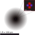 Graph of a helium atom
 -
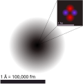 Done
Done


Article(s): Atom + 6
Request: Remove red border on inset and pink dot in the middle of the electron cloud (big black circle). Upload separately as File:Helium atom QM edit 1.svg. The image is currently nominated at FP. Crisco 1492 (talk) 11:38, 11 December 2011 (UTC)
Graphist opinion(s):
- Done by WebHamster who is currently blocked. Might as well put it up for him. --Sn1pe! (talk) 01:31, 18 December 2011 (UTC)
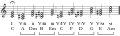
Article(s):
Request: Change the harps to make them more detailed. — Preceding unsigned comment added by 89.18.71.44 (talk • contribs) 17:18, 21 December 2011 (UTC)
Graphist opinion(s): ![]() Done
Done
Celtic Nations
-
 Map of Celtic Nations
 -


.svg)
Article(s): Celtic-related articles (full list at image page)
Request: Create a new file by colouring Scotland, Ireland, Wales, Brittany, Cornwall and the Isle of Man in green, England in red and France in blue. Plus remove the Republic of Ireland-Northern Ireland border and change the colour of the sea to white.
Graphist opinion(s): ![]() Done
Done
Commonwealth Games Federation Logo
Article(s):
Request: Place the logo on a white field
Graphist opinion(s): ![]() Done Jon C (talk) 05:18, 26 December 2011 (UTC)
Done Jon C (talk) 05:18, 26 December 2011 (UTC)
Drug danger and dependence


Article(s): Psilocybin, LSD, Cannabis, MDMA, and others
Request: Please convert to SVG if possible. This image is highly viewed, as it is present in several high-traffic articles. Sasata (talk) 19:05, 21 December 2011 (UTC)
Graphist opinion(s): ![]() Request taken by jkwchui. Jon C (talk) 05:56, 24 December 2011 (UTC)
Request taken by jkwchui. Jon C (talk) 05:56, 24 December 2011 (UTC)
- Marked as resolved, per discussion btw Sasata on my talk page. Jon C (talk) 05:15, 26 December 2011 (UTC)
Flag of Mide
-
 Description of image

Request: Redraw as SVG
Graphist opinion(s): Fred the Oyster made this already. Jon C (talk) 15:54, 26 December 2011 (UTC)
Genealogy of the kings of Israel and Judah
-
 A chart of the historical Kings of Judah and Israel.
 -
 Vector


Article(s): Book of Kings, Kingdom of Israel (Samaria), Kings of Judah.
Request: Please upload a vector version maintaining the same color scheme and composition. Thanks, Magister Scientatalk (Editor Review) 17:27, 19 December 2011 (UTC)
Graphist opinion(s): ![]() Done Jon C (talk) 05:58, 26 December 2011 (UTC)
Done Jon C (talk) 05:58, 26 December 2011 (UTC)
- Thank you so much! Magister Scientatalk 15:33, 26 December 2011 (UTC)
- My pleasure. I've marked this as resolved. Jon C (talk) 02:58, 27 December 2011 (UTC)
A few more old images
-
Low-quality as well as being a raster imageLow-quality as well as being a raster image
-
 Music, probably nicer as a .svg
 -
 Same as above
 -
 Vector of plug
 -

-

Article(s): Category:User-created public domain images from June 2004
Request: I'm back again looking for kind graphic artists willing to turn these images into .svg files so I can get them moved to Commons and nuke the category. Please and so much thank you =) ♠PMC♠ (talk) 22:18, 19 December 2011 (UTC)
Graphist opinion(s): I can do the plug one. Jon C (talk) 16:22, 20 December 2011 (UTC)
Plug: ![]() Done Jon C (talk) 17:04, 20 December 2011 (UTC)
Done Jon C (talk) 17:04, 20 December 2011 (UTC)
![]() Done NikNaks talk - gallery 21:44, 27 December 2011 (UTC)
Done NikNaks talk - gallery 21:44, 27 December 2011 (UTC)
Cornwall Ensign Flag
.svg)

Article(s): ?
Request: Create a new file named File:Cornish Red Ensign.svg by replacing the Union Flag with the Flag of Cornwall. — Preceding unsigned comment added by 89.18.71.44 (talk • contribs) 11:46, 28 December 2011 (UTC)
Graphist opinion(s): ![]() Done NikNaks talk - gallery 14:36, 28 December 2011 (UTC)
Done NikNaks talk - gallery 14:36, 28 December 2011 (UTC)
modify organofluorine montage

Article(s): Fluorine
Request: Make new graphic (new file name). Cut current molecules E, H and I and then reletter remaining molecules.TCO (talk) 04:45, 29 December 2011 (UTC)
Graphist opinion(s):
![]() Request taken by Pi.1415926535. Hell, why not. I already did the first 2... Pi.1415926535 (talk) 04:57, 29 December 2011 (UTC)
Request taken by Pi.1415926535. Hell, why not. I already did the first 2... Pi.1415926535 (talk) 04:57, 29 December 2011 (UTC)
- Thanks. May be one more coming later (with the cut molecules). But I will hold off until I have rewritten the pharma section.TCO (talk) 05:09, 29 December 2011 (UTC)
- Done: new file at File:Fluorocarbon-montage rotated-3.png. Pi.1415926535 (talk) 05:17, 29 December 2011 (UTC)
Duke of Cornwall Ensign
-

-
 Duke of Cornwall flag
 -
 Done
Done


.svg)
Article(s): ?
Request: Create a new file by replacing the Union Flag with the Flag of the Duke of Cornwall. — Preceding unsigned comment added by 89.18.71.45 (talk • contribs) 09:51, 29 December 2011 (UTC)
Graphist opinion(s): ![]() Done NikNaks talk - gallery 14:52, 29 December 2011 (UTC)
Done NikNaks talk - gallery 14:52, 29 December 2011 (UTC)
- ^ Waking Dreams, p. 26 (figure 5).