Graphical representation of the distribution of numerical data
A histogram is a visual representation of the distribution of quantitative data. The term was first introduced by Karl Pearson.[1] To construct a histogram, the first step is to "bin" (or "bucket") the range of values— divide the entire range of values into a series of intervals—and then count how many values fall into each interval. The bins are usually specified as consecutive, non-overlapping intervals of a variable. The bins (intervals) are adjacent and are typically (but not required to be) of equal size.[2]
Histograms give a rough sense of the density of the underlying distribution of the data, and often for density estimation: estimating the probability density function of the underlying variable. The total area of a histogram used for probability density is always normalized to 1. If the length of the intervals on the x-axis are all 1, then a histogram is identical to a relative frequency plot.
Histograms are sometimes confused with bar charts. In a histogram, each bin is for a different range of values, so altogether the histogram illustrates the distribution of values. But in a bar chart, each bar is for a different category of observations (e.g., each bar might be for a different population), so altogether the bar chart can be used to compare different categories. Some authors recommend that bar charts always have gaps between the bars to clarify that they are not histograms.[3][4]
Examples
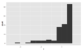
This is the data for the histogram to the right, using 500 items:
Bin/Interval
Count/Frequency
−3.5 to −2.51
9
−2.5 to −1.51
32
−1.5 to −0.51
109
−0.5 to 0.49
180
0.5 to 1.49
132
1.5 to 2.49
34
2.5 to 3.49
4
The words used to describe the patterns in a histogram are: "symmetric", "skewed left" or "right", "unimodal", "bimodal" or "multimodal".
It is a good idea to plot the data using several different bin widths to learn more about it. Here is an example on tips given in a restaurant.
Tips using a $1 bin width, skewed right, unimodal
Tips using a 10c bin width, still skewed right, multimodal with modes at $ and 50c amounts, indicates rounding, also some outliers
The U.S. Census Bureau found that there were 124 million people who work outside of their homes.[5] Using their data on the time occupied by travel to work, the table below shows the absolute number of people who responded with travel times "at least 30 but less than 35 minutes" is higher than the numbers for the categories above and below it. This is likely due to people rounding their reported journey time.[citation needed] The problem of reporting values as somewhat arbitrarily rounded numbers is a common phenomenon when collecting data from people.[citation needed]
Histogram of travel time (to work), US 2000 census. Area under the curve equals the total number of cases. This diagram uses Q/width from the table.
Data by absolute numbers
Interval
Width
Quantity
Quantity/width
0
5
4180
836
5
5
13687
2737
10
5
18618
3723
15
5
19634
3926
20
5
17981
3596
25
5
7190
1438
30
5
16369
3273
35
5
3212
642
40
5
4122
824
45
15
9200
613
60
30
6461
215
90
60
3435
57
This histogram shows the number of cases per unit interval as the height of each block, so that the area of each block is equal to the number of people in the survey who fall into its category. The area under the curve represents the total number of cases (124 million). This type of histogram shows absolute numbers, with Q in thousands.
Histogram of travel time (to work), US 2000 census. Area under the curve equals 1. This diagram uses Q/total/width (crowding) from the table. The height of a block represents crowding which is defined as - percentage per horizontal unit.
Data by proportion
Interval
Width
Quantity (Q)
Q/total/width
0
5
4180
0.0067
5
5
13687
0.0221
10
5
18618
0.0300
15
5
19634
0.0316
20
5
17981
0.0290
25
5
7190
0.0116
30
5
16369
0.0264
35
5
3212
0.0052
40
5
4122
0.0066
45
15
9200
0.0049
60
30
6461
0.0017
90
60
3435
0.0005
This histogram differs from the first only in the vertical scale. The area of each block is the fraction of the total that each category represents, and the total area of all the bars is equal to 1 (the fraction meaning "all"). The curve displayed is a simple density estimate. This version shows proportions, and is also known as a unit area histogram.
In other words, a histogram represents a frequency distribution by means of rectangles whose widths represent class intervals and whose areas are proportional to the corresponding frequencies: the height of each is the average frequency density for the interval. The intervals are placed together in order to show that the data represented by the histogram, while exclusive, is also contiguous. (E.g., in a histogram it is possible to have two connecting intervals of 10.5–20.5 and 20.5–33.5, but not two connecting intervals of 10.5–20.5 and 22.5–32.5. Empty intervals are represented as empty and not skipped.)[6]
Mathematical definitions
An ordinary and a cumulative histogram of the same data. The data shown is a random sample of 10,000 points from a normal distribution with a mean of 0 and a standard deviation of 1.
The data used to construct a histogram are generated via a function mi that counts the number of observations that fall into each of the disjoint categories (known as bins). Thus, if we let n be the total number of observations and k be the total number of bins, the histogram data mi meet the following conditions:
A histogram can be thought of as a simplistic kernel density estimation, which uses a kernel to smooth frequencies over the bins. This yields a smoother probability density function, which will in general more accurately reflect distribution of the underlying variable. The density estimate could be plotted as an alternative to the histogram, and is usually drawn as a curve rather than a set of boxes. Histograms are nevertheless preferred in applications, when their statistical properties need to be modeled. The correlated variation of a kernel density estimate is very difficult to describe mathematically, while it is simple for a histogram where each bin varies independently.
An alternative to kernel density estimation is the average shifted histogram,[7]
which is fast to compute and gives a smooth curve estimate of the density without using kernels.
Cumulative histogram
A cumulative histogram is a mapping that counts the cumulative number of observations in all of the bins up to the specified bin. That is, the cumulative histogram Mi of a histogram mj is defined as:
Number of bins and width
There is no "best" number of bins, and different bin sizes can reveal different features of the data. Grouping data is at least as old as Graunt's work in the 17th century, but no systematic guidelines were given[8] until Sturges's work in 1926.[9]
Using wider bins where the density of the underlying data points is low reduces noise due to sampling randomness; using narrower bins where the density is high (so the signal drowns the noise) gives greater precision to the density estimation. Thus varying the bin-width within a histogram can be beneficial. Nonetheless, equal-width bins are widely used.
Some theoreticians have attempted to determine an optimal number of bins, but these methods generally make strong assumptions about the shape of the distribution. Depending on the actual data distribution and the goals of the analysis, different bin widths may be appropriate, so experimentation is usually needed to determine an appropriate width. There are, however, various useful guidelines and rules of thumb.[10]
The number of bins k can be assigned directly or can be calculated from a suggested bin width h as:
Histogram data represented with different bin widths
which takes the square root of the number of data points in the sample and rounds to the next integer. This rule is suggested by a number of elementary statistics textbooks [11] and widely implemented in many software packages.[12]
Sturges's formula implicitly bases bin sizes on the range of the data, and can perform poorly if n < 30, because the number of bins will be small—less than seven—and unlikely to show trends in the data well. On the other extreme, Sturges's formula may overestimate bin width for very large datasets, resulting in oversmoothed histograms.[13] It may also perform poorly if the data are not normally distributed.
When compared to Scott's rule and the Terrell-Scott rule, two other widely accepted formulas for histogram bins, the output of Sturges's formula is closest when n ≈ 100.[13]
Rice rule
The Rice rule[14] is presented as a simple alternative to Sturges's rule.
Doane's formula
Doane's formula[15] is a modification of Sturges's formula which attempts to improve its performance with non-normal data.
where is the estimated 3rd-moment-skewness of the distribution and
Scott's normal reference rule
Bin width is given by
where is the sample standard deviation. Scott's normal reference rule[16] is optimal for random samples of normally distributed data, in the sense that it minimizes the integrated mean squared error of the density estimate.[8] This is the default rule used in Microsoft Excel.[17]
Terrell–Scott rule
The Terrell–Scott rule[13][18] is not a normal reference rule. It gives the minimum number of bins required for an asymptotically optimal histogram, where optimality is measured by the integrated mean squared error. The bound is derived by finding the 'smoothest' possible density, which turns out to be . Any other density will require more bins, hence the above estimate is also referred to as the 'oversmoothed' rule. The similarity of the formulas and the fact that Terrell and Scott were at Rice University when the proposed it suggests that this is also the origin of the Rice rule.
which is based on the interquartile range, denoted by IQR. It replaces 3.5σ of Scott's rule with 2 IQR, which is less sensitive than the standard deviation to outliers in data.
This approach of minimizing integrated mean squared error from Scott's rule can be generalized beyond normal distributions, by using leave-one out cross validation:[20][21]
Here, is the number of datapoints in the kth bin, and choosing the value of h that minimizes J will minimize integrated mean squared error.
Shimazaki and Shinomoto's choice
The choice is based on minimization of an estimated L2risk function[22]
where and are mean and biased variance of a histogram with bin-width , and .
Variable bin widths
Rather than choosing evenly spaced bins, for some applications it is preferable to vary the bin width. This avoids bins with low counts. A common case is to choose equiprobable bins, where the number of samples in each bin is expected to be approximately equal. The bins may be chosen according to some known distribution or may be chosen based on the data so that each bin has samples. When plotting the histogram, the frequency density is used for the dependent axis. While all bins have approximately equal area, the heights of the histogram approximate the density distribution.
For equiprobable bins, the following rule for the number of bins is suggested:[23]
This choice of bins is motivated by maximizing the power of a Pearson chi-squared test testing whether the bins do contain equal numbers of samples. More specifically, for a given confidence interval it is recommended to choose between 1/2 and 1 times the following equation:[24]
Where is the probit function. Following this rule for would give between and ; the coefficient of 2 is chosen as an easy-to-remember value from this broad optimum.
Remark
A good reason why the number of bins should be proportional to is the following: suppose that the data are obtained as independent realizations of a bounded probability distribution with smooth density. Then the histogram remains equally "rugged" as tends to infinity. If is the "width" of the distribution (e. g., the standard deviation or the inter-quartile range), then the number of units in a bin (the frequency) is of order and the relative standard error is of order . Compared to the next bin, the relative change of the frequency is of order provided that the derivative of the density is non-zero. These two are of the same order if is of order , so that is of order . This simple cubic root choice can also be applied to bins with non-constant widths.[citation needed]
In hydrology the histogram and estimated density function of rainfall and river discharge data, analysed with a probability distribution, are used to gain insight in their behaviour and frequency of occurrence.[26] An example is shown in the blue figure.
In many Digital image processing programs there is an histogram tool, which show you the distribution of the contrast / brightness of the pixels. histogram of contrast
See also
Wikimedia Commons has media related to Histograms.
^Dean, S., & Illowsky, B. (2009, February 19). Descriptive Statistics: Histogram. Retrieved from the Connexions Web site: http://cnx.org/content/m16298/1.11/
^Online Statistics Education: A Multimedia Course of Study (http://onlinestatbook.com/). Project Leader: David M. Lane, Rice University (chapter 2 "Graphing Distributions", section "Histograms")
^Doane DP (1976) Aesthetic frequency classification. American Statistician, 30: 181–183
^Scott, David W. (1979). "On optimal and data-based histograms". Biometrika. 66 (3): 605–610. doi:10.1093/biomet/66.3.605.
^Terrell, G.R. and Scott, D.W., 1985. Oversmoothed nonparametric density estimates. Journal of the American Statistical Association, 80(389), pp.209-214.
^Jack Prins; Don McCormack; Di Michelson; Karen Horrell. "Chi-square goodness-of-fit test". NIST/SEMATECH e-Handbook of Statistical Methods. NIST/SEMATECH. p. 7.2.1.1. Retrieved 29 March 2019.
^Moore, David (1986). "3". In D'Agostino, Ralph; Stephens, Michael (eds.). Goodness-of-Fit Techniques. New York, NY, US: Marcel Dekker Inc. p. 70. ISBN0-8247-7487-6.

 Symmetric, unimodal
 Bimodal
 Multimodal
 Symmetric


 Tips using a $1 bin width, skewed right, unimodal
 Tips using a 10c bin width, still skewed right, multimodal with modes at $ and 50c amounts, indicates rounding, also some outliers


.jpg)


![{\displaystyle k=\lceil 2{\sqrt[{3}]{n))\rceil }](https://wikimedia.org/api/rest_v1/media/math/render/svg/ce3fb056e5c916120cceb25689d0389b68a565ba)


![{\displaystyle h={\frac {3.49{\hat {\sigma ))}{\sqrt[{3}]{n))},}](https://wikimedia.org/api/rest_v1/media/math/render/svg/a7c27e8297b12a864e4820cb56e64daf436b790f)

![{\displaystyle k={\sqrt[{3}]{2n))}](https://wikimedia.org/api/rest_v1/media/math/render/svg/8ef8c72f40efc0511dc9f492de635495b26c1143)

![{\displaystyle h=2{\frac {\operatorname {IQR} (x)}{\sqrt[{3}]{n))},}](https://wikimedia.org/api/rest_v1/media/math/render/svg/66ab98a5a6eac6044fa3ba3cf5caabb5e6d07288)


![{\displaystyle {\sqrt[{3}]{n))}](https://wikimedia.org/api/rest_v1/media/math/render/svg/b780c7060d1bc0ab596390e950dc537cee82af1a)


![{\displaystyle s/{\sqrt[{3}]{n))}](https://wikimedia.org/api/rest_v1/media/math/render/svg/adb970135fc8968694cb4c3494e5b847667acb8b)


