-
$1 1862
Salmon P. Chase -

$2 1862
Alexander Hamilton -

$5 1862
Freedom, Alexander Hamilton
| Featured picture tools |
|---|
Please cut and paste new entries to the bottom of this page, creating a new monthly archive (by closing date) when necessary.
Mount Merapi
Voting period is over. Please don't add any new votes. Voting period ends on 1 Jul 2014 at 04:15:33 (UTC)

- Reason
- High resolution, decent quality, useful image (lead in the article)
- Articles in which this image appears
- Mount Merapi
- FP category for this image
- Wikipedia:Featured pictures/Places/Landscapes
- Creator
- Chris Woodrich
- Support as nominator – — Crisco 1492 (talk) 04:15, 21 June 2014 (UTC)
- Support . An exotic landscape that shows an interesting feature. and more landscape nominations would be nice... Hafspajen (talk) 13:46, 21 June 2014 (UTC)
- Weak support - definitely valuable and quite a pretty scene, though I can't help but feel it's not quite as sharp and detailed as it could be. A couple minor distractions in the foreground include a metal stake and some kind of utility line. However, it's high-quality illustration of the volcano itself, and given the smoke it may even have some value as an illustration of volcanic eruptions in general. – Juliancolton | Talk 17:30, 21 June 2014 (UTC)
- Well, I guess Crisco can just cropp that off, if it is a problem. Probably it would benefit the composition too. The mountain will be more proeminent. Hafspajen (talk) 20:41, 21 June 2014 (UTC)
- Right, I can crop if there is consensus for it. To get rid of the power line would be... perhaps 300 pixels. — Crisco 1492 (talk) 23:57, 21 June 2014 (UTC)
- You have 5,080 × 3,387 pixels to crop from. Would't mind an ALT. Hafspajen (talk) 00:46, 22 June 2014 (UTC)
- I prefer the original as well. The powerline isn't a huge issue. – Juliancolton | Talk 03:09, 22 June 2014 (UTC)
- Well, my guesstimate was off, but here's the alt. Don't quite like it myself. File:Mount Merapi in 2014 (edit).jpg. — Crisco 1492 (talk) 01:28, 22 June 2014 (UTC)
- Support. High quality picture, useful as an illustration of volcanic eruptions. --Carioca (talk) 19:45, 21 June 2014 (UTC)
- Support - Good EV--Godot13 (talk) 23:02, 21 June 2014 (UTC)
- Support Jee 15:34, 24 June 2014 (UTC)
- Support Excellent encyclopedic value, reasonable clarity and good composition. I do however think the wire at the bottom can be cropped out. Chillum (Need help? Ask me) 06:37, 25 June 2014 (UTC)
- Comment. Yes, if one put that crop exactly above the line, because the rest is needed. File:Mount Merapi in 2014 (edit).jpg is too tight. We need the green leaves in the foreground as a contrast, as a frame. Hafspajen (talk) 19:59, 25 June 2014 (UTC)
Promoted File:Mount Merapi in 2014.jpg --Armbrust The Homunculus 04:56, 1 July 2014 (UTC)
Madonna of the rocks
Voting period is over. Please don't add any new votes. Voting period ends on 9 Jul 2014 at 11:10:09 (UTC)
.jpg)
- Reason
- Iconic picture of Leonardo da Vinci. Leonardo was an Italian Renaissance painter, sculptor, architect, musician, mathematician, engineer, inventor, anatomist, geologist, cartographer, botanist, and writer and who knows what more. He is considered to be one of the greatest painters of all time.
- Articles in which this image appears
- Virgin of the Rocks, Leonardo da Vinci and more
- FP category for this image
- Wikipedia:Featured pictures/Artwork/Paintings
- Creator
- Leonardo da Vinci
- Support as nominator – Hafspajen (talk) 11:10, 29 June 2014 (UTC)
- Comment - The circle crop at the top was very poorly done. Very jagged. — Crisco 1492 (talk) 11:25, 29 June 2014 (UTC)
- Sigh. Yes, I had my doubts - but it seems like big mistake of us not to have a decent file on Wikipedia of this masterpiece. Hafspajen (talk) 12:09, 29 June 2014 (UTC)
- If I had a pre-crop version I could probably do something, but we'd just lose information if I tried to use this as my source file. — Crisco 1492 (talk) 14:27, 29 June 2014 (UTC)
- Yes, that would be nice. It is really a shame not to have this one. Hafspajen (talk) 14:36, 29 June 2014 (UTC)
- Sigh. Yes, I had my doubts - but it seems like big mistake of us not to have a decent file on Wikipedia of this masterpiece. Hafspajen (talk) 12:09, 29 June 2014 (UTC)
.jpg)
- @Crisco 1492 and Hafspajen: Is this any better? Failing that, this? Adam Cuerden (talk) 14:49, 29 June 2014 (UTC)
- Can't open the Russian site, and the second has painfully obvious cracks in the painting, such that I doubt it would last in the article. — Crisco 1492 (talk) 15:35, 29 June 2014 (UTC)
- Oh, the Russian site's version is on Commons. Looks like it's based on a photograph and not a scan (I think I see noise here) — Crisco 1492 (talk) 15:38, 29 June 2014 (UTC)
- Oppose It's the same gallerix.ru image as this Commons valued image which reached its status on the basis of a single vote from the nominator. The image in turn seems to be a processed version of of this point-and-shoot Canon PowerShot photo. On Commons you are supposed to indicate digital restorations, but I can't see any indication offered. I'm pretty sure what's been done here far exceeds WP:FP?#8. I rate the whole things as roughly on a par of those cam versions of the latest blockbuster films you see uploaded to Usenet the day after their release, and I can't support it. Too iconic for me I'm afraid, though I agree it's not displeasing: its authenticity another matter. Coat of Many Colours (talk) 18:37, 29 June 2014 (UTC)
- Well, it is a matter of personal taste, in this case. But things has to be seen in context in art history. Considering how people were drawing and painting before Leonardo, one has to be amazed how outstanding this man was. Nowadays one can take things for granted, because many painters learned the techniques and even made them exagerated, like in Manierism. But Leonardo Da Vinci can never be too iconic, that is just not possible. Leonardo da Vinci is one of the few people one can without any problem say that that man was a genius, because he was. As we are talking about this, I do admit that there are certain paintings that are blown up by the market, and don't have the value in the same way, like - some of the van Gogh or Picasso pictures, for example, yes. (And van Gogh has wonderfull, light blue and pink pictures, that nobody cares for ... because are not considered regular van Gogh's-style). But not Leonardo... And we should really try to get a decent file on Wikipedia of this masterpiece. Hafspajen (talk) 19:42, 29 June 2014 (UTC)
- Van Gogh blown up ... what heresy! But quite true of course. I had a look for images of the Louvre version of the Madonna of the Rocks and couldn't find any good ones. The Louvre doesn't allow flash photography, so any photograph would have to be taken in natural light. There are some Flickr versions, but they aren't very good and "all rights reserved" in any case. You can try Featuring the Coatzee bequest of the National Gallery version as restored a few minutes ago by yours truly :). Happy to support that. Coat of Many Colours (talk) 21:42, 29 June 2014 (UTC)
- Well, it is a matter of personal taste, in this case. But things has to be seen in context in art history. Considering how people were drawing and painting before Leonardo, one has to be amazed how outstanding this man was. Nowadays one can take things for granted, because many painters learned the techniques and even made them exagerated, like in Manierism. But Leonardo Da Vinci can never be too iconic, that is just not possible. Leonardo da Vinci is one of the few people one can without any problem say that that man was a genius, because he was. As we are talking about this, I do admit that there are certain paintings that are blown up by the market, and don't have the value in the same way, like - some of the van Gogh or Picasso pictures, for example, yes. (And van Gogh has wonderfull, light blue and pink pictures, that nobody cares for ... because are not considered regular van Gogh's-style). But not Leonardo... And we should really try to get a decent file on Wikipedia of this masterpiece. Hafspajen (talk) 19:42, 29 June 2014 (UTC)
Not Promoted --Armbrust The Homunculus 12:56, 2 July 2014 (UTC)
- Withdrawn nomination. Armbrust The Homunculus 12:56, 2 July 2014 (UTC)
Charles I
Voting period is over. Please don't add any new votes. Voting period ends on 2 Jul 2014 at 14:04:42 (UTC)
_-_Google_Art_Project.jpg)
- Reason
- Oil painting of Charles I of England by Flemish artist Sir Anthony Van Dyck, showing the King from three viewpoints, profile, front and semi-profile. The painting is currently part of the Royal Collection of the British Royal Family.
- Articles in which this image appears
- Charles I in Three Positions, Charles I of England, History of England
- FP category for this image
- Wikipedia:Featured pictures/People/Royalty and nobility
- Creator
- Sir Anthony Van Dyck
- Support as nominator – Hafspajen (talk) 14:04, 22 June 2014 (UTC)
- Support - I've been eyeing this painting since 2011 as a possible FP. Glad Google's finally scanned it. — Crisco 1492 (talk) 00:51, 23 June 2014 (UTC)
- Support - fascinating picture. SagaciousPhil - Chat 15:54, 24 June 2014 (UTC)
- Support Coat of Many Colours (talk) 01:44, 25 June 2014 (UTC)
- Support Adam Cuerden (talk) 09:36, 29 June 2014 (UTC)
Promoted File:Sir Anthony Van Dyck - Charles I (1600-49) - Google Art Project.jpg --Armbrust The Homunculus 14:09, 2 July 2014 (UTC)
- Placed it in Artwork/Paintings, as there is an article about the artistic work. Armbrust The Homunculus 14:09, 2 July 2014 (UTC)
Chex Mix
Voting period is over. Please don't add any new votes. Voting period ends on 2 Jul 2014 at 14:25:29 (UTC)

- Reason
- First thing I thought when I saw this: I'm hungry. Effective, well taken, well composed... and, surprisingly, with a Canon PowerShot! Wish mine could have done something like this.
- Articles in which this image appears
- Chex Mix +3
- FP category for this image
- Wikipedia:Featured pictures/Food and drink
- Creator
- Evan Amos
- Support as nominator – — Crisco 1492 (talk) 14:25, 22 June 2014 (UTC)
- My first thought on viewing this image was "I wish this had been taken with a D800". It's acceptable as it stands, but I've always been of the opinion that a photo of a readily available subject should be nothing short of memorizing for its resolution and detail. Waiting for some more thoughts before I commit to a vote. – Juliancolton | Talk 03:09, 23 June 2014 (UTC)
- Oppose - I just don't like the flat presentation of this pile of interesting shaped items. This snack mix could be far better presented in the way it is on the non-free image File:Chex-Mix-Trad-Bag-Small.jpg or even the free image of the same subject File:Chex Mix.jpg. Peripitus (Talk) 09:08, 23 June 2014 (UTC)
- I'd consider something like what's on the bag to have considerably less EV than what we've got here, as it wastes space. — Crisco 1492 (talk) 09:18, 23 June 2014 (UTC)
Not Promoted --Armbrust The Homunculus 14:33, 2 July 2014 (UTC)
Charles II of England
Voting period is over. Please don't add any new votes. Voting period ends on 3 Jul 2014 at 00:44:55 (UTC)

- Reason
- King of England painted by John Michael Wright (1617 – 1694)
- Articles in which this image appears
- Charles II of England, French migration to the United Kingdom, List of Canadian monarchs, and other Wikis
- FP category for this image
- Wikipedia:Featured pictures/People/Royalty and nobility
- Creator
- John Michael Wright
- Support as nominator – Hafspajen (talk) 00:44, 23 June 2014 (UTC)
- Support Coat of Many Colours (talk) 01:43, 25 June 2014 (UTC)
- Support Amandajm (talk) 09:06, 28 June 2014 (UTC)
- Support Adam Cuerden (talk) 09:37, 29 June 2014 (UTC)
- Support SagaciousPhil - Chat 18:00, 30 June 2014 (UTC)
Promoted File:King Charles II by John Michael Wright or studio.jpg --Armbrust The Homunculus 00:45, 3 July 2014 (UTC)
Maratus volans
Voting period is over. Please don't add any new votes. Voting period ends on 6 Jul 2014 at 15:01:42 (UTC)

- Reason
- Image is freely licensed, highly technically accurate, has a complete file description in English, and is the only image of a male peacock spider in its famous courtship pose available anywhere on Wikipedia or Commons that is not a reduced resolution JPEG photograph; as an SVG which has also been cleaned of all raster components, this image is unlimited by resolution.
- Articles in which this image appears
- Maratus
- FP category for this image
- WP:Featured pictures/Animals/Arachnids
- Creator
- KDS444
- Support as nominator – KDS4444Talk 15:01, 26 June 2014 (UTC)
- Support - totally brilliant image! I'm right in saying it started as a very fine drawing and then converted to an SVG file? Outstanding! Coat of Many Colours (talk) 15:59, 26 June 2014 (UTC)
- Comment - image is not used on Maratus volans - presumably it should replace the info box image there. --ThaddeusB (talk) 17:02, 26 June 2014 (UTC)
- Oppose It looks good in the thumbnail but why do we have a rendering of it rather than a picture of the actual thing? --Muhammad(talk) 18:39, 26 June 2014 (UTC)
- Neutral It's beautiful, but per Muhammad. The fact it's resolution independent doesn't makes this a bigger image in the sense that the increased resolution brings actual data. I see a lot of use for SVG but not this (and I can see author makes a lot of other beautiful useful diagrams). And not to mention there's always rendering issues with SVG (slow in that case, never render the same on different combinations of hardware/software when complex shapes are drawn ...). - Blieusong (talk) 19:22, 26 June 2014 (UTC)

- Weak oppose, per - Muhammad. Can't we replace it with a photo? And there are not enough pixels either on the image... Hafspajen (talk) 20:59, 26 June 2014 (UTC)
- Strong oppose, Agree with Muhammad. It is possible, so we should have a photo of this instead. --Chrismiceli (talk) 23:40, 26 June 2014 (UTC)
- Oppose - Where photographs are available of animals, we should generally promote those. — Crisco 1492 (talk) 02:58, 27 June 2014 (UTC)
- In fact the nominator substituted their SVG file for a recently obtained photograph by the current world expert back in February, so this evidently fails FP?#5. I suggest we just turn a blind eye to that. How so, incidentally your remark that a photograph is preferable to a drawing? Can you point to policy, please so that I can move to change it? Quite the opposite should be the case of course, though each case should naturally be determined on its merits in case of conflict. Coat of Many Colours (talk) 03:29, 27 June 2014 (UTC)
- Diagrams and drawings are only used when something can't be illustrated otherwise. The reality is so complex that a diagram or drawing can never replace the real thing. One notable exception is a big artist making a drawing or painting on something - THAT has an artistic value, because he/she adds that something that is mostly rather hard to describe. But that something is the thing that makes a big artist differ from a street artist. And this is one of the kind of things one studies when studying art history, aesthetics and so on. It is not a simple policy, but more than that. Hundreds and thousands of books were written on this king of topics, and more will be written. Hafspajen (talk) 08:19, 27 June 2014 (UTC)
- Hmhh.. well thanks for that. As example my case here's the photo illustrating Wild turkey and this is the Audubon print (Commons seems to have a complete collection of Birds of America from the University of Pittsburgh, part of the Zoomify bequest :) ; I trust one example at least of the bounty has made it to "Featured"). There's archaeological illustration as well one could give as example, though I don't doubt photography is making inroads there. I would still be curious to see policy. Coat of Many Colours (talk) 08:53, 27 June 2014 (UTC)
- A historical collection, made 1825 - and arround - before the camera was used - and before we could take colour pictures. That justifies its encyclopedic value. Voting on this page is about aesthetic judgment, not policy. Polic is a simple thing. Policy says: picture should be used in article, they have to be used in at least two-three articles - preferably more, should be used at least for a week, it has to be in the article for at least 7 days before it can be nominated. The pixels has to be more than 1500, at least 1500px, but that is a minimum, the more the better - but preferably more, should have EV, - and - they have to be sharp, and of good quality. The rest is aesthetic judgment, and that one can't summarize that in a few words. This discussion is now long enough, if more questions, start a new thread at talk page. Hafspajen (talk) 09:08, 27 June 2014 (UTC)
- I wasn't referring to WP:FP? (and incidentally the criteria is that the image should appear in at least one article, not at least two-three as you aver)) but to Crisco's assertion that photos are preferred over drawings. Wikipedia doesn't have space constraints, so if you would like to squeeze in a brief pointer I should appreciate it, you seems to be knowledgeable. Regarding this image I was suggesting that in this case we overlook FP?#5. Coat of Many Colours (talk) 09:43, 27 June 2014 (UTC)
- Talk page, please. Hafspajen (talk) 10:31, 27 June 2014 (UTC)
- Anywhere you like, at a time and place of your choosing. I opt for urostomy pouches at 10 paces, no seconds. You should know my squirt is infallibly fatal. You might like to reconsider and withdraw. Coat of Many Colours (talk) 13:14, 27 June 2014 (UTC)
- No, there is no current policy, but Hafs has already explained the rationale behind this: what we have here is an SVG depiction (an exceptionally well done SVG, I'll admit) of an animal that would be better and more accurately represented through photography. Unlike KDS' work with the ringworms, which are diagrams (and thus work better represented through illustrations), this is meant to show a whole animal - and just that. That the existing photograph is not as good as we'd like is not a reason to promote an illustration.
- Yes, we could theoretically pass an Audubon plate (or even the whole set if somebody really wanted to clean them up), but I doubt they would pass as accurate illustrations of the animals, but rather based on their EV in depicting how Audubon depicted the animals, in an article on the plates (yes, last I checked there is one on just the plates) or book. If we could get a good scan of Dürer's Rhinoceros, that would probably pass too - as a depiction of Dürer's Rhinoceros. — Crisco 1492 (talk) 11:39, 27 June 2014 (UTC)
- I'll pass on "better and more accurately represented" :). Thank you for confirming there is no policy. It would be frankly surprising if there was one such, given the long tradition of botanical illustration to name but just one area. Coat of Many Colours (talk) 12:42, 27 June 2014 (UTC)
- Addendum: Incidentally Dürer's Rhinoceros is illustrated in its featured article by an 8.6 Mb image from Christies last year (I do quite a few of these myself as it happens). I'll nominate it directly. Coat of Many Colours (talk) 12:53, 27 June 2014 (UTC)
- Talk page, please. Hafspajen (talk) 10:31, 27 June 2014 (UTC)
- I wasn't referring to WP:FP? (and incidentally the criteria is that the image should appear in at least one article, not at least two-three as you aver)) but to Crisco's assertion that photos are preferred over drawings. Wikipedia doesn't have space constraints, so if you would like to squeeze in a brief pointer I should appreciate it, you seems to be knowledgeable. Regarding this image I was suggesting that in this case we overlook FP?#5. Coat of Many Colours (talk) 09:43, 27 June 2014 (UTC)
- A historical collection, made 1825 - and arround - before the camera was used - and before we could take colour pictures. That justifies its encyclopedic value. Voting on this page is about aesthetic judgment, not policy. Polic is a simple thing. Policy says: picture should be used in article, they have to be used in at least two-three articles - preferably more, should be used at least for a week, it has to be in the article for at least 7 days before it can be nominated. The pixels has to be more than 1500, at least 1500px, but that is a minimum, the more the better - but preferably more, should have EV, - and - they have to be sharp, and of good quality. The rest is aesthetic judgment, and that one can't summarize that in a few words. This discussion is now long enough, if more questions, start a new thread at talk page. Hafspajen (talk) 09:08, 27 June 2014 (UTC)
- Hmhh.. well thanks for that. As example my case here's the photo illustrating Wild turkey and this is the Audubon print (Commons seems to have a complete collection of Birds of America from the University of Pittsburgh, part of the Zoomify bequest :) ; I trust one example at least of the bounty has made it to "Featured"). There's archaeological illustration as well one could give as example, though I don't doubt photography is making inroads there. I would still be curious to see policy. Coat of Many Colours (talk) 08:53, 27 June 2014 (UTC)
- In fact the nominator substituted their SVG file for a recently obtained photograph by the current world expert back in February, so this evidently fails FP?#5. I suggest we just turn a blind eye to that. How so, incidentally your remark that a photograph is preferable to a drawing? Can you point to policy, please so that I can move to change it? Quite the opposite should be the case of course, though each case should naturally be determined on its merits in case of conflict. Coat of Many Colours (talk) 03:29, 27 June 2014 (UTC)
- Comment I've no problem in featuring an illustration. But it must be verified by the experts first. So made a request at Wikipedia talk:WikiProject Spiders. Jee 13:37, 27 June 2014 (UTC)
- Yes. Good idea. Thanks for that. I'd really like to see the effort rewarded here, but I can see there are issues to address. Coat of Many Colours (talk) 19:16, 27 June 2014 (UTC)
- Oppose - beautiful illustration, but there are some anatomical details that need to be fixed if this is to be considered FP material:
- Most of the legs have the wrong number of segments. In particular, the raised 3rd legs do not seem to have patellas.
- It looks like the spider is standing on its claws rather than its foot pads. See [2] for spider foot diagrams and photos.
- The black "brushes" on the 3rd metatarsi should be more prominent and bushy.
- Kaldari (talk) 20:53, 27 June 2014 (UTC)
- Are the footpads visible on the photo? In your featured image (seriously just curious, it may be your species doesn't have them - but then you did say "spider" didn't you)? @KDS444: plainly we need to ping the nominator about this. Coat of Many Colours (talk) 23:11, 27 June 2014 (UTC)
- Yes, the foot pads are visible in both of those photos. They are the small black areas at the ends of each leg. You can see lots more foot pad photos in this paper. It looks like there may be small foot pads in KDS444's illustration, but it appears that the spider is standing on its claws rather its foot pads. Kaldari (talk) 00:31, 28 June 2014 (UTC)
- Well, that's what I thought, not that I'm an expert by any means. Still it's wonderful someone like you taking an interest. Thank you so much. Coat of Many Colours (talk) 01:38, 28 June 2014 (UTC)
- Yes, the foot pads are visible in both of those photos. They are the small black areas at the ends of each leg. You can see lots more foot pad photos in this paper. It looks like there may be small foot pads in KDS444's illustration, but it appears that the spider is standing on its claws rather its foot pads. Kaldari (talk) 00:31, 28 June 2014 (UTC)
- Are the footpads visible on the photo? In your featured image (seriously just curious, it may be your species doesn't have them - but then you did say "spider" didn't you)? @KDS444: plainly we need to ping the nominator about this. Coat of Many Colours (talk) 23:11, 27 June 2014 (UTC)
- I would like to simply withdraw my nomination at this point. I don't see a straightforward procedure for this as there is on Commons, so I am adding the request as just a statement. We can end the discussion now. Thank you all for your valuable opinions. KDS4444Talk 11:12, 3 July 2014 (UTC)
(Note that nominator and creator are the same individual: KDS4444=KDS444.)
Not Promoted -- — Crisco 1492 (talk) 14:28, 3 July 2014 (UTC)
- Withdrawn. — Crisco 1492 (talk) 14:29, 3 July 2014 (UTC)
The Cathedral (Katedrála)
Voting period is over. Please don't add any new votes. Voting period ends on 5 Jul 2014 at 01:21:25 (UTC)

- Reason
- High quality scan of a notable painting. Just don't open it in your browser.
- Articles in which this image appears
- The Cathedral (Katedrála) +2
- FP category for this image
- Wikipedia:Featured pictures/Artwork/Paintings
- Creator
- František Kupka
- Support as nominator – — Crisco 1492 (talk) 01:21, 25 June 2014 (UTC)
- Is there any way to upload a less mahoosive version as an alternative to list on the image description page? I'd like to see a bit more detail than the preview allows, but like you said... not a good idea at the moment. – Juliancolton | Talk 01:35, 25 June 2014 (UTC)
- 1) download via right clicking or 2) open one of the tiles used (all of them are hosted locally). — Crisco 1492 (talk) 01:43, 25 June 2014 (UTC)
- I'm a little concerned that it was only saved at quality 60. With chunked uploads, surely we can do better than that? Adam Cuerden (talk) 23:31, 25 June 2014 (UTC)
- Chunked uploads is only available on Commons. This file is hosted locally because it is still in copyright in the nation of origin (but out of copyright in the US). AFAIK, the only way to get a file that is more than 100mb in size on the English Wikipedia is a server-side upload. — Crisco 1492 (talk) 23:50, 25 June 2014 (UTC)
- Support, then. Adam Cuerden (talk) 19:49, 26 June 2014 (UTC)
- Chunked uploads is only available on Commons. This file is hosted locally because it is still in copyright in the nation of origin (but out of copyright in the US). AFAIK, the only way to get a file that is more than 100mb in size on the English Wikipedia is a server-side upload. — Crisco 1492 (talk) 23:50, 25 June 2014 (UTC)
- I'm a little concerned that it was only saved at quality 60. With chunked uploads, surely we can do better than that? Adam Cuerden (talk) 23:31, 25 June 2014 (UTC)
- 1) download via right clicking or 2) open one of the tiles used (all of them are hosted locally). — Crisco 1492 (talk) 01:43, 25 June 2014 (UTC)
- Support Coat of Many Colours (talk) 01:41, 25 June 2014 (UTC)
- Support - I had to download the image to my computer to be able to open it. The detail is... well... ridiculous--Godot13 (talk) 08:39, 1 July 2014 (UTC)
- Support a bit to modern for my personal taste, but it might work. Hafspajen (talk) 12:17, 2 July 2014 (UTC)
- Support -- Colin°Talk 11:15, 3 July 2014 (UTC)
Promoted File:František Kupka - Katedrála - Google Art Project.jpg --Armbrust The Homunculus 04:35, 5 July 2014 (UTC)
Fanny Bullock Workman
Voting period is over. Please don't add any new votes. Voting period ends on 5 Jul 2014 at 02:00:37 (UTC)

- Reason
- It's decent resolution, and for a print from the time - we often go with images from negatives - it's not bad. Fanny Bullock Workman was one of Adrianne Wadewitz's last articles, and, well, I want it to be as good as it would have been had she finished. It's not hard to see why she attracted Adrianne, someone who loved the 18th-century travel writings of Wollstonecraft, who had taken up rock climbing recently, and who was a feminist to her core.
- Articles in which this image appears
- Fanny Bullock Workman
- FP category for this image
- You could make a case for a lot of subcategories of "People", but, given she was a travel writer, I think Wikipedia:Featured pictures/People/Artists and writers would be least surprising.
- Creator
- Maull & Fox, restoration by Adam Cuerden
- Support as nominator – Adam Cuerden (talk) 02:00, 25 June 2014 (UTC)
- Support Coat of Many Colours (talk) 02:37, 25 June 2014 (UTC)
- Support - For a print this is pretty darned good, and not as noisy/blurry as those I've uploaded. Did you have to deal with any halftoning? — Crisco 1492 (talk) 05:12, 25 June 2014 (UTC)
- @Crisco 1492: No, it was a carte de visite, but I cropped the mount as the LoC scan was in black and white, and paper always looks horrible in black and white. Adam Cuerden (talk) 12:47, 25 June 2014 (UTC)
- Ah, so I can't pester you for help with the halftoning in Dhalia's image (shame too; I'd love to have access to the negative). — Crisco 1492 (talk) 13:58, 25 June 2014 (UTC)
- Moving this to your talk page. =) Adam Cuerden (talk) 14:14, 25 June 2014 (UTC)
- Ah, so I can't pester you for help with the halftoning in Dhalia's image (shame too; I'd love to have access to the negative). — Crisco 1492 (talk) 13:58, 25 June 2014 (UTC)
- @Crisco 1492: No, it was a carte de visite, but I cropped the mount as the LoC scan was in black and white, and paper always looks horrible in black and white. Adam Cuerden (talk) 12:47, 25 June 2014 (UTC)
- Support — Good B&W of a female historical character who in the cultural context of her times was amazing. (Love the hat!) Sca (talk) 15:33, 25 June 2014 (UTC)
- Support. High quality. High educational value. High encyclopedic value. — Cirt (talk) 16:19, 28 June 2014 (UTC)
Promoted File:Maull & Fox - Fanny Bullock Workman.jpg --Armbrust The Homunculus 04:38, 5 July 2014 (UTC)
Blenduk Church
Voting period is over. Please don't add any new votes. Voting period ends on 6 Jul 2014 at 02:05:46 (UTC)

- Reason
- I hear people are getting bored of temples, and that many are unaware that Indonesia has notable churches, so I present to you a 90 megapixel image of Blenduk Church, in Semarang... the oldest church in Central Java. Sharp, good quality, and very encyclopedic. Note that this angle was deliberate, allowing me to include the name of the church (the text on the facade) as well as most of the dome. Moving back would have caused several trees to enter the frame and start blocking the dome (visible here), so I didn't do that
- Articles in which this image appears
- Blenduk Church, List of church buildings in Indonesia, Semarang
- FP category for this image
- Wikipedia:Featured pictures/Places/Architecture
- Creator
- Chris Woodrich
- Support as nominator – — Crisco 1492 (talk) 02:05, 26 June 2014 (UTC)
- Support - nice morning light, but it's rather bland I think without a genuine highlight. Hell of a kit you must have there, but (speaking of temples and researching) it's nice to see you can still make the grade (on the Indonesian wiki at least) with entry-level gear - Borobudur-Nothwest-view. Coat of Many Colours (talk) 11:07, 26 June 2014 (UTC)
- Re: the Borobudur image: Gunkarta does some good photography, but I've been replacing his images with better ones where possible (Gunkarta, Me). The Indonesian Wikipedia's standards are somewhat lax; they accepted this on the main page (I've got a better version coming up, once I stitch it). Although I know what you mean, and agree that would make this even better, the "genuine highlights" are in the wrong spot this time of year; the church faces south, and the sunrise is to the north-east. It would be better around October, but that's usually when the rainy season starts (and thus very touch and go for travel by motorcycle). — Crisco 1492 (talk) 11:13, 26 June 2014 (UTC)
- Yes, your Kalasan image was excellent and I wouldn't have rated the Semarang image as "featured" you mention either, though of course it's nevertheless very welcome. Just griping really because I only have entry-level gear myself and don't think there's much chance of my getting a featured pic in. There are truly wonderful images being uploaded to Wikipedia, for example the Pont du Gard below. Keep up the good work! Coat of Many Colours (talk) 12:04, 26 June 2014 (UTC)
- Support An interesting, unusual buildning with encyclopedic value. (And I am waiting for the interior pictures... So they can be a set. ) Wish though that they did't put the garbage cans out like that. Hafspajen (talk) 20:57, 26 June 2014 (UTC)
- One problem with the interior picture: it has some artefacts from where I applied filters to remove any ghosting (see the upper windows). I'll see if I can rework that image so that those are not so apparent. — Crisco 1492 (talk) 00:25, 27 June 2014 (UTC)
- Support Good EV, very nice image given positioning difficulties.--Godot13 (talk) 15:09, 27 June 2014 (UTC)
- Support Jee 14:47, 29 June 2014 (UTC)
- Support. Nice composition and detail. Out of interest, what is the dome cladding material? I guess it must be painted sheet metal but it looks so wavy that it appears to be some kind of canvas or plastic! Ðiliff «» (Talk) 22:11, 30 June 2014 (UTC)
- I don't think I've seen any information on that so far. I suspect you are correct, but I'll keep my eye open for something a little more concrete — Crisco 1492 (talk) 23:36, 30 June 2014 (UTC)
- Silly me, article has a reference saying copper. — Crisco 1492 (talk) 15:56, 1 July 2014 (UTC)
Promoted File:Exterior of Blenduk Church, Semarang, 2014-06-18.jpg --Armbrust The Homunculus 04:53, 6 July 2014 (UTC)
A Young Girl Reading
Voting period is over. Please don't add any new votes. Voting period ends on 7 Jul 2014 at 09:27:16 (UTC)

- Reason
- Jean-Honoré Fragonard was a French painter, whose late Rococo manner was distinguished by remarkable facility, exuberance and hedonism. His paintings were meant to evoke emotion and passion instead of the calm rationality that had been prized during the Renaissance. He used more lighthearted, playful and witty themes but also tension, exuberance, and intricate designs in his paintings - an intimate scale, rather than the imposing Baroque presenting it. Among his most popular works are genre paintings conveying an atmosphere of intimacy.
- Articles in which this image appears
- A Young Girl Reading, Jean-Honoré Fragonard and more.
- FP category for this image
- Wikipedia:Featured pictures/Artwork/Paintings
- Creator
- Jean-Honoré Fragonard
- Support as nominator – Hafspajen (talk) 09:27, 27 June 2014 (UTC)
- Support - a major influence on Mary Cassatt, whose 1879 Woman Reading and On the Balcony both evidently influenced by Fragonard. But what is most interesting about Cassat's paintings is their modernity, not only in her treatment, but (as Griselda Pollock and Judith Barter point out) in the subject, because whereas Fragonard depicts his subject reading a novel, Cassat has hers reading a newspaper. And then of course there's Edouard Manet's celebrated 1879 Reading where not only do we have a woman reading a newspaper, but reading it in a café and with a glass of beer at hand to boot! Coat of Many Colours (talk) 12:28, 27 June 2014 (UTC)
- Question - Does the original have such prominent blue streaks on the face? I'm already ready to support, but I do find those odd. — Crisco 1492 (talk) 13:12, 27 June 2014 (UTC)
- Yes, well spotted and a good point. It's the museum's image, so that should be safe. But in any case these kind of blue and pink highlights are the Rococo style, copied by Mary Cassatt. Incidentally, I see the NGA zoom facility offers considerably more resolution than what Commons offers. I'll see if I can get that and upload it as a new version. Coat of Many Colours (talk) 13:25, 27 June 2014 (UTC)
- There are tools available to stitch those tiles together (as I did for File:Raden Saleh.jpg, from the Rijksmuseum), but the downloading takes forever! — Crisco 1492 (talk) 13:51, 27 June 2014 (UTC)
- NGA download allows up to 3,000 pixels long edge, which is what Commons provides. Don't know any scripts that will stitch NGA tiles. That Raden Saleh image is beautiful. Coat of Many Colours (talk) 15:02, 27 June 2014 (UTC)
- There are tools available to stitch those tiles together (as I did for File:Raden Saleh.jpg, from the Rijksmuseum), but the downloading takes forever! — Crisco 1492 (talk) 13:51, 27 June 2014 (UTC)
- Yes, well spotted and a good point. It's the museum's image, so that should be safe. But in any case these kind of blue and pink highlights are the Rococo style, copied by Mary Cassatt. Incidentally, I see the NGA zoom facility offers considerably more resolution than what Commons offers. I'll see if I can get that and upload it as a new version. Coat of Many Colours (talk) 13:25, 27 June 2014 (UTC)
- I think that it is correct, but I am not 100 % sure HOW proeminent they are. But the blue lights (or shadows) are there on almost all reproductions. This tells us citation: He painted these very quickly—in an hour, according to friends—using bold, energetic strokes. ... Fragonard explored the point at which a simple trace of paint becomes a recognizable form, dissolving academic distinctions between a sketch and finished painting. Interesting, using blue complementary colours as shadows like this. This will generally come much later - Monet was a great master of this. But it is not a general Rococo style, no, it is something that Fragonard uses - my guess would be - might have learned from Rubens (1577–1640), who was among the first to use this kind of fast, flowing brush technique, like here-> File:Peter Paul Rubens and workshop 001 colour version 01.jpg and Fragonard (1732-1806) was born around hundred years after Rubens died. Hafspajen (talk) 14:08, 27 June 2014 (UTC)
- Support - Okay Hafs and Coat, thanks for the explanation. This looks quite good, I think. — Crisco 1492 (talk) 14:32, 27 June 2014 (UTC)
- Comment This painting is actually mentioned as an example of ultra-high resolution at this NGA page here. Someone nerdier than me might be able to stitch the tiles on the basis of the info there? Coat of Many Colours (talk)
- It actually looks the same, the surface - it looks like in this picture. Hafspajen (talk) 23:04, 27 June 2014 (UTC)
- Well yes, but it would still be nice to have it at the mark. Coat of Many Colours (talk) 23:54, 27 June 2014 (UTC)
- It actually looks the same, the surface - it looks like in this picture. Hafspajen (talk) 23:04, 27 June 2014 (UTC)
- Support: The cool grey on the face is consistently used in the shadows in other parts of the painting. Amandajm (talk) 08:55, 28 June 2014 (UTC)
- Support Beautiful, beautiful painting! CorinneSD (talk) 23:53, 28 June 2014 (UTC)
- Support. Very sharp and a quality reproduction. Ðiliff «» (Talk) 12:54, 30 June 2014 (UTC)
- Support -- Colin°Talk 11:41, 3 July 2014 (UTC)
- Support Yann (talk) 07:54, 6 July 2014 (UTC)
Promoted File:Fragonard, The Reader.jpg --Armbrust The Homunculus 09:46, 7 July 2014 (UTC)
Wakatobi flowerpecker
Voting period is over. Please don't add any new votes. Voting period ends on 28 Jun 2014 at 16:20:09 (UTC)

.jpg)
.jpg)
- Reason
- This is my first FP nomination, so hopefully I get this right... I am nominating this picture for FP status as I feel it has exceptionally high EV and also is of good technical quality. The picture clearly shows the difference between two closely related bird species (who historically were thought of as subspecies) in a way that text alone can't.
- Articles in which this image appears
- Wakatobi flowerpecker, Grey-sided flowerpecker
- FP category for this image
- birds
- Creator
- Sean Kelly, David Kelly, Natalie Cooper, Bahrun Andi, Kangkuso Analuddin, Nicola Marples
- Support as nominator – ThaddeusB (talk) 16:20, 18 June 2014 (UTC)
- Comment - By all rights this should be a JPG. — Crisco 1492 (talk) 02:29, 19 June 2014 (UTC)
- Well, for use in articles, aye. Having it as PNG is helpful if more editing turned out to be needed. Wikipedia cripples the display of the PNG format because they want to save it for things that should be SVG. Adam Cuerden (talk) 08:18, 19 June 2014 (UTC)
- I understand that (if I recall correctly, we discussed it last year in Hong Kong). However, considering we're at FPC, and the image being nominated is a PNG (which displays substandardly), I think in the context my comment should be understood as "For the purposes of FPC, the photograph being used/nominated should be a JPG". — Crisco 1492 (talk) 12:23, 19 June 2014 (UTC)
- I had no idea, so thanks for pointing this out. I'll upload a second copy of the image this evening as JPG - I assume it should be lossless? --ThaddeusB (talk) 14:31, 19 June 2014 (UTC)
- JPEG can't be completely lossless, but as lossless as possible. Adam Cuerden (talk) 14:54, 19 June 2014 (UTC)
- I had no idea, so thanks for pointing this out. I'll upload a second copy of the image this evening as JPG - I assume it should be lossless? --ThaddeusB (talk) 14:31, 19 June 2014 (UTC)
- I understand that (if I recall correctly, we discussed it last year in Hong Kong). However, considering we're at FPC, and the image being nominated is a PNG (which displays substandardly), I think in the context my comment should be understood as "For the purposes of FPC, the photograph being used/nominated should be a JPG". — Crisco 1492 (talk) 12:23, 19 June 2014 (UTC)
- Well, for use in articles, aye. Having it as PNG is helpful if more editing turned out to be needed. Wikipedia cripples the display of the PNG format because they want to save it for things that should be SVG. Adam Cuerden (talk) 08:18, 19 June 2014 (UTC)
- Support although splitting this into individual images should also be doable (if that is thought to be more desirable). Personally I'm fine with this as it is. — Crisco 1492 (talk) 09:50, 20 June 2014 (UTC)
- Support is for alt too. — Crisco 1492 (talk) 15:40, 23 June 2014 (UTC)
- Comment I don't like this kind of multiple pictures. Visually, it is basically the same type of image four times. And if splitting this into individual images I could imagine supporting some of them, then but not all. Hafspajen (talk) 13:22, 20 June 2014 (UTC)
- Considering what the images are doing (comparing the two sexes of two species) we can't exactly cut back on the number of images and still have the same encyclopedic value. — Crisco 1492 (talk) 16:02, 20 June 2014 (UTC)
- Sigh, I got that too. Two males and two females. But the background is different, and the pictures are way too different. If I was the one using them, I would at least put the male and the female beside each other not below. Also, I would separate them, 2+2. Not 4 photos in the same picture but 2. And then 2 more. Too many different backgrounds and to many different fingers on top of each other. It is too much. Hafspajen (talk) 16:41, 20 June 2014 (UTC)
- Support Adam Cuerden (talk) 18:30, 20 June 2014 (UTC)
- Comment – If you look at the full size image, you can clearly see that the four photos do not have even sizes and are not exactly aligned, which could easily be fixed. – Editør (talk) 19:59, 20 June 2014 (UTC)
- @Editør: It looks like the top row is +/- 1510px while the bottom is +/- 1550, so you are correct they are a bit different. The column widths are also very slightly different ~1580px vs. ~1590px. I assume this is what you are referring to as opposed to the image scale. (The species are slightly different sized and of course there is some sexual dimorphism, so I am very hesitant to change the scale unless you have a suggestion as to how to ensure the scale is correct - visually it looks correct to me.) As to alignment, do you suggest aligning the bottom of the birds? --ThaddeusB (talk) 00:39, 21 June 2014 (UTC)
- I suggest that the square images are cropped to the same size and then positioned with even spaces between them. – Editør (talk) 10:12, 21 June 2014 (UTC)
- @Editør: It looks like the top row is +/- 1510px while the bottom is +/- 1550, so you are correct they are a bit different. The column widths are also very slightly different ~1580px vs. ~1590px. I assume this is what you are referring to as opposed to the image scale. (The species are slightly different sized and of course there is some sexual dimorphism, so I am very hesitant to change the scale unless you have a suggestion as to how to ensure the scale is correct - visually it looks correct to me.) As to alignment, do you suggest aligning the bottom of the birds? --ThaddeusB (talk) 00:39, 21 June 2014 (UTC)
- Comment The source link is directing me to an image; not to an image source page where I can see license and author info. I see CC BY-2.5 and CC BY-4.0 on the file page in Commons; but plos says all of their works are licensed with CC BY-3.0 Jee 07:42, 21 June 2014 (UTC)
- Comment - Alt1 uploaded with images all the same size & better aligned. --ThaddeusB (talk) 21:44, 21 June 2014 (UTC)
- Support Alt1. - Peripitus (Talk) 09:13, 23 June 2014 (UTC)
- Support any. Jee 15:32, 24 June 2014 (UTC)
- Oppose Alt 1 and Original.- It is a good picture, but not entirely up to a Featured picture quality. Hafspajen (talk) 21:07, 26 June 2014 (UTC)
- @Hafspajen: For my own benefit (to better learn FP standards), can you clarify if the objection is solely based on composition (variant backgrounds, preference to separate pics, etc.), or if it is also on technical quality (which is excellent I think, but could be mistaken)? --ThaddeusB (talk) 14:35, 27 June 2014 (UTC)
- It is still the way it is assembled, that makes the problem - visually, I mean. The visual balance. The sky for example is in the middle of the picture. The dark birds are on the top, it makes it top heavy. If you could at least put the male and female Grey-sided flowerpeckers (Dicaeum celebicum) beside each other, on top row, and Dicaeum kuehni, beside, under, starting with the males. Hafspajen (talk) 14:44, 27 June 2014 (UTC)
- Alt2 added per request from Hafspajen. What is the procedure for a late edit like this? Should be discussion me extended or something? --ThaddeusB (talk) 04:02, 28 June 2014 (UTC)
- Comment Well it would be good if you would notify the other participants from the addition of Alt 2 so that they can reconsider their !vote. Armbrust The Homunculus 05:21, 28 June 2014 (UTC)
- @Adam Cuerden, Crisco 1492, Editør, Jkadavoor, and Peripitus: - Preference for Alt1 or Alt2? --ThaddeusB (talk) 14:52, 28 June 2014 (UTC)
- 1I was opposing ALT1 but support ALT 2. Hafspajen (talk) 23:56, 28 June 2014 (UTC)
- 2 Preference for ALT1, but support any which get this to pass. — Crisco 1492 (talk) 23:51, 28 June 2014 (UTC)
- 3 I'm fine with either. Adam Cuerden (talk) 07:12, 29 June 2014 (UTC)
- 4 Just in case its not clear, either alt is fine by me. --ThaddeusB (talk) 13:32, 29 June 2014 (UTC)
- 5 Support any. Jee 02:46, 30 June 2014 (UTC)
- Editør has declined to comment further, so I guess this should be closed one way or another based on the existing comments. --ThaddeusB (talk) 14:05, 1 July 2014 (UTC)
Counting votes for Alt 2 or any. 5. Unless Peripitus opposes ALT 2 and Prefers Alt 1... Because then it is checkmate. Hafspajen (talk) 14:44, 2 July 2014 (UTC)
Well, then it is checkmate. Let the wise promote. Hafspajen (talk) 16:42, 2 July 2014 (UTC)
- @Peripitus:..open the Gordian buddy..--The herald 15:12, 6 July 2014 (UTC)
Can someone specify what "further input" is needed? Alt1 has 6 support, 1 oppose; Alt2 has 5 support, 0 oppose. One support for both preferred alt1; others who supported both had no preference. It seems to be that either alt has enough support to promote - is that the problem? (I.E. no clear decision on which is preferred, but both have enough support.) --ThaddeusB (talk) 02:50, 7 July 2014 (UTC)
- Yeah, I'm not sure which one should be promoted. It would be nice if @Crisco 1492:, @Adam Cuerden:, @Jkadavoor: and you would decide which one you like the most and only support that. Currently I tend to close this as "No consensus which one should be promoted.". Armbrust The Homunculus 05:19, 7 July 2014 (UTC)
Promoted File:Dicaeum celebicum compared to Dicaeum kuehni (vertical).jpg --Armbrust The Homunculus 12:51, 7 July 2014 (UTC)
- There is a rough consensus that Alt2 should be promoted. Armbrust The Homunculus 12:51, 7 July 2014 (UTC)
Dürer's Rhinoceros
Voting period is over. Please don't add any new votes. Voting period ends on 7 Jul 2014 at 13:05:43 (UTC)

- Reason
- Iconic image illustrating a Featured Article
- Articles in which this image appears
- Dürer's Rhinoceros
- FP category for this image
- Wikipedia:Featured pictures/Artwork/Others
- Creator
- Albrecht Dürer, uploaded by Scewing
- Support as nominator – Coat of Many Colours (talk) 13:05, 27 June 2014 (UTC)
Conditionalsupport - This is a very nice scan, and I can accept the (horrid! monstrous! scandalous!) cutting of the border which happened sometime in this copy's past (clearly wasn't the uploader). However, owing to technical limitations (JPGs are sharpened when thumbnailed, PNGs aren't) I think that a JPG version of this file should be used and promoted. — Crisco 1492 (talk) 13:21, 27 June 2014 (UTC)
- Also, best category is probably Wikipedia:Featured pictures/Artwork/Others, as this has its EV from its use in an article on an artwork. — Crisco 1492 (talk) 13:25, 27 June 2014 (UTC)
- OK. I'll go back to the original Christie's file and see what that does by way of cropping. I can upload a JPG, but is that allowed or should I be creating a new file? Perhaps you could let me know. Of course you're right about the category, and I changed that. Coat of Many Colours (talk) 13:32, 27 June 2014 (UTC)
- No, it's not a digital crop. Take a look at the borders (at full size; the white edges are not visible at thumb); they aren't straight, as they would be with a digital crop. It's clear that the paper was cut by someone, at some point in time, but I doubt we'd ever find out. — Crisco 1492 (talk) 13:36, 27 June 2014 (UTC)
- Yes, that's right. I've now downloaded a slightly higher resolution picture and saved it as a JPG. Let me know what to do with it. I think overwriting is safe? When you use these special scripts they give you a PNG file to begin with (and the original uploader only opted for the medium resolution vrsion for some reason). In fact I'll just go ahead and do it. Let me know if you want me to undo and do something else. Coat of Many Colours (talk) 13:44, 27 June 2014 (UTC)
- Ah, I can't overwrite a different file type. I'll do a fresh upload and link here accordingly (and relink the FA file, which should be OK since it's a better file). But I can't do this right now, perhaps this evening, because I like to write up a fair Commons description and it takes a while. I'll let you know when it's up. Coat of Many Colours (talk) 14:05, 27 June 2014 (UTC)
- Oh, I'm uploading now (saved with the least compression of course). Just moving veryyyyyyyyyyy slowly. — Crisco 1492 (talk) 14:23, 27 June 2014 (UTC)
- And done. — Crisco 1492 (talk) 15:29, 27 June 2014 (UTC)
- Great! Thanks for that. Coat of Many Colours (talk) 18:33, 27 June 2014 (UTC)
- OK. I'll go back to the original Christie's file and see what that does by way of cropping. I can upload a JPG, but is that allowed or should I be creating a new file? Perhaps you could let me know. Of course you're right about the category, and I changed that. Coat of Many Colours (talk) 13:32, 27 June 2014 (UTC)
- Weak oppose: I think that promoting such a bad crop is poor precedent. And it's not like it's a particularly high-resolution scan beyond that. Adam Cuerden (talk) 09:39, 29 June 2014 (UTC)
- It's been cropped just inside the bottom border. None of the rhino itself has been lost. Compare British Museum image here. I do rather agree with you. It's a great pity it was cropped like that. I've added Christie's lot description to the Commons file describing the crop. The British Museum image unfortunately isn't available as an anonymous bequest image, not unless anyone here fancies fancies commissioning new photography, a snip at £60 (can't help sorry, planning on bringing home a Bacon tomorrow and may be a bit short for the month, prolly I'll have to sell Google or something).
Not Promoted --Armbrust The Homunculus 13:06, 7 July 2014 (UTC)
Flying gurnard
Voting period is over. Please don't add any new votes. Voting period ends on 7 Jul 2014 at 13:11:09 (UTC)

- Reason
- High resolution, good quality for the age... in almost ten years we haven't gotten anything better. Hafs showed this to me, and I was wowed.
- Articles in which this image appears
- Flying gurnard +4
- FP category for this image
- Wikipedia:Featured pictures/Animals/Fish
- Creator
- Beckmannjan
- Support as nominator – — Crisco 1492 (talk) 13:11, 27 June 2014 (UTC)
- Support Interesting picture. Very impressive blended underwater lights & shadows. And it ain’t anther bird, even if I liked the last one. Hafspajen (talk) 13:28, 27 June 2014 (UTC)
- Support, certainly. Brandmeistertalk 21:44, 27 June 2014 (UTC)
- Support Great colors and shadowing for an underwater shot.--Godot13 (talk) 00:39, 28 June 2014 (UTC)
- Support Great colors, nice light and shadow, very clear. What is it? CorinneSD (talk) 23:49, 28 June 2014 (UTC)
- A type of fish with semi-transparent "wings". Never heard of it before Hafs brought this to my attention. — Crisco 1492 (talk) 00:09, 29 June 2014 (UTC)
- Support Lovely image. SagaciousPhil - Chat 22:03, 29 June 2014 (UTC)
- Support Minor technical flaws, but it's good for underwater photography and even better from 2006. I didn't know fish like this existed. --Lewis Hulbert (talk) 09:21, 30 June 2014 (UTC)
- Support per Corinne. Pteronura brasiliensis 18:19, 4 July 2014 (UTC)
- Support Yann (talk) 07:54, 6 July 2014 (UTC)
Promoted File:Flughahn.jpg --Armbrust The Homunculus 13:12, 7 July 2014 (UTC)
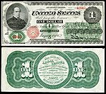
United States Notes ("Greenback") set
Voting period is over. Please don't add any new votes. Voting period ends on 7 Jul 2014 at 15:15:20 (UTC)
- Reason
- High quality, high EV (presented as a complete denominational set).
United States Greenbacks, so called because of the green ink used on the back of the notes, were authorized by Congress in three issues between 1862 and 1863. During that time, the wording of the payment obligation was altered creating additional varieties of the notes. The present set, $1 to $1,000, contains high grade examples of the somewhat more available lower-denomination notes as well as some extremely rare ($100 and $500) and unique ($50 and $1,000) varieties in the higher denominations.
Original – A nine-note complete denominational set of United States "Greenbacks", Series 1862–63.
- Articles in which these images appear
- Greenback (money) (all), one each in United States one-dollar bill, United States two-dollar bill, United States five-dollar bill, United States ten-dollar bill, United States twenty-dollar bill, United States fifty-dollar bill, United States one hundred-dollar bill, Large denominations of United States currency
- FP category for this image
- Currency
- Creator
- Both the American and Continental Banknote Companies under contract to the United States Department of the Treasury, as well as the U.S. Department of the Treasury itself.
From the National Numismatic Collection, NMAH, Smithsonian Institution.
Images by Godot13.


-

$10 1863
Abraham Lincoln, Eagle, Art -

$20 1863
Liberty -

$50 1862
Alexander Hamilton


-

$100 1863
Spread eagle -

$500 1863
Albert Gallatin -

$1,000 1863
Robert Morris


- Support as nominator – Godot13 (talk) 15:15, 27 June 2014 (UTC)
- Support - Another great set. — Crisco 1492 (talk) 15:28, 27 June 2014 (UTC)
- Support great work. Rreagan007 (talk) 20:31, 30 June 2014 (UTC)
- Support - belated because I've only just noticed how fine they are. Coat of Many Colours (talk) 11:46, 1 July 2014 (UTC)
- Support Jee 16:35, 1 July 2014 (UTC)
- Support Yann (talk) 07:52, 6 July 2014 (UTC)
Promoted File:US-$1-LT-1862-Fr-16c.jpg Armbrust The Homunculus 15:16, 7 July 2014 (UTC)
Promoted File:US-$2-LT-1862-Fr-41.jpg Armbrust The Homunculus 15:16, 7 July 2014 (UTC)
Promoted File:US-$5-LT-1862-Fr-61a.jpg Armbrust The Homunculus 15:16, 7 July 2014 (UTC)
Promoted File:US-$10-LT-1863-Fr-95b.jpg Armbrust The Homunculus 15:16, 7 July 2014 (UTC)
Promoted File:US-$20-LT-1863-Fr-126b.jpg Armbrust The Homunculus 15:16, 7 July 2014 (UTC)
Promoted File:US-$50-LT-1862-Fr-148a.jpg Armbrust The Homunculus 15:16, 7 July 2014 (UTC)
Promoted File:US-$100-LT-1863-Fr-167.jpg Armbrust The Homunculus 15:16, 7 July 2014 (UTC)
Promoted File:US-$500-LT-1863-Fr-183c.jpg Armbrust The Homunculus 15:16, 7 July 2014 (UTC)
Promoted File:US-$1000-LT-1863-Fr-186e.jpg Armbrust The Homunculus 15:16, 7 July 2014 (UTC)
Three Temples at Sam Poo Kong
Voting period is over. Please don't add any new votes. Voting period ends on 7 Jul 2014 at 17:07:15 (UTC)

- Reason
- High quality and resolution. We don't have much Chinese-style architecture featured.
- Articles in which this image appears
- Sam Poo Kong
- FP category for this image
- Wikipedia:Featured pictures/Places/Architecture
- Creator
- Chris Woodrich
- Support as nominator – — Crisco 1492 (talk) 17:07, 27 June 2014 (UTC)
- Support - Excellent image. Coat of Many Colours (talk) 19:06, 27 June 2014 (UTC)
- Support - Great addition to the article with high EV.--Godot13 (talk) 00:35, 28 June 2014 (UTC)
- Support – A very clear, striking photo. CorinneSD (talk) 23:48, 28 June 2014 (UTC)
- Support - Interesting image. SagaciousPhil - Chat 22:00, 29 June 2014 (UTC)
- Support. Nice image, although I note that at 100%, it's significantly lacking in detail on the peripheries, particularly on the left side. The stone tiles are almost completely smeared and there is some jaggedness in the building. I would understand it if this was a rectilinear projection but it appears to be cylindrical (no horizontal distortion at the edges). Ðiliff «» (Talk) 22:04, 30 June 2014 (UTC)
- It is rectilinear, actually. I'll try and prepare an alt using a cylindrical projection, to see how it looks. — Crisco 1492 (talk) 23:37, 30 June 2014 (UTC)
- Support Could you add geocoding please? Yann (talk) 07:52, 6 July 2014 (UTC)
- Done, inline. — Crisco 1492 (talk) 07:59, 6 July 2014 (UTC)
Promoted File:Three Temples at Sam Poo Kong, 2014-06-18.jpg --Armbrust The Homunculus 17:08, 7 July 2014 (UTC)
Prothonotary Warbler (Audubon)
Voting period is over. Please don't add any new votes. Voting period ends on 7 Jul 2014 at 18:53:16 (UTC)


Before processing

After processing
.jpg)
_-_pseudo_detoned.jpg)
- Reason
- This image has both historical and encyclopedic interest, being an Audubon engraving. The resolution is excellent, extending to individual marks of the engraver.
- Articles in which this image appears
- The Birds of America, Prothonotary warbler
- FP category for this image
- Wikipedia:Featured pictures/Artwork/Others
- Creator
- Mturtle
Support as nominatorWithdrawing support per discussion below. – Coat of Many Colours (talk) 08:39, 29 June 2014 (UTC)- Comment - There is already a featured image of the Prothonotary Warbler which is a photo Wikipedia:Featured picture candidates/Prothonotary Warbler dating from 2006. There is at least one featured image of an Audobon painting, namely the Ivory-billed woodpecker, which is indeed very fine, but at a file size of just 393 KB the resoltion is very limited. I have no idea how the foxing (yellowing) was fixed in these images, but the result is indeed wonderful. Coat of Many Colours (talk) 19:03, 27 June 2014 (UTC)
- Oppose - The areas around the text have not been cleaned up like the rest of the image. Perhaps the text should just be cropped out as was done with File:Campephilus principalisAWP066AA2.jpg. Kaldari (talk) 20:11, 27 June 2014 (UTC)
- I've been trying to get a better threshold mask. The problem is that the underbelly of the lower birds and the wings of the upper bird are in part painted in the same colour as the background, so that you're confronted with some quite delicate repainting. As for that background tone there's no prospect of recovering the original and I can't find a reference image on the web. Coat of Many Colours (talk) 21:05, 1 July 2014 (UTC)
- The foxing has been removed. What remains might well be an artefact of inking (I mean I don't know). You're examining it at a very high magnification to notice it. In any case what part of WP:FP? says every little bit should be clean? Note there is some license granted for historical images. I should be very sorry to see the text go over a little shadow. Coat of Many Colours (talk) 20:56, 27 June 2014 (UTC)
- Comment - I'm not sure that every bit should or needs to be clean (in fact the background looks artificially clean, no texture of any kind) but the restoration of the image should be consistent. Some places have been cleaned, others remain original. There is at least one area in the design where the restorer has made a few hesitant strokes to clean, but then abandoned the area (directly underneath the upper bird's leg). It's a very nice image, but the restoration is not finished, in my opinion...--Godot13 (talk) 23:01, 27 June 2014 (UTC)
- Looking at the numerous image uploaded, I would say that the background was entirely "clean" (I mean many of these images are mark resolved, so one can clearly discern toning artefacts), and that's confirmed by facsimiles such as this. I can see what you mean by the hesitant strokes. As far as I know you can't deal with foxing (toning) in even very sophisticated image processing suites (perhaps Crisco can confirm?) You just have to get in there with a rubber (as Juliet remarked to Romeo) and WP:FP? does make a concession here: "Exceptions to this rule may be made for historical or otherwise unique images. If it is considered impossible to find a technically superior image of a given subject, lower quality may sometimes be allowed". Coat of Many Colours (talk) 23:47, 27 June 2014 (UTC)
- Please don't get me wrong (as you are preaching to the choir regarding an understanding for historical or unique images). There are cases for no restoration, there are cases for light restoration, and there are sometimes cases for heavy restoration. This however, in my opinion only, is incomplete restoration. That doesn't take away from the value of the image, but it does make it much more difficult to become featured.--Godot13 (talk) 00:17, 28 June 2014 (UTC)
- Absolutely not and there you go! Coat of Many Colours (talk) 00:36, 28 June 2014 (UTC)
- Oppose
- The "restorer" has ignored the fact that the paper on which the image was printed was not white, and the paper on which the image was created would not have been stark white either. This shows a blatant disregard for the intentions of the artist who would have taken the colour of the paper on which the artwork was created into account.
- The subtle shading of blue and green has been diminished so that the areas that in the "unrestored" version are slightly iridescent, in the so-called "restored" version have lost their sheen.
- The loss of detail to the borders of the individual feathers of the wing are clearly apparent from these two details.
- My recommendation is that the colour of the background is restored to the image, (and by "restored" I don't mean "removed") and that the worst spotting and damage is cleaned up, and possibly the background lightened a little in tone to counteract the effect of aging, but with the integrity of the work maintained. Amandajm (talk) 08:36, 28 June 2014 (UTC)
- First of all I have to defer to your expertise about background colour (see also my further remarks below). I have no idea what the prints originally looked like and assumed the restorer knew what they were about. I did look at this virtual presentation of an edition and they simply looked foxed to me (the whole page). As I mention above there was an earlier image that made it to "Featured". That too has a white background (whereas the original has a mustard yellow background) and the issue wasn't raised at its discussion. Finally facsimiles such as this confirm a white background.
- But that is all justification after the fact. I readily confess I just assumed the paper was white without thinking about it. Whoops. But the whole set tinted mustard yellow? It does sound slightly implausible to me. On the other hand this Christies set does indeed have tinted backgrounds.
- Obviously if the community can't reconcile itself this time round to a white background, then we can't feature it. Coat of Many Colours (talk) 11:07, 28 June 2014 (UTC)
- I'm tempted to rerestore from the original. Adam Cuerden (talk) 07:22, 29 June 2014 (UTC)
- Since I initiated all this I suppose I ought to offer, but the fact is I haven't the faintest idea how to go about it. Looking at the original featured image, the cleaning seems to have been carried out at pixel level. I saw a web source about a tecnical process for removing foxing using a technique called inpainting here. I've withdrawn my nomination for this image incidentally. Coat of Many Colours (talk) 08:39, 29 June 2014 (UTC)
- Been researching these editions. One modern facsimile, the Openheimer Field Edition does indeed use white backgounds. The Commons category contains a complete collection of prints from the University of Pittsburgh edition. That is an example of the original Havell edition. These engravings were aquatints (explaining the speckling Kaldari noticed above and which puzzled me - incidentally Mary Cassatt was a master of the coloured aquatint - this is one of hers I uploaded to Commons) which were then hand painted with water color. Comparing the examples on the Audubon Society pages with the Pittsburg edition, you can see that the Pittsburg edition is very heavily toned and that it would be quite impossible to restore the original aquatint wash, thus our restorer's (I think we can bin the two-finger quotes in the circumstances) decision I expect to provide a white background on her restoration. The Christie's set I mention from the Duke of Portland is much better but they aren't reproduced on their site (after dezoomifying I mean) in such high resolution, but it should be possible to recover the aquatint tone from their reproductions. I will upload at least the Prothonotary Warbler image into a Duke of Portland subcategory on the Commons page should anyone like to have a go. Coat of Many Colours (talk) 11:25, 29 June 2014 (UTC)
- Prothonotary Warbler isn't among the 40 or so Christie's images. I'll upload the version of the featured image mentioned above. Coat of Many Colours (talk) 12:33, 29 June 2014 (UTC)
- Done (thumbnailed) Coat of Many Colours (talk) 20:40, 29 June 2014 (UTC)
- Prothonotary Warbler isn't among the 40 or so Christie's images. I'll upload the version of the featured image mentioned above. Coat of Many Colours (talk) 12:33, 29 June 2014 (UTC)
- Been researching these editions. One modern facsimile, the Openheimer Field Edition does indeed use white backgounds. The Commons category contains a complete collection of prints from the University of Pittsburgh edition. That is an example of the original Havell edition. These engravings were aquatints (explaining the speckling Kaldari noticed above and which puzzled me - incidentally Mary Cassatt was a master of the coloured aquatint - this is one of hers I uploaded to Commons) which were then hand painted with water color. Comparing the examples on the Audubon Society pages with the Pittsburg edition, you can see that the Pittsburg edition is very heavily toned and that it would be quite impossible to restore the original aquatint wash, thus our restorer's (I think we can bin the two-finger quotes in the circumstances) decision I expect to provide a white background on her restoration. The Christie's set I mention from the Duke of Portland is much better but they aren't reproduced on their site (after dezoomifying I mean) in such high resolution, but it should be possible to recover the aquatint tone from their reproductions. I will upload at least the Prothonotary Warbler image into a Duke of Portland subcategory on the Commons page should anyone like to have a go. Coat of Many Colours (talk) 11:25, 29 June 2014 (UTC)
- Since I initiated all this I suppose I ought to offer, but the fact is I haven't the faintest idea how to go about it. Looking at the original featured image, the cleaning seems to have been carried out at pixel level. I saw a web source about a tecnical process for removing foxing using a technique called inpainting here. I've withdrawn my nomination for this image incidentally. Coat of Many Colours (talk) 08:39, 29 June 2014 (UTC)
- I'm tempted to rerestore from the original. Adam Cuerden (talk) 07:22, 29 June 2014 (UTC)
- Oppose
- Absolutely not and there you go! Coat of Many Colours (talk) 00:36, 28 June 2014 (UTC)
- Please don't get me wrong (as you are preaching to the choir regarding an understanding for historical or unique images). There are cases for no restoration, there are cases for light restoration, and there are sometimes cases for heavy restoration. This however, in my opinion only, is incomplete restoration. That doesn't take away from the value of the image, but it does make it much more difficult to become featured.--Godot13 (talk) 00:17, 28 June 2014 (UTC)
- Looking at the numerous image uploaded, I would say that the background was entirely "clean" (I mean many of these images are mark resolved, so one can clearly discern toning artefacts), and that's confirmed by facsimiles such as this. I can see what you mean by the hesitant strokes. As far as I know you can't deal with foxing (toning) in even very sophisticated image processing suites (perhaps Crisco can confirm?) You just have to get in there with a rubber (as Juliet remarked to Romeo) and WP:FP? does make a concession here: "Exceptions to this rule may be made for historical or otherwise unique images. If it is considered impossible to find a technically superior image of a given subject, lower quality may sometimes be allowed". Coat of Many Colours (talk) 23:47, 27 June 2014 (UTC)
@Kaldari:, @Amandajm: I've uploaded a pseudo detone image for the Ivory-Billed Woodpecker (thumbnailed), complete with the naive Mathematica algorithm I used. It's only half-size because I've only got my laptop with me and it doesn't have enough memory for the full-size. I'll upload the Prothonotary Warbler later. Might be useful, but I shan't nominate it for "Featured". Coat of Many Colours (talk) 19:14, 2 July 2014 (UTC)
- @Coat of Many Colours: Defoxing isn't something that can be properly done by algorithm, IMO. It requires careful work in the 'levels' and 'hue/saturation' interfaces in Photoshop. In particular, you want to completely remove ("dodge") the range of tones that comprise the page color without negatively affecting the tones in the artwork. Sometimes this isn't even possible, but Photoshop definitely makes it easier. Sometimes you can get a pretty clean de-foxing just by using the input levels graph in the levels interface and the set whitepoint tool. You'll almost always need to do some manual clean-up afterwards though. Kaldari (talk) 23:32, 2 July 2014 (UTC)
- Also, I should mention that I can notice the artifacts of the incomplete defoxing of the warblers image even at thumbnail size. If it isn't noticeable to you, you may have your monitor contrast too high. Kaldari (talk) 23:35, 2 July 2014 (UTC)
- Yes, I'm sure that's right (and I do make that clear on the Commons page). However I'm frankly surprised that this naive algorithm does so well and I'm planning some tweaks based on Mathematica's HistogramTransform function (taking the virtually pristine Duke of Portland's edition as a reference work, but I'm constrained by RAM limitations). I think it's worth persisting because it's very unlikely high resolution images of the Audubon engravings other than the Pittsburg ones, sadly toned in my opinion, will become available. But I shan't maintain the debate here. Thanks for your comments. Coat of Many Colours (talk) 23:49, 2 July 2014 (UTC)
Not Promoted -- — Crisco 1492 (talk) 22:46, 7 July 2014 (UTC)
Berthe Morisot With a Bouquet of Violets
Voting period is over. Please don't add any new votes. Voting period ends on 8 Jul 2014 at 07:11:52 (UTC)

- Reason
- Édouard Manet's famous portrait of Berthe Morisot
- Articles in which this image appears
- Édouard Manet, Berthe Morisot, Black, List of paintings by Édouard Manet
- FP category for this image
- Wikipedia:Featured pictures/Artwork/Paintings
- Creator
- Édouard Manet
- Support as nominator – Coat of Many Colours (talk) 07:11, 28 June 2014 (UTC)
- Support, although the creator field needs to be fixed. — Crisco 1492 (talk) 07:56, 28 June 2014 (UTC)
- Done.Coat of Many Colours (talk) 10:01, 28 June 2014 (UTC)
- Support Amandajm (talk) 08:02, 28 June 2014 (UTC)
- Support. Very good picture. And it is indeed famous...
 . Hafspajen (talk) 12:13, 28 June 2014 (UTC)
 - Support — Iconic. Sca (talk) 13:03, 28 June 2014 (UTC)
- Support – Great painting. CorinneSD (talk) 23:39, 28 June 2014 (UTC)
- Looked at your User page. So excellent! Coat of Many Colours (talk) 12:13, 29 June 2014 (UTC)
Promoted File:Edouard Manet - Berthe Morisot With a Bouquet of Violets - Google Art Project.jpg --Armbrust The Homunculus 07:37, 8 July 2014 (UTC)
- Added it to People/Artists and writers, as this is a portrait and there is no article about it. Armbrust The Homunculus 07:37, 8 July 2014 (UTC)
The Angelus
Voting period is over. Please don't add any new votes. Voting period ends on 8 Jul 2014 at 07:49:38 (UTC)
.jpg)
_001.jpg)
- Reason
- Jean-François Millet's famous painting The Angelus
- Articles in which this image appears
- The Angelus (painting), Jean-François Millet, Droit de suite, Martinus Sieveking
- FP category for this image
- Wikipedia:Featured pictures/Artwork/Paintings
- Creator
- Jean-François Millet
- Support as nominator – Coat of Many Colours (talk) 07:49, 28 June 2014 (UTC)
- Support - Good scan, a bit dark but as it's set at the end of a working day that's to be expected. The creator is not "Artwork", though. It's Millet. The uploader =/= creator. — Crisco 1492 (talk) 07:54, 28 June 2014 (UTC)
- Not sure what to do with "Creator" now: the template says "the creator of the image, where possible using the format wikiuser" Done anyway.
- "where possible using the format wikiuser" means if the creator is a Wikipedian. If the creator is someone from Flickr (like File:Lucky Diamond Rich face.jpg), a painter (like this one), etc. we should link elsewhere (an article on the photographer, the flickr feed, whatever). — Crisco 1492 (talk) 14:43, 28 June 2014 (UTC)
- Not sure what to do with "Creator" now: the template says "the creator of the image, where possible using the format wikiuser" Done anyway.
- Comment: This is a very dark version. In order to see it t something like its real tonality, I have to up the brightness of my monitor to the max. I would like to see the overall brightness increased to a point where it looks right at a setting that is closer to medium. Amandajm (talk) 08:01, 28 June 2014 (UTC)
- Looks fine on my monitor, but these LED monitors nowadays are a real nuisance. I have mine tilted towards me (I really can't be getting on with vertical) but that means I have to stand to get a proper look at images. Regarding brightness I was looking at the most linked version of Van Gogh's The Potato Eaters this morning. That's been brightened to a quite unacceptable level, to the point I'm not prepared to nominate it for "Featured". It's quite inauthentic in my opinion. This one (Angelus I mean) is the museum image. I shouldn't want to tinker with it. Wikiart's verion, for example, is a travesty. Coat of Many Colours (talk) 09:58, 28 June 2014 (UTC)
- Comment Nice picture, but one has to think of visibility. I might support if brighter -lighter version can be proposed, - e.g. an alt - if possible. Add one, but not sure about that either, that one - the other scan we have on commons - it is of a weird reddish colour. Here is someting in between.. Hafspajen (talk) 12:08, 28 June 2014 (UTC)
- SmartHistory has a video shot in natural light here. You can see the colour values are the same, but the lighting is a little warmer. Colour temperature (i.e. whether the painting was viewed on bright sunny day or on a dull day - the D'Orsay has overhead vaulting letting in the light) is not something you can adjust in a JPG as far as I know. Crisco would know more about that than me. On the other hand if you start fiddling with the brightness control all you get is a washed out image because, like The Potato Eaters, this is an image which is supposed to be dark - it's a representation of evening prayer in the fields - and in particular the faces are in shadow. I can only repeat for myself I have no problem with the image. Of course it's for community consensus. Coat of Many Colours (talk) 14:19, 28 June 2014 (UTC)
- One can adjust warmth, but after the Olympia debacle I will not be doing anything of the like. — Crisco 1492 (talk) 14:41, 28 June 2014 (UTC)
- Well yes, but if you start doing that here you do end up with something along the lines of the hopelessly orange Wikiart Alt1. But it's true one can be overly respectful, and it's just a fact of life that art images vary very widely in fidelity. It's when you start tinkering with the museum image that I begin to feel uncomfortable. Nevertheless the Van Gogh image above I think probably does need warming. I shall look the other way ... :). Coat of Many Colours (talk) 14:53, 28 June 2014 (UTC)
- Haha, Coaty, you see that things can be more complicated than they might seem... in the beggining. Hafspajen (talk) 16:27, 28 June 2014 (UTC)
- :) Yes, well the Van Gogh image is very strange. I was tinkering with it earlier on in my image processor using Lch space, and I coudn't do anything with it. The blues are too light I think. Strange. The National Gallery charges serious money for their digital images ... Coat of Many Colours (talk) 17:19, 28 June 2014 (UTC)
- SmartHistory has a video shot in natural light here. You can see the colour values are the same, but the lighting is a little warmer. Colour temperature (i.e. whether the painting was viewed on bright sunny day or on a dull day - the D'Orsay has overhead vaulting letting in the light) is not something you can adjust in a JPG as far as I know. Crisco would know more about that than me. On the other hand if you start fiddling with the brightness control all you get is a washed out image because, like The Potato Eaters, this is an image which is supposed to be dark - it's a representation of evening prayer in the fields - and in particular the faces are in shadow. I can only repeat for myself I have no problem with the image. Of course it's for community consensus. Coat of Many Colours (talk) 14:19, 28 June 2014 (UTC)
- Comment Nice picture, but one has to think of visibility. I might support if brighter -lighter version can be proposed, - e.g. an alt - if possible. Add one, but not sure about that either, that one - the other scan we have on commons - it is of a weird reddish colour. Here is someting in between.. Hafspajen (talk) 12:08, 28 June 2014 (UTC)
- Looks fine on my monitor, but these LED monitors nowadays are a real nuisance. I have mine tilted towards me (I really can't be getting on with vertical) but that means I have to stand to get a proper look at images. Regarding brightness I was looking at the most linked version of Van Gogh's The Potato Eaters this morning. That's been brightened to a quite unacceptable level, to the point I'm not prepared to nominate it for "Featured". It's quite inauthentic in my opinion. This one (Angelus I mean) is the museum image. I shouldn't want to tinker with it. Wikiart's verion, for example, is a travesty. Coat of Many Colours (talk) 09:58, 28 June 2014 (UTC)
Not Promoted --Armbrust The Homunculus 07:50, 8 July 2014 (UTC)
Temple of Caitanya Mahaprabhu in Mayapur
Voting period is over. Please don't add any new votes. Voting period ends on 8 Jul 2014 at 09:16:09 (UTC)

- Reason
- The image is of good quality and resolution. It has high EV as it adds significantly to a number of key articles on Gaudiya Vaishnavism, being a photograph of its founder Chaitanya Mahaprabhu's birthplace. It also arguably has decent composition and aesthetic value.
- Articles in which this image appears
- Chaitanya Mahaprabhu, Bhaktivinoda Thakur, Mayapur, Nabadwip, Nadia district
- FP category for this image
- Religion and mythology
- Creator
- Cinosaur
- Support as nominator – Cinosaur (talk) 09:16, 28 June 2014 (UTC)
- Support - nice image. Coat of Many Colours (talk) 10:07, 28 June 2014 (UTC)
- Comment. I'm undecided on supporting it at the moment as the image quality is a little low, but it's an interesting composition and we're lacking good photography of India. I noticed it had quite a lot of image noise, and I've uploaded a noise reduced version over the top of it. If you don't appreciate the change, feel free to revert, but I don't think any detail was lost in the reduction. Ðiliff «» (Talk) 14:52, 30 June 2014 (UTC)
- Diliff, it was difficult to get any closer to the object because of the pond, and the kind of equipment used did not allow for a better image quality. (I wish you were there with your awesome cameras and skills.) As for retouching the image, thanks for the try. It's hard for my layman eye to detect any "before and after" changes without a guided side-by-side comparison, but as you said it didn't visibly do away with any detail of the original and it does appear slightly sharper now. And yes, the conspicuous lack of good (what to speak of featured) India-themed images on Wikipedia was my main incentive in nominating this one – which hopefully will be factored in by its reviewers. Regards, Cinosaur (talk) 16:29, 30 June 2014 (UTC)
- No problem, I understand that not everyone can (or should) shoot everything with professional camera equipment and yes, I think the inherent lack of quality imagery of certain regions is taken into consideration, but ultimately the project's goal is to feature the best that Wikipedia can offer. As for comparing the before and after, it's just a matter of opening the two images in different browser tabs and then switching back and forth. Ðiliff «» (Talk) 16:47, 30 June 2014 (UTC)
- Diliff, it was difficult to get any closer to the object because of the pond, and the kind of equipment used did not allow for a better image quality. (I wish you were there with your awesome cameras and skills.) As for retouching the image, thanks for the try. It's hard for my layman eye to detect any "before and after" changes without a guided side-by-side comparison, but as you said it didn't visibly do away with any detail of the original and it does appear slightly sharper now. And yes, the conspicuous lack of good (what to speak of featured) India-themed images on Wikipedia was my main incentive in nominating this one – which hopefully will be factored in by its reviewers. Regards, Cinosaur (talk) 16:29, 30 June 2014 (UTC)
- Support Quality picture. This photo captures the temple in its relation to the river, which makes it complete. Thanks. Ism schism (talk) 18:44, 30 June 2014 (UTC)
- Partial support I am no expert in the quality of the image; so can't comment on that. However, the image is good in EV and aesthetics IMO. Disclaimer: Invited here by the nominator (User_talk:Redtigerxyz#FP_nomination_for_Yogapith_temple) and discussion of the image usage User_talk:Cinosaur#File:Yogapith.2C_Mayapur.jpg_usage.--Redtigerxyz Talk 05:34, 1 July 2014 (UTC)
- Thanks for your comment, Redtigerxyz. I invited you and a few other editors actively involved with India-themed topics to comment on the nomination as those who might be in a better position to assess its EV. Regards, Cinosaur (talk) 07:08, 1 July 2014 (UTC)
- Weak Support Per Ðiliff. Adam Cuerden (talk) 10:13, 2 July 2014 (UTC)
- Support Good quality photo from an under-represented region with strong EV. If a higher quality version comes along we can, if need be, delist and replace this image. Nick-D (talk) 10:34, 2 July 2014 (UTC)
- Support I was also invited, presumably as I am active on articles to do with India. It's a good picture and looks like a useful one. Sure, maybe it's not perfect - perhaps it would be better if it weren't square in the middle, but that's just a quibble. I like the reflection in the pond. Dougweller (talk) 18:13, 2 July 2014 (UTC)
- Support. In spite of the technical deficiencies, the composition is good and it's an interesting looking temple. Ðiliff «» (Talk) 21:12, 2 July 2014 (UTC)
- Support - very nice work. Nikhil (talk) 02:50, 3 July 2014 (UTC)
- Support Could you add geocoding please? Yann (talk) 07:46, 6 July 2014 (UTC)
Promoted File:Yogapith, Mayapur.jpg --Armbrust The Homunculus 09:31, 8 July 2014 (UTC)
- Placed image in Places/Architecture, as every temple is there. Armbrust The Homunculus 09:31, 8 July 2014 (UTC)
Vase with Fifteen Sunflowers
Voting period is over. Please don't add any new votes. Voting period ends on 8 Jul 2014 at 09:33:25 (UTC)


.jpg)
- Reason
- The version of Vincent van Gogh's iconic Sunflowers at the National Gallery. London
- Articles in which this image appears
- Sunflowers (Van Gogh series), National Gallery, Décoration for the Yellow House
- FP category for this image
- Wikipedia:Featured pictures/Artwork/Paintings
- Creator
- Vincent van Gogh
Support as nominatorSupport proposed new nomination (see ensuing discussion) - Coat of Many Colours (talk) 07:51, 29 June 2014 (UTC)
- Why is this looking so flat and colourless? Van Gogh's paintins are not like this. Hafspajen (talk) 12:56, 28 June 2014 (UTC)
- Yes, that's quite true, and that also struck me forcefully when I fist saw this reproduction (it's the National Gallery's image) early last year. But I had just done London and haven't been back since, so I can't check. Part of the problem is this damned LED thing again I'm sure, but it does strike me as lacking saturation. I have Martin Bailey's recent book on the Sunflowers back at home and the illustration there is much more orange. I do think the image needs some expert attention, but I don't have the skills and in any case I don't have any visual memory of it. Perhaps the nomination just shouldn't be supported. I would understand that. Coat of Many Colours (talk) 14:34, 28 June 2014 (UTC)
- looks like some Van Gogh paintings are like this indeed. See this another version. - Blieusong (talk) 21:12, 28 June 2014 (UTC)
- I think that the one you showed is very different in colours and stucture from this. Or it is only a better copy. Hafspajen (talk) 23:53, 28 June 2014 (UTC)
- @Blieusong:: Very grateful to Blieusong for pointing this out. I know the VGM version well and their image is much more faithful (the pale blue of the signture in the VGM is authentic for example, whereas in the National Gallery version it is not - it should be maroon). There are two good possibilities for the VGM version, a Google Art Project version which has an overly bright background and disappointing resolution, and a drop dead gorgeous ultra-high resolution version thumbnailed right, which curiously seems to come from the National Gallery, London as well, the subject of an exhibition earlier this year.
- What I'll do is close this nomination for the NG version when the seven days are up as unsuccessful and nominate the VGM version instead. At least that's my plan barring sudden support for the NG original version, but I do agree the NG original version is very problematic . Thanks to Hafs his input. Coat of Many Colours (talk) 07:51, 29 June 2014 (UTC)
- Reflecting on it, I wonder whether the photographer of the National Gallery version was trying to compensate for the known instability of Chrome Yellow (the cheap yellow Van Gogh used after 1886). Doesn't get my vote if she was.Coat of Many Colours (talk) 08:08, 29 June 2014 (UTC)
- Support candidate 2 – Editør (talk) 12:25, 29 June 2014 (UTC)
- Simply a more detailed image than the Original. – Editør (talk) 12:37, 29 June 2014 (UTC)
- Support candidate 2 Not even sure looking at the actual one is a better experience :). - Blieusong (talk) 17:27, 3 July 2014 (UTC)
- Yes, that's quite right. I'm completely blown away by it. I'll nominate it once this nomination had run its course. Coat of Many Colours (talk) 02:12, 4 July 2014 (UTC)
- Support candidate 2 - A very well done scan indeed! — Crisco 1492 (talk) 10:06, 5 July 2014 (UTC)
- Do I need to renominate it? I don't know the procedure here? Coat of Many Colours (talk) 21:23, 5 July 2014 (UTC)
- Try adding it to Template:FPC urgents first. You only need one more support. — Crisco 1492 (talk) 01:14, 6 July 2014 (UTC)
Promoted File:Vincent van Gogh - Sunflowers - VGM F458.jpg --Armbrust The Homunculus 09:39, 8 July 2014 (UTC)
Three Beauties of the Present Day
Voting period is over. Please don't add any new votes. Voting period ends on 9 Jul 2014 at 11:31:45 (UTC)
From_Bijin-ga_(Pictures_of_Beautiful_Women),_published_by_Tsutaya_Juzaburo_-_Google_Art_Project.jpg)
- Reason
- Kitagawa Utamaro (1753 – 1806) was a Japanese woodblock print (ukiyo-e) artist. Utamaro is famous for his portraits of feminine beauties, his close-up portraits of beautiful women marked an epoch in the evolution of the Japanese print called bijin-ga (pictures of beautiful women), that is depicting feminine beauty in the Japanese art history. Utamaro is one of the very best representant of this genre.
- Articles
- Utamaro, Ukiyo-e, Portrait painting and 45 other articles on different Wikis.
- FP category for this image
- Wikipedia:Featured pictures/Artwork/East Asian art
- Creator
- Kitagawa Utamaro
- Comment - Needs categories on Commons (easily fixed). This might have EV in the article on Bijin-ga as well. Minor nitpicks, really. This is easily worth a support (blur is understandable, since the original object isn't even 40cm on its longest side yet this was scanned at 8k pixels). — Crisco 1492 (talk) 12:05, 29 June 2014 (UTC)
- Support - Perhaps not Utamaro's most famous work, but illustrative of the genre. — Crisco 1492 (talk) 12:51, 29 June 2014 (UTC)
- Comment - Rather a well known Utamaro print ... one of his finest works , here and it is a special composition invented by Utamaro, videly copied later, and it is easy to compare with other works here. Also, this picture is used in many articles on all Wikis. (And it had enough pixels too...) Hafspajen (talk) 14:10, 29 June 2014 (UTC)
- Support Note there's already a featured Utamaro here, a beautifully restored version of this LoC print. Ukiyo-e prints don't age well and that pale chestnut-maroon of the robes probably started life as something quite different. They were used as packing paper in Van Gogh's time! He tried to set up a business in Paris selling them, but it wasn't successful. Degas and Mary Cassatt much influenced by them - more examples of Utamaro in one of my Cassatt sandboxes. Coat of Many Colours (talk) 19:02, 29 June 2014 (UTC)
- Coat of Many Colours: That whole "packing material" meme is way exaggerated. Hokusai's Manga had been used as packing material by Félix Bracquemond's printer, and Monet may have found some prints in Holland that were used as wrapping paper. The pigments and apper are susceptible to degradation---compare an original to one of the Adachi reprints and see what a difference there is---you can see the clouds in the background of The Great Wave! Curly Turkey ⚞¡gobble!⚟ 13:52, 4 July 2014 (UTC)
- Well, I thought that was probably true of the packing paper story, still a good story. That's right about degrading. The quality of surviving copies of these prints varies enormously. Excellent user page of yours - worth checking out. Coat of Many Colours (talk) 14:17, 4 July 2014 (UTC)
- AARGH! Don't read that! That was an early draft of the ukiyo-e page that's now up for FAC. I forgot to redirect it to the mainspace article. Curly Turkey ⚞¡gobble!⚟ 14:28, 4 July 2014 (UTC)
- Whoops, sorry. Still looks prety good to me. Coat of Many Colours (talk) 15:51, 4 July 2014 (UTC)
- Comment - The other featured Utamaro is different, a single woman, but this print is using three women as a triangle , and it is a specific composition and a significant work of Utamaro. This composition was invented by Utamaro, and widely copied. And if you look at the category Wikipedia:Featured pictures/Artwork/East Asian art, there is no such picture there, actually Bijin-ga is rather poorly represented among our Featured Pictures of East Asian art, weird enough, considering that representing feminine beauty (Bijin-ga) how significant part is of the famous Ukiyo-e Japanese prints. As for the print, old prints lok like this. Hafspajen (talk) 10:57, 2 July 2014 (UTC)

- One interjection: that's a 12th century print; there's quite a difference in appearance between 12th-century and a well-preserved 19th century print. Adam Cuerden (talk) 15:28, 2 July 2014 (UTC)
- It say dated about 1793, same year when Louis XVI of France was guillotined... It is probably like 221 year old? Hafspajen (talk) 15:40, 2 July 2014 (UTC)
- Added. There's a nice Christie's set of deplorable images by Utamaro here incidentally if anyone's offering. Christie's don't keep their Zoomify images up for ever, so I would grab them quick if genuinely interested. Coat of Many Colours (talk) 19:14, 29 June 2014 (UTC)
- Uploaded as File:UTAMAKURA (POEM OF THE PILLOW).jpg. — Crisco 1492 (talk) 04:28, 30 June 2014 (UTC)
- Well done! I suspect Mary Cassatt probably didn't have this set in her collection (she had a few from Utamaro) but I'll keep it mind. I'll add to the Commons description when I have a moment. Coat of Many Colours (talk) 08:21, 30 June 2014 (UTC)
- Done. Coat of Many Colours (talk) 03:11, 1 July 2014 (UTC)
- Comment Is it just me, or is this slightly purplish? Adam Cuerden (talk) 15:25, 2 July 2014 (UTC)
- Yes it is. Depends on the quality of the print, paper and so no. Generally, they used hand-made paper; and those woodblocks were used to create lots of prints. like this one: File:Ogata Gekko - Ryu sho ten edit.jpg. Hafspajen (talk) 15:28, 2 July 2014 (UTC)
- @Hafspajen: I presume this is a response to my comment further up, not to it being purplish? Because I'm not quite convinced that hand-made paper tends towards purple most of the time, and most Ukiyo-es I've seen tend to age yellow. Adam Cuerden (talk) 16:28, 2 July 2014 (UTC)
- I don't know Adam. It could be the paper is coloured, it fades downwards. These look like they have a colored background. Maybe to emphasize the witness of the skin. The Light skin in Japanese culture thing. Or... I don't know. It is possible to do many different prints from the same woodblock, and since they were handmade, they would look different, all of them, more or less. It is not like just having one painting and one possible faithful reproduction. They came out differen. Hafspajen (talk) 16:44, 2 July 2014 (UTC)
- Does this help? They say something of the use of a sparkling mica-dust background (kirazuri) - and about different copies. This is [about techniques]...Hafspajen (talk) 17:04, 2 July 2014 (UTC)
- Hmm. I'm not sure - the faces are normally very, very white in geisha prints, it seems odd they're slightly coloured. Adam Cuerden (talk) 00:16, 3 July 2014 (UTC)

- The white face is paint. Everything on a Japanese woodcut print is put there. If the use plain paper and skip the white print plate, then it will be no white face. And if you put only a little, it will be hardly noticeable, like here probably. It is a special technic they use, the Nishiki-e. A nishiki-e print is created by carving a separate woodblock for every color, and using them in a stepwise fashion, made by hand. They put the paper on the plate and push, once for lines, once for colors, details, extra colors, and so on. It is not a painting, it is a print. It all depends on how the actual print was made. Hafspajen (talk) 02:58, 3 July 2014 (UTC)
- Have you tried to click on show details?, left upper corner ? IT reads like this, from The Toledo Museum of Art, USA,: (citation) Kitagawa Utamaro's interest in physiognomy, —the study of an individual's facial features as an indication of their character—helped lead to his skill at subtly altering the features of each face to create a sense of portraiture and individuality, such as the position and spacing of the eyes, the shape of the nose, and the placement of the ears. At the same time he retained a stylized, ideal beauty characterized by oblong faces and small eyes and mouths.Three Beauties demonstrates three new developments in Japanese printmaking that Utamaro helped make popular during the Edo period: the use of the so-called "big head" composition (okubi-e), which provides a close-up of each subject; the pyramidal formation of the figures; and the use of a sparkling mica-dust background (kirazuri) that sets off the soft matte tones of the faces. This print is one of at least three known states (versions with some variation of detail) of this design and includes a title cartouche in the upper right corner. Hafspajen (talk) 01:13, 3 July 2014 (UTC)
- And Utamaro's prints look like this sometimes, se book cover Utamaro revealed here. Hafspajen (talk) 02:58, 3 July 2014 (UTC)
- Comment I would agree with User:Adam Cuerden that the colour of this print is too mauve/pink all over. The grey here is a warm pinkish grey. It should be a cool grey (not blue grey either but slightly yellowed, if anything). The overall colour cast needs tweaking slightly. It just mean that by whatever process this was reproduced, the balance wasn't quite right. Otherwise, it is a well-composed print.
Also, this triangular composition may have been innovative in Japanese art, but it had become a common compositional device in Italian art in the 1300s.
I would like to make some adjustments to the caption,before it's used. Amandajm (talk) 05:52, 3 July 2014 (UTC)
- This is the MFA Boston version by way of reference. To illustrate the problems confronted by a "restorer" this is Commons:File:Kitagawa Utamaro - Takashima Ohisa Using Two Mirrors to Observe Her Coiffure Night of the Asakusa Marketing Festival - MFA Boston 21.6410.jpg uploaded by me earlier this year. This is the version owned by Mary Cassatt and hung for many years on her walls, showing the effects of fading (Mathews, Shapiro, Mary Cassatt: The Color Prints p. 65). The first (I mean the same example 21.6410 at Boston MFA) is reproduced at p. 67 of Mathews & Shapiro, where the grey of the robes in the museum image is revealed as in fact a plum colour. Good luck. Coat of Many Colours (talk) 13:00, 4 July 2014 (UTC)
- Mind you, I'm a little scared of another Olympia situation. I don't suppose anyone can actually look at it? Adam Cuerden (talk) 08:56, 3 July 2014 (UTC)
- Yeah, and who did that Olympia-situation, if not Naughty-Coaty, before graciously joining the gang? Hafspajen (talk) 11:33, 3 July 2014 (UTC)
- Ukiyo-e prints really don't keep well. Not only does the cheap newspaper quality paper tone a lot, the everyday printers' inks employed were also cheap and hopelessly fugitive. These prints were not destined for the fine art market but for popular consumption. That pale chestnut-marooon (ubiquitous in surviving examples of these prints) I mention above could have started life anywhere from red to green and in between. The Museum of Fine Arts in Boston has one of the largest and finest collection of these prints, but as you can readily see they generally haven't aged well: Abalone Divers is typical. What should be at stake here is the authenticity. Has the file been digitally processed and if so is the result authentic (or if not, at least meritorious on aesthetic grounds). In this case it's the museum image image via Google Art Ptoject and so far it hasn't been tinkered with. So I don't think there any issues regarding authenticity to worry about here. Coat of Many Colours (talk) 09:51, 3 July 2014 (UTC)
- Ukiyo-e was printed on a variety of paper qualities for different audiences and purposes, from the luxurious to the relatively inexpensive, but I don't think you could call any of it "cheap newspaper quality". They were generally hand-made mulberry paper, and the full-colour nishiki-e prints in particular (that are synonymous with "ukiyo-e" in the West) had to be of higher quality to withstand the multiple impressions of the different colour woodblocks (up to twenty in some cases). Utamaro had the same publisher as Sharaku—Tsutaya Jūzaburō—who was known to employ lavish printing techniques such as dusting the backgrounds with mica. Remember, the audience for these prints were not poor farmers, but the wealthy urban bourgeois who could afford to spend their time and money whoring in the pleasure districts—people who had larger incomes than those in the ruling samurai class. Curly Turkey ⚞¡gobble!⚟ 14:19, 4 July 2014 (UTC)
- Yes, I admit to talking out of the box "newspaper quality", but it was nevertheless art for mass consumption was it not? And it was precisely that aspect that attracted Westerners such as Degas and Cassatt. That Adachi facsimile is beautiful. Coat of Many Colours (talk) 16:00, 4 July 2014 (UTC)
- They were mass-produced, but "mass" is a relative term—According to this page, in the 19th century they were printed in edtions of a few hundred at a time, and the superstars such as Hiroshige could sell perhaps as many as 5–10,000 copies of their most popular prints. I seem to remember reading elsewhere that many earlier prints were special commissions, for exclusive private clubs and whatnot, in editions of possibly as low as single digits. Curly Turkey ⚞¡gobble!⚟ 21:14, 4 July 2014 (UTC)
- Yeah, and who did that Olympia-situation, if not Naughty-Coaty, before graciously joining the gang?
- Comment I would agree with User:Adam Cuerden that the colour of this print is too mauve/pink all over. The grey here is a warm pinkish grey. It should be a cool grey (not blue grey either but slightly yellowed, if anything). The overall colour cast needs tweaking slightly. It just mean that by whatever process this was reproduced, the balance wasn't quite right. Otherwise, it is a well-composed print.
- Looks like I started quite a debate with this poor picture. I really thougt that this one is going to be a singularly uncontroversial nomination, one of the most beautiful of Utamaro's production... and since we are so low on good pictures in the category Wikipedia:Featured pictures/Artwork/East Asian art... Hafspajen (talk) 14:37, 4 July 2014 (UTC)
- Curly Turkey, what about the lilac hue? Hafspajen (talk) 14:40, 4 July 2014 (UTC)
- Oh, I'm not the right guy to ask about that sort of thing... This shouldn't affect this nomination, but here's a modern Adachi reprint, to give an idea of how much the colours have degraded. Of course, that'll be true for any original. They weren't created with long-term preservation in mind. Curly Turkey ⚞¡gobble!⚟ 15:27, 4 July 2014 (UTC)
- Oh, I suspected this, but didn't want to just guess---according to the Adachi page, the whole background is dusted with mica, which gives a glittery effect that I image would never show up in a scan---though there's usually a certain quality to the scans that tells you it's one of those mica-dusted prints. Curly Turkey ⚞¡gobble!⚟ 15:35, 4 July 2014 (UTC)
- Do you think, Curly Turkey, Crisco 1492, Amandajm, Adam Cuerden, Coat of Many Colours that we should use the REPRINT showed here as a re-nomination instead of the original, the print from museum scan, 200 years old? Hafspajen (talk) 16:02, 4 July 2014 (UTC)
- Original, not reprint. — Crisco 1492 (talk) 16:07, 4 July 2014 (UTC)
- I'm not familiar enough with the guidelines; all I'll say is that several of the other ukiyo-e FPs are reprints---the other Utamaro's an Adachi. Curly Turkey ⚞¡gobble!⚟ 16:13, 4 July 2014 (UTC)
- I do support the original. It meets all the criteria. I can't help thinking that there's a small galaxy of images out there that in fact meet the requirements, but so long as they come in and we keep up I don't see why we shouldn't support them. I would also support a knowledgeable restoration such as Durova did with Ase o fuku onna (Woman wiping sweat). As for the reprint, that would be brilliant except I suspect it's still in copyright. Coat of Many Colours (talk) 16:16, 4 July 2014 (UTC)
- Copyright issue interesting on reflection. These Adachi prints date from around 1950s it seems. Are they in copyright in US law. They can't be said to be 'faithful representations' can they? Or are they classed as mere derivative works? Coat of Many Colours (talk) 16:21, 4 July 2014 (UTC)
- They couldn't possibly be under copyright—there's no creative element to them, which is the basis under which you can obtain copyright. For those who don't know what Adachi is about: The company was founded in 1926 to reproduce ukiyo-e prints using the original techniques—this means they re-carved all the woodblocks by hand, and do all the printing by hand, too (the faded bokashi effects can't be reproduced by machine, such as in the fading blue skies). Curly Turkey ⚞¡gobble!⚟ 20:35, 4 July 2014 (UTC)
- It may well be my Brit perspective getting in the way but I am dubious. I know nothing about US copyright law, but I do know Adobe Systems, Inc. v. Southern Software, Inc. because of another debate I took part in on Wikipedia. That case was about copying fonts and the Court upheld the plaintiff (on the distinctly curious grounds in my estimation) that the plaintiff displayed creativity in selecting control points for their Bezier splines (smoothing curves). Similarly surely it can be argued that Adachi displayed creativity in their selection, for example, of printing inks. The very act of printing, as I'm sure you know and will concede, is a creative one. Imagine a small museum in the US somewhere. They have a number of Japanese prints and generate useful income (or did until Wikipedia arrived) on selling poster reproductions. The museum Director has a wheeze: why not lift a few Adachi prints into a glossy little souvenir? Handy income and no royalties to pay. Somehow I can't see it, even in the US. Can you really? Coat of Many Colours (talk) 23:32, 4 July 2014 (UTC)
- I don't see how the oranges of Adobe can be compared to the grapes (sorry) of these reprints. It's long been held that faithful reproductions of 2D works acquire no new copyright in the US; this includes attempts to best recreate how a work originally looked. As such, even Adam's claim to copyright for his fantastic restoration work might not be defendable in the United States, amazing as that seems. I recall I tried to nominate a restored version of A Trip to the Moon for deletion, but it was kept (discussion here). — Crisco 1492 (talk) 00:54, 5 July 2014 (UTC)
- Given that Adachi's selling point is that they reproduce these prints as exactly as possible—right down to how the individual hairs are carved and the mica dusting—I imagine they've foregone any claims of having crossed the threshold of originality. I'm definitely not a lawyer, nor do I play one on TV, but this document suggests the threshold is higher than it is in the States, and we know the States has a higher threshold than the UK (no "sweat of the brow" stuff). On top of that, the Library of Congress has made available a pile of Adachi prints noted "Rights Advisory: No known restrictions on publication." Curly Turkey ⚞¡gobble!⚟ 02:09, 5 July 2014 (UTC)
- I always make it clear that I'm not a lawyer, know nothing substantial about US copyright law and indeed copyright law in general, and I'm always prepared to defer to experts, whether real, television or for that matter wikipedian.
The paradox about facsimiles is that they are indeed by their very nature faithful representations, but they are also restorations and, my point, involve many creative decisions. What's at stake here is not a museum trying to generate an income that they in reality have no right to, but a bona fide industry with many antecedents.
However it's true that the Library of Congress does tag Adachi prints in the way you say - this is an example. They regard them as reprints of an original, which I think is wrong in fact. I shall email them for clarification and report back. Coat of Many Colours (talk) 10:44, 5 July 2014 (UTC)
- Well, I'll lose whatever faith I have in copyright if you turn out to be right (the very idea seems to spit in the face of the spirit of American copyright laws), but keep in mind that Japanese copyright only extends for fifty years for corporate works, so any of these reproductions whose blocks were cut before 1964 are in the public domain in Japan any way one slices it (such as this, purchased in 1938). Curly Turkey ⚞¡gobble!⚟ 11:29, 5 July 2014 (UTC)
- It's instinct, not really knowledgeable on American copyright law as I stress. Didn't know that about Japan copyright law, but at Commons it must be PD in both nation of origin and US. At the beginning of this year I uploaded to the English Wikipedia some Fair Use images of Charlotte Salomon's work, which had come into PD in Europe but not (generally) into the US because of URAA considerations. I was astonished to find that these Fair Use images could not be copied to the Netherlands, French of German, the countries most associated with her, wikis because (so it seems) they only allow uploads from Commons (later in the year I was able to upload some images of hers to Commons given the dispensation there about URAA). Here's a link to a facsimile of William Blake's The Book of Urizen published by the Trianon press for the William Blake Society. At this dealer it's offered for £975 and there are numeous other facsimile edition, some of them very expensive indeed and sought by coillectors, of Blake's other works. The point is that indeed there's an industry in these kinds of facsimiles. I really do doubt that the spirit of the "faithful representation" doctrine in the US can extend to these. Coat of Many Colours (talk) 15:38, 5 July 2014 (UTC)
- Well, of course there's a market for these things, but the fact that there's money to be made isn't a consideration in US copyright law (is it in the UK/Europe?). I would be shocked if those editions were considered eligible for copyright. Curly Turkey ⚞¡gobble!⚟ 20:15, 5 July 2014 (UTC)
- No, you're right about money to be made. What I meant to suggest is that whereas no one really laments the fact that museums have been stiffed of their reproduction revenues (and American museums were amongst the most vociferous in protecting them) because we instinctively recognise that they don't really own those rights on work that have come into the public domain, it's a different matter when it comes to restorations ("facsimiles"), which is a niche industry in the art world and which undoubtedly would cease to exit if their copyright weren't granted. Of course a loss, to say nothing of the loss of livelihood of its employees. The US case law in question is Bridgeman Art Library v. Corel Corp.. That concerned photography. It's quite a stretch to move to cutting woodblocks, selecting inks and printing impressions as merely "slavish copying". I shall email LoC for their views and if I get a reply let you know on your Talk page. Coat of Many Colours (talk) 21:52, 5 July 2014 (UTC)
- I'll be glad to read it. I have to say, though, that Bridgeman v. Corel only makes me more confident that Adachi prints are uncopyrightable, particularly here:
With Adachi, there isn't even a "different medium" in play. Curly Turkey ⚞¡gobble!⚟ 22:22, 5 July 2014 (UTC)But he ruled that the plaintiff, by its own admission, had performed "slavish copying", which did not qualify for copyright protection. "[I]ndeed", he elaborated, "the point of the exercise was to reproduce the underlying works with absolute fidelity". He noted that "[i]t is uncontested that Bridgeman's images are substantially exact reproductions of public domain works, albeit in a different medium".
- Yes, but I'm saying the underlying work (the Adachi restoration) shouldn't be regarded as public domain in the first place. I haven't studied this judgment, but glancing at it (if I recall correctly) much was made about the evolution of the photographic process, that originally it was thought copyrightable whereas today that cannot be maintained.
Presently, in the context of photographing 3-D objects, it's accepted that the photographer has rights. That she doesn't in 2-D strikes me as frankly perverse, but as I say it's not something I lose sleep about over museum images. Facsimile editions a different matter. Coat of Many Colours (talk) 23:50, 5 July 2014 (UTC)
- Wow, I can't grasp that "perversity" at all. It sounds to me more like an underhanded way to rob the Public Domain. Curly Turkey ⚞¡gobble!⚟ 02:14, 6 July 2014 (UTC)
- What I really meant that is that it's perverse to say that photos of 3-D images are somehow more creative than photos of 2-D images. I would like to see that imaging of any PD work by any means doesn't attract fresh copyright, but that would be strictly *imaging* and not the recreation or restoration of the original work by for example cutting woodblocks, taking plaster casts of sculptures and so on. Coat of Many Colours (talk) 11:43, 6 July 2014 (UTC)
- Coaty be the nice, brilliant, lovely guy we all appreciate. Hafspajen (talk) 18:22, 6 July 2014 (UTC)
- Coat, do you do photography? Serious question. — Crisco 1492 (talk) 13:53, 6 July 2014 (UTC)
- Well I do, serious answer. But only entry level gear and basically for family snaps. I do know that photographing 2-D objects involves creative choices, hence all the discussion on this forum about various versions. The idea that 3-D photographs are somehow more creative is fairly absurd in my view. Like name your top 10 favourite images of Michelangelo's Pieta ... right, answers on a postcard. The realistic, matter of fact approach to alll this is that imaging of PD work in the modern world should not attract fresh copyright. Give it anothee decade. I'll allow others the last word here. Coat of Many Colours (talk) 15:24, 6 July 2014 (UTC)
- Yes, but I'm saying the underlying work (the Adachi restoration) shouldn't be regarded as public domain in the first place. I haven't studied this judgment, but glancing at it (if I recall correctly) much was made about the evolution of the photographic process, that originally it was thought copyrightable whereas today that cannot be maintained.
- I'll be glad to read it. I have to say, though, that Bridgeman v. Corel only makes me more confident that Adachi prints are uncopyrightable, particularly here:
- I always make it clear that I'm not a lawyer, know nothing substantial about US copyright law and indeed copyright law in general, and I'm always prepared to defer to experts, whether real, television or for that matter wikipedian.
- Support: I think it's better to promote this one, and if the colours prove wrong, we can fix it when we have the proof, not before. Adam Cuerden (talk) 21:53, 4 July 2014 (UTC)
- Just a question (I don't hang around here much and don't know the ropes): by "wrong" colours, do you mean not the original colours, or not the colours the print has now after two centuries of fading? Curly Turkey ⚞¡gobble!⚟ 22:04, 4 July 2014 (UTC)
- I'd be surprised if something faded lilac, but it could be something like fingers spreading the mica dust around over time. Adam Cuerden (talk) 02:42, 5 July 2014 (UTC)
- Support Yann (talk) 07:43, 6 July 2014 (UTC)
- I don't mean to throw a monkeywrench into the nomination, but if we are insisting on the "original" printing, this isn't it—according to Hideo Matsui, who runs the Koishikawa Ukiyo-e Art Museum, there are only two known copies from the original printing, and they both have the names of the thre beuaties to the left of the title in the top right corner. One of the copies is in the Museum of Fine Arts, Boston—you can see it here. Curly Turkey ⚞¡gobble!⚟ 06:12, 8 July 2014 (UTC)
- Oh, check out Three Beauties of the Present Day, by the way. Curly Turkey ⚞¡gobble!⚟ 06:22, 8 July 2014 (UTC)
- Comment. Looks like this discussion resulted in a new article... . Hafspajen (talk) 10:08, 8 July 2014 (UTC)
- The later print still has enough EV in that article. Thanks Curly. — Crisco 1492 (talk) 03:57, 9 July 2014 (UTC)
- Comment. Looks like this discussion resulted in a new article...
Promoted File:Kitagawa Utamaro - Toji san bijin (Three Beauties of the Present Day)From Bijin-ga (Pictures of Beautiful Women), published by Tsutaya Juzaburo - Google Art Project.jpg --Armbrust The Homunculus 11:32, 9 July 2014 (UTC)
Woman with Mirrors
Voting period is over. Please don't add any new votes. Voting period ends on 9 Jul 2014 at 16:07:19 (UTC)

- Reason
- Titian was an influential Italian painter and a painter who used colours in a very special way. He was a big colorist. The golden-reddish hair depicted here, like the hair colour used in many of the other works of Titian, is called Titian red , (also even darker tints) and are inspired of Tizian's luminous paintings and the golden-reddish tint he depicted on his modells, when the light is reflecting on the smoth surface of the depicted materials and hair.
- Articles in which this image appears
- Woman with a Mirror, Titian
- FP category for this image
- Wikipedia:Featured pictures/Artwork/Paintings
- Creator
- Titian
- Support as nominator – Hafspajen (talk) 16:07, 29 June 2014 (UTC)
- Support - Gorgeous scan of a great work of art. — Crisco 1492 (talk) 14:21, 30 June 2014 (UTC)
- Support. But the 'professionals' who photographed this (it wasn't scanned) have got dust on their sensor. There's a series of repeating dust bunnies all over the image, which suggests it was photographed as a mosaic with a small aperture (which exacebates sensor dust) and stitched. Unfortunate though, as it requires cloning over them and falsifying the cracks in the paint in order to fix it. Doable, but not as nice as not having them there in the first place. Ðiliff «» (Talk) 14:45, 30 June 2014 (UTC)
- Support That's right about dust bunnies. There's one just above the eyebrow on the right of the image and that's repeated directly below on the bosom just above the dress. I'm surprised the 'amateur' who warmed this to their satisfaction let them go :) ... Coat of Many Colours (talk) 15:15, 30 June 2014 (UTC)
-
- Get you a four month ban if you do. But right, it's a splendid image, though I don't think its resolution is as good as my proposed new Van Gogh candidate you very nicely think too iconic to support. I challenge anyone to show me an a better ultra high resolution image. Coat of Many Colours (talk) 03:09, 1 July 2014 (UTC)
- No, you don't. Keep up the nice, elegant, airy, mannerly coversation. Hafspajen (talk) 13:08, 1 July 2014 (UTC)
- Incidentally this is the same kind of IIP image used by the NGA for the Fragonard image below. If @Dcoetzee: can stitch these tiles with a script, as must be the case, it would be great if he can upload the ultra-high resolution version of that as well. For myself I can handle the Zoomify and NG scripts, but after that I'm defeated. Coat of Many Colours (talk) 15:47, 30 June 2014 (UTC)
- Support - Great image of a fantastic work. --Godot13 (talk) 18:23, 30 June 2014 (UTC)
- Support Lovely ... SagaciousPhil - Chat 09:38, 1 July 2014 (UTC)
- Support Yann (talk) 07:30, 6 July 2014 (UTC)
Promoted File:Portrait d'une Femme à sa Toilette, by Titian, from C2RMF retouched.jpg --Armbrust The Homunculus 16:10, 9 July 2014 (UTC)
Temple Church, London, UK
Voting period is over. Please don't add any new votes. Voting period ends on 10 Jul 2014 at 23:49:18 (UTC)
-
 Looking east from The Round
 -
 Looking west from the altar to the Round
 -
 The altar, reredos and stained glass
 -
 The organ, featuring the Royal coat of arms of the United Kingdom


- Reason
- These four images illustrate, in high resolution, different aspects of the Temple Church, a small but notable 12th century church in London built by the Knights Templar. I was given special permission to photograph this church so there were no visitors walking around to spoil the images.
- Articles in which this image appears
- Temple Church
- FP category for this image
- Wikipedia:Featured pictures/Places/Interiors
- Creator
- User:Diliff
- Support as nominator – Ðiliff «» (Talk) 23:49, 30 June 2014 (UTC)
- Support! Hafspajen (talk) 00:13, 1 July 2014 (UTC)
- Support — Nice images of a (an) historic edifice. Sca (talk) 01:14, 1 July 2014 (UTC)
- Support - Excellent images. Thanks for sharing. Coat of Many Colours (talk) 03:03, 1 July 2014 (UTC)
- Support - All superb... - Godot13 (talk) 03:59, 1 July 2014 (UTC)
- Support - You don't really need my vote here, but you've won it with your beautiful HDR images. Another 50 image stitch? — Crisco 1492 (talk) 08:14, 1 July 2014 (UTC)
- These ones are 30 images (3 columns x 2 rows x 5 exposures). I usually go for 50 when I need the additional two columns for horizontal width (in retrospect, the second image would have benefited from additional width to include more of the organ). Ðiliff «» (Talk) 08:57, 1 July 2014 (UTC)
- Just beautiful. — Crisco 1492 (talk) 15:15, 1 July 2014 (UTC)
- These ones are 30 images (3 columns x 2 rows x 5 exposures). I usually go for 50 when I need the additional two columns for horizontal width (in retrospect, the second image would have benefited from additional width to include more of the organ). Ðiliff «» (Talk) 08:57, 1 July 2014 (UTC)
- Comments (although minor conflict of interest seeing as I'm a member of Inner Temple and so this is my "work chapel"!) You had got your wests and easts muddled up in the captions, so I've changed that - the altar is at the east end, so photos from the altar towards the Round are looking west, etc. It's a shame that you've not got any exterior pictures of the building in this set, as the Round isn't really shown well in the photos we've got (although I know that positioning a camera is difficult here). However, I'm not entirely happy with File:Temple Church 5, London, UK - Diliff.jpg since it looks as though the Round is the Oval... surely the three central arches at the top of the Round ought to be the same width, not one narrow in the centre with one wide on each side? It looks too distorted compared to reality - compare [4] [5] for example. The other three images are excellent, but then I am biased! BencherliteTalk 19:30, 1 July 2014 (UTC)
- Thanks for your comments. Apologies for getting the ends mixed up. As for File:Temple Church 5, London, UK - Diliff.jpg, it's not really possible to show this angle of view without some distortion. Yes, the 'roundness' of the Round is compromised slightly, but in the example you provided, the vertical columns are leaning inwards (due to the camera being pointed upwards). This is just a geometric limitation when projecting a three dimensional scene onto a two dimensional plane and you have to accept one kind of distortion or the other. It's generally accepted that for architectural photography, it's more important to keep verticals vertical except when distortion becomes too excessive (that's why you would never see a skyscraper photographed from nearby at ground level with corrected verticals). As for the three central arches and the expectation of them being the same width, no, I don't think that's the case. The central arch is facing directly towards the viewer but the two on either side are at an oblique angle (as they follow the circumference of the Round). It's the same as having three books standing up on a table facing the viewer and then twisting the two outer ones inwards. They present less of a face to the viewer and therefore 'appear' thinner. Ðiliff «» (Talk) 19:52, 1 July 2014 (UTC)
- Regarding my last point, I just realised that I misunderstood what you meant and you were actually suggesting that the middle arch was narrower, not wider. Although my point is still valid and the side arches would be narrower due to the angle of them, the width of the arch is also affected by distance to the viewer and the middle arch is further away than the side arches which contributes to it looking both narrower and shorter. There are a number of geometric factors at play here. In any case, I can't think of any other angles or views that would be an improvement on the image. Moving further back would have obscured the roundness of the Round, moving further forward would have increased the distortion of the Round, and shifting the perspective so that the vertical lean inwards would have been a distortion in itself and would reduce its usefulness as an architectural image IMO. Ðiliff «» (Talk) 16:27, 2 July 2014 (UTC)
- Thanks for your comments. Apologies for getting the ends mixed up. As for File:Temple Church 5, London, UK - Diliff.jpg, it's not really possible to show this angle of view without some distortion. Yes, the 'roundness' of the Round is compromised slightly, but in the example you provided, the vertical columns are leaning inwards (due to the camera being pointed upwards). This is just a geometric limitation when projecting a three dimensional scene onto a two dimensional plane and you have to accept one kind of distortion or the other. It's generally accepted that for architectural photography, it's more important to keep verticals vertical except when distortion becomes too excessive (that's why you would never see a skyscraper photographed from nearby at ground level with corrected verticals). As for the three central arches and the expectation of them being the same width, no, I don't think that's the case. The central arch is facing directly towards the viewer but the two on either side are at an oblique angle (as they follow the circumference of the Round). It's the same as having three books standing up on a table facing the viewer and then twisting the two outer ones inwards. They present less of a face to the viewer and therefore 'appear' thinner. Ðiliff «» (Talk) 19:52, 1 July 2014 (UTC)
- OK, I know I'm not going to win any technical argument with Diliff on architectural photography, and my opinions won't actually affect the final result, but... I went back into the church this lunchtime to look again at the views from the far west and the far east (photos 1 and 2). In both cases, the effect of the image is to make the church look much, much longer than it actually is. In photo 1, for example, there looks to be a massive distance between the first two pillars on each side, whereas in reality they are not far apart at all. Similarly, photo 2 makes the Temple Church look more like Winchester Cathedral in length. Photograph 3 is excellent, and I love photograph 4 of the organ (I'm listening to a CD of it that I bought today, having had the pleasure of giving two recitals there in the past - I particularly enjoy seeing the organist's copy of Jehan Alain's Litanies on the console!) So, the net result is that I just don't think that photos 1 and 2 are truly representative of the interior, fine images though they are, leading me to oppose 1 and 2 though I support 3 and 4. BencherliteTalk 12:52, 3 July 2014 (UTC)
- You're right, wide angle photography does often have the effect of making the interior space look larger than it actually is. If you were to crop images 1 and 2 and only keep the centre, suddenly that effect would largely disppear. I've had a similar debate to this with others, and what I keep finding is that, a) the eye perceives a scene differently to how a camera captures it, and b) some people are more sensitive to certain geometric distortions than others. Some, like yourself, are bothered by the way certain parts of the image appear larger than others. I might know the technical reasons why certain illusions/effects occur, but I can't argue with subjective opinions on what looks good or not. ;-) All I can say is that distortions are unavoidable in any wide angle view and the struggle to represent a subject both accurately and aesthetically is never easy! Thanks for your thoughts and your votes anyway. Ðiliff «» (Talk) 13:26, 3 July 2014 (UTC)
- Support -- Colin°Talk 11:41, 3 July 2014 (UTC)
- Strong support Very nice technical achievement. Also, the result looks very natural despite the (I guess) very heavy processing behind it. On a subjective side, I'd only have straightened (?) the organ picture. - Blieusong (talk) 17:22, 3 July 2014 (UTC)
- Support Yann (talk) 07:30, 6 July 2014 (UTC)
Promoted File:Temple Church 5, London, UK - Diliff.jpg Armbrust The Homunculus 00:02, 11 July 2014 (UTC)
Promoted File:Temple Church 3, London, UK - Diliff.jpg Armbrust The Homunculus 00:02, 11 July 2014 (UTC)
Promoted File:Temple Church 2, London, UK - Diliff.jpg Armbrust The Homunculus 00:02, 11 July 2014 (UTC)
Promoted File:Temple Church Organ, London, UK - Diliff.jpg Armbrust The Homunculus 00:02, 11 July 2014 (UTC)
Indonesian one rupiah (first issue, first series)
Voting period is over. Please don't add any new votes. Voting period ends on 11 Jul 2014 at 08:01:28 (UTC)
.jpg)
- Reason
- High quality, high EV. One rupiah from the first issue, first series of rupiah banknotes (dated 1945/issued 1946) in the year Indonesia claimed independence, which was recognized in 1949. Between issuance and independence, these notes were not recognized outside of Indonesia and had no exchange rate.
- Articles in which this image appears
- Banknotes of the Rupiah, History of the Indonesian rupiah
- FP category for this image
- Currency
- Creator
- Republic of Indonesia
From the National Numismatic Collection, NMAH, Smithsonian Institution.
Image by Godot13.
- Support as nominator – Godot13 (talk) 08:01, 1 July 2014 (UTC)
- Support - Yes, yes, and yes! (sorry about the shampoo commercial). Lovely piece of history, even if the banknote could be cleaner. — Crisco 1492 (talk) 08:05, 1 July 2014 (UTC)
- Support -
There's loads of cleaning (as Crisco says) that can be done here that I would support as well.Coat of Many Colours (talk) 09:46, 1 July 2014 (UTC) - Support - Ah, Indonesian money... That is what made Crisco exited. Hafspajen (talk) 12:08, 1 July 2014 (UTC)
- Comment - Respectfully (and mentioned once before), I am uncomfortable doing restoration work on an item that the Smithsonian has allowed me to digitize for them as an accurate and true record of the object (and its condition).--Godot13 (talk) 04:54, 3 July 2014 (UTC)
- I know, but that red fiber looks like something foreign that got into the scanner. Sorry if it isn't, but that was my impression. — Crisco 1492 (talk) 14:24, 3 July 2014 (UTC)
- Yes, I struck my comment. You can see red fibres at 100% in the vicinity of the right text box on the reverse side, but I don't think that's scanner dirt but rather artefacts from the red over-printing. Coat of Many Colours (talk) 02:44, 4 July 2014 (UTC)
- The upper borders of the note's obverse as well... but yeah, looking again it appears to be some kind of ink or pencil marking... — Crisco 1492 (talk) 10:43, 4 July 2014 (UTC)
- Support Adam Cuerden (talk) 02:59, 6 July 2014 (UTC)
- Support Yann (talk) 07:28, 6 July 2014 (UTC)
Promoted File:IND-17-Republik Indonesia-1 Rupiah (1945).jpg --Armbrust The Homunculus 08:02, 11 July 2014 (UTC)
Khao Ping Kan
Voting period is over. Please don't add any new votes. Voting period ends on 11 Jul 2014 at 16:20:06 (UTC)

- Reason
- Simply beautiful (good technical quality and crosses the other bars too)
- Articles in which this image appears
- Khao Phing Kan
- FP category for this image
- Wikipedia:Featured pictures/Places/Landscapes
- Creator
- Diego Delso
- Support as nominator – — Crisco 1492 (talk) 16:20, 1 July 2014 (UTC)
- Support Hafspajen (talk) 17:16, 1 July 2014 (UTC)
- Support Been there. Have a pic somewhere. It's not so good. Coat of Many Colours (talk) 21:13, 1 July 2014 (UTC)
-
- Whoops. Thanks for that. I definitely meant my picture wasn't so good. This one however is splendid and supported by me. Off-topic, but nearby there's a fish farm they take you to. The community live *above* the farm on stilts and erm ... *feed* it in a natural way ... just a thought the next time you buy a pack of juicy prawns from this part of the world . Coat of Many Colours (talk) 01:45, 4 July 2014 (UTC)
- I went to a restaurant-cum-fish farm yesterday. They never have to feed the fish, as customers just throw their leftovers in the water - splish, dinner's ready. (It's catch and release too, so they can grow fairly big) — Crisco 1492 (talk) 01:48, 4 July 2014 (UTC)
- Whoops. Thanks for that. I definitely meant my picture wasn't so good. This one however is splendid and supported by me. Off-topic, but nearby there's a fish farm they take you to. The community live *above* the farm on stilts and erm ... *feed* it in a natural way ... just a thought the next time you buy a pack of juicy prawns from this part of the world
- Support - lovely image and, to me, just epitomises my memories of Thailand. SagaciousPhil - Chat 18:05, 4 July 2014 (UTC)
- Support Could you add geocoding please? Yann (talk) 12:32, 5 July 2014 (UTC)
- Object location added. Diego would have to add the camera location. — Crisco 1492 (talk) 14:18, 5 July 2014 (UTC)
 Done and thanks a lot to Crisco 1492 for this nomination! Poco2 23:18, 11 July 2014 (UTC)
Promoted File:Isla Tapu, Phuket, Tailandia, 2013-08-20, DD 36.JPG --Armbrust The Homunculus 16:30, 11 July 2014 (UTC)
City of Workers
Voting period is over. Please don't add any new votes. Voting period ends on 11 Jul 2014 at 18:05:41 (UTC)
.jpg)
- Reason
- A compelling work from the noted Berlin Secession artist Hans Baluschek, illustrating an article newly translated from German Wikipedia. (Nominated for DYK too.)
- Articles in which this image appears
- Hans Baluschek
- FP category for this image
- Wikipedia:Featured pictures/Artwork/Paintings
- Creator
- Hans Baluschek
- Question - There are two very different colour patterns in the history of this image... which ones are correct? — Crisco 1492 (talk) 23:54, 1 July 2014 (UTC)
- Answer This one, here you can read about it. Also one can compare here and maybe here. Hafspajen (talk) 00:11, 2 July 2014 (UTC)
- Alright, thanks. Support. — Crisco 1492 (talk) 00:21, 2 July 2014 (UTC)
- Support - Interesting reading about the artwork. (BTW; The art museum call it: Working-class City) Hafspajen (talk) 00:24, 2 July 2014 (UTC)
- Support - Hans Baluschek entirely new to me. That's certainly a wonderful painting and a very nice museum image. Coat of Many Colours (talk) 04:15, 2 July 2014 (UTC)
- Support Honestly thought I had already voted. Strange. Adam Cuerden (talk) 15:20, 3 July 2014 (UTC)
- Support Yann (talk) 12:29, 5 July 2014 (UTC)
- Support. That's one excellent painting. De728631 (talk) 15:53, 9 July 2014 (UTC)
- Support Intriguing painting. Redtigerxyz Talk 05:10, 11 July 2014 (UTC)
- Support. Agree this is a very compelling painting. Evocative. Fylbecatulous talk 14:10, 11 July 2014 (UTC)
Promoted File:Hans Baluschek - Arbeiterstadt (1920).jpg --Armbrust The Homunculus 18:08, 11 July 2014 (UTC)
Falkirk Wheel time lapse
Voting period is over. Please don't add any new votes. Voting period ends on 11 Jul 2014 at 19:32:16 (UTC)
- Reason
- This is something a bit different from me, a video time lapse of the rotational of the Falkirk Wheel, a unique boat lift in Scotland which raises the height of the boat by 24 metres to connect the Forth and Clyde Canal with the Union Canal. Although it is a video, it is, at 3840 x 2160, actually well above the minimum resolution requirements of an image and is 4k / Ultra high definition television compliant. The video itself is
6|10 seconds long, but covers a real time period of approximately 10 minutes. - Articles in which this image appears
- Falkirk Wheel
- FP category for this image
- Wikipedia:Featured pictures/Engineering and technology/Machinery or Wikipedia:Featured pictures/Other
- Creator
- User:Diliff
- Support as nominator – Ðiliff «» (Talk) 19:32, 1 July 2014 (UTC)
- Support - Excellent video and my first introduction to this technical marvel. Great EV. Coat of Many Colours (talk) 21:21, 1 July 2014 (UTC)
- Support - Very nice time lapse photography, very useful and encyclopedic. — Crisco 1492 (talk) 23:53, 1 July 2014 (UTC)
- Comment It seems a little too quick perhaps, though it's extremely well-shot. Could we slow it down slightly without making it too jerky? Also, next time you're roaming around Scotland, let us Scottish people know - it'd be nice to meet up. =) Adam Cuerden (talk) 10:09, 2 July 2014 (UTC)
- Yeah, I agree on reflection that it is a bit fast. It's comprised of 157 frames, which is 6.5 seconds at 24 fps. I could slow it down to 13 seconds at 12 fps but it would obviously become more jerky. I did actually investigate some kind of frame interpolation (something like Twixtor) but I couldn't get it to work well without some weird warping. Leave it with me and I'll see if I can improve it. At the very least I can bring it down to 12 fps. Unfortunately it was a bit of a flying visit to that part of Scotland (spent most of my time in the north-west around Skye!) but next time, I'll let you know! Ðiliff «» (Talk) 10:50, 2 July 2014 (UTC)
- I've uploaded a new version which is 15 fps and 10 seconds in length. Hopefully this is an acceptable compromise. Ðiliff «» (Talk) 12:02, 2 July 2014 (UTC)
- That's great, Support. Adam Cuerden (talk) 15:21, 3 July 2014 (UTC)
- I've uploaded a new version which is 15 fps and 10 seconds in length. Hopefully this is an acceptable compromise. Ðiliff «» (Talk) 12:02, 2 July 2014 (UTC)
- Yeah, I agree on reflection that it is a bit fast. It's comprised of 157 frames, which is 6.5 seconds at 24 fps. I could slow it down to 13 seconds at 12 fps but it would obviously become more jerky. I did actually investigate some kind of frame interpolation (something like Twixtor) but I couldn't get it to work well without some weird warping. Leave it with me and I'll see if I can improve it. At the very least I can bring it down to 12 fps. Unfortunately it was a bit of a flying visit to that part of Scotland (spent most of my time in the north-west around Skye!) but next time, I'll let you know! Ðiliff «» (Talk) 10:50, 2 July 2014 (UTC)
- support Very captivating, but a bit sad we don't see the boats entering the lifts... - Blieusong (talk) 21:16, 2 July 2014 (UTC)
- Support - nice work. Nikhil (talk) 02:48, 3 July 2014 (UTC)
- Support -- Colin°Talk 11:44, 3 July 2014 (UTC)
- Support Pteronura brasiliensis 18:16, 4 July 2014 (UTC)
- Support Yann (talk) 12:31, 5 July 2014 (UTC)
- Support This is webM.©Geni (talk) 17:03, 7 July 2014 (UTC)
- Support! Jee 17:24, 7 July 2014 (UTC)
Promoted File:Falkirk Wheel Timelapse, Scotland - Diliff.webm --Armbrust The Homunculus 19:33, 11 July 2014 (UTC)
- Placed it in Engineering and technology/Machinery, as there is already a picture about the Falkirk Wheel. Armbrust The Homunculus 19:33, 11 July 2014 (UTC)
Sgùrr nan Gillean
Voting period is over. Please don't add any new votes. Voting period ends on 12 Jul 2014 at 19:10:52 (UTC)

- Reason
- It's a crisp, high resolution, aesthetically pleasing view of the mountain of Sgùrr nan Gillean, as well as the surrounding landscape and vegetation. Weather and visibility was close to perfect. The image is 40 megapixels and sharp at 100%.
- Articles in which this image appears
- Sgùrr nan Gillean and Cuillin
- FP category for this image
- Wikipedia:Featured pictures/Places/Landscapes
- Creator
- User:Diliff
- Support as nominator – Ðiliff «» (Talk) 19:10, 2 July 2014 (UTC)
- Support - another excellent pic meeting all requirements. I can confirm sharpness at 100% Coat of Many Colours (talk) 21:08, 2 July 2014 (UTC)
- Support - Another great landscape image. — Crisco 1492 (talk) 23:48, 2 July 2014 (UTC)
- Support excellent quality and great work as usual. Nikhil (talk) 02:47, 3 July 2014 (UTC)
- Support Seems good! Looks like a wide angle lens, not quite sure if your using the 5D Mark 3 or a better full-frame camera. ///EuroCarGT 03:22, 3 July 2014 (UTC)
- It's still the 5D Mk iii. It's a stitched image which has been downsampled slightly. Ðiliff «» (Talk) 08:28, 3 July 2014 (UTC)
- So it's a photomerge. Thought you were using a 16-35 or 17-40mm lens. ///EuroCarGT 03:02, 4 July 2014 (UTC)
- It's still the 5D Mk iii. It's a stitched image which has been downsampled slightly. Ðiliff «» (Talk) 08:28, 3 July 2014 (UTC)
Weak Oppose, with regret. Technically high standard but not an outstanding photograph. This is one of the most photogenic places in Scotland yet the landscape is not imaginatively captured nor is the time of day/year or weather showing it at its best [though it is far from the worst weather!]. The choice of viewpoint and wide-angle means the subject is quite small in the frame, which is particularly noticeable in thumbnail. The burn is rather dry so not adding any drama or interest. The relatively high viewpoint leaves the grassy moorland in the middle to fill much of the frame and stops the burn successfully leading the eye towards the peaks. Compare this and this, which make use of a bridge to add foreground interest. Compare this which has dramatic water. Compare this and this which have a considerably more photogenic time of year and day. The subject is great, but the other things are the difference between an FP and not. -- Colin°Talk 12:49, 3 July 2014 (UTC)
- Comment I don't know. One doesn't always have to have the dramatic effects in mind. Mountains are nice as they are, and this picture has it points as it is, right now. It shows a much wider area, which is good, and it is taken in the summer, so it can't be snow on top. The other ones show more of the rocks as a foreground, but this shows more of the whole area. Hafspajen (talk) 20:37, 3 July 2014 (UTC)
- I struggled with deciding between weak oppose and neutral. I'd be more comfortable with a straight oppose on Commons, as there simply isn't enough wow (esp for a subject that can be photographed with plenty wow). Mere technical utility isn't sufficient for en:fp either -- it needs a little magic to make it among the "finest". But nobody should let my vote influence their decision/opinion -- there are plenty fine attributes about this image too. -- Colin°Talk 08:35, 4 July 2014 (UTC)
- Support *sigh* I think I'm guilty of judging this one what it could be rather than what it is. I've seen many wonderful photos of this mountain range on postcards and calendars that my reaction was a bit of a let down on seeing this. But looking at it again today, I see colours blending from warm rocks through green moorland to grey mountain tops to blue sky. This is what it looks like on a fine sunny summer's day, rather than on a calendar. -- Colin°Talk 16:19, 4 July 2014 (UTC)
- I struggled with deciding between weak oppose and neutral. I'd be more comfortable with a straight oppose on Commons, as there simply isn't enough wow (esp for a subject that can be photographed with plenty wow). Mere technical utility isn't sufficient for en:fp either -- it needs a little magic to make it among the "finest". But nobody should let my vote influence their decision/opinion -- there are plenty fine attributes about this image too. -- Colin°Talk 08:35, 4 July 2014 (UTC)
- Support thanks, Colin. Hafspajen (talk) 20:38, 4 July 2014 (UTC)
- Support A very pretty picture and a good representation of the landscape. Pteronura brasiliensis 18:14, 4 July 2014 (UTC)
- Support Could you add geocoding please? Yann (talk) 12:28, 5 July 2014 (UTC)
- Support. Easy decision. Stunning photograph with fantastic EV. J Milburn (talk) 10:30, 11 July 2014 (UTC)
Promoted File:Sgùrr nan Gillean from Sligachan, Isle of Skye, Scotland - Diliff.jpg --Armbrust The Homunculus 19:11, 12 July 2014 (UTC)
Unisphere
Voting period is over. Please don't add any new votes. Voting period ends on 13 Jul 2014 at 02:45:44 (UTC)

- Reason
- Good quality and decent EV
- Articles in which this image appears
- Unisphere
- FP category for this image
- Wikipedia:Featured pictures/Places/Architecture or Wikipedia:Featured pictures/Artwork/Sculpture
- Creator
- Flapane on Italian Wikipedia
- Support as nominator – Nikhil (talk) 02:45, 3 July 2014 (UTC)
- Comment: I hate to bring this up, but should there be concerns about the copyright status of the sculpture? --Paul_012 (talk) 03:39, 3 July 2014 (UTC)
- Support Lovely picture. That's right about copyright since Freedom of Panorama doesn't extend to sculptures in the US, but it's OK if it was installed before 1977 without a copyright notice (or one that was renewed), as the vast majority of such works were. I've added the appropriate template. Coat of Many Colours (talk) 08:25, 3 July 2014 (UTC)
- You need to differentiate between the sculpture and the photograph there. The photograph is certainly not PD. — Crisco 1492 (talk) 11:27, 3 July 2014 (UTC)
- That's understood of course. Usually these descriptions don't explicitly make the distinction. Coat of Many Colours (talk) 13:07, 3 July 2014 (UTC)
- It's best practice to include a way to differentiate them. Adam differentiates between the copyright of the source work and his restoration (restorations attract new copyright in the UK), and when I've been asked to note the copyright of a structure on a description page I've generally separated the copyright for the structure and the photograph. — Crisco 1492 (talk) 10:41, 4 July 2014 (UTC)
- Just went to do it and saw you've already done it. In future I'll make the distinction, but as I say the vast majority of these files don't. It's logical to make the distinction and it might serve a purpose in educating the surprising number of people who imagine just donating an image they took themselves confers PD on the image. Coat of Many Colours (talk) 18:47, 4 July 2014 (UTC)
- It's best practice to include a way to differentiate them. Adam differentiates between the copyright of the source work and his restoration (restorations attract new copyright in the UK), and when I've been asked to note the copyright of a structure on a description page I've generally separated the copyright for the structure and the photograph. — Crisco 1492 (talk) 10:41, 4 July 2014 (UTC)
- That's understood of course. Usually these descriptions don't explicitly make the distinction. Coat of Many Colours (talk) 13:07, 3 July 2014 (UTC)
- This gives me the strong impression that they had copyrighted the statue. I'd hope for an RS that says it is PD. — Crisco 1492 (talk) 11:35, 3 July 2014 (UTC)
- Why does that document suggest to you it had been copyrighted? I'm not being obstructive when I note that most artworks weren't copyrighted at the time. That's just a fact. I've seen a figure of 90% quoted as not copyrighted. Of course it can be easily checked, but I should hope it needn't go to that. It's been on Commons nearly three years and no one's challenged it despite the extensive patrolling that site receives. I appreciate the criteria say the work should be PD but there's no cause to challenge it's not, and that's not what we're about, the original issue raised here doubtlessly in ignorance of US copyright law. Coat of Many Colours (talk) 13:07, 3 July 2014 (UTC)
- No entries for Gilmore D Clarke (the landscape artist who designed the work and presumably owns any copyright) at the US Copyright Office. You have to present yourself in person for registrations before 1978. There are various records for "Unisphere", but these refer to a jazz suite by Dave Brubeck performed at the World Fair. I think there's due diligence here and we need not worry about copyright Coat of Many Colours (talk) 13:21, 3 July 2014 (UTC)
- I know we'd have to go in person, which is why I didn't rely only on that source (we could also find PDFs of the actual records, but my connection can't handle that). I believe that source suggests United States Steel is the copyright holder. — Crisco 1492 (talk) 14:20, 3 July 2014 (UTC)
- Also, Commons lets copyvios get by all the time. I wouldn't take 3 years on Commons as proof that someone has looked into this. — Crisco 1492 (talk) 14:22, 3 July 2014 (UTC)
- The document talks about the World Fair registering the Unisphere's image as a trademark. The copyright of the work itself, however, belongs to the creator on my understanding and that doesn't seem to have been registered. I suggest you raise it at one of the copyright forums. @Stefan2: Stefan will know. Coat of Many Colours (talk) 15:01, 3 July 2014 (UTC)
- It was constructed over 1963 and 1964 so (if it has a notice) which year was it published? If 1963 then copyright would have to have been renewed (1991?). Can we check for renewal with certainty? (I am out of my depth so these are remarks and not statements of fact.). Thincat (talk) 21:07, 3 July 2014 (UTC)
- Hi Thincat. Thanks for responding. I was looking for renewals when I searched at US Copyright. I didn't see any. Just the Dave Brubeck quartet thing (which I must search out and have a listen). Coat of Many Colours (talk) 01:37, 4 July 2014 (UTC)
- Hi. I couldn't find anything either, but I don't know how to do these things properly. If it was first published in 1964 I don't think it would have needed renewal. Thincat (talk) 07:05, 4 July 2014 (UTC)
- Missed the first question: the copyright holders (US Steel) were very strict about enforcing the copyright on images which reproduced the statue (note how they required copyright notices be included for all published photographic reproductions). This attention to copyright suggests they would have copyrighted the original statue. — Crisco 1492 (talk) 10:41, 4 July 2014 (UTC)
- The problem with looking for a renewal is that the absense of a renewal is not proof that this has lapsed into PD territory. See the Hirtle chart: 1964 through 1977 (Published with notice) expires 95 years after publication date (earliest 2060). No renewal necessary. All we need is proof of notice (hard to do unless we check the whole sculpture) and registration (much simpler). — Crisco 1492 (talk) 10:47, 4 July 2014 (UTC)
- K, I've been through Archive.org's scans, and the only copyrights for the Unisphere I found were photographic representations of it. Guess this is PD. — Crisco 1492 (talk) 11:01, 4 July 2014 (UTC)
- I opened a discussion at Wikipedia:Media_copyright_questions#Unisphere.2C_Flushing_Meadow. Response so far is that unregistered work before 1977 is PD (for the benefit of newcomers to US copyright law, before that date works had to be formally registered for copyright protection and works of art generally were not). Coat of Many Colours (talk) 11:31, 4 July 2014 (UTC)
- K, I've been through Archive.org's scans, and the only copyrights for the Unisphere I found were photographic representations of it. Guess this is PD. — Crisco 1492 (talk) 11:01, 4 July 2014 (UTC)
- Hi. I couldn't find anything either, but I don't know how to do these things properly. If it was first published in 1964 I don't think it would have needed renewal. Thincat (talk) 07:05, 4 July 2014 (UTC)
- Hi Thincat. Thanks for responding. I was looking for renewals when I searched at US Copyright. I didn't see any. Just the Dave Brubeck quartet thing (which I must search out and have a listen). Coat of Many Colours (talk) 01:37, 4 July 2014 (UTC)
- No entries for Gilmore D Clarke (the landscape artist who designed the work and presumably owns any copyright) at the US Copyright Office. You have to present yourself in person for registrations before 1978. There are various records for "Unisphere", but these refer to a jazz suite by Dave Brubeck performed at the World Fair. I think there's due diligence here and we need not worry about copyright Coat of Many Colours (talk) 13:21, 3 July 2014 (UTC)
- Why does that document suggest to you it had been copyrighted? I'm not being obstructive when I note that most artworks weren't copyrighted at the time. That's just a fact. I've seen a figure of 90% quoted as not copyrighted. Of course it can be easily checked, but I should hope it needn't go to that. It's been on Commons nearly three years and no one's challenged it despite the extensive patrolling that site receives. I appreciate the criteria say the work should be PD but there's no cause to challenge it's not, and that's not what we're about, the original issue raised here doubtlessly in ignorance of US copyright law. Coat of Many Colours (talk) 13:07, 3 July 2014 (UTC)
- You need to differentiate between the sculpture and the photograph there. The photograph is certainly not PD. — Crisco 1492 (talk) 11:27, 3 July 2014 (UTC)
- Comment Concerning the copyright question, the outcome of the discussion is that its public domain status is confirmed. It would be a pity if editors refrained from supporting this fine image out of scruples over copyright. Coat of Many Colours (talk) 15:32, 4 July 2014 (UTC)
- Support, sharp enough, tourists add scale (and thus I don't mind them). Though I'd put this in Wikipedia:Featured pictures/Artwork/Sculpture. — Crisco 1492 (talk) 05:52, 5 July 2014 (UTC)
- Neutral. It's a very nice photo, but looking more closely, I found myself rather distracted by the building with flag seemingly floating behind the sculpture, its base obscured by the fountains. Crop also feels rather tight at the top. --Paul_012 (talk) 09:03, 7 July 2014 (UTC)
- Neutral It's a very nice photo, but looking more closely, I found myself rather distracted by the flowerbed and its colors in the foreground. The picture would have been much cleaner and clearer if the photograph was standing in such manner that the flowerbed was behind him. The turist I don't mind. Hafspajen (talk) 14:27, 7 July 2014 (UTC)
Not Promoted --Armbrust The Homunculus 04:31, 13 July 2014 (UTC)
- Not enough support for promotion. Armbrust The Homunculus 04:31, 13 July 2014 (UTC)
U-21 sinking the Linda Blanche
Voting period is over. Please don't add any new votes. Voting period ends on 13 Jul 2014 at 13:52:43 (UTC)

- Reason
- A rather fine artwork by a notable WWI painter. The depiction of the U-boat is quite good, the Linda Blanche not very, but then, it's not like he could ask England for pictures of the ship his country just sunk.
- Articles in which this image appears
- Willy Stöwer, SM U-21 (Germany)
- FP category for this image
- WP:Featured pictures/History/WWI
- Creator
- Willy Stöwer
- Support as nominator – Adam Cuerden (talk) 13:52, 3 July 2014 (UTC)
- Comment - Some water damage and browning near the edges. If you want to put this through as is, fine, but I just thought I'd point it out. I'd fix the first one, personally — Crisco 1492 (talk) 14:18, 3 July 2014 (UTC)
- We don't normally like to clean paintings, though. Adam Cuerden (talk) 15:16, 3 July 2014 (UTC)
- Right. I seem to have thought this was a lithograph like the earlier ship images (which you do clean). What's the original size of this painting? — Crisco 1492 (talk) 10:38, 4 July 2014 (UTC)
- I'm sorry, I don't know. I'm pretty sure it's watercolour, so probably not huge. Adam Cuerden (talk) 10:41, 4 July 2014 (UTC)
- Right. I seem to have thought this was a lithograph like the earlier ship images (which you do clean). What's the original size of this painting? — Crisco 1492 (talk) 10:38, 4 July 2014 (UTC)
- We don't normally like to clean paintings, though. Adam Cuerden (talk) 15:16, 3 July 2014 (UTC)
- Also, nitpick: U-21 is a dab page. — Crisco 1492 (talk) 14:18, 3 July 2014 (UTC)
- Sorry, fixed. Adam Cuerden (talk) 15:17, 3 July 2014 (UTC)
- Comment — Oddly enough, the text of SM U-21 (Germany) doesn't mention the sinking of the Linda Blanche, and neither does the corresponding German article [6] — but this illustration is included in SM U-21 (Germany) anyway. Komisch. Sca (talk) 15:20, 3 July 2014 (UTC)
- Long story short: U-21 sunk a lot of ships; this is a good illustration of it doing so. I suppose that I do have sources to add the Linda Blanche in, though. Adam Cuerden (talk) 15:26, 3 July 2014 (UTC)
- Support. You don't have a good image for James Clark The Great Sacrifice, an immensely popular WW1 print, by any chance Adam? I uploaded an image from The Art Newspaper earlier this year, but looking out for a better. Coat of Many Colours (talk) 18:48, 3 July 2014 (UTC)
- I probably could have a decent go at finding it, but it's not going to be soon. Adam Cuerden (talk) 18:57, 3 July 2014 (UTC)
- Thanks. Would appreciate it. I was thinking Imperial War Museum perhaps? Coat of Many Colours (talk) 01:31, 4 July 2014 (UTC)
- I live the opposite side of the country (possibly soon to become me living in a different country to London - Scottish independence referendum, you know), but it was originally published in The Graphic, and that's a pretty commonly-held newspaper in libraries - much easier. Adam Cuerden (talk) 01:40, 4 July 2014 (UTC)
- Well, I might head back too (half of me hails from Boleskine). Coat of Many Colours (talk) 02:24, 4 July 2014 (UTC)
- I live the opposite side of the country (possibly soon to become me living in a different country to London - Scottish independence referendum, you know), but it was originally published in The Graphic, and that's a pretty commonly-held newspaper in libraries - much easier. Adam Cuerden (talk) 01:40, 4 July 2014 (UTC)
- Thanks. Would appreciate it. I was thinking Imperial War Museum perhaps? Coat of Many Colours (talk) 01:31, 4 July 2014 (UTC)
- I probably could have a decent go at finding it, but it's not going to be soon. Adam Cuerden (talk) 18:57, 3 July 2014 (UTC)
- Support - Alright, assuming this isn't crazy big, it's good enough resolution for FP IMHO. Good example of the artist's work. — Crisco 1492 (talk) 10:51, 4 July 2014 (UTC)
- Support per Crisco, and I like this picture. It has atmosphere. Hafspajen (talk) 17:37, 4 July 2014 (UTC)
- Support per Hafs, it creates a mood and uses dimensionality well.--Godot13 (talk) 20:57, 4 July 2014 (UTC)
- Support Awesome picture!--MarshalN20 Talk 01:19, 5 July 2014 (UTC)
- Support Yann (talk) 12:20, 5 July 2014 (UTC)
- Comment — Aesthetically, I like the picture too, but before it's FP'd the U-21 article [7] absolutely should be expanded (if only a little) to include the sinking of the Linda Blanche — evidently, an American vessel sunk before the U.S. entered WWI, thus historically interesting. Sca (talk) 23:15, 9 July 2014 (UTC)
Promoted File:Willy Stöwer - Sinking of the Linda Blanche out of Liverpool.jpg --Armbrust The Homunculus 13:53, 13 July 2014 (UTC)
The Fringes of the Fleet
Voting period is over. Please don't add any new votes. Voting period ends on 13 Jul 2014 at 15:14:12 (UTC)
_-_cleaned.jpg)
_-_cleaned_and_background_removed.jpg)
- Reason
- While it has fairly low "Wow" factor, this is the first edition cover to a notable book, and, as such, has very high EV. This version has been somewhat cleaned, but I didn't want to clean it so much that it looked like some new printing, when it's a year short of a hundred years old.
- Articles in which this image appears
- The Fringes of the Fleet
- FP category for this image
- WP:Featured pictures/Artwork/Literary illustrations, I guess.
- Creator
- Macmillan and Co., prepared and cleaned by Adam Cuerden
- Support as nominator – Adam Cuerden (talk) 15:14, 3 July 2014 (UTC)
- Comment - This isn't actually the version used in the article. — Crisco 1492 (talk) 15:26, 3 July 2014 (UTC)
- *shiftyeyes* I don't know what you're talking about Chris, of course it's the version used in the article. Check again. I wouldn't be that stupid. Adam Cuerden (talk) 15:34, 3 July 2014 (UTC)
- Say, what is this this blue phone box here..... oh yes, indeed. Never never. Say, support for the good quality scan of a first edition of a notable book. Before someone comments on the border around the book, I should note that the edges don't quite appear to be straight, and thus cropping to a true straight line may misrepresent the object (although, Adam, a black background like Godot's note scans may be more dynamic) — Crisco 1492 (talk) 15:45, 3 July 2014 (UTC)
- That would probably require rescanning and redoing the restoration. Because the book is relatively thin, the white on the lid was more visible than it normally is, giving the grey. I've never been entirely happy with an attempt to change a background colour. Adam Cuerden (talk) 16:25, 3 July 2014 (UTC)
- I'll see if I can have a go. — Crisco 1492 (talk) 16:46, 3 July 2014 (UTC)
- That would probably require rescanning and redoing the restoration. Because the book is relatively thin, the white on the lid was more visible than it normally is, giving the grey. I've never been entirely happy with an attempt to change a background colour. Adam Cuerden (talk) 16:25, 3 July 2014 (UTC)
- Say, what is this this blue phone box here..... oh yes, indeed. Never never. Say, support for the good quality scan of a first edition of a notable book. Before someone comments on the border around the book, I should note that the edges don't quite appear to be straight, and thus cropping to a true straight line may misrepresent the object (although, Adam, a black background like Godot's note scans may be more dynamic) — Crisco 1492 (talk) 15:45, 3 July 2014 (UTC)
- *shiftyeyes* I don't know what you're talking about Chris, of course it's the version used in the article. Check again. I wouldn't be that stupid. Adam Cuerden (talk) 15:34, 3 July 2014 (UTC)
- Comment - This isn't actually the version used in the article. — Crisco 1492 (talk) 15:26, 3 July 2014 (UTC)
- ALT added, Support original
or alt1 (prefer the alt). — Crisco 1492 (talk) 01:25, 4 July 2014 (UTC) - Support original or alt1 (prefer the alt) per Crisco. Coat of Many Colours (talk) 01:33, 4 July 2014 (UTC)
- Support original, Oppose alt. Photographing something "on white" or "on black" really needs to be done at capture or with very skilful Photoshopping + a bit of downsizing. Here, the cut out is fairly crude and has included the dark grey shadow the book casts on the light-grey/white paper (a mix of spine and shadow here, which is hard to separate). I think it valuable to see the soft/frayed edge of the book. -- Colin°Talk 14:03, 4 July 2014 (UTC)
- My original cut-out had excluded the spine, though Adam requested that it be included. I agree, that area is a bit crude. — Crisco 1492 (talk) 14:10, 4 July 2014 (UTC)
- Sorry! It just seemed a bit flat without it... Adam Cuerden (talk) 14:56, 4 July 2014 (UTC)
- (I think Colin's including some other areas outside of that area as well, though... didn't mean to seem to blame you). — Crisco 1492 (talk) 15:01, 4 July 2014 (UTC)
- I don't think it is easy/possible to tell what is spine and what shadow but it sure looks odd against the solid black. -- Colin°Talk 15:52, 4 July 2014 (UTC)
- I could probably burn the spine/shadow area to make the jump less "jumpy" for lack of a better term, or revert to the previous version.... — Crisco 1492 (talk) 15:56, 4 July 2014 (UTC)
- And that doesn't work. Oh well. — Crisco 1492 (talk) 23:34, 4 July 2014 (UTC)
- I could probably burn the spine/shadow area to make the jump less "jumpy" for lack of a better term, or revert to the previous version.... — Crisco 1492 (talk) 15:56, 4 July 2014 (UTC)
- I don't think it is easy/possible to tell what is spine and what shadow but it sure looks odd against the solid black. -- Colin°Talk 15:52, 4 July 2014 (UTC)
- (I think Colin's including some other areas outside of that area as well, though... didn't mean to seem to blame you). — Crisco 1492 (talk) 15:01, 4 July 2014 (UTC)
- Sorry! It just seemed a bit flat without it... Adam Cuerden (talk) 14:56, 4 July 2014 (UTC)
- My original cut-out had excluded the spine, though Adam requested that it be included. I agree, that area is a bit crude. — Crisco 1492 (talk) 14:10, 4 July 2014 (UTC)
- Support Original is better. Yann (talk) 12:19, 5 July 2014 (UTC)
Promoted File:Rudyard Kipling - The Fringes of the Fleet (cover) - cleaned.jpg --Armbrust The Homunculus 15:15, 13 July 2014 (UTC)
Sony Alpha 77 II
Voting period is over. Please don't add any new votes. Voting period ends on 14 Jul 2014 at 09:03:04 (UTC)
- Sony α77 II A-mount camera with Sony DT 16-50mm F2.8 SSM kit lens
-
 Top
Top -
 Front
Front -
 Rear
Rear


- Reason
- A set of images illustrating the Sony α77 II camera from three key angles and taken to professional brochure/advert quality and style. Low-key lighting was chosen rather than an "isolated on white" approach. The result is more desirable and engaging than the usual "eBay listing" style. All the critical features of the camera are clearly visible and the overall form and shape of the body and lens are emphasised. Thus meeting the FP criteria of being both illustrative and eye-catching.
- Articles in which this image appears
- Sony Alpha 77 II, Low-key lighting
- FP category for this image
- Wikipedia:Featured pictures/Photographic techniques, terms, and equipment
- Creator
- Colin
- Support as nominator – Colin°Talk 09:03, 4 July 2014 (UTC)
- Support A bit of dust on the viewfinder, otherwise, about as good as you could get. Adam Cuerden (talk) 10:44, 4 July 2014 (UTC)
- Support - per Adam. — Crisco 1492 (talk) 10:49, 4 July 2014 (UTC)
- Support Coat of Many Colours (talk) 11:34, 4 July 2014 (UTC)
- Support Gorgeous pictures. Pteronura brasiliensis 18:11, 4 July 2014 (UTC)
- Support Nice. ///EuroCarGT 21:08, 6 July 2014 (UTC)
- Support Jee 17:22, 7 July 2014 (UTC)
- support Great pack shot. --PierreSelim (talk) 15:12, 10 July 2014 (UTC)
Promoted File:Sony A77 II - top.jpg --Armbrust The Homunculus 09:05, 14 July 2014 (UTC)
Promoted File:Sony A77 II.jpg --Armbrust The Homunculus 09:05, 14 July 2014 (UTC)
Promoted File:Sony A77 II - rear.jpg --Armbrust The Homunculus 09:05, 14 July 2014 (UTC)
Signing of the Constitution of the United States
Voting period is over. Please don't add any new votes. Voting period ends on 14 Jul 2014 at 12:52:04 (UTC)

- Reason
- Notable painting used in many articles, meets size requirements, high EV, good quality
- Articles in which this image appears
- Scene at the Signing of the Constitution of the United States, Constitutional Convention (United States), American philosophy, List of proposed amendments to the United States Constitution, Howard Chandler Christy, Timeline of drafting and ratification of the United States Constitution, George Washington, Originalism, Founding Fathers of the United States, Powers of the United States Congress, United States Congress, United States Constitution, Independence National Historical Park, etc.
- FP category for this image
- Wikipedia:Featured pictures/History/USA History
- Creator
- Howard Chandler Christy
- Support as nominator – MarshalN20 Talk 12:52, 4 July 2014 (UTC)
- Comment - very nice image and compares well with this reference work "Allegory versus Authenticity:The Commission and Reception of Howard Chandler Christy’s The Signing of the Constitution of the United States. I should much like to support but would like clarification on the resolution first. I see several uploads upping the pixel count, but no source far any of the uploads. Coat of Many Colours (talk) 14:21, 4 July 2014 (UTC)
- @Coat of Many Colours: I did not know that the pixel count needed a source (unless I misunderstood the question); sorry! I found the image at The Indian Reporter, and then balanced the colors in comparison to other images (including the previous uploaded ones). I am still learning about copyright, so please forgive me if I did anything inadequate. Regards.--MarshalN20 Talk 15:02, 4 July 2014 (UTC)
- No, that's fine. I'll add the source to the Description file and put a formal support vote below. You did a good job on the colour balance I think. Incidentally someone should really find a place for this Cristy image (Feminism?)
- That image also caught my attention. It could probably also be used in Women in the military.--MarshalN20 Talk 16:02, 4 July 2014 (UTC)
- Good idea. I'll make the edit some time the next few days if I don't see you making it. Cheers. Coat of Many Colours (talk) 18:30, 4 July 2014 (UTC)
- Support Nice image and good agreement with reference image "Allegory versus Authenticity:The Commission and Reception of Howard Chandler Christy’s The Signing of the Constitution of the United States mentioned above. Coat of Many Colours (talk) 15:27, 4 July 2014 (UTC)
- Oppose - I was checking this out a couple weeks ago, and ultimately decided not to nominate for the same reason I'm opposing here. There are too few pixels. Yes, it's over the 1500 minimum. But this painting measures 20 by 30 feet, give or take. That only 100 pixels a foot, or 8 an inch. Tiny. — Crisco 1492 (talk) 23:39, 4 July 2014 (UTC)
- I'm sorry you consider it this way, but understand the decision. I'd find a higher pixel size to help, but this is the largest one in the web; I think this is also understandable considering the large size of the painting. Regards.--MarshalN20 Talk 00:53, 5 July 2014 (UTC)
- Support. I understand the concern raised about the resolution, but it does meet the requirements and is good enough for all practical purposes. Rreagan007 (talk) 14:37, 5 July 2014 (UTC)
- Oppose - MarshalN20, now remember this is nothing personal, you seems to be a very nice editor. This I really mean. But one thing is the problem mentioned above. The other is a stylistic problem. Painter lived 1873 – 1952, well fairly recently, the artist is obviously indulging in nostalgia for a distant past. The artist must have based its details on older paintings he had seen in museums, without being able to work from direct experience of the period in which the events took place. As a result, there is an uneasy feeling, not because it is unusual to depict other eras. It doesn't need to be condemned simply because it did not originate in the period being represented. Painters of many periods, for example, have depicted Biblical scenes without ever having witnessed them at first hand, The evident nostalgia, however, for a time not actually in the artist's experience is not unlike trying to paint an imagined remote future Utopia, when "things will have gotten better". It is, a denial of the artist's own time—a wish to escape from it by retreating into fantasy. Well, one simple thing - would that really be possible that nearly all figures that day are wearing green, the same green as the curtains? (And tablecloth...) Hafspajen (talk) 15:00, 5 July 2014 (UTC)
- Well you can say much the same about a similar historical painting Commons:File:Declaration independence.jpg which did make it to Featured picture status. And where's all this stuff in WP:FP? anyway? Coat of Many Colours (talk) 16:09, 5 July 2014 (UTC)
- No, not quite the same, Coaty. There is a very fine difference. John Trumbull lived 1756–1843, what he painted happened 1776, he was 20 at the time. Howard Chandler Christy was born c. 100 years after what he depicted happened. (About where that stuff is - remember discussion aesthetic judgment?) Hafspajen (talk) 16:17, 5 July 2014 (UTC)
- Well I don't suppose Trumbull was working from photographs. I did put up a link to a discussion of this painting because it provides a useful reference image. Without reading it in detail, I gathered it was making the point that the painting was an allegory of the American consciousness, and that stikes me as about right, although discussions about the merits of a painting are neither here nor there in this forum. It's the merits of the image that we are concerned with here, whether it has encyclopaedic value and so on. I didn't enter into any discussions with you about aesthetics. The only thing I can find in WP? about aesthetics is "A featured picture is not always required to be aesthetically pleasing".
Crisco's point about resolution is fair. I too was dismayed at the lack of fine detail in this image and that was why I queried the source. But FP? guidelines are at least 1,500 pixels, and this image is 3,000 pixels wide. Coat of Many Colours (talk) 18:30, 5 July 2014 (UTC)
- Re: Trumbull's version. That was promoted six years ago, when standards were quite different. I'd probably oppose if that came up now. Yes, 1500 is the minimum, but for some subjects (say, really big structures, or really big paintings) more resolution may be expected. — Crisco 1492 (talk) 01:10, 6 July 2014 (UTC)
- I don't know the technical difficulties of getting a higher resolution picture, how feasible it is to ask for one. It's Rembrandt Nightwatch size (someone should nominate that for Featured]]. I imagine that was done with scaffolding? Coat of Many Colours (talk) 15:12, 6 July 2014 (UTC)
- Re: Nightwatch: Needs to be in an article first . I'm not 100% familiar with art photography, particularly as I've yet to see a painting here that I could photograph and upload freely to Wikipedia/Commons (and thus haven't bothered to take anything bigger than what would show up well on Facebook), but yes, scaffolding and taking several images which can be stitched together would probably work. — Crisco 1492 (talk) 02:30, 7 July 2014 (UTC)
- OH, I am pretty sure that Nightwatch by Rembrandt has already an article. Yes, there it is, The Night Watch, also the picture is already Featured, here File:The Nightwatch by Rembrandt.jpg, I remember there was a link to an article from the picture's name, it was from the Rembrandt article. Hafspajen (talk) 01:04, 9 July 2014 (UTC)
- That surely could be in the Rembrandt article, but the one the one thay have is already very agreeable and itself a Featured image with many links, so I shan't interfere with that. A long way ahead I plan a few Rembrandt edits. I might do an article on the Nightwatch, linking the new image. Incidentally Godot13 has a to die for engraving of the Trumbull painting at FPC. Coat of Many Colours (talk) 21:48, 7 July 2014 (UTC)
- I am still of the oppinion that as an artwork of a historical event it is rather schematic. But you can take Crisco's more down to earth motivation, then. Hafspajen (talk) 19:51, 5 July 2014 (UTC)
- The positions taken by Hafspajen and Crisco have merit, but there is a flaw in their conclusion. The question asked here is whether the image in question meets the guidelines for it being a Featured Picture in Wikipedia. The answer is, as explained by Coat of Many Colours, a simple yes. However, Hafspajen's and Crisco's views are valid towards the idea that the image could be improved; however, this only leads me to consider that pictures in Wikipedia, like articles in Wikipedia, are a work in progress. Even after reaching featured status, images and articles in Wikipedia can still be made better (I'm sure technology in the future will lead to much more aesthetically pleasing images). Of course, all editors are entitled to their own perspectives, and I also like to assume all of them are nice persons. [;)]--MarshalN20 Talk 14:02, 6 July 2014 (UTC)
- Re: Nightwatch: Needs to be in an article first
- Well I don't suppose Trumbull was working from photographs. I did put up a link to a discussion of this painting because it provides a useful reference image. Without reading it in detail, I gathered it was making the point that the painting was an allegory of the American consciousness, and that stikes me as about right, although discussions about the merits of a painting are neither here nor there in this forum. It's the merits of the image that we are concerned with here, whether it has encyclopaedic value and so on. I didn't enter into any discussions with you about aesthetics. The only thing I can find in WP? about aesthetics is "A featured picture is not always required to be aesthetically pleasing".
- Oppose per Haffy. To me it looks like something from the Saturday Evening Post, churned out by Norman Rockefeller or whatever his name was.
 Sca (talk) 21:43, 7 July 2014 (UTC)
- Well, I can see where you're coming from there, but it's the image we should surely be judging, not the merits of the artwork. It's certain encyclopaedic. And Norman Rockefeller sells for serious money at Christie's , his auction record being $46 million Saying Grace at Sotheby's. Coat of Many Colours (talk) 13:42, 8 July 2014 (UTC)
- I am very surprised a couple of experienced editors are making these arguments. The artistic quality or content of the painting is immaterial. Our criteria judge it on its encyclopedic value - in this case solidly underpinned by an independent and lengthy article. Is the work kitschy, nostalgic, patriotic and arguably quite ugly? Yes. Does it matter? No; we don't get to judge based on our own conception of aesthetics. 70.72.190.205 (talk) 05:45, 14 July 2014 (UTC)
Not Promoted --Armbrust The Homunculus 12:53, 14 July 2014 (UTC)
Romain Rolland on the balcony of his home
Voting period is over. Please don't add any new votes. Voting period ends on 14 Jul 2014 at 14:09:18 (UTC)
-
 Original – Romain Rolland on balcony of his home, face view
 -
 Original – Romain Rolland on balcony of his home, profile view


- Reason
- High value historical images with restoration: 100 year-old picture, and this year is the 70th anniversary of his death. Both pictures are precisely geocoded and described (see also the notes).
- Articles in which this image appears
- Romain Rolland
- FP category for this image
- Wikipedia:Featured pictures/People/Artists and writers
- Creator
- unknown photographer from Agence Meurisse, uploaded and restored by Yann
- Support as nominator – Yann (talk) 14:09, 4 July 2014 (UTC)
- Support (both) - Excellent, excellent images. High praise. Coat of Many Colours (talk) 14:25, 4 July 2014 (UTC)
- Support set. Have you found out what type of media these were originally? Still curious about those lines. — Crisco 1492 (talk) 00:06, 5 July 2014 (UTC)
- I'm undecided on the photos individually, but I think I oppose them as a set. They don't really form a whole, and don't really add much to each other. If there's going to be a promotion, I think it should be an either/or. I also think it's regrettable that these images are tucked away towards the bottom of the article- they come across as decorative, rather than high-impact, highly-valuable additions. J Milburn (talk) 10:20, 7 July 2014 (UTC)
- @J Milburn: There are only 2 taken on that day and that place, and I think they complement well each other: one showing the man, the other one more the environment. Did you look at the description? And what do you suggest about the article? Regards, Yann (talk) 13:48, 7 July 2014 (UTC)
- This is one of those things where a question needs to be asked: Is there significance in this day, and is the balcony a significant place for him? Because I'm not quite sure I see how these are particularly more valuable than other images of him might be, and hence why both should be featured. Why is the background valuable? If there's good answers to these, then that makes the set obvious, and very valuable, if it's just two images from a random day, we may only want to feature one. Adam Cuerden (talk) 01:58, 8 July 2014 (UTC)
- Thanks, good questions Adam. We don't have so many good quality images of R. Rolland, let alone free like these ones. AFAIK, there are also the only ones which are dated, and for which the location is known precisely. These are by far the highest resolution images of him we have. This is the balcony of his home, where he lived until 1914. He left for Switzerland at the beginning of WWI, after receiving death threats due to his vocal opposing to the war and nationalism. We can see in the background the monastary of the Sisters of Visitation, and on the right one, also the the cupola of the observatory of Paris. Regards, Yann (talk) 07:46, 8 July 2014 (UTC)
- Well, I can certainly support the profile view, but the face view... honestly, I'd be more inclinedtowards an IAR support of the article's lead image for that. The expression is a bit awkward on it. Adam Cuerden (talk) 11:16, 8 July 2014 (UTC)
- Thanks, good questions Adam. We don't have so many good quality images of R. Rolland, let alone free like these ones. AFAIK, there are also the only ones which are dated, and for which the location is known precisely. These are by far the highest resolution images of him we have. This is the balcony of his home, where he lived until 1914. He left for Switzerland at the beginning of WWI, after receiving death threats due to his vocal opposing to the war and nationalism. We can see in the background the monastary of the Sisters of Visitation, and on the right one, also the the cupola of the observatory of Paris. Regards, Yann (talk) 07:46, 8 July 2014 (UTC)
- This is one of those things where a question needs to be asked: Is there significance in this day, and is the balcony a significant place for him? Because I'm not quite sure I see how these are particularly more valuable than other images of him might be, and hence why both should be featured. Why is the background valuable? If there's good answers to these, then that makes the set obvious, and very valuable, if it's just two images from a random day, we may only want to feature one. Adam Cuerden (talk) 01:58, 8 July 2014 (UTC)
- @J Milburn: There are only 2 taken on that day and that place, and I think they complement well each other: one showing the man, the other one more the environment. Did you look at the description? And what do you suggest about the article? Regards, Yann (talk) 13:48, 7 July 2014 (UTC)
Not Promoted --Armbrust The Homunculus 14:16, 14 July 2014 (UTC)
- Neither image has enough support for promotion. Armbrust The Homunculus 14:16, 14 July 2014 (UTC)
Snæfellsjökull
Voting period is over. Please don't add any new votes. Voting period ends on 14 Jul 2014 at 14:25:12 (UTC)
.jpg)
- Reason
- High quality pic with a higher visibility
- Articles in which this image appears
- Snæfellsjökull
- FP category for this image
- Wikipedia:Featured pictures/Places/Landscapes
- Creator
- Axel Kristinsson (from Flickr)
- Support as nominator – The herald 14:25, 4 July 2014 (UTC)
- Oppose Seems like an HDR, over-saturated. --///EuroCarGT 19:42, 5 July 2014 (UTC)
- May be because of the reflection.?? eh..The herald 07:32, 6 July 2014 (UTC)
- I don't think it's oversaturated... It was taken in the morning light (so everything is cast in a warm glow). I'm not sure about composition though, the way the photographer is kind of half way between the grass and the pond is unfortunate, it leaves the image looking slightly snapshotty. The light is great though. Ðiliff «» (Talk) 09:41, 6 July 2014 (UTC)
- Support a very good image of Snæfellsjökull. --Alchemist-hp (talk) 22:54, 11 July 2014 (UTC)
Not Promoted --Armbrust The Homunculus 14:29, 14 July 2014 (UTC)
Annie Besant in 1897
Voting period is over. Please don't add any new votes. Voting period ends on 14 Jul 2014 at 14:27:50 (UTC)

- Reason
- Old high resolution picture of a famous personality, with restoration.
- Articles in which this image appears
- Annie Besant
- FP category for this image
- Wikipedia:Featured_pictures/People
- Creator
- photographer unknown, uploaded, restored and nominated by Yann
- Info
- Renomination with less contrast. Previous nom. had only a few reviews: Wikipedia:Featured picture candidates/Annie Besant
- Support as nominator – Yann (talk) 14:27, 4 July 2014 (UTC)
Weak support- Fine quality but bad crop on sides..The herald 14:33, 4 July 2014 (UTC)- @The herald: What crop do you want? Regards, Yann (talk) 15:42, 4 July 2014 (UTC)
- Right shoulder buddy..but fine and so Support--The herald 07:33, 6 July 2014 (UTC)
- @The herald: What crop do you want? Regards, Yann (talk) 15:42, 4 July 2014 (UTC)
- Support - That's right about the crop, but the original looks damaged on the right side so I expect that's the reason. Brilliant signature above BTW! Coat of Many Colours (talk) 15:44, 4 July 2014 (UTC)
Not Promoted --Armbrust The Homunculus 14:30, 14 July 2014 (UTC)
Sarah Bernhardt, par Nadar, 1864
Voting period is over. Please don't add any new votes. Voting period ends on 14 Jul 2014 at 17:04:36 (UTC)

- Reason
- 150 old picture of a famous personality, by a famous photographer. Already FP on Commons. Renom. after further restoration.
- Articles in which this image appears
- Sarah Bernhardt, Nadar (photographer)
- FP category for this image
- Wikipedia:Featured_pictures/People
- Creator
- picture by Nadar (1820-1910), uploaded, restored and nominated by Yann
- Support as nominator – Yann (talk) 17:04, 4 July 2014 (UTC)
- Comment I hope it is OK this time. Personally, I doubt doing more restoration on the background add value to the image. Yann (talk) 17:08, 4 July 2014 (UTC)
- Still a couple of water stains (on her hair and on her dress). Weak support. — Crisco 1492 (talk) 23:34, 4 July 2014 (UTC)
- Support Coat of Many Colours (talk) 15:44, 5 July 2014 (UTC)
- Support. Nadar is a great artist, about the technical part - I let the others decide. Hafspajen (talk) 03:02, 7 July 2014 (UTC)
- Coat and Haffy: Could the two of you bold your supports, to make counting easier? — Crisco 1492 (talk) 22:43, 7 July 2014 (UTC)
Not Promoted --Armbrust The Homunculus 17:05, 14 July 2014 (UTC)
In the Turret
Voting period is over. Please don't add any new votes. Voting period ends on 14 Jul 2014 at 22:30:46 (UTC)
-In_the_Turret.jpg)
- Reason
- High quality, high EV. Detailed depiction of the interior of a naval cannon turret (not previously illustrated in the article).
- Articles in which this image appears
- Art and engraving on United States banknotes, Gun turret and Naval artillery
- FP category for this image
- Wikipedia:Featured pictures/Engineering and technology/Weaponry
- Creator
- Bureau of Engraving and Printing.
Restoration by Godot13.
- Support as nominator – Godot13 (talk) 22:30, 4 July 2014 (UTC)
- Support - Looks good. Probably going to have more EV when your new article comes out. — Crisco 1492 (talk) 23:31, 4 July 2014 (UTC)
- Support Coat of Many Colours (talk) 15:46, 5 July 2014 (UTC)
- Comment — Looks as if it might have been intended to represent the turret of the USS Monitor, which contained two 11-inch Dahlgren guns — although other Civil War vessels also were armed with Dahlgrens — see USS Passaic (1862). The interest-bearing note was dated 1864; Monitor was lost at sea in 1862. Sca (talk) 21:36, 6 July 2014 (UTC)
- Comment - Added a new primary article for the image's use.--Godot13 (talk) 06:36, 9 July 2014 (UTC)
- Support Honestly thought I had already. Adam Cuerden (talk) 17:31, 14 July 2014 (UTC)
Not Promoted --Armbrust The Homunculus 23:08, 14 July 2014 (UTC)
- Not enough support for promotion. Armbrust The Homunculus 23:08, 14 July 2014 (UTC)
Great Mosque of Central Java
Voting period is over. Please don't add any new votes. Voting period ends on 15 Jul 2014 at 05:48:52 (UTC)

- Reason
- Well, we've got a church down there, and a Chinese temple... I don't think I've nominated a mosque yet! I had a hell of a time taking this. After failing to take a decent image from the viewing level (owing to a concrete skirt around it, which got in the way) I went to the (closed) 18th floor to try and take an image through the glass, but it was so dirty that it didn't work. I tried to take an image from the very top of the tower, standing next to the lightning rod. No good, still stone blocking the photograph. Finally I ended up going back to the viewing level, standing on a stool, and sticking my camera out of the tower, through the bars, to get the whole darned thing in view. The results, however, are pleasing (at least to me). This appears to be the best aerial view of the mosque online in terms of composition (we have the dome, the three buildings, and even most of the the courtyard), and resolution is certainly not lacking either!
- Articles in which this image appears
- Great Mosque of Central Java
- FP category for this image
- Wikipedia:Featured pictures/Places/Architecture
- Creator
- Chris Woodrich
- Support as nominator – — Crisco 1492 (talk) 05:48, 5 July 2014 (UTC)
- Strong support A no brainer. A beautiful, breathtaking and thorough view of the subject (and its surrounding environment), and a very good technical achievement despite a few slightly misfocused source pictures. - Blieusong (talk) 08:45, 5 July 2014 (UTC)
- Thanks Benh. — Crisco 1492 (talk) 09:50, 5 July 2014 (UTC)
- Support Yann (talk) 12:14, 5 July 2014 (UTC)
- Support Hafspajen (talk) 14:55, 5 July 2014 (UTC)
- Support Coat of Many Colours (talk) 15:42, 5 July 2014 (UTC)
- Support. An interesting view and extremely high resolution image. One question though: Could you not correct the verticals? It's just as nice/useful for views looking down as it is for views looking up. I wonder if it might introduce too much distortion at the bottom though. Just wondering if you tried it though, even a partial correction would be worth a try. Perhaps upload it as an alternative? Ðiliff «» (Talk) 16:59, 5 July 2014 (UTC)
- I did try, but I couldn't get anything I would accept (needs a fair bit of rotation, which means the horizon ends up a little wonky). As I didn't save that "experiment", I'll try again to see if I can upload an alt. — Crisco 1492 (talk) 23:38, 5 July 2014 (UTC)
- And that's a no go... even after going back to the source panorama (which has some room for changes), the necessary rotations leave a lot of dead space which one would have to fill in digitally. — Crisco 1492 (talk) 23:44, 5 July 2014 (UTC)
- Ok, no problem. It's still great as-is. I know the feeling, you only get one chance under difficult circumstances and then find that you haven't left much room for adjustments. Sometimes (as per the Temple Church nom), I wish I'd shot just a bit wider. It's hard to visualise the stitched composition when you're shooting. Ðiliff «» (Talk) 09:38, 6 July 2014 (UTC)
- Preachin' to the choir. I'd love to retake the interior at Gedangan from a little bit further back, or Pendem Temple (no article yet) without missing that one frame. Maybe some day... — Crisco 1492 (talk) 09:47, 6 July 2014 (UTC)
- Ok, no problem. It's still great as-is. I know the feeling, you only get one chance under difficult circumstances and then find that you haven't left much room for adjustments. Sometimes (as per the Temple Church nom), I wish I'd shot just a bit wider. It's hard to visualise the stitched composition when you're shooting. Ðiliff «» (Talk) 09:38, 6 July 2014 (UTC)
- And that's a no go... even after going back to the source panorama (which has some room for changes), the necessary rotations leave a lot of dead space which one would have to fill in digitally. — Crisco 1492 (talk) 23:44, 5 July 2014 (UTC)
- I did try, but I couldn't get anything I would accept (needs a fair bit of rotation, which means the horizon ends up a little wonky). As I didn't save that "experiment", I'll try again to see if I can upload an alt. — Crisco 1492 (talk) 23:38, 5 July 2014 (UTC)
- Support One word - amazing! Angle makes the mosque look big. Seems like a tourism commercial/ad. ///EuroCarGT 19:35, 5 July 2014 (UTC)
- (Well, it is pretty darn big. 15k worshipers isn't a figure to sneeze at. Those six umbrellas are each something like 20 or 30 feet tall. — Crisco 1492 (talk) 08:31, 6 July 2014 (UTC))
- Well I'll be damned. The Indonesian Wikipedia gives 20 metres (66 ft) for each umbrella (sadly unreferenced). — Crisco 1492 (talk) 09:50, 6 July 2014 (UTC)
- (Well, it is pretty darn big. 15k worshipers isn't a figure to sneeze at. Those six umbrellas are each something like 20 or 30 feet tall. — Crisco 1492 (talk) 08:31, 6 July 2014 (UTC))
- Support Great shot.--Godot13 (talk) 23:28, 5 July 2014 (UTC)
- Support It is a great shot.--talk→ WPPilot 06:08, 7 July 2014 (UTC)
- Support! Jee 17:13, 7 July 2014 (UTC)
Promoted File:Great Mosque of Central Java, aerial view.jpg --Armbrust The Homunculus 06:30, 15 July 2014 (UTC)
God Speed redux
Voting period is over. Please don't add any new votes. Voting period ends on 15 Jul 2014 at 09:17:02 (UTC)

- Reason
- A version with higher resolution was uploaded since the first nomination, so giving it a second chance. Also, improves our coverage of artists less known than Rembrandt or van Gogh. Brandmeistertalk 09:17, 5 July 2014 (UTC)
- Articles in which this image appears
- God Speed, Edmund Leighton, 1900 in art, 2012 in art
- FP category for this image
- Artwork/Paintings
- Creator
- Edmund Leighton
- Support as nominator – Brandmeistertalk 09:17, 5 July 2014 (UTC)
- Support - Lovely reproduction. — Crisco 1492 (talk) 09:54, 5 July 2014 (UTC)
- Support Yann (talk) 12:13, 5 July 2014 (UTC)
- Support Hafspajen (talk) 14:54, 5 July 2014 (UTC)
- Support - though I rather prefer this reproduction from the original Sotheby's sale catalogue (it's easy to recover Sotheby's high resolution images from the page Source file BTW). It would be nice if someone at Commons could write a template for Sotheby's similar to the Christie's template. Coat of Many Colours (talk) 15:15, 5 July 2014 (UTC)
- The Christie's file is essentially the same scan, just a bit warmer. I may upload it, as I agree it looks better. — Crisco 1492 (talk) 01:03, 6 July 2014 (UTC)
- Saw that, thanks. Coat of Many Colours (talk) 12:12, 6 July 2014 (UTC)
- The Christie's file is essentially the same scan, just a bit warmer. I may upload it, as I agree it looks better. — Crisco 1492 (talk) 01:03, 6 July 2014 (UTC)
- Support SagaciousPhil - Chat 07:55, 7 July 2014 (UTC)
Promoted File:Leighton-God Speed!.jpg --Armbrust The Homunculus 09:18, 15 July 2014 (UTC)
Cafe Terrace at Night
Voting period is over. Please don't add any new votes. Voting period ends on 25 Jul 2014 at 08:57:04 (UTC)
-
 Original – Café Terrace at Night is a coloured oil painting of Vincent van Gogh on an industrially primed canvas in Arles, France, mid-September 1888.
 -
 Alt – Used on other articles on en.Wikipedia, but has a lower resolution

.jpg)
- Reason
- high quality and EV
- Articles in which this image appears
- Cafe Terrace at Night
- FP category for this image
- Wikipedia:Featured pictures/Artwork/Paintings
- Creator
- Vincent van Gogh
- Support either as nominator – Armbrust The Homunculus 08:57, 15 July 2014 (UTC)
- Oppose - Reproduction from an art book, hence the visible pixelation/halftoning. — Crisco 1492 (talk) 10:57, 15 July 2014 (UTC)
- @Crisco 1492:@Coat of Many Colours: Added alternative. Armbrust The Homunculus 13:04, 15 July 2014 (UTC)
- Oppose the alt 2, per Diliff. — Crisco 1492 (talk) 15:51, 15 July 2014 (UTC)
- @Crisco 1492:@Coat of Many Colours: Added alternative. Armbrust The Homunculus 13:04, 15 July 2014 (UTC)
- Support either (prefer Alt) -- It's from the Kroller-Muller, who have a very tight images policy (a laugh really since they were bailed out by the Dutch government when the family firm went bankrupt). Unlikely to get a better image than this (although the Yorck for once is quite nice). I'll have a look, but I can tell you now it's not going to happen. Coat of Many Colours (talk) 11:18, 15 July 2014 (UTC)
- I uploaded a nice Flickr version into the category using Flinfo and linked it the file, but I should think that's probably it as far as good digital images are concerned. Coat of Many Colours (talk) 12:11, 15 July 2014 (UTC)
- Bother. It's a copy. I'll delink. Coat of Many Colours (talk) 12:28, 15 July 2014 (UTC)
- Is there anything about the museum it's in that means we couldn't, say, chip in to get Diliff a Netherlands trip, with mandatory visits to the Franz Hals museum and the Kröller-Müller Museum? (I realize it's not in the Franz Hals museum, but, c'mon, Hals is amazing. Adam Cuerden (talk) 12:17, 15 July 2014 (UTC)
- Pretty sure KM doesn't allow photography. Coat of Many Colours (talk) 12:28, 15 July 2014 (UTC)
- I'm not worried about the colour fidelity, but the color halftoning (very visible) and the fact that, as this is a reproduction from a print, it's relatively flat. — Crisco 1492 (talk) 12:37, 15 July 2014 (UTC)
- The Alt looks pretty good to me, though I agree it's soft in close-up. But it's very nice I thinks. Isn't there something in the guidelines about a lower bar for hard to get images? Coat of Many Colours (talk) 15:50, 15 July 2014 (UTC)
- I uploaded a nice Flickr version into the category using Flinfo and linked it the file, but I should think that's probably it as far as good digital images are concerned. Coat of Many Colours (talk) 12:11, 15 July 2014 (UTC)
- Oppose original and alt as per Crisco, we have to at least get a reproduction of the original painting. The alt is just too soft (and also seems to have minor artifacts similar to halftoning, although it's hard to tell). Ðiliff «» (Talk) 15:29, 15 July 2014 (UTC)
- Oppose per Diliff and Crisco. Even if this is the best we're going to get for the forseeable future, I am not convinced that it "is among the best examples of a given subject that the encyclopedia has to offer". J Milburn (talk) 17:03, 15 July 2014 (UTC)
- Well, I can understand that, and actually looking more closely at the two both can be objected to on the grounds of the crop, the one on the left cropped on the right and the one on the right cropped on the left. Coat of Many Colours (talk) 18:29, 15 July 2014 (UTC)
Not Promoted --Armbrust The Homunculus 20:50, 15 July 2014 (UTC)
- Withdraw due to the above mentioned cropping issue. Armbrust The Homunculus 20:50, 15 July 2014 (UTC)
Albert Einstein
Voting period is over. Please don't add any new votes. Voting period ends on 16 Jul 2014 at 08:01:51 (UTC)


- Reason
- Fixed issues raised by first nomination. Highest ev for any other image.
- Articles in which this image appears
- Albert Einstein and History of Germany (highest EV)
- FP category for this image
- Wikipedia:Featured pictures/People/Science and engineering
- Creator
- Ferdinand Schmutzer
- Support either as nominator – The herald 08:01, 6 July 2014 (UTC)
- Question/comment - This has quite a bit of dust which could be removed. Also, where was this published before 1923? — Crisco 1492 (talk) 08:05, 6 July 2014 (UTC)
- Comment I am not sure what are the quality requirements here, I am more used to Commons'. The quality of the picture is not so good IMO, even for that time (the forehead is overexposed). Personally, I'd rather like it in B&W. And anyway, at least some cleaning is needed, which I did here: File:Albert Einstein 1921 by F Schmutzer.jpg. Regards, Yann (talk) 12:21, 6 July 2014 (UTC)
- @Yann:--How's the alternate.??--The herald 14:58, 6 July 2014 (UTC)
- Support Alt1. For the copyright, I agree with Coat of Many Colours below.
It was most probably published in 1921, and even if published later, most probably without a notice. And even if published with a notice, it is most probable that the copyright was not renewed. I think we are safe enough on that ground.Yann (talk) 17:44, 6 July 2014 (UTC)
- Support Alt1. For the copyright, I agree with Coat of Many Colours below.
- @Yann:--How's the alternate.??--The herald 14:58, 6 July 2014 (UTC)
- Support original or Alt1 (prefer Alt1) I think the proposed version is worth supporting. The original appears to be this at the Austrian National Library and I've added a link to the Commons description. I agree with Yann I prefer B&W. A crop of this image previously failed Featured because the nomination was spoilt by socking. This is an iconic photo of Einstein as an old man which is Featured. I certainly think we should have the younger one as a foil. Coat of Many Colours (talk) 14:53, 6 July 2014 (UTC)
- What we need is proof of publication before 1923, because otherwise this may be in copyright in the US. — Crisco 1492 (talk) 14:55, 6 July 2014 (UTC)
- It's been around on Commons a long time. On Commons it's accepted that date of publication is taken to be date of creation unless otherwise known to be the case, simply because of the difficulty in establishing a date of publication. Even were it known to be published after 1923 it would still be quite likely PD in the US because in all likelihood it wasn't published in compliance with US formalities, although there may be URAA issues. For example Commons:File:Albert Einstein Head cleaned.jpg above was copyrighted in 1947 but not renewed, so LoC take the view its PD. Why can't we just take the PD status of Commons Files on trust? It's their job to vet the status of their images. Plainly in blatant cases of copy vios which have escaped attention we should intervene, but otherwise it seems to me that we should just mind our own business and let them mind theirs. Coat of Many Colours (talk) 20:18, 6 July 2014 (UTC)
- @Crisco 1492:--will this do any good Crisco for the date? They say 1921..The herald 15:01, 6 July 2014 (UTC)
- That unfortunately only establishes the date of creation. The Berne convention stipulate date of publication, which essentially means making it avilable to the public for copying. However by 1921 Albert Einstein was amongst the most celebrated physicists of his age. It's likely this image was published at the same time (as a book cover perhaps). I don't suppose it was a family snap (I rather doubt he did those). Coat of Many Colours (talk) 16:08, 6 July 2014 (UTC)
- I'd still like to see proof of publication. Otherwise, I sadly have to oppose for now. — Crisco 1492 (talk) 00:22, 7 July 2014 (UTC)
- Comment Well, that's very disappointing and sets a bad precedent (if that's indeed what it is, is it?) for the forum. I'm not being obstructive when I say it's a real issue at Commons and that matter of factly policy is to accept date of creation as date of publication. I've been there with this debate: see my gripe about my tribulations over copyright issues as a nooby editor, where precisely this is raised. This worth quoting from that I think:
- I'd still like to see proof of publication. Otherwise, I sadly have to oppose for now. — Crisco 1492 (talk) 00:22, 7 July 2014 (UTC)
- That unfortunately only establishes the date of creation. The Berne convention stipulate date of publication, which essentially means making it avilable to the public for copying. However by 1921 Albert Einstein was amongst the most celebrated physicists of his age. It's likely this image was published at the same time (as a book cover perhaps). I don't suppose it was a family snap (I rather doubt he did those). Coat of Many Colours (talk) 16:08, 6 July 2014 (UTC)
- What we need is proof of publication before 1923, because otherwise this may be in copyright in the US. — Crisco 1492 (talk) 14:55, 6 July 2014 (UTC)
- "What transpired was that right from the beginning obstacles were put in my way by editors who take upon themselves the policing of copyright in Wikipedia. A user Sfan00 IMG flagged for deletion a whole series of pre-1923 local uploads of works still in artists' copyright as possibly URAA breaches. This turned out to be entirely specious, simply flat-out wrong. But what was actually comical was that when I turned to the Teahouse, support group for newbies, an adviser there with no absolutely no avowed expertise in copyright issues whatsoever, whom I rather strongly suspected of knowing less about copyright than I did, took it upon himself to defend the deletions on the grounds that there was no evidence the works had been "published" pre-1923. My reasonable replies, on which I spent significant time, were simply rejected. When I actually presented an impeccable provenance and exhibition history for one of the works prepared by the National Gallery of London, he airily dismissed that as not proof of "publication". In the end it transpired he had no idea what constitutes "publication" and that in any case the issue had been debated and settled before in favour of my position. It's no accident that the invitation to the Teaparty no longer graces this page."
- The article start in question was Facing the Modern: The Portrait in Vienna 1900. The painting I refer to above was Oskar Kokoschka's Portrait of Lotte Franzos (a local upload because it's not PD in Austria). This famous and beautiful painting, created in 1909, was immediately controversial. It's unthinkable that it wasn't "published" i.e. illustrated in one of the very numerous art magazines of the time, when it was first exhibited in 1911. Yet to provide "proof" of this publication would be a major undertaking that even the National Gallery of London could not supply in its Immunity from Seizure filing it made for the exhibition.
- It's frankly tedious to continue contributing to debates like this. Eventually one gives up in frustration as I indeed did with almost my entire project when I started my account.
- I urge editors to ignore this specious copyright issue raised here, really not our concern, when considering their support for this image.Coat of Many Colours (talk) 11:17, 7 July 2014 (UTC)
- "Policy is to accept date of creation as date of publication"... really now? That's not my experience, and in fact I've seen several images taken in the 1940s be deleted because there was no proof that they were published at the time. For, say, an Australian photograph in which the year of creation is taken into consideration (and not publication), that might not be a problem, but for this image there are major issues. We should not knowingly promote a possible copyright violation as FP. Period. Possible copyvios are far from "Wikipedia's best work". — Crisco 1492 (talk) 11:25, 7 July 2014 (UTC)
- Yes, really now. Are you challenging? Coat of Many Colours (talk) 11:40, 7 July 2014 (UTC)
- I should have thought that was obvious. See my comment below. (Also, if you are saying it's commons "policy", please do link to said policy) — Crisco 1492 (talk) 11:43, 7 July 2014 (UTC)
- Facing the Modern: The Portrait in Vienna 1900 -- I remember that! I think I commented on some of the images.
I wouldn't call Stefan2 a newb. He's well versed in image issues and rarely wrong.(add: Oops! Wrong editor) Paintings are particularly difficult to claim publication over (even worse than photographs) which is why Les Demoiselles d'Avignon has such a... muddy background and pile of debates about it. For that case, see File talk:Les Demoiselles d'Avignon.jpg, Wikipedia:Featured picture candidates/PicassoPainting, and Wikipedia:Featured picture candidates/Les Demoiselles d'Avignon for some background. — Crisco 1492 (talk) 11:31, 7 July 2014 (UTC)
- I suggested to Stefan2 that he was Sfan00 IMG and he said he wasn't. The Tea House edit was some other editor. Stefan2 (as Stefan4 of Commons) was wrong to call the Chilkat blanket I uploaded a "sculpture". Busy rest of day, return this evening. Coat of Many Colours (talk) 11:40, 7 July 2014 (UTC)
- Stricken as I had misunderstood which Stefen/Sfan. — Crisco 1492 (talk) 11:42, 7 July 2014 (UTC)
- Rereading the debates over the Vienna exhibition, it appears you are paraphrasing a quote by Stefan2, namely "This problem is sometimes discussed on Commons, and Commons has more or less accepted that the date of publication is impossible to find, so Commons typically uses the date of creation instead." I should note again that this is for paintings, not photographs. Data of creation is generally not enough for a photograph to survive a deletion nomination at Commons (in my personal experience, at least). — Crisco 1492 (talk) 11:42, 7 July 2014 (UTC)
- Yes indeed, as conceded by the great Stefan2/4/etc. himself. And I can quote a long standing administrator at Commons in support as well. So there we are. It is exactly as I said i.e. to say Commons policy is to accept creation date as publication date failing evidence to the contrary. As for Les Demoiselles d'Avignon, of course that was "published" before 1923, Picasso long an established artist and the painting long iconic.
- In this case we have a photograph of a similarly celebrated public figure which was plainly taken for the purpose of illustrating some work or other and there's every reason to suppose it was published at around the same time and no good reason to suppose it wasn't. So why the attitude here? Coat of Many Colours (talk) 12:57, 7 July 2014 (UTC)
- @Crisco 1492: I think it is very sad that you oppose because of copyright issue. As I said above (did you read me?), even if we don't have a definitive proof, I think there is only one chance in a million that it is not in the public domain in the US. Regards, Yann (talk) 13:57, 7 July 2014 (UTC)
- Oppose Alt 1: Why do we have to desaturate photographs that were taken by a method that was genuinely sepia toned, and thus make them look like they were taken by another method? Disregard if the sepia tone is an a filter or something, but I'd presume it wasn't. Adam Cuerden (talk) 02:46, 7 July 2014 (UTC)
- @Adam Cuerden: How do you know that the original in in sepia tone? Additionally, I think it isn't even really sepia. It looks more yellow to me. Anyway, the sepia tone is added on the print. The negative is not sepia. Yann (talk) 09:15, 7 July 2014 (UTC)
- Yes, agree with Yann. I've already said in this forum (the Rotterdam image) how much I like sepia prints myself, but the archive print in the Austrian National Library isn't a sepia tint. Coat of Many Colours (talk) 11:17, 7 July 2014 (UTC)
- Hmm. Given http://www.bildarchivaustria.at/Bildarchiv//474/B5103991T5103996.jpg , Support, but I'd like to know the real source for the image. Adam Cuerden (talk) 13:07, 7 July 2014 (UTC)
- I'm very tempted to believe that the dead link to the library/archives is the original source image. — Crisco 1492 (talk) 13:14, 7 July 2014 (UTC)
- Hmm. Given http://www.bildarchivaustria.at/Bildarchiv//474/B5103991T5103996.jpg , Support, but I'd like to know the real source for the image. Adam Cuerden (talk) 13:07, 7 July 2014 (UTC)
- Comment: the image is public domain in Austria and the US Regarding the origin and copyright status of this image it is a study by the portraitist F. Schmutzer, a member of the Vienna Secession and its president from 1914 to 1917. Schmutzer did not intend his studies to be pubished, they were for his own private use. His studies were discovered in 2001 and sold to the Austrian National Library. It follows that this image could not have been published before 2001 and thus not within 50 years of its creation (1921), in turn making it public domain in both the United States and Austria.
- Once again I plead that editors do not let these specious copyright concerns deter them from supporting fine images such as this. Coat of Many Colours (talk) 13:47, 7 July 2014 (UTC)
- Unpublished until 2001. Per the Hirtle Chart, this would have been considered published in 2001 in the United States and is thus in copyright until at least 2047. I'm nominating for deletion. — Crisco 1492 (talk) 14:01, 7 July 2014 (UTC)
- Could you take it to a copyright forum first please, to make sure of the facts before nominating for deletion this long-standing multi-linked file. As I read the the Hirtle chart, it was first published abroad 2001 (purchase by a national archive constitutes publication) and in the public domain in Austria at the URAA date (Schmutzer died in 1925). So we are instructed to go to US publication chart to determine status and we have never published, never registered - "Known author with a known date of death: 70 years after the death of author" ((PD-US-unpublished)). That's how I read the chart. @Stefan: Stefan will know - not that he responds to my pings very much . Coat of Many Colours (talk) 15:33, 7 July 2014 (UTC)
- I see you have already nominated it for deletion. The Commons chart is lifted from Cornell, which makes the correct situation pretty clear I think. Coat of Many Colours (talk) 15:57, 7 July 2014 (UTC)
- Yes, the Hirtle chart was published on Cornell's website first (but given a CC license). Have another read of ((PD-US-unpublished)); for the 70 years pma to apply here, the images would have had to first been published in 2003 or later. This is in-line with what the Hirtle chart says (Commons version): "Created before 1978 and first published between 1 March 1989 through 2002 = The greater of the term specified in the previous entry or 31 December 2047 = earliest 2047)". If this had been published just two years later, this would have been free, but sadly it wasn't. — Crisco 1492 (talk) 16:11, 7 July 2014 (UTC)
- Query Aren't you looking in the wrong place? This is for work first published in the US. But this work was first published in Austria. The mere act of these images being purchased by a a national archive constitutes publication in US case law. QED. My money is on Cornell. Coat of Many Colours (talk) 18:29, 7 July 2014 (UTC)
- Per Cornell - "Published abroad after 1 March 1989"
- Published in a country that is a signatory to the Berne Convention - 70 years after the death of author, or if work of corporate authorship, 95 years from publication.
- Blame Cornell. Can't really be arsed with this any more. Sorry. A real expert like Stefan no doubt will be along in a while. Love you loads, Stef. No really. Honest Indian, swear by my blanket and everything. Peace pipe. Coat of Many Colours (talk) 16:16, 7 July 2014 (UTC)
- Could you take it to a copyright forum first please, to make sure of the facts before nominating for deletion this long-standing multi-linked file. As I read the the Hirtle chart, it was first published abroad 2001 (purchase by a national archive constitutes publication) and in the public domain in Austria at the URAA date (Schmutzer died in 1925). So we are instructed to go to US publication chart to determine status and we have never published, never registered - "Known author with a known date of death: 70 years after the death of author" ((PD-US-unpublished)). That's how I read the chart. @Stefan: Stefan will know - not that he responds to my pings very much
- Comment: Even if we do assume that date of creation = date of publication (which is not my experience, and I am aware of no policy which suggests otherwise)- I think we need something a little stronger than "oh well, I suppose it's PD" for a featured picture. J Milburn (talk) 17:56, 7 July 2014 (UTC)
- Supplied by me above. Some drama about where exactly Austria is. Coat of Many Colours (talk) 18:29, 7 July 2014 (UTC)
- I was mentioned above. I have nominated one copy of the file for deletion as unfree in both Austria and the United States, see c:Commons:Deletion requests/File:Albert Einstein 1921 by F Schmutzer.jpg. Another copy of the file has been nominated for deletion by someone else at c:Commons:Deletion requests/File:Einstein 1921 by F Schmutzer.jpg. --Stefan2 (talk) 19:28, 7 July 2014 (UTC)
- Well, all I can say is that I'll never pay the slightest attention to anything Cornell University ever says again. Thank god there are people here who really care. I'll write the National Library of Austria to let them know. Thanks very much Stefan and well done too especially the editor who researched all this! Coat of Many Colours (talk) 20:11, 7 July 2014 (UTC)
- Done
- Well, all I can say is that I'll never pay the slightest attention to anything Cornell University ever says again. Thank god there are people here who really care. I'll write the National Library of Austria to let them know. Thanks very much Stefan and well done too especially the editor who researched all this! Coat of Many Colours (talk) 20:11, 7 July 2014 (UTC)
- To: bildarchiv@onb.ac.at
- Subject: Bild Nummer 5103991
- Message:
- Can you comment please for me on the the Public Domain status in the United States (and indeed in Austria) of your holding inv. no. 5103991. This is a B&W glass negative portrait of Albert Einstein by Ferdinand Schmutzer, portraitist and President of the Vienna Secession 1914-1917, dating from 1921. I believe it was purchased by your library in 2001 along with other recently discovered negatives by Schmutzer. Is that correct? If not perhaps you can tell me when it was first published. I know that Schmutzer's images of Sigmund Freud are contested by the Freud estate. As far as I know there are no claims on his images of Albert Einstein. I would be grateful if you could confirm that as well.
- I'll report back if I hear anything. Coat of Many Colours (talk) 20:56, 7 July 2014 (UTC)
- I've had confirmation from the ANL that the image was purchased in 2001 (copied to the nomination for deletion pages). This indeed means that the image is in their copyright until 2027 per article 4 Directive 2006/116/EC because it was published after the author's copyright had expired (on a point of clarity if had been published while in copyright then the ordinary term 70 year pma applies: thus if it had been published in 1998 - Schmutzer dying in 1928 according to Wikipedia - it would have entered PD the year following in the normal way).
- The PD status in US not clear to me. I'm consulting source text tonight, if necessary US case law. I want to save this fine image at least for Wikipedia with a local upload. Coat of Many Colours (talk) 12:38, 8 July 2014 (UTC)
- I have uploaded the Schmutzer etching (thumbnailed) to Commons:File:Albert Einstein, Etching by Ferdinand Schmutzer 1921.jpg and posted at Commons:Village_pump/Copyright#Albert_Einstein_photo_by_Ferdinand_Schmutzer to enquire whether the 1921 publication of the etching is adequate to establish publication within the terms of the Berne Convention for the photo. Coat of Many Colours (talk) 17:04, 8 July 2014 (UTC)
- I'll report back if I hear anything. Coat of Many Colours (talk) 20:56, 7 July 2014 (UTC)
Not Promoted --Armbrust The Homunculus 10:43, 16 July 2014 (UTC)
Mehmed VI
Voting period is over. Please don't add any new votes. Voting period ends on 17 Jul 2014 at 02:44:07 (UTC)

- Reason
- A reasonably high-quality carte-de-visite photograph by the sultan's official photographer. Not that that's in the article yet; I really need to make one on Sébah & Joaillier. It was an interesting cleanup job: there was blue fibres stuck to the lower right, and brown marks across the middle. Hence why I haven't had a lot of nominations this week.
- Articles in which this image appears
- Mehmed VI +1
- FP category for this image
- Well, a sultan is both a religious, royal, and political figure... I'd say Wikipedia:Featured pictures/People/Royalty and nobility or Wikipedia:Featured pictures/People/Political are probably the most significant?
- Creator
- Sébah & Joaillier, restored by Adam Cuerden
- Support as nominator – Adam Cuerden (talk) 02:44, 7 July 2014 (UTC)
- Support - Very nice restoration, decent quality image. Just a nitpick (I seem to have them a lot now, don't I?): there seems to be a fingerprint on the far right side of the card, at the border, about 200 pixels lower than his shoulder. — Crisco 1492 (talk) 02:54, 7 July 2014 (UTC)
- @Crisco 1492: Fix uploaded. You'll probably need to refresh, as usual. Adam Cuerden (talk) 03:27, 7 July 2014 (UTC)
- Perfect. — Crisco 1492 (talk) 03:31, 7 July 2014 (UTC)
- @Crisco 1492: Fix uploaded. You'll probably need to refresh, as usual. Adam Cuerden (talk) 03:27, 7 July 2014 (UTC)
- Support — Historically significant. Sca (talk) 14:05, 7 July 2014 (UTC)
- Support - Coat of Many Colours (talk) 16:23, 7 July 2014 (UTC)
- Support - per Sca --Godot13 (talk)
Promoted File:Sébah & Joaillier - Sultan Mehmed VI.jpg --Armbrust The Homunculus 02:50, 17 July 2014 (UTC)
Abdul Harris Nasution
Voting period is over. Please don't add any new votes. Voting period ends on 17 Jul 2014 at 02:50:16 (UTC)

- Reason
- I've been sitting on this for almost a year, to be honest. This is easily the best image of an Indonesian general we have, but the pose is not as dynamic as some of our portraits. Nonetheless, I think it's time to give it a shot. Decent resolution, sharp, good quality.
- Articles in which this image appears
- Abdul Haris Nasution, National Hero of Indonesia
- FP category for this image
- Wikipedia:Featured pictures/People/Military, probably
- Creator
- Punt/Anefo (released under a CC license by the National Archives of the Netherlands); restored by Chris Woodrich
- Support as nominator – — Crisco 1492 (talk) 02:50, 7 July 2014 (UTC)
- Few white specks on the coat, otherwise very good, and I'm sure they'll be gone pretty quickly. Support Adam Cuerden (talk) 02:56, 7 July 2014 (UTC)
- White specks gone after going back to the original PSD file (I still have it, amazingly enough). Uploaded. — Crisco 1492 (talk) 03:14, 7 July 2014 (UTC)
- Still one on his tie, but think that's the end of it. =) Adam Cuerden (talk) 03:50, 7 July 2014 (UTC)
- D'oh. And that's that, gone now. — Crisco 1492 (talk) 08:32, 7 July 2014 (UTC)
- Still one on his tie, but think that's the end of it. =) Adam Cuerden (talk) 03:50, 7 July 2014 (UTC)
- White specks gone after going back to the original PSD file (I still have it, amazingly enough). Uploaded. — Crisco 1492 (talk) 03:14, 7 July 2014 (UTC)
- Support Yann (talk) 09:11, 7 July 2014 (UTC)
- Support - because it's a historical image, definition needs much to be desired. Coat of Many Colours (talk) 20:55, 7 July 2014 (UTC)
- Support - historical EV (and best image/portrait in the article)-Godot13 (talk) 06:32, 9 July 2014 (UTC)
Promoted File:Abdul Haris Nasution.jpg --Armbrust The Homunculus 02:51, 17 July 2014 (UTC)
Aerial Photo of The City of Dana Point, California
Voting period is over. Please don't add any new votes. Voting period ends on 17 Jul 2014 at 05:40:21 (UTC)

- Reason
- Great photo I took a few years ago that shows the entire city of Dana Point, California, a city located in southern Orange County, California. It has one of the few harbors along the Orange County coast, and with ready access via State Route 1, it is a popular local destination for surfing.
- Articles in which this image appears
- Dana Point, California
- FP category for this image
- Portal:Geography/Featured picture
- Creator
- --talk→ WPPilot 05:40, 7 July 2014 (UTC)
- Support as nominator – talk→ WPPilot 05:40, 7 July 2014 (UTC)
- Comment - Nothing really striking about this image, is there? What Commons Featured Pictures call "wow". I mean if it was fantastically encyclopaedic, that wouldn't matter. But it's not that either. Coat of Many Colours (talk) 18:53, 7 July 2014 (UTC)
- Oppose per Coat. Sca (talk) 21:35, 7 July 2014 (UTC)
- Weak support I rather like this photo. While I agree that it doesn't have a huge deal of 'wow factor', it does provide a very clear and high quality illustration of the topic of the article. Nick-D (talk) 11:57, 10 July 2014 (UTC)
- Weak support - This could be clearer, perhaps (though out of a moving plane I don't know how clear we'd expect this to be). However, I have to say I like the idea of providing images which position a city within its landscape, rather than the omnipresent photomontages of famous landmarks. — Crisco 1492 (talk) 15:55, 10 July 2014 (UTC)
- Support --Alchemist-hp (talk) 22:50, 11 July 2014 (UTC)
- Weak support. Quite soft at 100% and not that high res for a landscape photo, but it's one of the more interesting aerial views we have and is well composed. Ðiliff «» (Talk) 15:32, 15 July 2014 (UTC)
Not Promoted --Armbrust The Homunculus 07:01, 17 July 2014 (UTC)
Voting period is over. Please don't add any new votes. Voting period ends on 17 Jul 2014 at 16:59:54 (UTC)

- Reason
- A fine map, useful, and, well, I do think we have some very good SVG creators, but old maps just say history a bit more, y'know?
- Articles in which this image appears
- History of Scandinavia, History of Sweden, Johann Homann +1
- FP category for this image
- For once, an obvious choice: Wikipedia:Featured_pictures/Diagrams,_drawings,_and_maps/Maps
- Creator
- Johann Homann, courtesy of Geographicus.
- Support as nominator – Adam Cuerden (talk) 16:59, 7 July 2014 (UTC)
- Comment I haven't done any cleaning up on this, but if that's desireable, I'd be delighted to. Adam Cuerden (talk) 16:59, 7 July 2014 (UTC)
- Support – a very nice old Homann map. Hafspajen (talk) 17:47, 7 July 2014 (UTC)
- Comment - the funny thing is that Johan Homan - with 1 n - s, is a kind of Sherlock Holmes figure in a long series of rather interesting detective stories written by a Swedish diplomat Jan Mårtenson. Hafspajen (talk) 00:13, 9 July 2014 (UTC)
- Support - (had a hard time getting here). Coat of Many Colours (talk) 17:55, 7 July 2014 (UTC)
- Support Yann (talk) 20:04, 7 July 2014 (UTC)
- Support — Gotta admit my only reason is I love old maps. This one would seem appropriate also as a cartographic artifact for Scandinavian Peninsula — of interest partly because Sweden appears somewhat bloated. (Too much lutefisk, Hafs?) Sca (talk) 21:33, 7 July 2014 (UTC)
- Support - No need to restore this one, looks fine. — Crisco 1492 (talk) 22:43, 7 July 2014 (UTC)
- Support as is, a restoration might remove some of the authenticity. --Janke | Talk 09:30, 8 July 2014 (UTC)
- Support - Great image--Godot13 (talk) 04:23, 10 July 2014 (UTC)
Promoted File:1730 Homann Map of Scandinavia, Norway, Sweden, Denmark, Finland and the Baltics - Geographicus - Scandinavia-homann-1730.jpg --Armbrust The Homunculus 17:09, 17 July 2014 (UTC)
Kampoeng Rawa
Voting period is over. Please don't add any new votes. Voting period ends on 18 Jul 2014 at 00:45:38 (UTC)
-
 Original – The dock at the tourist attraction Kampoeng Rawa, which connects to Lake Rawa Pening through a canal. This image is illustrative because it shows just how close Kampoeng Rawa is to the lake, which has been the source of controversy.
 -
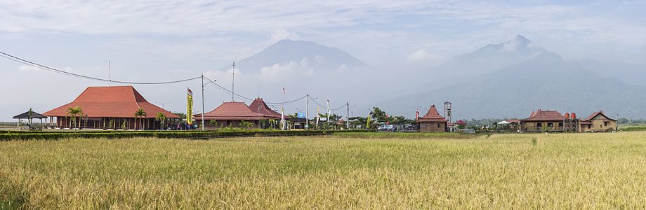 ALT – Panorama of the site itself, from the approaching road. Mounts Merbabu and Telomoyo are visible in the background.

.jpg)
- Reason
- Good resolution and attractive view of the dock and Lake Rawa Pening
- Articles in which this image appears
- Kampoeng Rawa; I might add this to Lake Rawa Pening too
- FP category for this image
- Wikipedia:Featured pictures/Places/Others, maybe?
- Creator
- Chris Woodrich
- Support as nominator – — Crisco 1492 (talk) 00:45, 8 July 2014 (UTC)
- If people prefer we can include File:Kampung Rawa, from a distance 2014-06-20 (02).jpg with this nomination. — Crisco 1492 (talk) 00:46, 8 July 2014 (UTC)
- Alt added, also support alt. — Crisco 1492 (talk) 07:27, 8 July 2014 (UTC)
- Comment I would be happy to support the splendid panorama you have on the page, but this doesn't seem to me to be especially encyclopaedic (what does it really add to our knowledge of Kampoeng Rawa?). Image not especially striking either for that matter, though of course technically it is very fine as all your images are. Coat of Many Colours (talk) 07:18, 8 July 2014 (UTC)
- I've added the alt. Aside from illustrating the dock itself, the first image illustrates how close the attraction is to Lake Rawa Pening (although Google's overhead view showed me exactly how shockingly close), which has been a point of contention (see the last two paragraphs in the article). — Crisco 1492 (talk) 07:27, 8 July 2014 (UTC)
- Support Alt - splendid panorama. Coat of Many Colours (talk) 11:42, 8 July 2014 (UTC)
- Oppose Original – Although it might be the best possible photo on that location, the composition of Original doesn't work for me. I'm undecided about ALT. What exactly are we looking at here? – Editør (talk) 09:44, 9 July 2014 (UTC)
- The Kampoeng Rawa site, which is spread out across multiple buildings in between rice fields and swamplands. — Crisco 1492 (talk) 09:53, 9 July 2014 (UTC)
- Firstly, I think the backdrop is beautiful. Secondly, are these, from left to right, the restaurant, crafts center, and pendopo? I couldn't figure out what the buildings on the right might be. Thirdly, wouldn't a photo such as [8] have much more encyclopedic value as an image of the kampung? – Editør (talk) 10:30, 9 July 2014 (UTC)
- That's the restaurant itself, viewed from much closer up. It's actually on the viewer's right side (you can see the front entrance from this angle). I'll label the buildings; I can tag them too if necessary. As for EV, I think a view of the site is better than just one or two buildings. — Crisco 1492 (talk) 10:55, 9 July 2014 (UTC)
- I've added information to the description page, as well as some notations. I have an image of the restaurant I can upload locally as well, but I prefer the dock image. — Crisco 1492 (talk) 11:01, 9 July 2014 (UTC)
- Thank you for the extra information. I've added an image caption to the article and the image's encyclopedic value is much clearer now. But the image doesn't obviously pass or fail WP:FP? #3 for Kampoeng Rawa, so I've decided to abstain from voting on ALT. – Editør (talk) 11:54, 9 July 2014 (UTC)
- Support - You're really having fun with photomerging. (Unless you have a wide angle lens) ///EuroCarGT 19:47, 9 July 2014 (UTC)
- Nope, no wide angle lens yet (the distortion would have given me away if I did). — Crisco 1492 (talk) 00:21, 10 July 2014 (UTC)
- Support ALT--Godot13 (talk) 04:21, 10 July 2014 (UTC)
- Support ALT- and I think that the garish colours to the right at original is the one that is causing the problems - the boat and the big sign - if one takes a paper and covers those, I think it is an excelent picture - otherwise. Hafspajen (talk) 20:45, 10 July 2014 (UTC)
- That's kinda how they paint their boats, however... I think it has something to do with attracting tourists with bright, happy colors. — Crisco 1492 (talk) 08:27, 11 July 2014 (UTC)
Promoted File:Kampung Rawa, from a distance 2014-06-20 (02).jpg --Armbrust The Homunculus 01:13, 18 July 2014 (UTC)
James Webb Space Telescope mirror acceptance testing
Voting period is over. Please don't add any new votes. Voting period ends on 19 Jul 2014 at 04:53:15 (UTC)

- Reason
- Striking image, good composition, good illustration for the JWST, Primary mirror and Acceptance testing articles
- Articles in which this image appears
- James Webb Space Telescope, Systems architect, and just added to primary mirror and acceptance testing
- FP category for this image
- Wikipedia:Featured pictures/Space/Understanding
- Creator
- NASA/MSFC/David Higginbotham
- Support as nominator – Pine✉ 04:53, 9 July 2014 (UTC)
- Comment - Really noisy, like ISO 3200 noisy. Otherwise great, but so noisy... — Crisco 1492 (talk) 07:36, 9 July 2014 (UTC)
- Support - Just voted for this over at FPC. No technical data on the file. I'm guessing it had to be taken in low or available light as those mirrors would have been blinding under lights? Coat of Many Colours (talk) 08:47, 9 July 2014 (UTC)
- Definitely in low-light conditions, but there are some tools that help reduce noise. — Crisco 1492 (talk) 09:41, 9 July 2014 (UTC)
- Tripods. Also I'd expect better than at at 3200ISO on a modern DSLR. Might have been taken with one of those expensive medium format hasselblads that NASA uses (they don't perform very well in low light).©Geni (talk) 16:18, 9 July 2014 (UTC)
- Interesting to know. — Crisco 1492 (talk) 00:39, 10 July 2014 (UTC)
- Tripods. Also I'd expect better than at at 3200ISO on a modern DSLR. Might have been taken with one of those expensive medium format hasselblads that NASA uses (they don't perform very well in low light).©Geni (talk) 16:18, 9 July 2014 (UTC)
- Definitely in low-light conditions, but there are some tools that help reduce noise. — Crisco 1492 (talk) 09:41, 9 July 2014 (UTC)
- Support Yann (talk) 11:09, 9 July 2014 (UTC)
- Support Good perspective. ///EuroCarGT 19:45, 9 July 2014 (UTC)
- Oppose per Crisco. Lovely picture. But the photos on Featured pictures are of really high quality - and this one is not quite there. Hafspajen (talk) 23:32, 10 July 2014 (UTC)
- Support Not impressed by the noise. - Blieusong (talk) 23:46, 13 July 2014 (UTC)
- Support Rreagan007 (talk) 16:23, 14 July 2014 (UTC)
- oppose Sorry but the noise particularly on the back of the man's overalls is just too bad.©Geni (talk) 19:32, 17 July 2014 (UTC)
Promoted File:James Webb Primary Mirror.jpg --Armbrust The Homunculus 04:54, 19 July 2014 (UTC)
Plum trees by Utagawa Hiroshige and Vincent van Gogh
Voting period is over. Please don't add any new votes. Voting period ends on 19 Jul 2014 at 09:07:06 (UTC)

Original 1 – The Plum Garden in Kameido (1857) by Hiroshige, from his One Hundred Famous Views of Edo, in the collection of the Rijksmuseum in Amsterdam

Original 2 – Flowering Plum Tree (after Hiroshige) (1887) by Vincent van Gogh, from his Japonaiserie, in the collection of the Van Gogh Museum in Amsterdam
- Reason
- Individually two quality images of art works by famous artists, having even more encyclopedic value when shown side by side.
- Articles in which this image appears
- Japonaiserie (Van Gogh) (both), Copies by Vincent van Gogh (both), Hiroshige (both), One Hundred Famous Views of Edo (Hiroshige image), Vincent van Gogh (Van Gogh image), Japonism (Van Gogh image), List of works by Vincent van Gogh (Van Gogh image), Almond Blossoms (Van Gogh image), Modern art (Van Gogh image)
- FP category for this image
- Artwork
- Creator
- Hiroshige and Vincent van Gogh (artists)
Rijksmuseum and Google Art Project (photographers)
Fæ and DcoetzeeBot (uploaders)
- Support as nominator – Editør (talk) 09:07, 9 July 2014 (UTC)
- Support - Useful as a set. — Crisco 1492 (talk) 09:38, 9 July 2014 (UTC)
- Support - the van Gogh was down when I went to Van Gogh Museum to check source image. This is a Google image, but often the museum has better quality available and that from VGM is superb. But they're very tight about their Zoomify images, bundling them into a viewer I'm not nerdy enough to penetrate. Hints appreciated. Coat of Many Colours (talk) 09:49, 9 July 2014 (UTC)
- Support Yann (talk) 11:10, 9 July 2014 (UTC)
- Support and actually add one of the more Japanese inspired van Gogh pictures above. Hafspajen (talk) 17:28, 9 July 2014 (UTC)
Promoted File:De pruimenboomgaard te Kameido-Rijksmuseum RP-P-1956-743.jpeg Armbrust The Homunculus 09:09, 19 July 2014 (UTC)
Promoted File:Vincent van Gogh - Bloeiende pruimenboomgaard- naar Hiroshige - Google Art Project.jpg Armbrust The Homunculus 09:09, 19 July 2014 (UTC)
SAI KZ IV
Voting period is over. Please don't add any new votes. Voting period ends on 19 Jul 2014 at 09:19:08 (UTC)

- Reason
- A unique aircraft restored to its wartime configuration with an interesting history taken in good light conditions with good timing while landing.
- Articles in which this image appears
- SAI KZ IV
- FP category for this image
- Wikipedia:Featured pictures/Vehicles/Air
- Creator
- Slaunger
- Support as nominator – Slaunger (talk) 09:19, 9 July 2014 (UTC)
- Comment Good EV, but it's a crop of an original which doesn't make the pixel count and indeed the definition isn't as high as I should like to see in a Featured Picture. Coat of Many Colours (talk) 09:56, 9 July 2014 (UTC)
- reply It is correct it has been cropped from an original 16 Mpixels down to a little over 7 Mpixels. Yet that is still well above the minimum file size. When photographing relatively fast moving object while panning, I tend to zoom out a bit as it can be hard to exactly frame the object as intended the moment things happens, and it is then easier to crop a bit afterwards. This aircraft only landed once, so it was the only chance I had. I think the less-than-optimal resolution is compensated by excellent light. I admit though, that my gear was miserable compared to the gear used by the pro aviation photographers at the same event:-) --Slaunger (talk) 10:53, 9 July 2014 (UTC)
- Ah yes, I beg your pardon. I missed the note about the original file size in the original image. Happy to support now below. Coat of Many Colours (talk) 16:51, 9 July 2014 (UTC)
- Support per above remarks. Nice image. Coat of Many Colours (talk) 16:49, 9 July 2014 (UTC)
- Support - As good EV as we could expect for a plane like this. Technical quality is good too. — Crisco 1492 (talk) 08:35, 10 July 2014 (UTC)
- Support Adam Cuerden (talk) 22:14, 10 July 2014 (UTC)
- Support Good EV--Godot13 (talk) 15:33, 11 July 2014 (UTC)
- Support Good EV - talk→ WPPilot 00:26, 16 July 2014 (UTC)
Promoted File:OY-DIZ SAI KZ IV landing Danish Air Show 2014-06-23.jpg --Armbrust The Homunculus 09:25, 19 July 2014 (UTC)
Almond blossom
Voting period is over. Please don't add any new votes. Voting period ends on 19 Jul 2014 at 17:33:47 (UTC)

- Reason
- From the National Gallery of Art's "Effects of the Sun in Provence (citation):
"It was sun that Van Gogh sought in Provence, a brilliance and light that would wash out detail and simplify forms,
reducing the world around him to the sort of pattern he admired in Japanese woodblocks.[1]
- ^ "Effects of the Sun in Provence" (PDF). National Gallery of Art Picturing France (1830—1900). Washington, D.C.: National Gallery of Art. p. 12.
- Articles in which this image appears
- Almond Blossoms, Vincent van Gogh, Van Gogh Museum, List of works by Vincent van Gogh, Van Gogh's family in his art
- FP category for this image
- Wikipedia:Featured pictures/Artwork/Paintings
- Creator
- Vincent van Gogh

- Support as nominator – (and Crisco trimmed image) Hafspajen (talk) 17:33, 9 July 2014 (UTC)
- Support This is an example where the image on the museum site is richer than the version supplied to Google Art Project, but as I mention below I can't get at it myself. Perhaps someone else knows how and can overwrite the file with the museum version. Coat of Many Colours (talk) 18:45, 9 July 2014 (UTC)
- Done. Coat of Many Colours (talk) 08:45, 13 July 2014 (UTC)
- ON reflection, I've reverted to original and I'll upload the tiled version as a separate file since it's not strictly speaking a Google Art project image. Coat of Many Colours (talk) 18:24, 13 July 2014 (UTC)
- Done. Coat of Many Colours (talk) 08:45, 13 July 2014 (UTC)
- Comment Video. Almond blossom, Hafspajen (talk) 19:06, 9 July 2014 (UTC)
- Seriously? You've got me worried. Coat of Many Colours (talk) 08:40, 10 July 2014 (UTC)
- Not paint but... what, exactly? Plastic? — Crisco 1492 (talk) 08:46, 10 July 2014 (UTC)
- Plastic?? Do you mean the very thick paint when the light reflects on it? That was van Gogs style. He always did that. He used up twice as much paint than the others, took thick brushes and lots and lots of paint on it, so it is like you can clearly see how the brush touched the canvas. Kind of nice too. If you observe the Sunflowers, same there. He painted in a wild, energetic and spontaneous way... Hafspajen (talk) 02:49, 11 July 2014 (UTC)
- In the video, he says that the reproduction they were showing was not paint (although it looked like it)... so what was it? That's an interesting video. — Crisco 1492 (talk) 08:05, 11 July 2014 (UTC)
- Hm, well, you got me on that. I don't know why he said that, the Dutch curator at the museum, and it is not explained. The only thing I can come up with that he possibly (?) meant that van Gogh didn't always bought his paints in a tube or painted out of a tube - but made sometimes his own colors. He grounded the pigment and prepared it himself - but this doesn't sounds like a very good explanation. Hafspajen (talk) 11:54, 11 July 2014 (UTC)
- Not quite sure what the nuances of this discussion are, but it's just a Giclée print whose characteristic is it's fidelity to the original (but it 2-D and not relief - one day that will happen of course). Point of my response was that the thought suddenly occurred to me that VGM in fact displays it Giclée reproductions on its pages. That's really quite possible. I'm not aware that van Gogh ground his own pigment. Van Gogh's method of working very much flavour of the month in van Gogh circles. I have Marije Vellekoop's recent Van Gogh at Work and there's no mention there. Perhaps he did for a while during one of his experimental phases, but certainly not as a regular practice. He was constantly asking his brother to order (and pay for) colours for him. I'm the sort of photographer who takes photos of other people looking at paintings BTW. Coat of Many Colours (talk) 22:44, 11 July 2014 (UTC)
- Yes, that brother of him who never sold his pictures or made any advertisment for them. One should never trust only one manager. Sometimes he did, if I remember that right (reading his letters), but I said that it was not a very convincing explanation. The - Dutch curator just stops in the middle of the sentence so the rest is cut of. He could have said something more afterwards that put that in a context. Anyway, paint in tube is a fairly new invention- and most painers did made their own paint - in the history of painting... Hafspajen (talk) 23:39, 11 July 2014 (UTC)
- The entire family an epic tragedy. Vincent a suicide, his brother Theo dead from neurosyphilis six months later, the remaining brother also a suicide, their younger sister Wil, an early feminist, sectioned 1902 and lingering on for some 40 years entirely unresponsive to her surroundings, and the other sister tormented by an illicit affair in her youth which saw her only child put out for adoption. That's what I call dysfunctional. Coat of Many Colours (talk) 00:06, 12 July 2014 (UTC)
- It is a terrible loss. He was still so young, only 37... A very sad story. Hafspajen (talk) 00:16, 12 July 2014 (UTC)
- Stop press. New van Gogh discovered in cafe in Reading, UK (VGM unimpressed) — Preceding unsigned comment added by Coat of Many Colours (talk • contribs) .
- Seriously? You've got me worried. Coat of Many Colours (talk) 08:40, 10 July 2014 (UTC)
- The image could be made from the files named
4-x-x.jpgin this folder. – Editør (talk) 10:40, 10 July 2014 (UTC)- Did they seriously leave that folder open to the public? There's a plug-in for Gimp which allows people to put this together easily. — Crisco 1492 (talk) 10:42, 10 July 2014 (UTC)
- All files used for the zoom function are in open folders. – Editør (talk) 10:51, 10 July 2014 (UTC)
- Many thanks for that. I'll try and put together their Potato Eaters if I can Coat of Many Colours (talk) 22:44, 11 July 2014 (UTC)
- Got the tiles. It's a straight forward 14 x 10 mosaic (at level 4). Ill stitch them with Mathematica, but it will involve some string manipulations opening files I don't normally do, so it will be a day or two I expect while I clue up on that. Should be 3586x2517 pixels and I'll overwrite Commons:File:Van-willem-vincent-gogh-die-kartoffelesser-03850.jpg with it, but I can tell you right now someone will come along and lighten it to their satisfaction. Still I'll have done my best. Thanks very much for pointing me to the folders. Coat of Many Colours (talk) 00:06, 12 July 2014 (UTC)
- @Editør: Done at Commons:File:Van-willem-vincent-gogh-die-kartoffelesser-03850.jpg: I've included the code in the File Description for other Mathematica users who might like to upload other images. I'll see if the VGM has a better version of Starry Night and maybe upload others. I'll do this one as well. Thanks for the heads up on the folders.Coat of Many Colours (talk) 19:29, 12 July 2014 (UTC)
- Nice! – Editør (talk) 10:14, 13 July 2014 (UTC)
- It seems wise to check all versions on Commons first, because the image of Skull of a Skeleton with Burning Cigarette on the Van Gogh Museum website is not better than the one in the article. – Editør (talk) 10:35, 13 July 2014 (UTC)
- Yes, that right. Starry Night (which is is in any case at MoMA) is represented on Commons by a massive 200 Mb something file. But I'll probably stitch and upload the much lower, but still high, resolution VGM offers to a separate file, Coat of Many Colours (talk) 10:56, 13 July 2014 (UTC)
- @Editør: Done at Commons:File:Van-willem-vincent-gogh-die-kartoffelesser-03850.jpg: I've included the code in the File Description for other Mathematica users who might like to upload other images. I'll see if the VGM has a better version of Starry Night and maybe upload others. I'll do this one as well. Thanks for the heads up on the folders.Coat of Many Colours (talk) 19:29, 12 July 2014 (UTC)
- Got the tiles. It's a straight forward 14 x 10 mosaic (at level 4). Ill stitch them with Mathematica, but it will involve some string manipulations opening files I don't normally do, so it will be a day or two I expect while I clue up on that. Should be 3586x2517 pixels and I'll overwrite Commons:File:Van-willem-vincent-gogh-die-kartoffelesser-03850.jpg with it, but I can tell you right now someone will come along and lighten it to their satisfaction. Still I'll have done my best. Thanks very much for pointing me to the folders. Coat of Many Colours (talk) 00:06, 12 July 2014 (UTC)
- Many thanks for that. I'll try and put together their Potato Eaters if I can Coat of Many Colours (talk) 22:44, 11 July 2014 (UTC)
- All files used for the zoom function are in open folders. – Editør (talk) 10:51, 10 July 2014 (UTC)
- Support Lol at the no idea thumbnail. ///EuroCarGT 19:43, 9 July 2014 (UTC)
- Support Yann (talk) 19:50, 9 July 2014 (UTC)
- Comment. Looks like it needs a crop. Kaldari (talk) 22:12, 9 July 2014 (UTC)
- Do you mean the ~3 black pixels on the right and bottom? — Crisco 1492 (talk) 00:37, 10 July 2014 (UTC)
- There are thin lines visible at the bottom and on the right. – Editør (talk) 10:41, 10 July 2014 (UTC)
- That's exactly what I meant. Does he mean this, or is there a more serious issue that I can't see? — Crisco 1492 (talk) 12:08, 10 July 2014 (UTC)
- I imagine it can be cropped. Hafspajen (talk) 18:16, 10 July 2014 (UTC)
- Alright, trimmed. They were one pixel thick. — Crisco 1492 (talk) 00:25, 11 July 2014 (UTC)
- There are thin lines visible at the bottom and on the right. – Editør (talk) 10:41, 10 July 2014 (UTC)
- Support – Editør (talk) 08:02, 11 July 2014 (UTC)
- Support. A brilliant reproduction of a stunning painting. I feel Commons:Template:Artwork would be a helpful addition. J Milburn (talk) 10:19, 11 July 2014 (UTC)
- Done. Coat of Many Colours (talk) 01:22, 15 July 2014 (UTC)
Promoted File:Vincent van Gogh - Almond blossom - Google Art Project.jpg --Armbrust The Homunculus 17:40, 19 July 2014 (UTC)
National Bank Notes (Original/1875) set
Voting period is over. Please don't add any new votes. Voting period ends on 19 Jul 2014 at 23:26:17 (UTC)
- Reason
- High quality, high EV (presented as a set). A complete denomination set of the first series of National Bank Notes. The design features both allegorical and historical vignettes, and engravings reproducing 7 of 8 paintings hanging in the Capitol Rotunda. The motivation for the Treasury Department's design selection was two-fold: educationally it would circulate images depicting important scenes from American history while at the same time enhancing the security of the note by involving highly complex engravings. There are three $500 notes known (two in government collections, one held privately), and the $1,000 note is unknown in issued form.
Each National Bank Note is signed (the present early examples by hand, but later often by rubber stamp) by the President (or Vice President) and Cashier (or Assistant Cashier) of the bank. The bank officers who signed the notes below include: one mining tycoon, two lawyers (one of which was a State senator, the other a State Supreme Court judge and law school Dean), 3 doctors (one a Civil War colonel, the other survived the Battle of Little Bighorn), and one Civil War general (see the primary article for links). - Original
- A 9-note complete denomination type set of first issue National Bank Notes
- Articles in which this image appears
- Art and engraving on United States banknotes, National Bank Note
- FP category for this image
- Currency
- Creator
- American, Continental, and National Bank Note Companies under contract to the Bureau of Engraving and Printing
The $500 and $1,000 are from the National Numismatic Collection, NMAH, Smithsonian Institution.
Images by Godot13.
Denomination type set of first issue National Bank Notes
-

$1 Original Series
First National Bank
Lebanon, Indiana -

$2 Series 1875
First National Bank
Emporia, Kansas -
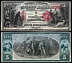
$5 Series 1875
Vineland National Bank
Vineland, New Jersey -
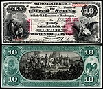
$10 Series 1875
First National Bank
Bismarck, North Dakota


-
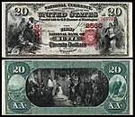
$20 Series 1875
First National Bank
Butte, Montana -
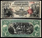
$50 Series 1875
First National Bank
Cleveland, Ohio -
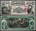
$100 Original Series
Raleigh National Bank
Raleigh, North Carolina


-
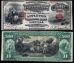
$500 Original Series
Appleton National Bank
Lowell, Massachusetts -
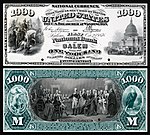
$1,000 Series 1875 (proof)
First National Bank
Salem, Massachusetts

.jpg)
- Support as nominator – Godot13 (talk) 23:26, 9 July 2014 (UTC)
- Support - Beautiful. Coat of Many Colours (talk) 00:41, 10 July 2014 (UTC)
- Support - More beautiful scans. — Crisco 1492 (talk) 05:07, 10 July 2014 (UTC)
- Support Interesting themes. Brandmeistertalk 08:53, 10 July 2014 (UTC)
- Support — Historically and aesthetically interesting. Sca (talk) 14:23, 10 July 2014 (UTC)
Promoted File:US-NBN-IL-Lebanon-2057-Orig-1-400-C.jpg --Armbrust The Homunculus 23:42, 19 July 2014 (UTC)
Promoted File:US-NBN-KS-Emporia-1915-1875-2-1915-A.jpg --Armbrust The Homunculus 23:42, 19 July 2014 (UTC)
Promoted File:US-NBN-NJ-Vineland-2399-1875-5-2518-D.jpg --Armbrust The Homunculus 23:42, 19 July 2014 (UTC)
Promoted File:US-NBN-ND-Bismarck-2434-1875-10-2238-C.jpg --Armbrust The Homunculus 23:42, 19 July 2014 (UTC)
Promoted File:US-NBN-MT-Butte-2566-1875-20-4943-A.jpg --Armbrust The Homunculus 23:42, 19 July 2014 (UTC)
Promoted File:US-NBN-OH-Cleveland-7-1875-50-1711-A.jpg --Armbrust The Homunculus 23:42, 19 July 2014 (UTC)
Promoted File:US-NBN-NC-Raleigh-1557-Orig-100-761-A.jpg --Armbrust The Homunculus 23:42, 19 July 2014 (UTC)
Promoted File:US-NBN-MA-Lowell-986-Orig-500-206-A.jpg --Armbrust The Homunculus 23:42, 19 July 2014 (UTC)
Promoted File:US-$1000-NBN-1875-Fr-465 (Proof).jpg --Armbrust The Homunculus 23:42, 19 July 2014 (UTC)
Nusfjord Road
Voting period is over. Please don't add any new votes. Voting period ends on 20 Jul 2014 at 02:18:11 (UTC)

- Reason
- Nice looking image
- Articles in which this image appears
- Flakstadøya, Scandinavian coastal conifer forests
- FP category for this image
- Wikipedia:Featured pictures/Places/Landscapes
- Creator
- Ximonic
- Support as nominator – ///EuroCarGT 02:18, 10 July 2014 (UTC)
- Support - Beautiful. Coat of Many Colours (talk) 08:26, 10 July 2014 (UTC)
- This is something else, alright. I just don't see the EV though. It's in a gallery on the article on the island, and though it's the lead image in the article on the forests, the focus isn't actually on the forests. — Crisco 1492 (talk) 08:34, 10 July 2014 (UTC)
- Comment — Gorgeous, fresh yet ethereal. Love it. But Crisco has a point re EV ... ?? Sca (talk) 14:18, 10 July 2014 (UTC)
- Support a very atmospheric image. --Alchemist-hp (talk) 22:48, 11 July 2014 (UTC)
- Comment. I agree with Crisco about EV, and in addition to that, I sometimes find that exceptional atmospheric conditions like the sunset/sunrise through the mist end up misleading the viewer a little, or at the least distract. Although it's more difficult to give the image 'wow', regular conditions are more representative of what the region is actually like. Ðiliff «» (Talk) 09:10, 13 July 2014 (UTC)
- Comment. This is a pretty good image of Lofoten, when it rains, because - well, the conditions are different there. The sun never goes down in summer. It is pretty weird. It stays light all the time, it is never dark. I remember two o'clock in the night it was as light as in midday in June. It was never dark, one had to look at the watch to realize that it is midnight, because it is just slighly dawn-ish, nothing more. Later in the autumn, it is the reverse, than it is dark instead, it never gets light, it is this kind of darkish light most part of the day, it will never be real sunshine, just this darkish weird light. And both dawn and sunset is going on for a long time, sort of half darkish weird light, for hours. You can check here Civil twilight, at Duration. (Lofoten is above Trondheim). So I would say it is quite regular and representative conditions for Lofoten. Hafspajen (talk) 10:55, 13 July 2014 (UTC)
- Support by the way. Hafspajen (talk) 05:02, 14 July 2014 (UTC)
- Support per Hafspajen. Adam Cuerden (talk) 01:44, 18 July 2014 (UTC)
Promoted File:Nusfjord road, 2010 09.jpg --Armbrust The Homunculus 03:27, 20 July 2014 (UTC)
- Placed it in Places/Panorama. Armbrust The Homunculus 03:27, 20 July 2014 (UTC)
Chequered Skipper
Voting period is over. Please don't add any new votes. Voting period ends on 20 Jul 2014 at 08:39:26 (UTC)
.jpg)
- Reason
- High quality and attractive. The animal really stands out against the background.
- Articles in which this image appears
- Chequered Skipper
- FP category for this image
- Wikipedia:Featured pictures/Animals/Insects
- Creator
- Haeferl
- Support as nominator – — Crisco 1492 (talk) 08:39, 10 July 2014 (UTC)
- Support — Cuz I like the name. And the colors. (It's a large file, could be cropped a bit tighter.) Sca (talk) 14:08, 10 July 2014 (UTC)
- Support Excellent definition. Shouldn't want it cropped myself. Coat of Many Colours (talk) 14:12, 10 July 2014 (UTC)
- Support - per Coat - and also Sca. It is a delicate, lovely picture and it is so sharp, you can count each little hair on the butterflys back. (cropped or not) Hafspajen (talk) 17:46, 10 July 2014 (UTC)
- Weak support. It'd be worth keeping an eye on the article, as it's a little over-illustrated. Also, it be good if the subject could be sexed, but as males and females are apparently pretty similar, it's not essential. Beautifully composed photo! J Milburn (talk) 10:06, 11 July 2014 (UTC)
- Support--Godot13 (talk) 16:17, 12 July 2014 (UTC)
- Comment - I would prefer a tighter crop. Kaldari (talk) 20:01, 18 July 2014 (UTC)
Promoted File:Laab im Walde - Bärenberg - Gelbwürfeliger Dickkopffalter (Carterocephalus palaemon).jpg --Armbrust The Homunculus 08:40, 20 July 2014 (UTC)
Le Moulin de la Galette
Voting period is over. Please don't add any new votes. Voting period ends on 30 Jul 2014 at 20:30:06 (UTC)


- Reason
- The picture is one of Impressionism's most celebrated masterpieces. The Impressionist approach to painting is usually identified with a strong concern for light in its changing qualities, often with an emphasis on the effects of a particular passage of time.
- Articles in which this image appears
- Bal du moulin de la Galette; Pierre-Auguste Renoir;
Music in Paris; Moulin de la Galette; + 9
- FP category for this image
- Wikipedia:Featured pictures/Artwork/Paintings
- Creator
- Pierre-Auguste Renoir
- Support as nominator – Hafspajen (talk) 20:30, 20 July 2014 (UTC)
- Support – Fabulous painting! CorinneSD (talk) 21:17, 20 July 2014 (UTC)
- Comment - This is not the image at Musee D'Orsay as the file claims. Coat of Many Colours (talk) 23:02, 20 July 2014 (UTC)
- Support Almost thought the guy sitting on the chair and the girl in front of him were fist fighting. Anyways nice image. ///EuroCarGT 04:21, 21 July 2014 (UTC)
- Oppose - Good painting, but I'm not sure the resolution fits the size. I mean, it's more than a meter on each side! Not as bad as that recent humongous painting, but still not quite that much resolution. — Crisco 1492 (talk) 11:14, 21 July 2014 (UTC)
- Oppose Alt - I am sorry, but I am pretty sure that the colours are all wrong in Alt 1. It is not how this picture looks at all... because it looks like here and here. Alt2 has right colours but even less pixels then original, original has 2,200 × 1,639 while Alt 2 has only 1,740 × 1,293 pixels. I don't mind an alt, but it has to have the right colours. Hafspajen (talk) 15:47, 21 July 2014 (UTC)
- Support Alt - per Crisco above and noting the original is effectively unsourced. That appears to be a derivative version of the museum version. I dare say it is to be found on VintPrint . Coat of Many Colours (talk) 11:29, 21 July 2014 (UTC)
- To be fair they actually do offer the unvarnished (whatever) version of the Google image. Take it all back, Vint. Sorry. Coat of Many Colours (talk) 15:01, 21 July 2014 (UTC)
.jpg)
- I've uploaded a lighter version of this (reduced to 2.25 MP) in LCH space. Coat of Many Colours (talk) 12:53, 21 July 2014 (UTC)
- Needless to say I oppose Alt2 (my own file) as WP:FP?#8 inauthentic. Nominating for "Featured" wasn't the point of the upload. It was uploaded into a category Commons:Category:Derivative works of Bal du moulin de la Galette by Renoir and it's full name is File:Auguste Renoir - Dance at Le Moulin de la Galette - Musée d'Orsay RF 2739 (derivative work - AutoContrast edit in LCH space).jpg. I'm tolerably curious about the dark colour of the original. I must have visited the d'Orsay dozens of times, but one can't remember everything. I wonder if that greenish look is supposed to represent gas-light? I mean I just don't know. I'll research as I am able and report back. The point about these uploads of LCH edited versions is to provide thumbnails per DCoetzee's remarks elsewhere and I made the relevant WP:BOLD edit here. I'll see how that is received and might then start routinely doing these. I do agree there is a problem here, but for the life of me I really can't see how we can put these tinkered versions up for "featuring". Coat of Many Colours (talk) 17:02, 21 July 2014 (UTC)
- This gets you into the Musée d'Orsay at Ph.D. level in Google's virtual tour. It's in room 32, fifth floor, two rooms to the left of this location. I must say it looks absolutely stunning under the lights (there's also an overhead vault letting in daylight). That remark of mine about gaslights obviously stupid. It seems the naughty French of those days held their dances in the afternoon. It seems plain that the Google Art Project image simply looks too dark, but that image is uniform across all the Musée d'Orsay pages featuring this painting that I've seen. I'm really not prepared to mess with it as a "Featured" nomination. Others may feel differently, but please don't vote for my tinkered version! And I'm sticking with the Google Art Project image, although I do agree there's an issue there. Coat of Many Colours (talk) 17:52, 21 July 2014 (UTC)
Not Promoted --Armbrust The Homunculus 07:01, 22 July 2014 (UTC)
- Withdrawn nomination, Armbrust The Homunculus 07:01, 22 July 2014 (UTC)
File:Bath, Somerset Panorama - April 2011.jpg
Voting period is over. Please don't add any new votes. Voting period ends on 22 Jul 2014 at 22:06:46 (UTC)

- Reason
- It's a good view of an very easy on the eye city, Bath, England. There's plenty of detail and sharpness.
- Articles in which this image appears
- Bath, Somerset and List of cities in the United Kingdom
- FP category for this image
- Wikipedia:Featured pictures/Places/Urban
- Creator
- User:Diliff
- Support as nominator – Ðiliff «» (Talk) 22:06, 12 July 2014 (UTC)
- Support - I'll be honest and say that the framing of the city between two trees/bushes almost threw me off this (the conjunction of the plants and the curved rail line gave me the impression of a wide-angle lens), but after seeing the full resolution version, I am quite pleased with what we have. Shame about the cut-off church at the bottom, but it appears that you could not have gotten the whole building in-frame because of the plant growth. (Unrelated note: the 100mm 2.8/f lens makes for some pretty nice panoramas, doesn't it? I've found the same for me too) — Crisco 1492 (talk) 15:17, 13 July 2014 (UTC)
- Yeah, the 100mm f/2.8 macro lens is very sharp. Most decent quality prime lenses will easily outperform even the most expensive zoom lenses though. As for the framing, I did consider cropping it a little tighter on the left side (and may still do so if people think it's better) but to really eliminate the bushes, it would need to be much tighter still and you'd lose too much of the city. It's not possible to get a better view from this hill without a really big ladder or a helicopter. :-) Ðiliff «» (Talk) 16:16, 13 July 2014 (UTC)
- Comment It's a nice view, but it looks a bit washed out and bright. I'd do something on the upper part with a gradient filter to make up for the harsh light. I just played with it at home and it renders quite fine IMO, but in any way, it's better you do it from raw material. As a side note, doing so revealed some strange seams which I attribute to blending process. Inconsistencies between exposures perhaps ? - Blieusong (talk) 16:57, 13 July 2014 (UTC)
- If I recall correctly, Lightroom's adjustment brush/gradient includes the Clarity control, which has a strange ability to cut through haze. It might be selectively applied to bring out the weaker areas without overdoing the stronger ones. -- Colin°Talk 11:48, 15 July 2014 (UTC)
- True. I'll give it a go. I knew already that there was a bit of haze (if you look at the version history, you'll see this version is already an improvement!). I'm loathe to go back to the original raw files as it was taken with my old 5D Mk i and it didn't have an ultrasonic dust shaker on the sensor and it was very prone to collecting spots... each of the 21 segments has about 40 dust spots. Argh! Oh well, I'll go back and give it one more processing run and see if I can improve on the haze and washed out look. Ðiliff «» (Talk) 12:00, 15 July 2014 (UTC)
- For the curious... :-) Here's an example frame, enhanced for detail. Ðiliff «» (Talk) 12:04, 15 July 2014 (UTC)
- That is absolutely horrifying. — Crisco 1492 (talk) 05:44, 17 July 2014 (UTC)
- For the curious... :-) Here's an example frame, enhanced for detail. Ðiliff «» (Talk) 12:04, 15 July 2014 (UTC)
- True. I'll give it a go. I knew already that there was a bit of haze (if you look at the version history, you'll see this version is already an improvement!). I'm loathe to go back to the original raw files as it was taken with my old 5D Mk i and it didn't have an ultrasonic dust shaker on the sensor and it was very prone to collecting spots... each of the 21 segments has about 40 dust spots. Argh! Oh well, I'll go back and give it one more processing run and see if I can improve on the haze and washed out look. Ðiliff «» (Talk) 12:00, 15 July 2014 (UTC)
- If I recall correctly, Lightroom's adjustment brush/gradient includes the Clarity control, which has a strange ability to cut through haze. It might be selectively applied to bring out the weaker areas without overdoing the stronger ones. -- Colin°Talk 11:48, 15 July 2014 (UTC)
- Comment. OK, as per above feedback, I've reprocessed the image to achieve less haze and a bit more contrast. I've also cropped the left side to remove the trees, and slightly on the right too. I actually prefer this framing now, although it is a little tighter. Crisco, I've also managed to recover a bit more of the church as a result. Ðiliff «» (Talk) 12:32, 15 July 2014 (UTC)
- Support Lots of detail and high EV. Reminds me of my own trip to Bath years ago, when I took lots of photos and then discovered the film wasn't winding on properly in the camera. -- Colin°Talk 07:22, 17 July 2014 (UTC)
- Support I'd have increased the contrast even further on the top part, but I think it's fine. I believe I still see seams (I sometimes have same issue) Moving ur head away from screen might help to see. If not, let me know and I'll go to the ophthalmologist. - Blieusong (talk) 22:29, 17 July 2014 (UTC)
- Support Lovely, though it might be a smidgen saturated. Adam Cuerden (talk) 14:15, 18 July 2014 (UTC)
- I think that's possibly due to the boosting of contrast, I didn't adjust the saturation at all. Ðiliff «» (Talk) 12:44, 19 July 2014 (UTC)
- I've found that contrast adjustments tend to up apparent saturation. It's because, in RGB colour space, stretching things along a dark-light axis also stretches out the differences between the R, G, and B channels For example, R:30, G:37, B,52 ([30,37,52] if the colours are stretched so that [[0,0,0], [127,127,127]] is stretched to [[0,0,0], [255,255,255]] will become [60,74,104]. Saturation is roughly equivalent to the differences between R, G, and B, so that's a much more saturated colour. Adam Cuerden (talk) 17:07, 20 July 2014 (UTC)
- The adjustment controls in Lightroom and Camera Raw aren't simply altering the RGB values. I recommend "The Digital Negative" by Jeff Schewe for details (the book is mainly aimed at those using Adobe raw software). Lightroom manipulates all images in a 32-bit floating-point HDR space (vs 8-bit integer of JPG or 12-14 bit raw), which is why it natively supports the 32-bit HDR output of Photoshop's "Merge to HDR". The "Basic Panel" sliders are tone-mapping controls rather than simple levels controls, and their behaviour is designed to produce pleasing results (esp at extremes) rather than linear mathematical adjustment. Schewe says "Beware that in Lightroom and Camera Raw, increasing the contrast does increase the saturation of the image, while reducing contrast reduces saturation... Why is saturation connected to contrast? It really goes back to analog film. Thomas Knoll felt that altering contrast should alter saturation because that's the expected result when pushing or pulling film developmnet. It would be argued that it's not needed in digital, but then you would have to argue with Thomas... Personally, I don't have a problem with saturation changing with contrast changes." -- Colin°Talk 07:01, 21 July 2014 (UTC)
- I've found that contrast adjustments tend to up apparent saturation. It's because, in RGB colour space, stretching things along a dark-light axis also stretches out the differences between the R, G, and B channels For example, R:30, G:37, B,52 ([30,37,52] if the colours are stretched so that [[0,0,0], [127,127,127]] is stretched to [[0,0,0], [255,255,255]] will become [60,74,104]. Saturation is roughly equivalent to the differences between R, G, and B, so that's a much more saturated colour. Adam Cuerden (talk) 17:07, 20 July 2014 (UTC)
- I think that's possibly due to the boosting of contrast, I didn't adjust the saturation at all. Ðiliff «» (Talk) 12:44, 19 July 2014 (UTC)
Promoted File:Bath, Somerset Panorama - April 2011.jpg --Armbrust The Homunculus 22:07, 22 July 2014 (UTC)
- Added it to Places/Panorama. Armbrust The Homunculus 22:07, 22 July 2014 (UTC)
Skull with cigarette by Vincent van Gogh
Voting period is over. Please don't add any new votes. Voting period ends on 23 Jul 2014 at 11:38:09 (UTC)

- Reason
- Highly detailed image of this striking painting by Vincent van Gogh.
- Articles in which this image appears
- Skull of a Skeleton with Burning Cigarette, Vincent van Gogh, List of works by Vincent van Gogh
- FP category for this image
- Artwork
- Creator
- Vincent van Gogh (painting)
Google Art Project (photo)
DcoetzeeBot (upload)
- Support as nominator – Editør (talk) 11:38, 13 July 2014 (UTC)
- Support -- Coat of Many Colours (talk) 13:32, 13 July 2014 (UTC)
- Support - Good scan of a notable painting. Although it seems some of it is wearing off... canvas is very obvious at the edges. — Crisco 1492 (talk) 15:02, 13 July 2014 (UTC)
- Support. Not a very large painting; seems like an excellent reproduction. J Milburn (talk) 18:16, 13 July 2014 (UTC)
- Support - such an amazingly unique image...smoking has its price; 100 years ahead of its time...Modernist (talk) 19:23, 13 July 2014 (UTC)

- Comment. It is not ahead of its time or unique at all. All painters have painted one or two or several pictures or paintings like this. It is part of the regular artist's education. Studies like this were used by artists to understand the problems involved in execution of the artists subjects - such as the human body. Studies like this can be traced back as long ago as the Italian Renaissance, for example Leonardo da Vinci's and Michelangelo's studies. Anatomical studies of the human body started with the physician Andreas Vesalius work of anatomical studies (except for Leonardo and such) to De humani corporis fabrica (On the fabric of the human body), published 1543, and it was a pioneering work of human anatomy illustrated by Titian's pupil Jan Stephen van Calcar, promoting the "anatomical" view of the body, seeing human internal functioning as an essentially corporeal structure filled with organs arranged in three-dimensional space. Standard depiction, part of any serious artis's education. (with the exception of those who walk around naked and call that art). One can find this kind of depictions hundreds of them - at any serious art school, probably better done then this one...Hafspajen (talk) 21:14, 15 July 2014 (UTC)
- Yes, he was indeed at art school at the time in Antwerp. But there was more to it than that. His health had collapsed. He might well have been receiving treatment for syphilis. His teeth were literally falling out as a result and he was looking for excuses. Naifeh and Smith actually go so far as to describe it as his first self-portrait (p 489 n 419)! Coat of Many Colours (talk) 23:00, 15 July 2014 (UTC)
- That is when people go too far when it is about a great artist. Hafspajen (talk) 23:03, 15 July 2014 (UTC)
- JH980 to JH1018 are his Antwerp studies, mostly nudes. They're not very good. Hulsker calls them "ungainly". I can't find any Commons examples , but JH1004 is typical. This is his hanging skeleton and cat (F1361 JH998). I'll put a note in the file description about these studies, but I can't be bothered to upload examples. Coat of Many Colours (talk) 08:08, 16 July 2014 (UTC)
- Maybe there is a misunderstanding here. Modernist and Sca saw in this painting a warning about the health risks of smoking, which they considered ahead of Van Gogh's time. I don't think anyone was saying that painting skulls in itself is unique. – Editør (talk) 10:18, 16 July 2014 (UTC)
- Indeed! My comment is simply about the dangers of smoking...Modernist (talk) 20:58, 16 July 2014 (UTC)
- Yes, indeed. Van Gogh was certainly aware of the dangers that smoking posed his health. I've made a separate file of the Van Gogh Museum image Commons:File:Vincent van Gogh - Head of a Skeleton with a Burning Cigarette - VGM F212.jpg and added some notes, cross-linking the two files. Coat of Many Colours (talk) 01:45, 17 July 2014 (UTC)

- If it is so that he meant "Smoking is dangerous" - well, then he was indeed ahead of Van Gogh's time. But how does this explain all those selfportraits with pipes and so on. I think that it simply an ateljé-studio-joke. All those skeletons just inspire for this kind of jokes. Our studio skeleton had a tophat, baskers, a pink hat with roses, neckties, bow ties, a red rose between the teeth, was dressed up as Socrates and even had a kilt at some moment - in his spare time, when not need for drawings. Hafspajen (talk) 04:16, 17 July 2014 (UTC)
- Ah, just read the in the article: Skull of a Skeleton with Burning Cigarette - is an undated painting by Vincent van Gogh, part of the permanent collection of the Van Gogh Museum in Amsterdam.ef name="vgmnl">((cite web| url= http://www.vangoghmuseum.nl/vgm/index.jsp?page=1628&collection=619&lang=en |title=Skull of a Skeleton with Burning Cigarette, 1886| publisher= Van Gogh Museum| accessdate=2013-05-19| quote= This curious and somewhat macabre little painting is undated. It was probably executed in the winter of 1885–86, during Van Gogh’s stay in Antwerp....This skull with a cigarette was likely meant as a kind of joke, and probably also as a comment on conservative academic practice./ref It was probably painted in the winter of 1885–86 as a humorous comment on conservative academic practices,ef name="vgmnl"/> an assumption based on the fact that Van Gogh was in Antwerp at that time, attending classes at the Royal Academy of Fine Arts, classes he would later say were boring and taught him nothing.f name="Bundrick"/>.
So, it does sound like a studio-joke alright, and probably a comment on how stupid those conservative academic practices were. Hafspajen (talk) 04:25, 17 July 2014 (UTC)
- Nevertheless he certainly knew smoking was bad for his health. I included a couple of quotes from his Letters in the file description I provided. That doesn't make him "ahead of his time" of course, as it had long been a commonplace that smoking was very bad for your health. Nevertheless, imaging it like this very well might have been a first. Coat of Many Colours (talk) 10:44, 17 July 2014 (UTC)
- Comment — Alas, one is not an art historian. Having scanned for foregoing 1,000-word discussion, one perceives the atelier-joke nature of this work, which indeed is neither up to the artist's later standards nor predictive of late-20th century medical developments. Sca (talk) 14:17, 19 July 2014 (UTC)
- As you know, an image doesn't need to be aesthetically pleasing to be featured. Also, the perception of the painting as a health warning or as an atelier-joke are only speculation. Would you please elaborate on the criteria the image is failing in your opinion? – Editør (talk) 15:22, 19 July 2014 (UTC)
Promoted File:Vincent van Gogh - Head of a skeleton with a burning cigarette - Google Art Project.jpg --Armbrust The Homunculus 11:40, 23 July 2014 (UTC)
Gabrielle et Jean
Voting period is over. Please don't add any new votes. Voting period ends on 24 Jul 2014 at 01:31:21 (UTC)

- Reason
- High quality and a good depiction of the artist's family dynamic (the nanny as the frequent model, the son as a common subject). Both subjects are notable, as is the artist. As a side note, we don't seem to have any of Renoir's works featured yet.
- Articles in which this image appears
- Gabrielle Renard, Jean Renoir, Pierre-Auguste Renoir
- FP category for this image
- Wikipedia:Featured pictures/Artwork/Paintings
- Creator
- Pierre-Auguste Renoir
- Support as nominator – — Crisco 1492 (talk) 01:31, 14 July 2014 (UTC)
- Support -- Coat of Many Colours (talk) 01:43, 14 July 2014 (UTC)
- Support -- Incredible detail.-Godot13 (talk) 18:13, 15 July 2014 (UTC)
- Support Hafspajen (talk) 14:21, 17 July 2014 (UTC)
Oppose Not enough resolutionSupport Adam Cuerden (talk) 14:17, 18 July 2014 (UTC)- Support - SagaciousPhil - Chat 13:15, 23 July 2014 (UTC)
Promoted File:Gabrielle et Jean, by Pierre-Auguste Renoir, from C2RMF cropped.jpg --Armbrust The Homunculus 02:51, 24 July 2014 (UTC)
- Placed it in People/Others, as there is no article about the artwork. Armbrust The Homunculus 02:51, 24 July 2014 (UTC)
The Death of Socrates
Voting period is over. Please don't add any new votes. Voting period ends on 25 Jul 2014 at 05:56:37 (UTC)

- Reason
- Good quality and high EV
- Articles in which this image appears
- The Death of Socrates, Greece
- FP category for this image
- Wikipedia:Featured pictures/Artwork/Paintings
- Creator
- Jacques-Louis David (1748–1825)
- Support as nominator – Nikhil (talk) 05:56, 15 July 2014 (UTC)
- Support -- Well found! That really is a magnificent image. Coat of Many Colours (talk) 10:53, 15 July 2014 (UTC)
- Support — Crisco 1492 (talk) 11:00, 15 July 2014 (UTC)
- Support A classic. Adam Cuerden (talk) 14:16, 18 July 2014 (UTC)
- Support --Pine✉ 07:23, 20 July 2014 (UTC)
Promoted File:David - The Death of Socrates.jpg --Armbrust The Homunculus 05:57, 25 July 2014 (UTC)
- Well darn...I would have voted for this one in a heart beat!--Mark Miller (talk) 06:00, 25 July 2014 (UTC)
- Well that wouldn't counted anyway after the voting period ended. Armbrust The Homunculus 06:15, 25 July 2014 (UTC)
- Of course. I am just kicking myself for not being a part of bringing this to FP status. One of my favorites and a file I have used on an article. But kudos to those that supported it. Superb!--Mark Miller (talk) 06:27, 25 July 2014 (UTC)
- Well that wouldn't counted anyway after the voting period ended. Armbrust The Homunculus 06:15, 25 July 2014 (UTC)
Wilbert Robinson
Voting period is over. Please don't add any new votes. Voting period ends on 25 Jul 2014 at 12:13:59 (UTC)

- Reason
- I like to try and restore a few images connected to good work I've seen others doing. I found this one when reporting on the Wikicup for the WP:Signpost, and thought it had a lot of potential.
- Articles in which this image appears
- Wilbert Robinson, List of Major League Baseball hitters who have batted in 10 runs in one game
- FP category for this image
- Wikipedia:Featured_pictures/People/Sport
- Creator
- Bain News Service, restored by Adam Cuerden
- Support as nominator – Adam Cuerden (talk) 12:13, 15 July 2014 (UTC)
- Support - Very well done scan and restoration. — Crisco 1492 (talk) 12:30, 15 July 2014 (UTC)
- Support Coat of Many Colours (talk) 12:33, 15 July 2014 (UTC)
- Support Very nice restoration...--Godot13 (talk) 18:14, 15 July 2014 (UTC)
- Comment To me it seems very yellow. Is that how it's supposed to be? 86.160.82.46 (talk) 19:35, 15 July 2014 (UTC)
- This wasn't scanned with a colour bar, so I can't say for certain, but photography from this era does tend to be very yellow, and the original background (cropped out, obviously) looked pretty natural, and not yellow. As such, I suspect it's, at the very least, more-or-less right. Adam Cuerden (talk) 23:49, 15 July 2014 (UTC)
- Support good work. --Pine✉ 06:57, 18 July 2014 (UTC)
Promoted File:Wilbert Robinson 1916.jpg --Armbrust The Homunculus 12:15, 25 July 2014 (UTC)
Tony Stewart on 2 wheels at Infineon
Voting period is over. Please don't add any new votes. Voting period ends on 25 Jul 2014 at 18:16:26 (UTC)

- Reason
- Fantastic photo of one of NASCAR's top stars "Tony Stewart" up on 2 wheels on his way to win the race & the 2005 NASCAR Nextel Cup Series
- Articles in which this image appears
- NASCAR - 2005 NASCAR Nextel Cup Series - Tony Stewart - Joe Gibbs Racing - Sonoma Raceway - Toyota/Save Mart 350 - Stock car racing - Auto racing
- FP category for this image
- Wikipedia:Featured pictures/Vehicles/Land
- Creator
- WPPilot
- Support as nominator – talk→ WPPilot 18:16, 15 July 2014 (UTC)
- Comment Seems to be of pretty fair quality overall. Slight noise throughout, but not enough to warrant an Oppose. It may just be me, but the encyclopaedic value seems rather low... While it does contribute to the above articles, it would be nice to see the picture appear in other articles as well, as this would greatly increase it's value overall. Dusty777 03:46, 16 July 2014 (UTC)
- Very well composed, but do I see compression artefacts or discolourations on the car itself? — Crisco 1492 (talk) 08:59, 16 July 2014 (UTC)
- Thank you, Crisco, yes that is the discoloration you see on the hood, that track is dirty and the cars, every one of them are beat up and thrashed, after racing on that track as it is one of only 2 road tracks that these cars race upon. The hood also has plates that are riveted into it, that may look out of place close up.talk→ WPPilot 17:16, 16 July 2014 (UTC)
- Hmm... well, I guess it's possible that those specks are dirt. Support barring arguments otherwise. — Crisco 1492 (talk) 01:38, 17 July 2014 (UTC)
- A note: I've uploaded a new version of the file after running the original JPG through Noise Ninja. The specks are much less pronounced, so I think it works better, but feel free to revert if you disagree (you may have to purge your cache). — Crisco 1492 (talk) 01:44, 17 July 2014 (UTC)
- Thank you, Crisco, yes that is the discoloration you see on the hood, that track is dirty and the cars, every one of them are beat up and thrashed, after racing on that track as it is one of only 2 road tracks that these cars race upon. The hood also has plates that are riveted into it, that may look out of place close up.talk→ WPPilot 17:16, 16 July 2014 (UTC)
Not Promoted --Armbrust The Homunculus 18:18, 25 July 2014 (UTC)
Historical paintings engraved for U.S. banknotes
Voting period is over. Please don't add any new votes. Voting period ends on 27 Jul 2014 at 00:12:00 (UTC)
- Original
- A seven-engraving design set of the first issue National Bank Note reverse based on historical paintings in the United States Capitol rotunda.
- Reason
- High quality, high EV (presented as a set). There are eight historical paintings hanging in the United States Capitol rotunda which depict scenes from early American exploration and colonization as well as the American Revolution. Due in large part to the national themes depicted, seven of these images were chosen as designs for the reverse of the first issue of the United States National Bank Note. Only the Surrender of Lord Cornwallis was not included (for reasons not revealed in Treasury Department correspondence).
This nomination includes the seven engravings that were made based on the Capitol Rotunda paintings. Underneath each caption is a link to the original art as a comparative reference. Each painting is 12 feet (3.66m) x 18 feet (5.49m). The vignette portion of the engraved plate is 2.5 inches (0.064 m) x 5 inches (0.13 m).
The original imprints come from a Department of the Treasury presentation book (believed to have been given to Lyman Gage). Scans were made with an Epson 10000XL scanner at 2,400dpi. - Articles in which these images appear
- Art and engraving on United States banknotes (all), Steel engraving, and others.
- FP category for this image
- U.S. History
- Creator
- American, Continental, and National Bank Note Companies under contract to the Bureau of Engraving and Printing.
Restoration by Godot13.
-Landing_of_Columbus_(Vanderlyn).jpg)
.jpg)
.jpg)
.jpg)
.jpg)
.jpg)
.jpg)
.jpg)
.jpg)
_-_Google_Art_Project.jpg)
From_Bijin-ga_(Pictures_of_Beautiful_Women),_published_by_Tsutaya_Juzaburo_-_Google_Art_Project.jpg)
.jpg)
.jpg)
.jpg)
- Support as nominator – Godot13 (talk) 00:12, 17 July 2014 (UTC)
- Support - Great detail. — Crisco 1492 (talk) 00:54, 17 July 2014 (UTC)
- Support -- These restorations are just beautiful. Coat of Many Colours (talk) 01:54, 17 July 2014 (UTC)
- Support. Nice job. Rreagan007 (talk) 04:37, 23 July 2014 (UTC)
- Support- Sublime work as usual by Godot. Bzweebl (talk • contribs) 02:50, 24 July 2014 (UTC)
Promoted File:BEP-(Multiple)-Landing of Columbus (Vanderlyn).jpg Armbrust The Homunculus 00:13, 27 July 2014 (UTC)
Promoted File:BEP-GIRSCH-DeSoto Discovering the Mississippi (Powell).jpg Armbrust The Homunculus 00:13, 27 July 2014 (UTC)
Promoted File:BEP-BURT-Baptism of Pocahontas (Chapman).jpg Armbrust The Homunculus 00:13, 27 July 2014 (UTC)
Promoted File:BEP-RICE-Embarkation of the Pilgrims (Weir).jpg Armbrust The Homunculus 00:13, 27 July 2014 (UTC)
Promoted File:BEP-GIRSCH-Declaration of Independence (Trumbull).jpg Armbrust The Homunculus 00:13, 27 July 2014 (UTC)
Promoted File:BEP-GIRSCH-Surrender of General Burgoyne (Trumbull).jpg Armbrust The Homunculus 00:13, 27 July 2014 (UTC)
Promoted File:BEP-DELNOCE & GIRSCH-Washington Resigning his Commission (Trumbull).jpg Armbrust The Homunculus 00:13, 27 July 2014 (UTC)
Blue Lagoon (geothermal spa)
Voting period is over. Please don't add any new votes. Voting period ends on 27 Jul 2014 at 01:51:22 (UTC)

- Reason
- High quality and an attractive illustration
- Articles in which this image appears
- Blue Lagoon (geothermal spa)
- FP category for this image
- Wikipedia:Featured pictures/Places/Landscapes
- Creator
- Sarah1990
- Support as nominator – — Crisco 1492 (talk) 01:51, 17 July 2014 (UTC)
- Support -- The creator's other contribution Commons:File:St Georges Asylum.jpg is also gorgeous. Someone should ping her and encourage her to contribute more! Coat of Many Colours (talk) 02:00, 17 July 2014 (UTC)
- There are sometimes editors who contribute a couple amazing images, then disappear. The FP File:Lava Lake Nyiragongo 2.jpg was uploaded by a Dutch editor who uploaded a batch of nine great images then just stopped editing. — Crisco 1492 (talk) 05:00, 17 July 2014 (UTC)
- I actually really like File:Iceland Glacier.jpg too, although her attention to the file description is slightly lacking, there's no such thing as the Golden Glacier in Iceland. There's a Golden Circle tourist route that covers that waterfall, but the filename/description is encyclopaedically useless... anyway, I digress. If she had stuck around a little longer we may have had a chance to improve that. Ðiliff «» (Talk) 08:37, 20 July 2014 (UTC)
- Support - It is an outdoor spa with warm water, and people can use it even in winter. A lovely place, lovely image. Hafspajen (talk) 04:34, 17 July 2014 (UTC)
- Oppose. It's a somewhat unencyclopaedic image IMO, as it's dark and you can't really see anything of it except a reflection of the sky, and some lights in the background. There are much more useful images in the article, although none of them are particularly awe-inspiring. Ðiliff «» (Talk) 19:27, 17 July 2014 (UTC)
- Weak support EV could be stronger, but this image might do better as a Commons FPC. --Pine✉ 07:25, 20 July 2014 (UTC)
- Oppose low encyclopaedic value + per Diliff. I can't see the "Blue Lagoon". Perhaps an other view of the "Blue Lagoon outside area"? So I'd like to upload it. --Alchemist-hp (talk) 17:14, 20 July 2014 (UTC)
- Oppose as per above, the uniqueness of this lake is the blueness. It's taken when it's so dark that the colour doesn't stand out, reducing the overall EV. Mattximus (talk) 22:18, 22 July 2014 (UTC)
Not Promoted --Armbrust The Homunculus 06:02, 27 July 2014 (UTC)
The Screaming Skull
Voting period is over. Please don't add any new votes. Voting period ends on 27 Jul 2014 at 19:35:28 (UTC)

- Reason
- Good scan and high EV - aritlce is GA
- Articles in which this image appears
- The Screaming Skull, Alex Nicol
- FP category for this image
- Wikipedia:Featured pictures/Culture, entertainment, and lifestyle/Entertainment
- Creator
- Employee(s) of National Screen Service Corp. (uploaded by Crisco 1492)
- Support as nominator – Tomer T (talk) 19:35, 17 July 2014 (UTC)
- Support - Coat of Many Colours (talk) 21:12, 17 July 2014 (UTC)
- Oppose, sadly. The poster is very featureable, but this scan currently has the fold lines (fixable) and considerable compression artefacts (not that fixable). — Crisco 1492 (talk) 23:34, 17 July 2014 (UTC)
- Oppose per Crisco. Hafspajen (talk) 00:36, 18 July 2014 (UTC)
Not Promoted --Armbrust The Homunculus 19:42, 27 July 2014 (UTC)
SMS Seeadler
Voting period is over. Please don't add any new votes. Voting period ends on 27 Jul 2014 at 20:26:08 (UTC)

- Reason
- The last nomination got very little input, and, as to the one objection raised, I do not think it was particularly valid: There may, in theory, be other photographs of the ship, but they are most likely undigitized in some dark collection; I can't find any evidence of any others available of even moderately comparable value. Cropped to balance sky, sea, and smoke (Wikipedia's thumbnailing only really cares about width, anyway.), while including the smoke that shows its means of power.
- Articles in which this image appears
- SMS Seeadler
- FP category for this image
- Wikipedia:Featured pictures/Vehicles/Water
- Creator
- Detroit Photographic Co.; restoration by Adam Cuerden
- Support as nominator – Adam Cuerden (talk) 20:26, 17 July 2014 (UTC)
- Support - Coat of Many Colours (talk) 21:13, 17 July 2014 (UTC)
- Support - Per last nomination. — Crisco 1492 (talk) 23:15, 17 July 2014 (UTC)
- Support Per Crisco Hafspajen (talk) 23:32, 17 July 2014 (UTC)
- Support -- Godot13 (talk) 06:25, 20 July 2014 (UTC)
- Support — OK, you-all convinced me. We'll call it an environmental shot & vote aye aye. (And BTW, I didn't actually vote against it last time.) Sca (talk) 14:11, 21 July 2014 (UTC)
Promoted File:SMS Seeadler cropped.jpg --Armbrust The Homunculus 20:27, 27 July 2014 (UTC)
Edwin Landseer - Scene from A Midsummer Night's Dream
Voting period is over. Please don't add any new votes. Voting period ends on 27 Jul 2014 at 22:24:44 (UTC)

- Reason
- A Midsummer Night's Dream is a comedy play by William Shakespeare, believed to have been written between 1590 and 1596. In Great Britain from the 13th century, Midsummer was celebrated on Midsummer Eve (St. John's Eve, June 23) and St. Peter's Eve (June 28) with the lighting of bonfires, feasting and merrymaking. The play is one of Shakespeare's most popular works for the stage and is widely performed across the world.
- Articles in which this image appears
- A Midsummer Night's Dream; Edwin Landseer; Rabbits and hares in art
- FP category for this image
- Wikipedia:Featured pictures/Artwork/Paintings
- Creator
- Edwin Landseer
- Support as nominator – Hafspajen (talk) 22:24, 17 July 2014 (UTC)
- Support I love Landseer. We're lucky enough to have a couple of his works in the National Gallery of Scotland, and I adore them. Adam Cuerden (talk) 01:02, 18 July 2014 (UTC)
- Support - Coat of Many Colours (talk) 01:29, 18 July 2014 (UTC)
- Support - Just love it. SagaciousPhil - Chat 05:05, 18 July 2014 (UTC)
- Support (He he he, bottom) — Crisco 1492 (talk) 05:38, 18 July 2014 (UTC)
- Support We definitely need more paintings of tiny streakers exposing themselves to donkeys. Belle (talk) 14:40, 18 July 2014 (UTC)
Promoted File:Edwin Landseer - Scene from A Midsummer Night's Dream. Titania and Bottom - Google Art Project.jpg --Armbrust The Homunculus 22:26, 27 July 2014 (UTC)
Bindo Altoviti by Raphael
Voting period is over. Please don't add any new votes. Voting period ends on 28 Jul 2014 at 00:02:27 (UTC)

- Reason
- Portrait of Bindo Altoviti is one of the great Renaissance portraits. Raphael and the Beautiful Banker: The Story of the Bindo Altoviti Portrait
The painting is made by Raphael, Italian painter and architect of the High Renaissance. Bindo Altoviti was a rich banker born in Rome in 1491, but of Florentine origin. Bindo Altoviti was a cultured man who loved the arts. Raphael was at the time influenced by the works of Leonardo, which he studied during this period, for example the darkness in front of the figure is not a characteristic trait of Raphael's paintings. The artwork is curently at National Gallery of Art in Washington, D.C. - Articles in which this image appears
- Portrait of Bindo Altoviti (Raphael); Raphaello Sanzio; List of paintings by Raphael
- FP category for this image
- Wikipedia:Featured pictures/Artwork/Paintings
- Creator
- Raphaello Sanzio or Raphael Santi or simply Raphael
- Support as nominator – Hafspajen (talk) 00:02, 18 July 2014 (UTC)
- Support - Coat of Many Colours (talk) 01:26, 18 July 2014 (UTC)
- Support Good scan. — Crisco 1492 (talk) 05:34, 18 July 2014 (UTC)
- Support --Godot13 (talk) 14:33, 18 July 2014 (UTC)
- Support. Nice work. Rreagan007 (talk) 04:36, 23 July 2014 (UTC)
- Support . Fylbecatulous talk 16:47, 24 July 2014 (UTC)
Promoted File:Raphael - Bindo Altoviti - Google Art Project.jpg --Armbrust The Homunculus 01:11, 28 July 2014 (UTC)
Portrait of Jeanne d'Aragon by Raphael
Voting period is over. Please don't add any new votes. Voting period ends on 28 Jul 2014 at 02:22:44 (UTC)

- Reason
- Portrait of Dona Isabel de Requesens, Lady Viceroy of Naples, formerly known as Portrait of Jeanne d’Aragon. This work is now attributed to Raphael (Raffaello Santi), and even Giulio Romano a pupil of Raphael. Raphael was an Italian painter and architect of the High Renaissance. Together with Michelangelo and Leonardo da Vinci, Raphael was considered as the best of great masters of the Renaissance.[1] It was not unusual that great masters had a workshop, when they became famous - usually the master painted the face and hands and the more elaborate details, while the pupil will paint the background, and less important parts of the peainting. The portrait is showing skill depicting the portrait, textile and textures.[9]
(Warning -some browsers may have trouble displaying this image at full resolution: This image has a large number of pixels and may either not load properly or cause your browser to freeze. Just click on the last resolution at 810 × 1,024 pixels.)
- ^ See, for example Honour, Hugh; Fleming, John (1982). A World History of Art. London: Macmillan Reference Books. p. 357. ISBN 9780333235836. OCLC 8828368.
- Articles in which this image appears
- Giovanna d'Aragona; Duchy of Alvito; Ramón de Cardona;
- FP category for this image
- Wikipedia:Featured pictures/Artwork/Paintings
- Creator
- Raphaello Sanzio or Raphael Santi or simply Raphael
- Support as nominator – Hafspajen (talk) 02:22, 18 July 2014 (UTC)
- Oppose - No way. I don't have enough computer memory to process these enormous images, but I did manage to get the retouching editor's last effort at FPC into Nikon X2 long enough to see that basically what's he's doing is "equalizing" the histogram (essentially pushing the "auto-level" button). That may be appropriate for a digital image, but it won't do for an art image. These images have simply aged, and they darken for a variety of complex reasons. Only expert restoration can bring them back to an approximation of their original appearance. This kind of processing is just silly, inauthentic, and derisory. The original still beautiful: " ... thy eternal summer shall not fade / Nor lose possession of that fair thou ow'st": but this is just horrible, a kind of art botox. Not on my account, sorry. Coat of Many Colours (talk) 05:18, 18 July 2014 (UTC)
- Whatever. But please don't start changing the file. And if you think that your van Gogh you nominated or any other artwork has not been restaurated at the museums you are in error. Art botox, eh? All artworks are regularly restaurated, cleaned and messed with at all museums, all over the world, addressing problems of chemical and physical deterioration, and performing corrective treatment based on an evaluation of the aesthetic, historic, and scientific characteristics of the object. Latest and probably not so good example is Michelangelo's works at the Sistine chapel. Hafspajen (talk) 06:20, 18 July 2014(UTC)

- Or maybe you prefer THIS or maybe THIS??? Here you can use your epitets: just silly, inauthentic, and derisory... Hafspajen (talk) 07:06, 18 July 2014 (UTC)
- I'm not talking about museum restorations such as the 2007 restoration of the Frans Hals I nominated at FPC. I'm talking about digitally processing an art image as if that could emulate such restoration.It can't. Coat of Many Colours (talk) 11:19, 18 July 2014 (UTC)
- I believe that Adobe handles up to 30k pixels in each direction (at least, natively). Now how well one's computer can cope... that's a different story. My laptop (8gb RAM, Intel Core i5-3210M, NVIDIA GeForce GT630M) starts bogging up around 200 mp, like the scan of a banknote I made the other day. (Gets even worse once we add new layers, but then you weren't doing that). — Crisco 1492 (talk) 15:50, 18 July 2014 (UTC)
- Comment - Coat, you'd need to use the large image viewer and/or download the image to see it. Browsers crash at this resolution, not owing to a lack of computing power, but owing to their own limitations. — Crisco 1492 (talk) 05:38, 18 July 2014 (UTC)
- Support - I trust Dcoetzee when it comes to this, although I agree that he should probably document his edits a bit better. — Crisco 1492 (talk) 05:38, 18 July 2014 (UTC)
- WP?#8 is fairly clear on the subject. We know from other examples that images like these are likely to be picked up and sold commercially as posters. Wikipedia shouldn't be placing a seal of approval on such images. They are inauthentic. Of course I have no objection to Dcoetzee uploading derivative files such as these, but I really can't see how they satisfy WP?#8, the basis of my objection. Coat of Many Colours (talk) 11:19, 18 July 2014 (UTC)

- That is your objection. I trust Dcoetzee when it comes to this, also. It looks to me like any other regular old Renaissance portrait made by Raphael. And you couldn't even look at it. There is no real difference beteewen this and the one presented at La Petite larousse or here att the www.larousse.encyclopedie. And the gown was probably clear strong red - much much more reddish than this one - when it was painted. And Dcoetzee is a trusted editor. Hafspajen (talk) 16:35, 18 July 2014 (UTC)
- No, it's 'WP?#8's' objection. Why the passion? Here is the latest Raphael restoration and here a video of the restoration. Bit of a difference I fancy. Did DCoetzee use x-rays, cat scans and laser imaging as preparation before pushing autolevel? Enough already if you're wilfully not going to get the point. Nominate away. You're never going to get me to change my vote on these. Cheers. Coat of Many Colours (talk) 17:20, 18 July 2014 (UTC)
- Why your passion? Gnothi seauton. And your example is about the Madonna of the Goldfinch by Raphael. Not nominated here. Hafspajen (talk) 17:42, 18 July 2014 (UTC)
- Boje moy! Chto xudshee sanskrtiskee akkcentee ya kagdee-libo slishal. Hope that's right, French was never my strong point. I'll try to beg, borrow, or steal a high resolution image of theMadonna with the Goldfinch, failing which (likely the Uffizi being what it is) I'll just upload a photoshopped version of what I would have done if I had painted this great masterpiece myself. Coat of Many Colours (talk) 18:16, 18 July 2014 (UTC)
- Your French is not French. And I wan't to remind you that once upon a time when Raphael made it this picture looked like this kind of strong colours - like HERE - just you know. Hafspajen (talk) 18:21, 18 July 2014 (UTC)
- Sign language, whatever. Another recently restored version (thumb|upright= 2.0|right|Not the way I would have done it myself.). I'll let you have the last poke in the chest . Coat of Many Colours (talk) 18:56, 18 July 2014 (UTC)
- Could you please remove that picture, or I am going to do it. It has nothing to do with this and it is the same size as the nominations and frankly it is irritating. No need to make a circus of this nomination. Hafspajen (talk) 22:15, 18 July 2014 (UTC)
- Play fair Hafs. Reverting my upload of the Raphael wasn't a poke in the chest and it wasn't nice. Coat of Many Colours (talk) 22:17, 18 July 2014 (UTC)
- Could you please remove that oversized picture, File:Raphael - Saint John the Baptist Preaching.JPG that is visually disturbing or I am going to do it. It has nothing to do with this and it is the same size as the nominations. I don't want that picture in my nomination. You can link to it but you don't need to post it right here. Hafspajen (talk) 22:37, 18 July 2014 (UTC)
- Sign language, whatever. Another recently restored version (thumb|upright= 2.0|right|Not the way I would have done it myself.). I'll let you have the last poke in the chest
- Support Alt (but not original) - Alt is lovely. Coat of Many Colours (talk) 22:27, 18 July 2014 (UTC)
- I've removed the two images that were not being discussed for FPC (left Coat's as a link). Ladies, gentlemen, art lovers, and bystanders (choose your own category): let's please try to be civil, and try to avoid overpowering the page with images.. — Crisco 1492 (talk) 23:14, 18 July 2014 (UTC)
- The point about the image of the Raphael restoration I uploaded was its subtlety, quite unlike the chocolate botox kitsch of trusty old DCoetzee's restoration nominated here. I've told Hafs that in future I will oppose these kind of nominations as "inauthentic WP?#8". If he can't handle an editor opposing his nomination stating a valid reason citing the guidelines and makes an issue of it, then he must expect a response. If he tries his hand at wit and subtlety, then he must expect me to respond in kind. No lady, no gent moi BTW. Got that quite wrong. Coat of Many Colours (talk) 00:43, 19 July 2014 (UTC)

_-_Portrait_of_Do%C3%B1a_Isabel_de_Requesens_-_Louvre_612_Joconde_000PE026978.jpg)
- And I told you I don't agree. The WP?#8 say - Digital manipulation for the purpose of correcting flaws in a photographic image is generally acceptable provided it is limited, well-done, and not deceptive - a picture should:
- Avoid inappropriate digital manipulation.
- Digital manipulation for the purpose of correcting flaws in a photographic image is generally acceptable provided it is limited, well-done, and not deceptive.
- Typical acceptable manipulation includes cropping, perspective correction, sharpening/blurring, and colour/exposure correction.
- More extensive manipulation should be clearly described in the image text.
- Any manipulation which causes the main subject to be misrepresented is unacceptable.
- Note that this criterion is not relevant to vector-based SVG images, as the entire image is a digital construction.
- Avoid inappropriate digital manipulation.
- I have no opinion on the nomination. The only changes I made to the image were to adjust levels (manually using the Curves function in Photoshop), and solely because some parts of the original were dark and difficult to see when surrounded by whitespace in the context of an article. I don't think it's more authentic or better - C2RMF's images are very authentic professional works - and when viewed fullscreen or surrounded by black space, I think C2RMF's images look better as well. Again, this image was really just intended for use at thumbnail size in articles, not for any other use. I am not a professional in restoration or art history and no special trust should be placed in me. Dcoetzee 14:44, 19 July 2014 (UTC)
- Cheers DC. Thanks for this. A fan of yours by the way. Coat of Many Colours (talk) 16:29, 19 July 2014 (UTC)
- Hints on this appreciated by the way. I can't make any of the JPEG 2000 viewers I see on Google work for me. Email me if you like. Coat of Many Colours (talk) 22:23, 19 July 2014 (UTC)
- Thank you Dcoetzee for passing by. I was now checking around in all kinds of screens - for a while; and Alt1 is simply too dark on most small screens. The picture is going to be displayed on all sorts of screens - and unfortunately not Alt1 is not very visible, too dark. It is a quite valid reason for Dcoetzee edits, since we use this on Wikipedia.
Also I think this kind of language used in this nomination like: horrible, a kind of art botox, just silly, inauthentic, and derisory, and you're wilfully not going to get the point , Chto xudshee sanskrtiskee akkcentee ya kagdee-libo slishal and the rest of similar expressions as: chocolate botox kitsch of trusty old DCoetzee's restoration and other personal attacs like he tries his hand at wit and subtlety, then he must expect me to respond in kind - should not be alowed to be used more in any nominations, not here, not anywhere. It is framed in with red: Please remember to becivil, ...+ to comment on the image, not the person. Which is why we have "All objections should be accompanied by a specific rationale that, if addressed, would make you support the image." right at the top of this page. If civil comments would have been used, I doubt there would have been any comments regarding said oppose. But no, we've gotten this kind of expressions five or six times. It's just plain disrespectful; and this kind of behaviour is seriously wrong. Hafspajen (talk) 16:57, 19 July 2014 (UTC)
- Thank you Dcoetzee for passing by. I was now checking around in all kinds of screens - for a while; and Alt1 is simply too dark on most small screens. The picture is going to be displayed on all sorts of screens - and unfortunately not Alt1 is not very visible, too dark. It is a quite valid reason for Dcoetzee edits, since we use this on Wikipedia.
- Comment. The painting is not attributed to Raphael and is no longer thought to be a portrait of Jeanne d'Aragon (just 18 years old and unmarried when Raphael died). It is rather attributed to Raphael's pupil Giulio Romano and is thought to be a portrait of Doña Isabel de Requesens y Enríquez de Cardona-Anglesola - see this Louvre webpage or this page at another place. The subtle and beautiful image on the Louvre page is by Hervé Lewandowski and later this evening I will upload it as a file in Romano's category at Commons. Coat of Many Colours (talk) 04:14, 20 July 2014 (UTC)
- Done Coat of Many Colours (talk) 18:22, 22 July 2014 (UTC)

- Don't you make comments in the MIDDLE OF THE nomination text, like you did HERE, got that? And what you added is old news, and there is a file Portrait of Dona Isabel de Requesens, marked both Giulio Romano and Raphael, since 28 May 2008. Not exactly unusual that pictures are attributed several artists. I would be thankful if you would really stop now editing this nomination, you made enought damage already, thank you. You don't know as much about art as you try to give the impression of. Hafspajen Wade Retro (talk) 03:03, 24 July 2014 (UTC)
- The point is the nomination no longer has EV. It doesn't have EV because the painting is not by Raphael (not listed by the Louvre as such) and it doesn't have EV as a portrait of the Duchess of Malfi otherwise. That surely was worth highlighting at the outset once discovered. I'm not trying to 'destroy' your nomination. That's your take. I'm simply pointing out that the image sucks. Get over it and move on. Stop caring so much. Coat of Many Colours (talk) 20:10, 26 July 2014 (UTC)
- I have to seriously ask you stop editing this nomination, stop posting more pictures here ( I removed some new ones added here again) and stop adding comments like this image sucks and now I am asking for administrators intervention agains Wikipedia:Harassment on this nomination, Drmies.
And also ask for stop telling Fylbecatulous not to vote here, above in the nomination The Scream. Raphael lived 1483-1520 and Jeanne d'Aragon lived 1502–1575, it is not impossible for him to paint it. I care because it is my nomination, because it is a beautiful picture, it has character, grace and it is lovely. If it is attributed to several painters - this kind of doubt happens in the world of art history. Why do you care som much, that is on the other hand a mystery. Hafspajen (talk) 22:55, 26 July 2014 (UTC)
- Raphael retouched the face because he was worried about the comparison his patron Francis I would make with the Mona Lisa, which he also owned. It was not a portrait of the Duchess of Malfi, but rather the wife of the viceroy of Naples, a very celebrated beauty of the time. Raphael couldn't undertake the commission, so he sent his pupil Giulio Romano instead. It couldn't possibly be a portrait of Jeanne d'Aragon (Duchess of Malfi) because she was no older than sixteen at the time and the painting is clearly sensuous (erotic) in accordance with Francis 1's avowed taste in portraiture. Even an image of her with her hair tumbling down would have quite unthinkable for a sixteen year unmarried girl, not to mention its other features that would not have escaped the attention of a medieval masturbator. HTH. And yes, it's a beautiful painting. What a shame the image you propose to feature is so completely hideous. Coat of Many Colours (talk) 00:27, 27 July 2014 (UTC)
- What a shame that you are using such words as completely hideous and medieval masturbator, that you are still editing the nomination after being asked several times not to, and what a shame that you are a truly disruptive editor, but nobody dares tell you that. Hafspajen (talk) 00:34, 27 July 2014 (UTC)
- And - you are assuming above a great deal. People in the Middle Ages and Renaissance were getting married when 14 - 15 and cetainly a painting of a girl at the of 16 in the Renaissance should be clearly sensuous because it was an age when girls were about to marry. Not American standards. Could have been a portrait to show for a rich bachelor - no snapshots at the time. Hafspajen (talk) 04:50, 27 July 2014 (UTC)
- Hafs, that's nonsense. The painting is not by Raphael. He may have intervened on the face and the painting may have been have been based on a design by him, but the only source for that is Vasari. We have in Raphael's own handwriting documentation testifying that he depatched his ablest student Giulio Romano to execute the painting. Coat of Many Colours (talk) 05:08, 27 July 2014 (UTC)
- The painting is The workshop and school of Rafael - and the master always took care that the paintings coming out of his workshop were well done. And what - we don't even know for sure who exacly Mona Lisa is - that doesn't mean that the painting is not one of the greatest Renaissance portraits. And have you seen what kind of paintings Giulio Romano cames up with? No good quality - but this one is marvelous. He could not have done this alone... Hafspajen (talk) 05:30, 27 July 2014 (UTC)
- This is the image held in the Louvre database. Its title is "Giulio Romano, peut-être avec l’intervention de Raphaël, Portrait de Doña Isabel de Requesens y Enríquez de Cardona-Anglesola, 1518" ("Giulio Romano, possibly with the intervention of Raphaël, Portrait of Doña Isabel de Requesens y Enríquez de Cardona-Anglesola, 1518"). As I say you won't find this painting searching under "Raphael" in the museum catalogue. Romano was a master draughtsman, given important commissions in his lifetime. His was perfectly capable of painting this work and that he did do is attested by Raphael himself. The Mona Lisa is iconic in its own right, but this painting on the face of it has no EV, not by a great master and of only minor historic importance. It shouldn't be a Featured Picture. Coat of Many Colours (talk) 17:33, 27 July 2014 (UTC)
- I have to seriously ask you stop editing this nomination, stop posting more pictures here ( I removed some new ones added here again) and stop adding comments like this image sucks and now I am asking for administrators intervention agains Wikipedia:Harassment on this nomination, Drmies.
- Support: per nom, Hafspajen. Fylbecatulous talk 19:49, 25 July 2014 (UTC)
- Support - for original as nominated. SagaciousPhil - Chat 11:14, 27 July 2014 (UTC)
Not Promoted --Armbrust The Homunculus 06:03, 28 July 2014 (UTC)
- Not enough support for promotion. Armbrust The Homunculus 06:03, 28 July 2014 (UTC)
Garibalbi Lake
Voting period is over. Please don't add any new votes. Voting period ends on 28 Jul 2014 at 06:36:27 (UTC)

- Reason
- Encyclopedic image, attractive aesthetics
- Articles in which this image appears
- Garibaldi Provincial Park and just added to Garibaldi Lake
- FP category for this image
- Wikipedia:Featured pictures/Places/Landscapes
- Creator
- Andysonic777
- Support as nominator – Pine✉ 06:36, 18 July 2014 (UTC)
- Is it just me, or does the horizon look tilted? — Crisco 1492 (talk) 06:45, 18 July 2014 (UTC)
- Crisco 1492 I had that same thought but when I rotated the image it didn't look better. I would appreciate it if you'd try a rotation and see if you get a better result. --Pine✉ 06:50, 18 July 2014 (UTC)
- Once I get home, I'll see.. — Crisco 1492 (talk) 06:53, 18 July 2014 (UTC)
- Nothing; guess this is it. — Crisco 1492 (talk) 02:04, 28 July 2014 (UTC)
Not Promoted --Armbrust The Homunculus 06:39, 28 July 2014 (UTC)
Indonesian rice farmer
Voting period is over. Please don't add any new votes. Voting period ends on 28 Jul 2014 at 06:44:03 (UTC)

- Reason
- High technical quality, interesting contrast between the individual and the rice which must be harvested. Costume is common for rice harvests. This will probably be my last nomination from the trip to Semarang last month.
- Articles in which this image appears
- Rice production in Indonesia, Kampoeng Rawa
- FP category for this image
- Wikipedia:Featured pictures/People/Traditional dress, maybe?
- Creator
- Chris Woodrich
- Support as nominator – — Crisco 1492 (talk) 06:44, 18 July 2014 (UTC)
- Weak oppose nothing especially wrong with this but I wouldn't say it's among Wikipedia's best work. --Pine✉ 06:53, 18 July 2014 (UTC)
- Support. This is exactly how I imagined Mrs Pollifax and the Hong Kong Buddha while chasing bandits outside the city in the ricefields. Hafspajen (talk) 06:57, 18 July 2014 (UTC)
- I'll have to look into that series; sounds interesting. — Crisco 1492 (talk) 07:02, 18 July 2014 (UTC)
-
- Thankfully there's a second-hand bookstore here which has English-language books. Off hunting I go! — Crisco 1492 (talk) 07:12, 18 July 2014 (UTC)
-
- Comment Isn't it rather soft? Coat of Many Colours (talk) 11:22, 18 July 2014 (UTC)
- My kit lens is admittedly a bit soft (the panoramas you've seen are downsampled by about 15–20% for sharpness), but I believe the key parts of this image are sharp enough without downsampling. — Crisco 1492 (talk) 11:38, 18 July 2014 (UTC)
- If you mean the parts to the back of the image, that's deliberate, to keep the focus on the individual and give a greater impression of depth. — Crisco 1492 (talk) 11:42, 18 July 2014 (UTC)
- My kit lens is admittedly a bit soft (the panoramas you've seen are downsampled by about 15–20% for sharpness), but I believe the key parts of this image are sharp enough without downsampling. — Crisco 1492 (talk) 11:38, 18 July 2014 (UTC)
- Comment Why you cropped it? To remove the "distracting element" on right? The people far behind give me a better feeling about the environment than this farmer, isolated. Jee 15:58, 18 July 2014 (UTC)
- I cropped it in rather than out because I agreed with the QI review comment that the cut-off lean-to (for lack of a better word) was distracting. Had I gone up (and kept the lean-to), then the horizon would have come in and the illusion of endless fields of rice would have been broken. I didn't want to lose that effect, so I went in. — Crisco 1492 (talk) 23:26, 18 July 2014 (UTC)
- Weak oppose. It's a good photo image compositionally (although if you're not going to include the horizon, I would crop it a little further and remove the line at the top), but image quality isn't stellar and it doesn't really have a lot of wow. Not quite enough to push it over the line. Ðiliff «» (Talk) 14:39, 20 July 2014 (UTC)
- Oppose I think the photo lacks something. I think if something -- people, buildings, trees, or water -- were in the distance, it would give more of an impression of the vastness of the field, not less. CorinneSD (talk) 21:50, 20 July 2014 (UTC)
Not Promoted --Armbrust The Homunculus 06:45, 28 July 2014 (UTC)
Cheakamus Lake
Voting period is over. Please don't add any new votes. Voting period ends on 28 Jul 2014 at 06:45:33 (UTC)

- Reason
- Striking image, encyclopedic subject
- Articles in which this image appears
- Cheakamus Lake, British Columbia, and just added to Garibaldi Provincial Park
- FP category for this image
- Wikipedia:Featured pictures/Places/Landscapes
- Creator
- Zorbzorb123
- Support as nominator – Pine✉ 06:45, 18 July 2014 (UTC)
- Support - Nice crisp image. Coat of Many Colours (talk) 11:25, 18 July 2014 (UTC)
- Oppose Oversharpened, note halos around branches. Strong chromatic aberration in trees. Not much EV either... --Janke | Talk 16:31, 18 July 2014 (UTC)
- Oppose. Agree with Janke. EV is poor as you can hardly see anything except the silhouette of the trees and the reflection of the sky in the water. All I can tell from the image is that the lake has got a narrow section in the middle. Lighting needs to be much better IMO. Ðiliff «» (Talk) 14:35, 20 July 2014 (UTC)
- Support Not every picture in WP has to be a daytime scene. This picture conveys the silence of the wilderness. CorinneSD (talk) 21:44, 20 July 2014 (UTC)
- I do agree that not every picture on WP has to be a daytime scene, but they do have to be encyclopaedic, and EV is crucially important for FPC. What can you learn from a photo like this? It could be almost anywhere in the world that happens to have pine trees and mountains. Ðiliff «» (Talk) 01:00, 21 July 2014 (UTC)
- Oppose Nice picture, but the silhouetting of the trees makes it hard to see what this area looks like. Not encyclopedic unless it's taken during the day. Mattximus (talk) 22:14, 22 July 2014 (UTC)
Not Promoted --Armbrust The Homunculus 06:46, 28 July 2014 (UTC)
File:Coventry Cathedral Interior, West Midlands, UK - Diliff.jpg
Voting period is over. Please don't add any new votes. Voting period ends on 28 Jul 2014 at 15:18:31 (UTC)

- Reason
- I apologise in advance because I'm probably going to end up spamming FPC with cathedral nominations before long. I recently went on a four day cathedral photography trip funded by Wikimedia UK and photographed a large number of them. Anyway, I thought I'd start with something a bit different. Coventry Cathedral was bombed during WW2 and rebuilt in a modernist style in the 50s. As the main visual interest is split between the view down the aisle and the large stained glass wall at the entrance, I needed to use an off-centred point of view to capture it.
- Articles in which this image appears
- Coventry Cathedral
- FP category for this image
- Wikipedia:Featured pictures/Places/Interiors
- Creator
- User:Diliff
- Support as nominator – Ðiliff «» (Talk) 15:18, 18 July 2014 (UTC)
- Support - Apologizing for images like this? Oh, the nerve... — Crisco 1492 (talk) 15:43, 18 July 2014 (UTC)
- Support - Great image, lovely colours and interesting composition (and from the look of your other cathedral uploads, I'd more than likely be supporting all of them). Sotakeit (talk) 16:39, 18 July 2014 (UTC)
- Support - Lovely (keep them coming). Coat of Many Colours (talk) 16:58, 18 July 2014 (UTC)
- Support - Great image. Hafspajen (talk) 17:37, 18 July 2014 (UTC)
- It's always nice to have the lead image for the Signpost featured content report be really obvious. Adam Cuerden (talk) 00:41, 19 July 2014 (UTC)
- Support Eye catching colours. Nikhil (talk) 02:10, 19 July 2014 (UTC)
- Support -- Colin°Talk 12:59, 19 July 2014 (UTC)
- support Is that ceiling cladding new?©Geni (talk) 18:49, 19 July 2014 (UTC)
- I don't believe so. I overheard a guide giving a talk to schoolchildren and he said that the wood was a gift from Canada (there's also a maple leaf just out of frame on the right as a nod to Canada), so I'm guessing it's original from the late 50s/early 60s. It does look in good condition though. Ðiliff «» (Talk) 19:56, 19 July 2014 (UTC)
- Support - Beautiful angle. ///EuroCarGT 02:29, 20 July 2014 (UTC)
- Support – CorinneSD (talk) 21:39, 20 July 2014 (UTC)
- Support- This picture makes the cathedral look unreal, in a very good way. The angle is the perfect perspective for the ceiling. Bzweebl (talk • contribs) 22:27, 24 July 2014 (UTC)
- Support - 99of9 (talk) 03:32, 25 July 2014 (UTC)
Promoted File:Coventry Cathedral Interior, West Midlands, UK - Diliff.jpg --Armbrust The Homunculus 15:38, 28 July 2014 (UTC)
The Fall of the Rebel Angels
Voting period is over. Please don't add any new votes. Voting period ends on 28 Jul 2014 at 17:10:52 (UTC)

.jpg)

- Reason
- One of those astonishing paintings, somewhat Boschian (although the contrast and lighting here look better, I hope Google Art didn't mess something again).
- Articles in which this image appears
- The Fall of the Rebel Angels (Bruegel), List of paintings by Pieter Bruegel the Elder, War in Heaven
- FP category for this image
- Artwork/Paintings
- Creator
- Pieter Bruegel the Elder
- Support as nominator – Brandmeistertalk 17:10, 18 July 2014 (UTC)
- Support - Coat of Many Colours (talk) 17:58, 18 July 2014 (UTC)
Support. Not, per Crisco. Hafspajen (talk) 18:02, 18 July 2014 (UTC)Support- Although I wonder if this is not overly dark. — Crisco 1492 (talk) 01:17, 19 July 2014 (UTC)
- It looks much better viewed 100% (it's amazingly detailed). But I have to admit it does lack presence. The category image Commons:File:Pieter Bruegel I-Fall of rebel Angels (merge).jpg is very attractive, but is surely too blue and lacks resolution. This thing is 450 years old. I doubt it looks as fresh as that. But I've never seen it. Coat of Many Colours (talk) 04:45, 19 July 2014 (UTC)
- Confirmed as too dark. The 1280px thumbnail has >10% of the histogram completely unused. Samsara (FA • FP) 14:25, 19 July 2014 (UTC)
- Yes, that's right. The same with the Raphael images recently nominated here at at Commons. The trouble is that darkening is the result of aging, not (say) underexposure in a photograph, and can't be corrected digitally (nor in reality can it indeed be in a photograph as, unlike overexposure, the information was never there in the first place). So I would say in a Featured Picture we shouldn't be adjusting, unless we have good reason to suppose it's an artefact of the image rather than the photograph itself. But, picking up on a remark by DCoetzee below, I do think there's a case for doing that so as top provide thumbnails and the like. But these really shouldn't, in my opinion, be nominated as "Featured", and I think better reduced in the first place to avoid that. This evening I'll have a go at that to indicate what I have in mind and post back here. As to whether rather dull images such as we have here for nomination should really be "Featured", I do think that's a question to be debated another day perhaps.Coat of Many Colours (talk) 16:46, 19 July 2014 (UTC)
- I've thumbnailed a version lightened in LCH space using the Nikon Capture X2 AutoContrast tool. The idea is to adjust the contrast without affecting the hues or saturation of the colours. Coat of Many Colours (talk) 19:36, 19 July 2014 (UTC)
- The version on the official site of the Belgian Royal Museums of Fine Arts may be correct, it's closer to the Google Art version rather than that currently in the article on painting. Brandmeistertalk 20:06, 19 July 2014 (UTC)
- Yes, indeed. I noticed that too. Incredibly hard to find that website by the way. I wanted this page in connection with the article start for Little Girl in a Blue Armchair I provided, but it drove me absolutely bonkers finding it. I do think the Google image you nominated is worth Featuring. It's unfortunate that thumbnail size it's pretty unprepossessing. Coat of Many Colours (talk) 21:47, 19 July 2014 (UTC)
- So a very light edit, perhaps. — Crisco 1492 (talk) 00:51, 20 July 2014 (UTC)
- No! Inauthentic WP:FP?#8. There's no reason to suppose the Google Art Project image is anything other than an accurate (faithful representation) of the painting as it is today and on the contrary every reason to suppose that it is because it's hard to imagine Google deliberately providing an image misrepresenting the painting in such an unattractive way. There is, as acknowledged by me above and remarked by DCoetzee below in connection with his image, a place for retouching the image in thumbnails and the like, but not here as expressly envisaged by the guidelines. Coat of Many Colours (talk) 03:43, 20 July 2014 (UTC)
- As with many other Google art scans, it is overly dark, which reduces the EV. This is fixable without the "auto-levels" you claim are manifested in every digital attempt at restoration. I don't think any serious editor is stupid enough to just click "auto-levels". — Crisco 1492 (talk) 03:48, 20 July 2014 (UTC)
- Yes, indeed. I noticed that too. Incredibly hard to find that website by the way. I wanted this page in connection with the article start for Little Girl in a Blue Armchair I provided, but it drove me absolutely bonkers finding it. I do think the Google image you nominated is worth Featuring. It's unfortunate that thumbnail size it's pretty unprepossessing. Coat of Many Colours (talk) 21:47, 19 July 2014 (UTC)
- The version on the official site of the Belgian Royal Museums of Fine Arts may be correct, it's closer to the Google Art version rather than that currently in the article on painting. Brandmeistertalk 20:06, 19 July 2014 (UTC)
- I've thumbnailed a version lightened in LCH space using the Nikon Capture X2 AutoContrast tool. The idea is to adjust the contrast without affecting the hues or saturation of the colours. Coat of Many Colours (talk) 19:36, 19 July 2014 (UTC)
- Oppose this scan. Way too dark, even if the resolution is great. — Crisco 1492 (talk) 03:48, 20 July 2014 (UTC)
- Well, I can understand that, but I'm curious to know whether you know for a fact that the image is dark, rather than the painting itself, presumably dark from age I would say. Some paintings of course are dark by design. The Potato Eaters or The Angelus amongst recently discussed here. I don't really see why they should be barred from "Featured Pictures" just for that reason. Likewise paintings, such as here in my estimation, which have darkened with age and cannot be restored by digital processing. Coat of Many Colours (talk) 04:24, 20 July 2014 (UTC)
- And regarding your alternative lightening image, you still haven't equalised the histogram and the result is demonstrably less successful than mine.All AutoLevels does is map the palest tone to pure white and the darkest tone to pure black and interploate linearly mid-tones. If you want to further adjust mid-tones as well (gamma) then a separate edit on the curve will accomplish that. In your image the full tonal range is still not represented. However if you were to attempt this (I haven't tried) in three channel RGB space you would almost certainly interfere with colour balances. In the case of the Romano (school of Raphael) image below, the result was an unpleasant yellow colour cast. The appropriate colour space to use is LCH as used by me above. Coat of Many Colours (talk) 05:53, 20 July 2014 (UTC)
Not Promoted --Armbrust The Homunculus 17:13, 28 July 2014 (UTC)
File:Salisbury Cathedral Lady Chapel 2, Wiltshire, UK - Diliff.jpg
Voting period is over. Please don't add any new votes. Voting period ends on 29 Jul 2014 at 14:40:20 (UTC)

- Reason
- It's a beautiful section of Salisbury Cathedral, which in itself is quite an attractive cathedral in general. Although the blues of the stained glass are quite vivid in the image, they were even more impressive in person, and really contrasted nicely against the peachy hues of the chapel walls and ceiling. Pictured below the stained glass is an installation by artist Nicholas Pope called "The Apostles Speaking in Tongues Lit By Their Own Lamps".
- Articles in which this image appears
- Salisbury Cathedral and Nicholas Pope
- FP category for this image
- Wikipedia:Featured pictures/Places/Interiors
- Creator
- User:Diliff
- Support as nominator – Ðiliff «» (Talk) 14:40, 19 July 2014 (UTC)
- Support -- Coat of Many Colours (talk) 16:26, 19 July 2014 (UTC)
- comment What is the roof made of? the colour balance seems a little odd.©Geni (talk) 18:50, 19 July 2014 (UTC)
- I'm not sure what it's made of, but it's painted over (if you look carefully, you can see that the 'brickwork' pattern is painted on, but I'm not sure if it follows the actual brickwork or is 'faked' for artistic effect). I don't think the colour balance is off, the cloth on top of the stand in the middle is pretty close to white. There are incandescent lights pointed up at the ceiling in this image which would give it a warmer hue. On a brighter day with cooler natural lighting from outside and no interior lighting, it would look more like this I suppose. Ðiliff «» (Talk) 19:39, 19 July 2014 (UTC)
- Support - Agree that it's clearly paint (notice how clean the crack at the top edge is?). Looks good to me. — Crisco 1492 (talk) 04:18, 20 July 2014 (UTC)
- Support – I think the contrast between the blue windows and the yellow-peach of the rest of the chapel is gorgeous. I think it's interesting that while the windows are mainly blue with a little red, the reflection on the floor is purple. CorinneSD (talk) 21:30, 20 July 2014 (UTC)
- Support. Very nice. Rreagan007 (talk) 04:36, 23 July 2014 (UTC)
- Support. Quite a unique image and I am absolutely enraptured with the blue of the stained glass. Agree the blue contrasts pleasingly with the peachy hues. A keeper. Fylbecatulous talk 00:37, 24 July 2014 (UTC)
.jpg)
Promoted File:Salisbury Cathedral Lady Chapel 2, Wiltshire, UK - Diliff.jpg --Armbrust The Homunculus 14:56, 29 July 2014 (UTC)
Northern mockingbird
Voting period is over. Please don't add any new votes. Voting period ends on 30 Jul 2014 at 07:16:18 (UTC)

- Reason
- Much larger image than the one it just replaced as the lede image for the Northern mockingbird article. Because of the increase in quality I feel that waiting 7 days is unnecessary. The file is already in use on the English, French, Spanish, and other language Wikipedias.
- Articles in which this image appears
- Northern mockingbird, List of U.S. state birds, Hidalgo (state), Michoacán
- FP category for this image
- Wikipedia:Featured pictures/Animals/Birds
- Creator
- Captain-tucker
- Support as nominator – Pine✉ 07:16, 20 July 2014 (UTC)
- Support - Coat of Many Colours (talk) 09:33, 20 July 2014 (UTC)
- Weak Oppose. It's very noisy at 100%. And slightly overexposed too if I'm picky. It doesn't really compare to the best of our bird photography. Ðiliff «» (Talk) 14:32, 20 July 2014 (UTC)
- Support – We don't often see a photo of a bird at right angles to the side -- a kind of silhouette pose. Also, I like the reflection of the green leaves on the underside of the bird. CorinneSD (talk) 21:23, 20 July 2014 (UTC)
- Oppose per Ðiliff. Also, IMO, there are some jpeg artefacts visible in the background and the tail of the bird. Sorry. Nikhil (talk) 04:16, 21 July 2014 (UTC)
- Ðiliff and Nikhil, please feel free to check the image again (I've uploaded an edit; exposure lowered by 0.2, some contrast and clearness adjustments; noise reduction). Sadly I wasn't able to remove all of the JPG artefacts. You may need to purge your cache. — Crisco 1492 (talk) 11:30, 21 July 2014 (UTC)
- That's a pretty classy edit which gets my seal of approval. Much improved. Coat of Many Colours (talk) 14:11, 21 July 2014 (UTC)
- Crisco 1492, great job with the edit there. But still, IMHO, from what I have learnt through my time at FPC, leaves look overexposed causing distraction from the main subject. The quality of the image is still not as per the FP standards for bird pics. I would like to know what Ðiliff thinks about it. Nikhil (talk) 15:41, 21 July 2014 (UTC)
- There's no way to entirely fix the exposure (there's just no detail on some of those leaves), sadly, but dropping the highlights by 10 or 15% might minimize the glare while avoiding most of the icky grey that comes from reducing highlights too much. Of course, I'll wait for Diliff to weigh in before toying with this. — Crisco 1492 (talk) 16:00, 21 July 2014 (UTC)
- Off topic I know, but any twitchers here able to identify this for me? I want it to be something fantastically rare of course. Taken a few weeks ago somewhere in the EU quite a lot to the left of anywhere on the map. Snapped without fill-in flash, so that eye-colour is natural. It's the eye colour that defeats me. Location was an old train embankment in a woody area. Thanks. Coat of Many Colours (talk) 22:01, 21 July 2014 (UTC)
- I usually ask at Wikipedia:Reference desk/Science if I want an ID. — Crisco 1492 (talk) 23:06, 21 July 2014 (UTC)
- Ah, thanks. Didn't know about that. Will do. Coat of Many Colours (talk) 23:55, 21 July 2014 (UTC)
- It's a Dunnock! Thanks for the advice. Coat of Many Colours (talk) 06:27, 22 July 2014 (UTC)
Not Promoted --Armbrust The Homunculus 09:04, 30 July 2014 (UTC)
File:Worcester Cathedral Cloister, Worcestershire, UK - Diliff.jpg
Voting period is over. Please don't add any new votes. Voting period ends on 30 Jul 2014 at 13:53:50 (UTC)

- Reason
- It's an interesting view of the cloister of Worcester Cathedral. As HDR tone mapping was used (and is used in virtually all my interiors), some detail of the cathedral is visible through the glass windows. This would normally be washed out (and probably the shadow detail would also be lost, as it's an extremely contrasty scene). In the foreground on the left is (I believe) an old radiator used to keep the cloister heated in winter.
- Articles in which this image appears
- Worcester Cathedral
- FP category for this image
- Wikipedia:Featured pictures/Places/Interiors
- Creator
- User:Diliff
- Support –--Hafspajen (talk) 14:00, 20 July 2014 (UTC)
- Support - Coat of Many Colours (talk) 14:52, 20 July 2014 (UTC)
- Support – Interesting perspective. The detail of the floor, the windows, and the ceiling is amazing. CorinneSD (talk) 21:21, 20 July 2014 (UTC)
- Comment - nice picture but the far right window makes the ceiling above it look steamy (I know it's the sun's glare). ///EuroCarGT 04:23, 21 July 2014 (UTC)
- Question - Why not go with a set? The images you got were stunning... I'm just not sure if the cloisters on their own have the EV to pass the featured bar. Don't see much detail on the cloisters in the article. — Crisco 1492 (talk) 11:19, 21 July 2014 (UTC)
- True. I did consider sets but it's a lot of photos and I didn't want to overwhelm. There could easily be 10-20 sets of 5+ photos by the time I'm done. But I suppose you're right, it may be better than lower EV individual images. Part of the problem is that we need more cathedral article contributors. It's too much for me to sufficiently expand that many articles. I'm just a photo guy. ;-) I'm happy to withdraw the nom and renominate the set though. Thoughts, anyone? Ðiliff «» (Talk) 19:11, 22 July 2014 (UTC)
- Well, based on the response here I think it's obvious my concerns are not shared by other reviewers. No worries. (BTW, Support on technical quality; we can find some more information on the cloisters later) — Crisco 1492 (talk) 00:48, 23 July 2014 (UTC)
- True. I did consider sets but it's a lot of photos and I didn't want to overwhelm. There could easily be 10-20 sets of 5+ photos by the time I'm done. But I suppose you're right, it may be better than lower EV individual images. Part of the problem is that we need more cathedral article contributors. It's too much for me to sufficiently expand that many articles. I'm just a photo guy. ;-) I'm happy to withdraw the nom and renominate the set though. Thoughts, anyone? Ðiliff «» (Talk) 19:11, 22 July 2014 (UTC)
- Support - Great detail and perspective.--Godot13 (talk) 16:37, 22 July 2014 (UTC)
Promoted File:Worcester Cathedral Cloister, Worcestershire, UK - Diliff.jpg --Armbrust The Homunculus 13:54, 30 July 2014 (UTC)
Luncheon on the Grass
Voting period is over. Please don't add any new votes. Voting period ends on 30 Jul 2014 at 19:59:36 (UTC)

- Reason
- Manet created a scandal when he exhibited Le déjeuner sur l'herbe, in which a model is depicted naked. Portraits and nudes even without a pretense to allegorical or mythological meaning were a fairly common genre of art during all centuries. Paintings of non-allegoric depictions of nude females were not uncommon, especially paintings of mistresses and lovers of kings, dukes and other aristocrats and mistresses and wives of the artists. Luncheon on the Grass was different in only one way, it was exhibited on a public art exhibition and was a profane female nude depicted in a contemporary enviroment.
- Articles in which this image appears
- The Luncheon on the Grass; Salon des Refusés; Succès de scandale; A Woman with No Clothes On;1863 in art; Édouard Manet; + c. 12 more
- FP category for this image
- Wikipedia:Featured pictures/Artwork/Paintings
- Creator
- Édouard Manet
- Support as nominator – Hafspajen (talk) 19:59, 20 July 2014 (UTC)
- Support – An important painting. CorinneSD (talk) 21:18, 20 July 2014 (UTC)
- Support - Coat of Many Colours (talk) 23:05, 20 July 2014 (UTC)
- Support — Crisco 1492 (talk) 11:13, 21 July 2014 (UTC)
- Support....but why is she naked???Rreagan007 (talk) 04:29, 23 July 2014 (UTC)
- Support - SagaciousPhil - Chat 13:12, 23 July 2014 (UTC)
Promoted File:Edouard Manet - Luncheon on the Grass - Google Art Project.jpg --Armbrust The Homunculus 20:49, 30 July 2014 (UTC)
Auguste Renoir - Dance at Le Moulin de la Galette
Voting period is over. Please don't add any new votes. Voting period ends on 31 Jul 2014 at 23:39:37 (UTC)
.jpg)
.jpg)
- Reason
- One of Renoir's most iconic images. A Google Art Project Gigapixel image (638 MP)
- Articles in which this image appears
- Bal du moulin de la Galette
- FP category for this image
- Wikipedia:Featured pictures/Artwork/Paintings
- Creator
- Pierre-Auguste Renoir
- Support as nominator – Coat of Many Colours (talk) 23:39, 21 July 2014 (UTC)
- (edit conflict)Oppose - Now this was my nomination, Wikipedia:Featured picture candidates/File:Pierre-Auguste Renoir, Le Moulin de la Galette.jpg. And oppose for the same reason I withdrawn MY nomination of this earlier today - I am pretty sure that the colours are not like it should be. Hafspajen (talk) 02:45, 22 July 2014 (UTC)
- How is this different from the one nominated by Hafspajen? I am confused: two of the same images up at FPC? Drmies (talk) 02:39, 22 July 2014 (UTC)
- It is exact the same picture, but file has more pixels - and the colors have a greenish hue - versus original that has a different - pinkish hue, very much like like here. Hafspajen (talk) 02:45, 22 July 2014 (UTC)
- I spent significant time contributing to the last nomination. The original file nominated was effectively unsourced (i.e. sourced to the museum but the actual image significantly edited - this happens all the time). I noted that with a neutral "Comment". Another long-standing editor then opposed the nomination on the grounds that it lacked sufficient pixels given the size of the painting. At that point I proposed the Google Gigapixel image as an alternative and constructively (and cooperatively) debated the subsequent objection about the colour values. Late yesterday evening I was astonished to discover all that significant input "withdrawn".
I think there is a debate that should be had here about the authenticity of so-called "Featured" images of works of art. You will forgive me for reaching the conclusion that this is not the place to pursue the debate. I am simply not prepared to invest the time when I am treated like this. Over at Commons I made a nomination Commons:Featured_picture_candidates#File:Johannes_Vermeer_-_Girl_with_a_Pearl_Earring_-_Maurtishuis_670.jpg regarding the so-called "Dutch Mona Lisa", one of the best loved paintings in the world and certainly by me from my very earliest childhood, nevertheless a painting whose "Featured" image on Commons is an absolute travesty of the original, frankly a parody, which I think effectively encapsulates the problems we are facing with these Featured pictures.
I shall continue to vote here. I rather enjoy looking at the "own work" images uploaded by editors here and would certainly wish to support their efforts. Coat of Many Colours (talk) 05:35, 22 July 2014 (UTC) - As for this image, all I can say is that the thumbnail does indeed suck , but when I get it into Windows Live Photo Gallery screen size it's absolutely beautiful and as I mentioned VintPrint do it for their poster. The only pity is that it won't zoom for me because the file is far too large, and in fact I don't have any applications that will accept it. I don't know why thumbnails of these Gigapixel images suck so. I have suggested what seems to me a sensible workround in LCH space, rather better I suggest than DCoetzee's Photoshop Curves edits, which introduce unpleasant colour casts as they must when you are equalising 10% or more of the histogram in RGB space in this way, but I didn't receive a single constructive remark about that. Coat of Many Colours (talk) 07:09, 22 July 2014 (UTC)
- ... oh,
and BTW, the version originally uploaded is not the version in the Musée d'Orsay, but rather a smaller version sold for a record price by Sotheby's in 1990 and now in a Swiss private collection. HTH.Of course one would be so very grateful and obliged were the d'Orsay version I nominate here to receive support. Thank you all so very much. Coat of Many Colours (talk) 16:34, 22 July 2014 (UTC)
- Actually not it turns out, but it is unsourced and it emphatically is not is the museum image. I've got the Sotheby's image now and scanned it, but it was from a foldout and I'm going bonkers learning how to Inpaint the crease out, so it may be a day or two before I can get it in. It's almost exactly the same, but there are some minor differences (for example the central figure leaning over lacks an earring). The catalogue reproduces the d'Orsay image in the same 'dark green' colours as the museum image. Yet another source that unfortunately doesn't process its reproductions properly. Coat of Many Colours (talk) 23:31, 30 July 2014 (UTC)
- I spent significant time contributing to the last nomination. The original file nominated was effectively unsourced (i.e. sourced to the museum but the actual image significantly edited - this happens all the time). I noted that with a neutral "Comment". Another long-standing editor then opposed the nomination on the grounds that it lacked sufficient pixels given the size of the painting. At that point I proposed the Google Gigapixel image as an alternative and constructively (and cooperatively) debated the subsequent objection about the colour values. Late yesterday evening I was astonished to discover all that significant input "withdrawn".
- Strong oppose Hey...whoever took the photograph did their best and it just isn't good enough. This artist's use of color can be difficult to capture in the low lighting of a museum. Trust me...I know this from experience.[10]. Perhaps one day when working with GLAM we can get better images but we can't just hand this a Feature status because it has more pixels. As Hafspajen states, this image has a greenish hue and I also note is far too dark.--Mark Miller (talk) 06:20, 25 July 2014 (UTC)
- Nevertheless it's the image used by VintPrint and Google. It's the thumbnail that looks green. The image itself at 100% is stunning. Remember the thumbnailing process is a simple algorithm that averages pixel values. It may not be equally effective for all images. It's the image we should be judging and not its thumbnail. Coat of Many Colours (talk) 07:46, 25 July 2014 (UTC)
- I've added a detail from the original so editors can judge closer to the mark (it still needs to be opened). An interesting feature of this painting is that it depicts both natural and artificial light (gaslight), a combination I suspect we are not too familiar with today. I should think that's where most of the grief is coming from here. To repeat, my comment (it was not an oppose) about the previous nomination was simply that the image was unsourced. i.e. to say it plainly was not the museum image as the file claimed. I simply can't find a plausible candidate for the original image nominated. At least a couple of websites suggest that is in fact an image of an earlier version auctioned 1990. I've ordered the relevant catalogue and will upload a (sourced) image of that in time.
Done my best here. Coat of Many Colours (talk) 09:45, 25 July 2014 (UTC) - To clarify, what I'm suggesting is that Renoir might well have laid down a thin glaze of a greenish hue to suggest gaslight. If that is so, then the presence of that in every single pixel might well get concentrated down in the thumbnail. To repeat, it's the original we should be judging, not the thumbnail. Coat of Many Colours (talk) 11:25, 25 July 2014 (UTC)
- That seems to assume a great deal. Your argument does not convince me but mainly because you are emphasizing things that are not relevant and are just guesses. Having VintPrint and Google use this image is not a standard for feature Picture. I would like to see a true "own work" uploaded. Where is this painting located now?--Mark Miller (talk) 21:14, 25 July 2014 (UTC)
- I've already made the tests and I can confirm that is what seems to be the problem here, on the assumption of course that Renoir did lay down the sort of glaze I suggest. But I don't know this painting at all, though I must have walked past it literally dozens, even hundreds, of times. I don't really care very much for Renoir.
There are two versions of this painting. An earlier smaller version of the painting which I gather is not so atmospheric nor well defined. This is the version that was formerly in the Whitney collection and was sold for a record price in 1990 to a Japanese shipping magnate and since, allegedly, by private sale to a Swiss collector. I've never seen this painting, nor can I find a convincigly sourced image of it and as far as I know it hasn't been exhibited since 1990. I've ordered the 1990 sale catalogue and if possible will upload a scan to Commons.
The other version is in the Musee D'orsay. It's an exact copy in every detail of the original, but it's larger. In the course of what I took to be a perfectly ordinary discussion in the last nomination, I gave the Google Virtual Tour location of this painting, which provoked the nominating editor to withdraw his nomination. Here is is again, though you have to walk a couple of rooms to the left of this point (to room 32, fifth floor)Ah it's more complicated. Take the lift to the fifth floor. Which room you end up in seems pretty random. In the strip of thumbnails below, click on Luncheon on the Grass (nominated below). That will take you to the room with Whistler's Mother. Now walk two rooms to the left. It looks absolutely stunning under a combinatation of the gallery lights and natural light coming in from the vaulting above, and you can see that its general impression from a distance is indeed somewhat greenish, though not as pronounced as the thumbanail, and certainly not the pinkish version originally supplied in the last nomination. As I pointed out in a *comment* (I wasn't opposing) that image is effectively unsourced as it's given as the museum image in the description, but plainly isn't their image.
Regarding your comment about assumptions, if that's a reference to gaslight, then that's not an assumption. The museum description confirms it as image bathed in both natural and artificial light: "The study of the moving crowd, bathed in natural and artificial light, is handled using vibrant, brightly coloured brushstrokes".
I hope this is useful and that at least this time my remarks will be allowed to stand. I can't but help thinking I'm on a hiding to nothing here. Coat of Many Colours (talk) 22:29, 25 July 2014 (UTC) - By the way I like "own works" too. I always link my Commons file descriptions to a framed work if I can find one. I know a couple of Flickr editors who upload excellent images, but they're "all rights reserved". As a general proposition own works can't compete with gallery images, because flashlight and ancillary lighting isn't usually permitted. Coat of Many Colours (talk) 23:09, 25 July 2014
- I had a very valid reason witdrawing my nomination. This picture, that I actually had withdrawn, is too dark. Impressionists painted sunshine. This PDF say that he painted it in the afrernoon. Most painters wouldn't try such a complicated subject to paint both artifical and sunlight (that would make the shadows look like if they were comming from several directions) - and the impessionist most certainly wouldn't. They wanted to catch the light and the sunshine of the moment. And, of course - with so much sunshine one wouldn't be able to see if the lights from the artificial light either, anyway - if the artifical lights were on - because the sunshine is always stronger. Hafspajen (talk) 18:23, 26 July 2014 (UTC)
- The museum description confirms it as an image bathed in both natural and artificial light: "The study of the moving crowd, bathed in natural and artificial light, is handled using vibrant, brightly coloured brushstrokes". Not doing very well the museum, is it? Not only does it give the painting the wrong colours, it doesn't even describe it properly. Coat of Many Colours (talk) 19:38, 26 July 2014 (UTC)
- I've already made the tests and I can confirm that is what seems to be the problem here, on the assumption of course that Renoir did lay down the sort of glaze I suggest. But I don't know this painting at all, though I must have walked past it literally dozens, even hundreds, of times. I don't really care very much for Renoir.
- I've added a detail from the original so editors can judge closer to the mark (it still needs to be opened). An interesting feature of this painting is that it depicts both natural and artificial light (gaslight), a combination I suspect we are not too familiar with today. I should think that's where most of the grief is coming from here. To repeat, my comment (it was not an oppose) about the previous nomination was simply that the image was unsourced. i.e. to say it plainly was not the museum image as the file claimed. I simply can't find a plausible candidate for the original image nominated. At least a couple of websites suggest that is in fact an image of an earlier version auctioned 1990. I've ordered the relevant catalogue and will upload a (sourced) image of that in time.
Not Promoted --Armbrust The Homunculus 23:41, 31 July 2014 (UTC)